The landscape for international equities continues to show a rotation out of Emerging Markets into more developed markets. At least that is the big picture. There are a few ways that we can use to approach this equity universe and I will use three different relative rotation graphs in this blog for that purpose.
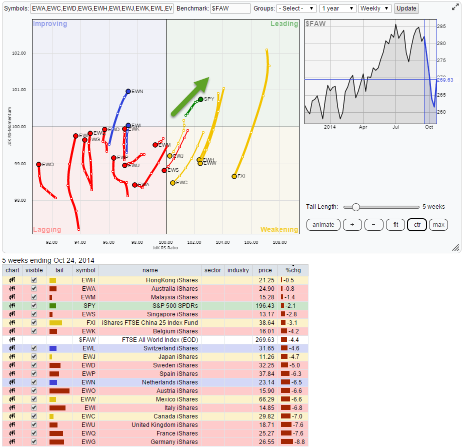
The first RRG takes the pre-defined, international ETFs, universe from the drop-down box on the RRG start page. I have added symbol FXI for China (mental memo, I will ask SCC to add this symbol to the pre-defined universe) and we'll leave the benchmark at SPY for the time being.
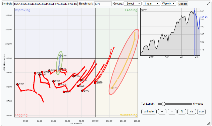
Distorted picture
This looks like a 'distorted' picture... And it is! The primary reason for this is that the benchmark for this Relative Rotation Graph is set at SPY (for US equities) which is a 'member of the universe of different countries'. The second reason that causes distortion is the fat that all these ETFs are traded in USD which includes the currency move of the USD against the local currencies of the ETFs on the plot. This is not a 'problem' as such but something we have to take into account when reading the chart as explained in this blog.
With that in mind, based on this RRG, there is only one viable conclusion that can be drawn from this chart: US Equities are in the lead! Remember that SPY is the benchmark and therefore positioned at the cross hair of both axes. What we see is that the vast majority of the other ETFs in the universe are in the lower left-hand, lagging, quadrant, indicating relative down-trends against the SPY where negative momentum is still added.
The length of the tails
The lone ranger in blue (EWN) just entering the improving quadrant is my home-market in the Netherlands :) The only ETF in the weakening (orange) quadrant is China (FXI). Now look at the difference in the tails of those two ETFs on the RRG-chart, both cover a time-period of five weeks but the tail on FXI is much longer than the one on EWN. The length of the tails is an important source of information, it will tell you something about the strength of a move.
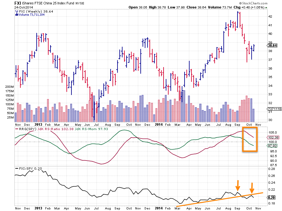
The best way to get a grip on this is to look at EWN and FXI on regular price charts in combination with the RRG lines and the RS-line.
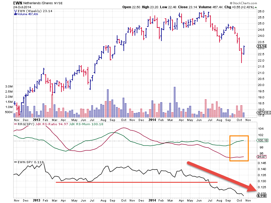
The movements of the RRG-Lines (JdK RS-Ratio & JdK RS-Momentum) in the orange boxes hold the clue to the length of the trail on the Relative Rotation Graph. For EWN on the left we can see that the recent movement of the RRG-Lines has been almost flat for the RS-Ratio (red) which explains the near vertical move on the RRG-chart while the RS-Momentum line moves only gradually higher. This causes short week-to-week moves on the RS-Momentum axis. The combination of both makes a relatively short tail on the left hand side which means " relative down-trend still intact but going through a mild recovery".
The FXI chart on the right shows a different picture. Here both RRG-Lines are showing a steep(er) decline. Which means that FXI is moving lower on both axes and it is doing that at a faster pace. This combination makes a long(er) tail on the RRG-chart while pointing towards the lagging quadrant meaning "The prevailing relative up-trend is now weakening rapidly and on the verge of turning around into a negative one".
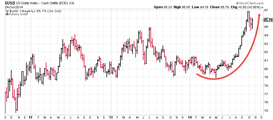
It's the currency
The cause of all this relative strength for SPY lies of course in the on-going strength of the USD vis-a-vis most other currencies in the world
Against 'the world'
In an attempt to add a bit more color to this currency driven picture I have changed the benchmark for the RRG to a broader world index quoted in USD. This is symbol $FAW. When i stick to the same universe as on the RRG above but change the benchmark to $FAW we get the following picture.
Although this setup causes the universe to be slightly better spread out over the RRG-canvas the position of SPY immediately catches the eye. It is the only one inside the leading quadrant, it is moving higher on both axes and it has a relatively short tail which means that it is a stable trend. All good! This means that the US equity market is still in a relative uptrend against the 'world' ($FAW) and that this up-trend is still gaining strength (JdK RS-Momentum moving higher).
Comparing that to the other ETFs on the plot makes it very clear that the US equity market is firmly in the lead over other international markets within this universe of ETFs (all in USD).
Against 'the world' but without the FX-effect
The last way to look at this universe is through a lens un-adjusted for currency movements. I have done that by creating a RRG-chart using $index tickers that mimic the underlying markets for the ETFs used in the first two RRGs. This gives the picture below:
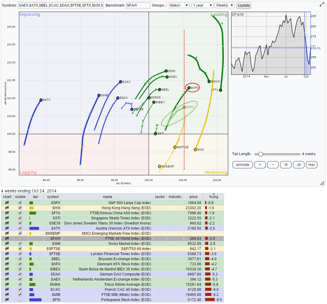
Given the fact of how completely different this RRG looks from the previous two RRGs makes the impact of the USD move very clearly visible. BUT !!! The US market (SPY) is still coming out very strong even without the help of the currency move. $SPX is captured in the green shaded oval, also in this setup well inside the leading quadrant and moving higher on both axes with a relatively short tail. Also on this RRG the majority of the markets are (way) on the left of the $SPX pointing to overall strength for the US market.
There are four markets on the right of $SPX, these are $FTX (China), $NIKK (Japan), $HSI (Hong Kong) and $KFX (Denmark). This indicates that these are all in a relative up-trend against the $SPX. $FTX and $HSI are both rapidly losing relative momentum (long tail) and just started to move lower on the RS-Ratio axis which suggests that $SPX is on its way to overtake those markets. $NIKK is still moving higher on the RS-Ratio axis but at slightly declining relative momentum. Plotting a Relative Strength line of $NIKK and $SPX shows a sideways pattern over the past few months with $SPX gaining over $NIKK over the past few weeks.
The same picture shows up when we plot $KFX against $SPX as can be seen in the graph below:
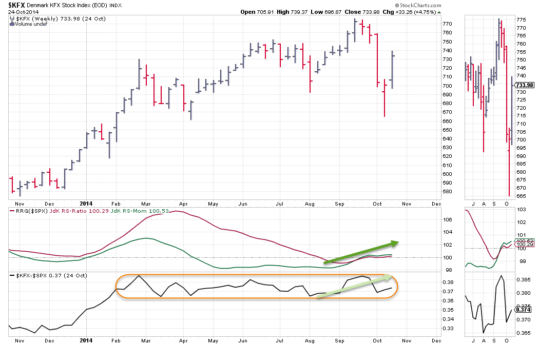
The differences are very small, almost neglectable but the improvement of $KFX over $SPX during the last few weeks causes it to get slightly ahead of the US market. It is surely the only market that has been able to keep up with the relative power of the US equity market recently. We're going to keep an eye on this rotation to see how long it will last but for now: Enjoy the ride!
Conclusion
- US equity markets remain firmly in the (relative) lead over other world equity-markets
- Denmark the only one able to keep up with US
Julius de Kempenaer | RRG Research
