RRG Charts November 29, 2014 at 07:28 PM
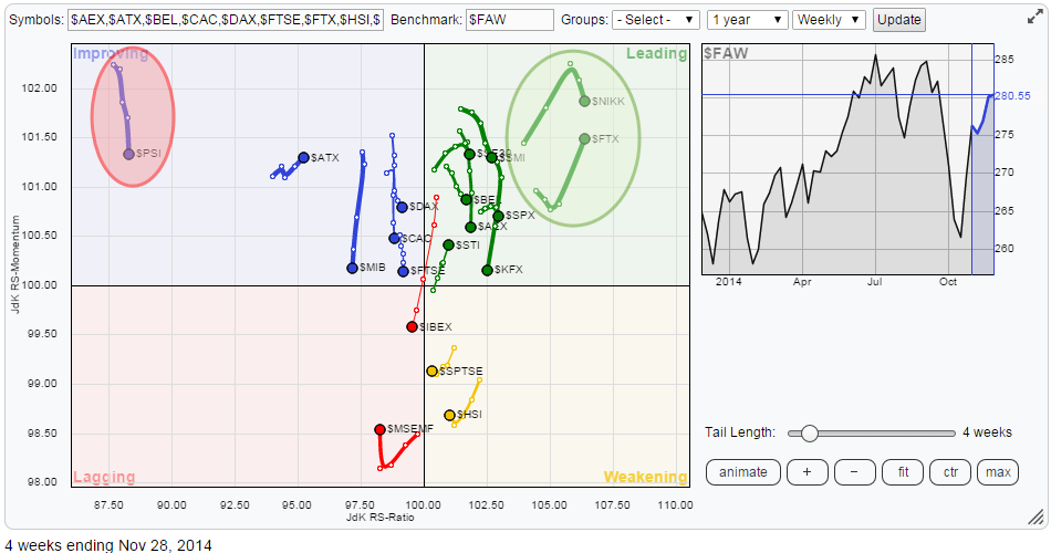
The Relative Rotation Graph™ below shows the relative position and movement of international equity markets against the FTSE All World index. At one glance we can immediately see which markets deserve our attention. THAT is the big advantage of RRG™ Charts... Read More
RRG Charts November 23, 2014 at 06:15 AM
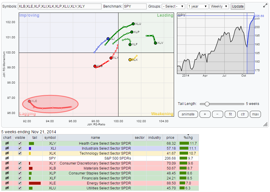
The Relative Rotation Graph below shows the weekly rotation pattern for the nine S&P sector ETFs. The single one sector that immediately catches attention is Energy (XLE) in the bottom left-hand corner (lagging). This is by far the weakest sector on the chart... Read More
RRG Charts November 14, 2014 at 06:23 AM
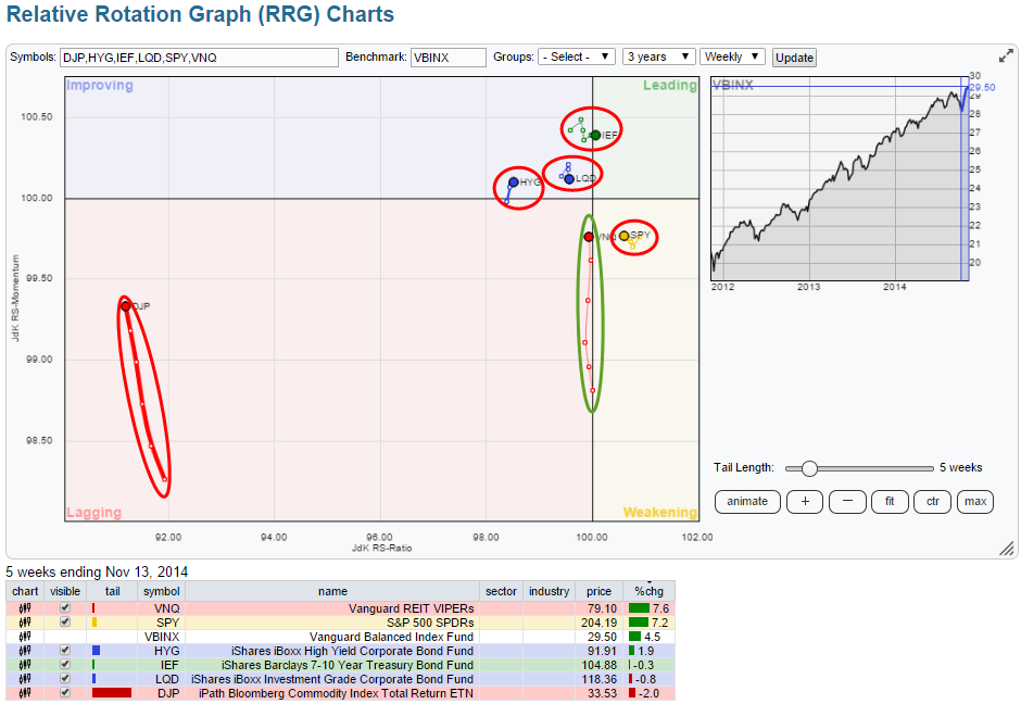
Wow...! What a difference a month makes .... I had lunch with Arthur Hill yesterday in Breda (the Netherlands) which is halfway where he lives in Belgium and where I live in the Netherlands (Amsterdam)... Read More
RRG Charts November 03, 2014 at 05:25 PM
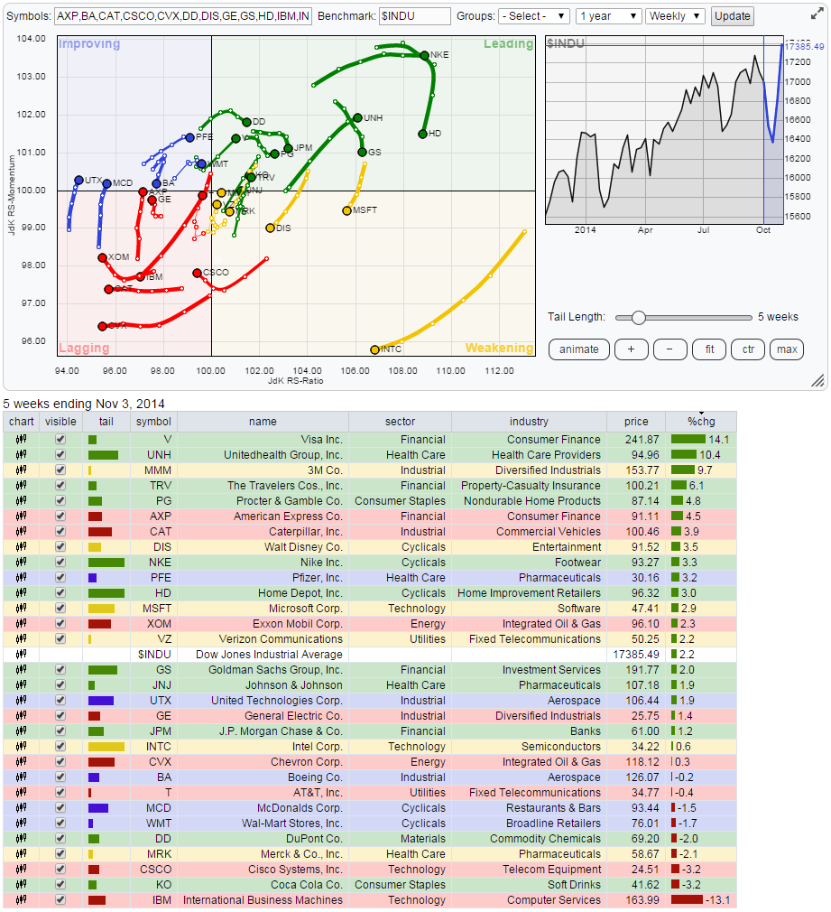
The Relative Rotation Graph below shows the members of the Dow Jones Industrials index with that same index acting as the benchmark. As all members of the benchmark universe are present on the plot we call this a "closed universe"... Read More