The 30 stocks that make up the Dow Jones Industrials index are more or less evenly spread out over the Relative Rotation Graph below.
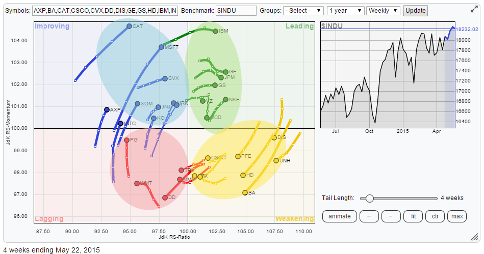
There is a group of stocks that has entered the leading quadrant a few weeks ago and which are establishing solid relative up-trends including the stocks that I wrote about in the previous edition of the RRG blog on Dow members. Then there is a group of names in the weakening quadrant that are still in relative up-trends but their relative trends are losing power.
Only a hand full of stocks have entered the lagging quadrant and are moving in relative down-trends but we do not find any extreme readings here. And finally there is a relatively big group found inside the improving quadrant with a number of names pushing hard for a rotation into the leading quadrant.
Initial observations
A few names that get my attention from the RRG above are CAT and MSFT as they have high JdK RS-Momentum values and are heading rapidly higher on the RS-Ratio axis as well.
Pretty much all greens that are heading East are worth a quick check. As GE, JPM and GS were covered about a month ago and they are confirming their strong rotation they need little attention, leaving IBM and NKE for further inspection.
In the weakening quadrant DIS and UNH are still in strong relative up-trends and according to their position on the RS-Ratio axis the two strongest stocks in this universe. This goes to a lesser extent for PFE, HD and BA where some weakness seems to be sneaking into the charts.
In the lagging quadrant we find WMT leading the way down on the JdK RS-Ratio axis followed by DD while TRV and MMM look to be onboarding for a ride lower in, at least, relative terms.
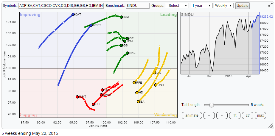
The RRG below holds the tickers mentioned above.
GS, JPM and GE
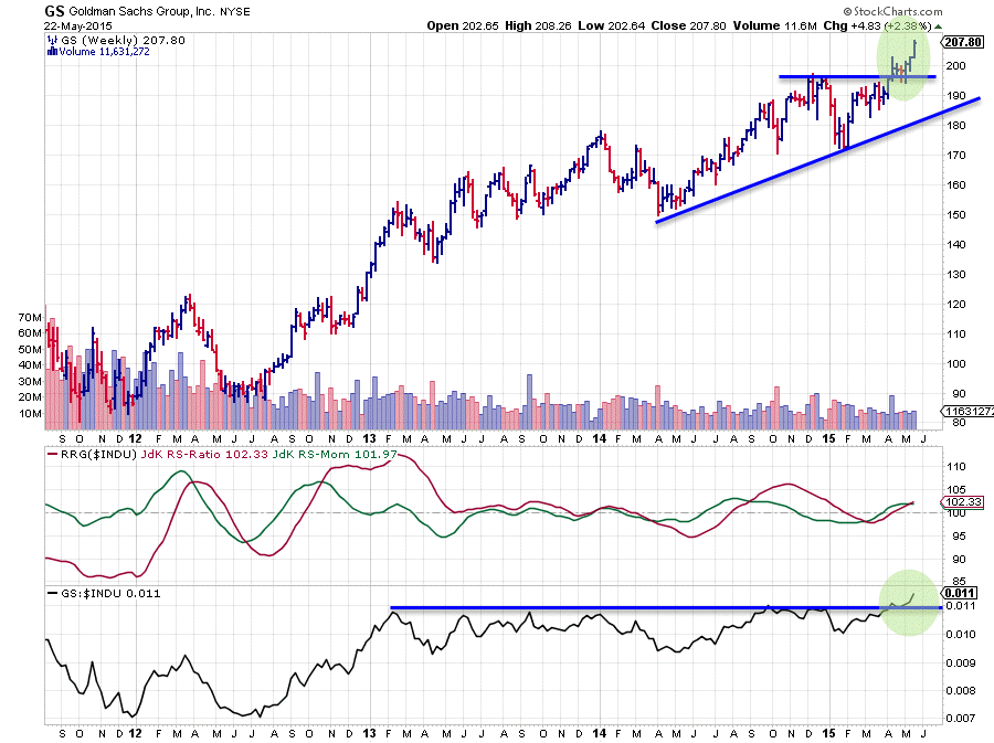
Following up on my previous blog on the Dow Industrials members these three names deserve a quick check. Goldman Sachs (GS) and JPM look especially interesting at the moment as they both just clearly broke above their horizontal resistance levels on the price chart and at the same time took out a 2 year old horizontal barrier on their RS charts. These breaks should open up the way for further upside movement from both a price and a relative perspective.
Here are the links to the charts for JPM and GE.
IBM and NKE
IBM and NKE are the two other ticker symbols inside the leading quadrant that deserve a bit of attention. Although they both arrived inside the leading quadrant recently, they did so via different routes which provides two different pictures.
IBM
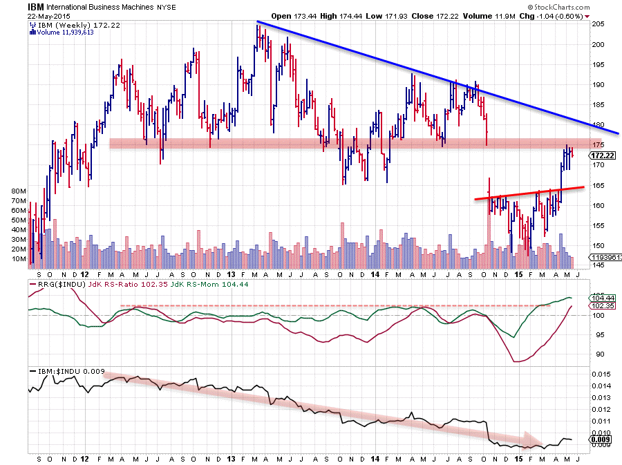
IBM went through a very weak period and has been showing a relative down-trend since 2012, and looking at the slope of the raw RS-Line this relative down-trend is still in play but looks to be in the process, or 'could be in the process', of forming a bottom.
The recent sideways movement and small rise caused the RRG-Lines to pick up strength and push IBM into the leading quadrant coming from very low levels, JdK RS-Ratio levels around 85! The problem with a move like this is that the JdK RS-Momentum line has been leading this move for months already and is currently at its highest level since 2009, which makes a further push higher questionable.
Combining this with the developments on the price chart does not make the outlook any better. The big gap down in October last year has put a big dent in the IBM picture.
The way I read the IBM price chart at the moment is that we have seen a long consolidation period after the gap-down, digesting all the supply that came in after that move. Late April price managed to break the upper boundary of that consolidation and one could even detect a H&S reversal pattern, but the problem is that there is serious overhead resistance offered by the three lows from 2013-2014: just above 170 and then clearly the top of the gap area near 180, which is starting to coincide with a falling resistance line connecting major peaks since early 2013.
All in all upside potential seems (very) limited while the relative improvement is questionable at this stage. So too many uncertainties to become overly optimistic here.
NKE
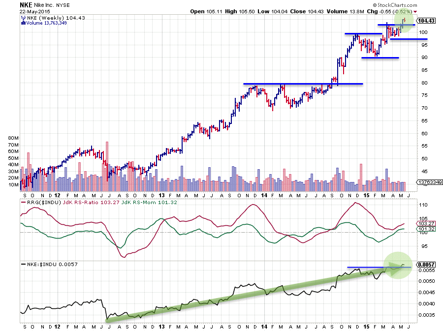
NKE sends a completely different message. The strong up-trends on both the relative and the price charts of NKE have been discussed a few times before here. Since the beginning of this year NKE was positioned inside the weakening quadrant on the Relative Rotation Graph due to a declining JdK RS-Momentum line but as we can see on the graph above that move 'only' brought the RS-Ratio line down from high levels (>110) and this coincides with a new (higher) high - (higher) low move in the raw RS-Line. The current 'hook' back up into the leading quadrant is simply confirming the still strong relative trend of NKE versus the Dow Industrials index.
DIS & UNH
DIS and UNH, based on their JdK RS-Ratio readings are still the leading stocks in the Dow universe. A look at the individual charts will immediately make clear why that is.
DIS
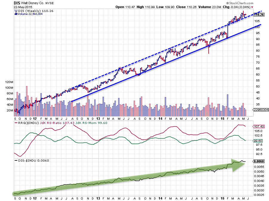
If you are at a party sometime in coming weeks and someone tries to convince you that stock markets are a random walk and your habit of checking out (technical) charts is futile .... simply show them the Disney chart, point to the move that emerged out of the 2011 low and ask them how that fits in the 'random walk' theory...
Uncle Scrooge must still be enjoying that ride every day. The JdK RS-Momentum line just dipped below 100 and this puts DIS within the weakening quadrant. However with RS-Ratio at 107 the overall trend is still very strong from both relative- and price points of view and as of this moment there are no signs of upcoming weakness ahead other then a temporary dip in relative strength.
UNH
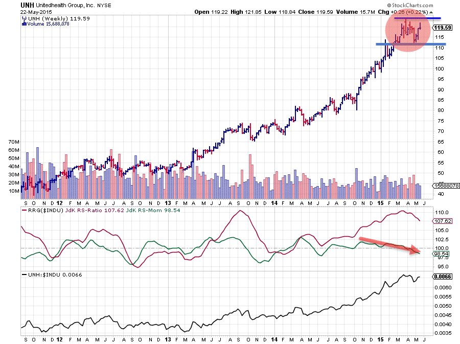
UNH is a slightly different story. The trend is definitely there on both (price and RS) charts, but on the price chart the recent up-move seems to have some difficulties taking out the previous high which has happened fairly easily on previous occasions over the past year. The loss of pace on the RS-line and the slow slide in the JdK RS-Momentum line makes this chart a bit less appealing than DIS. Nevertheless it is still clearly one of the stronger names in the Dow. Watch for a break below $110 as that could be the trigger for a larger down-move.
DD, TRV, WMT & MMM
DD and TRV continued to show weakness after their previous mention here. Their patterns have not really changed and further (relative) weakness is expected ahead.
In DD relative strength has continued to slide lower while price is testing support at $70 at the moment. A break below this support level will very likely trigger an acceleration lower.
A somewhat similar pattern is showing in TRV where you will find a horizontal support level near $100 which, once broken, can trigger downward acceleration.
WMT
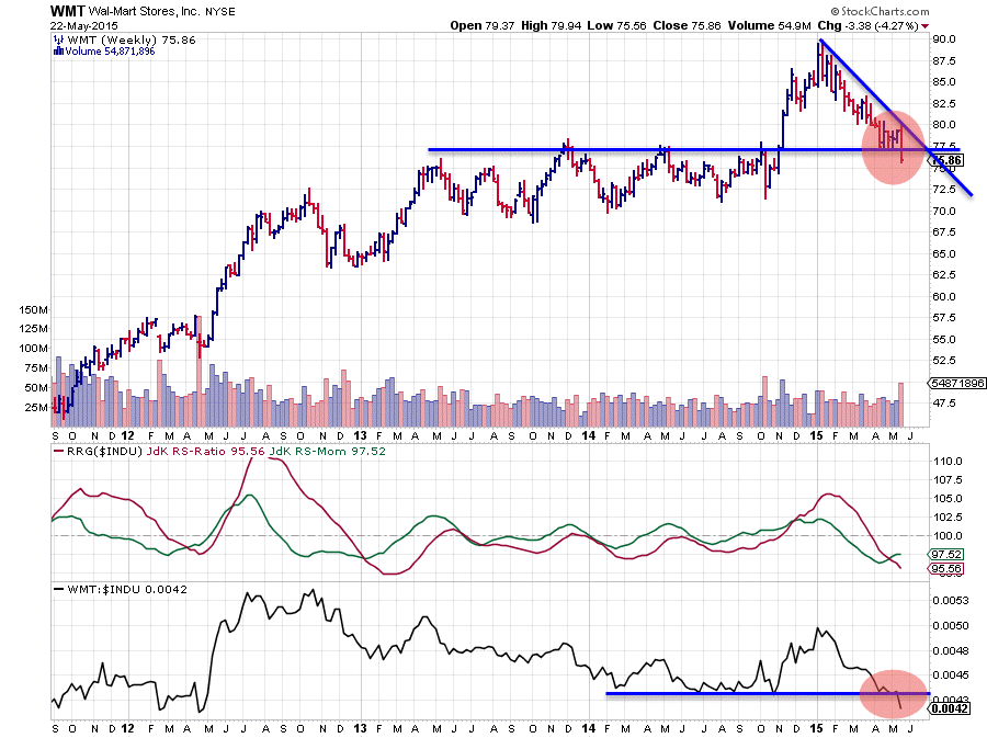
WMT has been solidly sliding lower since the beginning of this year, already taking price down from $90 towards the $77.50 area where it seemed to find some support for a while. Last week, however, a very nasty drop made WMT fall below that horizontal support level, opening up the way for more downside towards the next support zone near $70.
The relative picture did not do much better. Late 2015 it looked as if a turnaround was in the making after an almost three year period of under-performance. However the upward break was quickly negated and last week's drop in price has also pushed the RS-ine below its previous lows again. The relative down-trend seems to back in full force again.
MMM
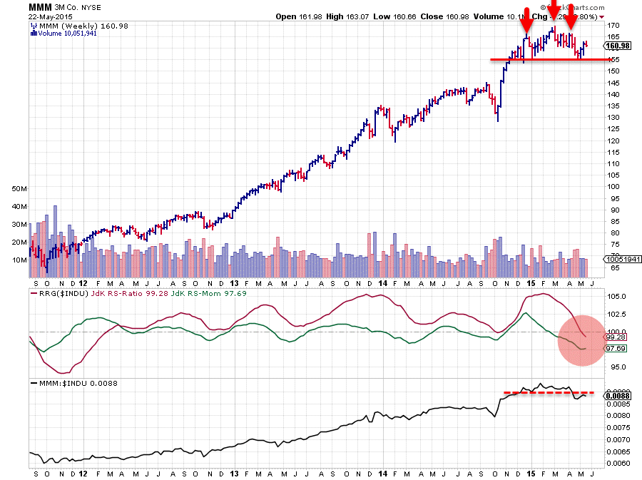
3M makes for an interesting chart. The JdK RS-Ratio moved above 100 early in 2012 and has moved above that level ever since following the up-trend that is visible in the raw RS-Line.
The price chart does not look bad either, a very solid series of higher highs followed by higher lows with one exception in Q3-2014 which was quickly recovered.
Since the beginning of this year the price trend has been moving more or less sideways with a small and brief peek above resistance in March which was unsustainable. One could even detect a small H&S reversal pattern. In any case a pattern of lower highs and lower lows seems to be emerging, still at a minor level but it is there, with important support now showing up at $155. Once that support gives way, a swift move lower could take MMM down to the 145 area.
On the relative charts the JdK RS-Ratio line has dropped below 100 for the first time since 2012 which provides enough reasons to think twice before entering (new) long positions. At the moment risk seems to start outweighing profit potential.
CAT & MSFT
In the improving quadrant we find CAT and MSFT at relatively high JdK RS-Momentum values heading higher on the RS-Ratio scale.
CAT
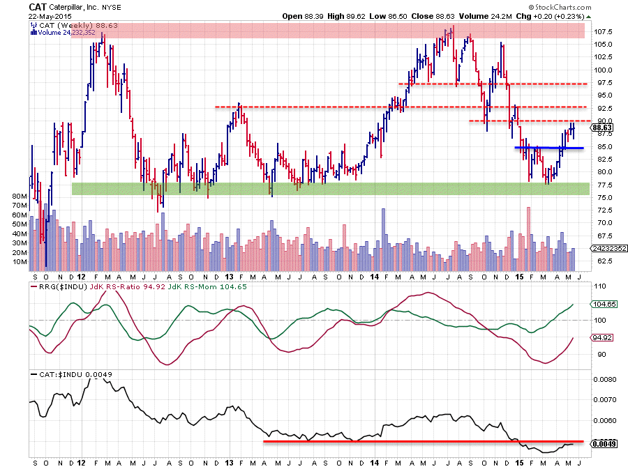
CAT is the one that stands out most as it is the furthest away from the benchmark and the other stocks in the universe. It has the highest JdK RS-Momentum value. However the JdK RS-Ratio is still at 95 which means that still quite a bit of both price and relative performance is needed to drag the stock into the leading quadrant.
This causes a situation which is similar to the one we have seen earlier in IBM where it is questionable if the current relative momentum will be strong enough to really turn the relative trend around. There is still a serious risk that this rotation will not make it into the leading quadrant and turn back down.
The price chart is not giving much better insights. CAT has been moving in a very wide trading range between $77.50 and $107.50 since 2011. During the first few months of 2015 a double bottom low has been put into place against the lower boundary of that range but almost immediately after completing this low the stock ran into another resistance level near $90 and there are many more resistance levels that can be detected very nearby. This limits the upside potential for this stock for the time being making it less attractive than others within the universe.
MSFT
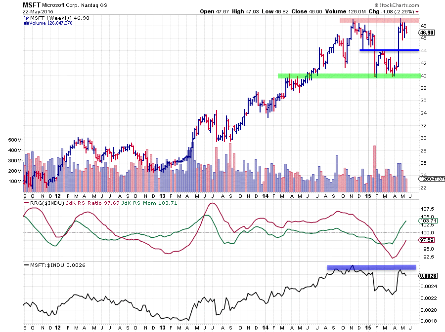
In the beginning of this year MSFT finished a long stretch of relative out-performance that started back in 2013. After a fast decline late January the stock price came to a rest near support at $40 where a double bottom was put into place with another swift move higher after completion. All in all some pretty volatile movements which make the chart hard(er) to read.
At the moment resistance seems to be showing up just below $50 while the raw RS-Line peaked near the level of its previous high.
Compared to CAT, MSFT is at a higher JdK RS-Ratio level with RS-Momentum still on the rise, making it a more interesting stock to watch. On both the RS chart as well as the price chart MSFT is pushing against resistance. A clear break beyond $50 on the price chart will very likely open up (a lot) more potential and make this a very interesting candidate to pick up.
Julius de Kempenaer | RRG Research
RRG, Relative Rotation Graphs, JdK RS-Ratio and JdK RS_Momentum are registered TradeMarks by RRG Research
