The sector rotation inside the S&P 500 index is getting more and more pronounced.
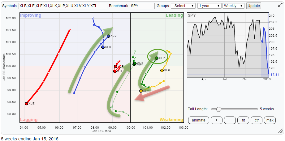
The Relative Rotation Graph holding the sector ETFs that make up the entire S&P 500 index clearly shows the recent improvement for Health Care (XLV), Utilities (XLU) and Consumer Staples (XLP). I have been looking at the developments in the Consumer Staples sector in the past two blogs as well and especially the relationship against its counterpart Consumer Discretionary (XLY).
This XLP/XLY ratio has now really shifted in favor of XLP with XLP rotating back up into the leading quadrant while XLY, although still in weakening, continues to move towards the lagging quadrant. The difference in tail length over the past two to three weeks indicates the strength of XLP over XLY.
Summary
- XLV, XLU and XLP display improving relative strength against SPY
- XLB, XLE and XLY showing weak rotation
- ADM, MDLZ and CCE weak and weakening inside XLP
- K, KR, TSN and HRL offering opportunities to beat XLP
At sector level
With the general market in trouble, it is not surprising to see a sector rotation in favor of "defensive" sectors underway on the Relative Rotation Graph. Consumer Staples, Utilities and Health Care stand out. What I like to do to "sense-check" what I see on an RRG is to project the relative trends that are visible on the RRG onto the sector rotation model taken from Sam Stovall's work and pictured underneath on the perf chart for S&P sector ETFs.
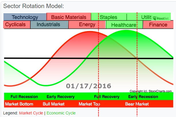
At the moment, the relative strength for Staples, Health Care, and Utilities is evident as is the relative weakness of Basic Materials, Energy, and Cyclicals. Projecting these relative positions from the RRG onto the sector rotation model seems to make sense. The relative positions of the other sectors are a bit mixed. Financials are, still, weak while Technology is weakening but their moves are not very pronounced at this stage.
The way I read this is that the general market has passed its peak (for now) otherwise Materials and Energy should be strong(er). The gravity of the relative strength for Staples, Health Care, and Utilities is positioned in the first part of the transition from Market Top to Bear Market. Given the fact that Financials is still relatively weak suggests that the market ($SPX) is not in a full-fledged market (yet).
Hence, going forward, the rotation of the Financials sector could be telling us more about if and when a bear market is underway. As Staples is the first sector to improve (relatively) when the going gets tough it will be interesting to monitor the XLF/XLP ratio as you would expect Staples to be the first sector to start losing relative strength when Financials are beginning to improve. For now, that is not the case yet.
With XLP moving into the leading quadrant I would like to have a look inside the XLP universe and find some interesting stock rotations providing opportunities to outperform the current market decline.
Stock rotation inside XLP
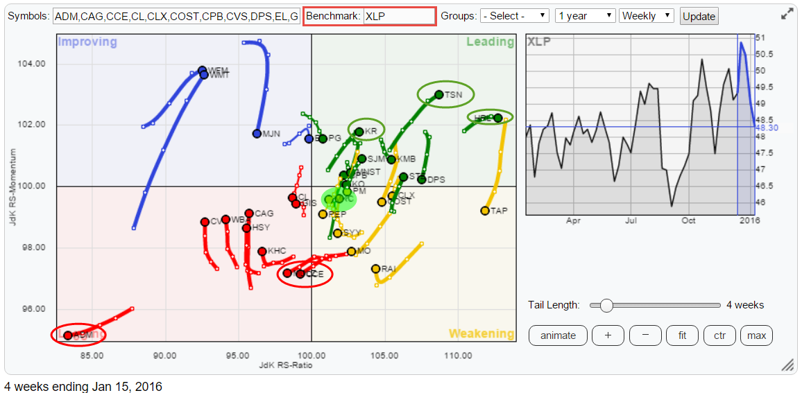
Please remember that Relative Rotation Graphs are all about relative strength. The RRG above shows the stocks that make up the Consumer Staples index (XLP) against XLP as the benchmark. So when they move into the leading quadrant, they are not only in a relative uptrend against SPY but also against XLP. When they are in a relative downtrend against XLP (lagging quadrant) it is very well possible that they are still in a relative uptrend against SPY.
Working your way down a universe like this helps you search for stocks that not only beat the general market but also beat the sector to which they belong. You're looking for the "best of the best". One of the things that I always try to explain to people is that it is also, or maybe even more so, important to identify which stocks are in a relative downtrend against the index that you would like to beat. The reason for that is that NOT owning the individual stocks which are underperforming a particular benchmark, already will help you to outperform that index.
There are a few ways you can achieve such positions as an investor. First of all, you can, of course, buy some individual stocks for your portfolio, good old-fashioned stock-picking. However, unless you have a very big portfolio with many individual stocks per sector this means that you are increasing the overall risk in your portfolio. Chances of a single stock going against you are still a lot higher than a complete sector.
The second possibility to implement such a view is to buy "the sector" via the ETF, in this case, XLF and strip out the individual stocks, identified as potential underperformers. This can be done by either outright shorting them, or, if shorting is not possible, by using options (long puts or short calls on the individual ticker symbols).
Weak names inside XLP
On the RRG holding the members of XLP, I have circled a few names in red that seem poised to continue their relative downtrends and further underperform the benchmark.
ADM is the most striking ticker that catches the eye as it is very far away in the lower left-hand corner of the lagging quadrant. MDLZ and CCE are just crossing over into the lagging quadrant from weakening.
Archer Daniels Midland Co. - ADM
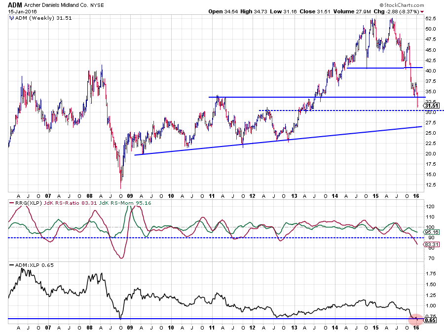
The chart of ADM is very weak from both a price- and a relative point of view. On the price chart ADM has cut through a number of important support levels on its way down. The last one near $ 33. There is now a minor support level waiting around $ 30 and then again just below $ 27.50. What's more important is that the former support levels will start to act as resistance on the way up which will severely limit upside potential for this stock.
The relative charts do not look much better either. On the contrary. The JdK RS-Ratio line is still dropping very fast and is heading for levels only seen back in 2008. Looking at the raw RS-Line in the lower pane above shows that relative strength is about to cross below its 2008 low which should be seen as a major support level in relative strength and a clear break would be a very weak sign.
The only "risk" with ADM is that the move on both the price and the RS charts is nearing extremes which increases the chances for a rebound.
Given the levels and the strength of the trends and all the overhead resistance on the price chart however, it is very unlikely that we will see a real turnaround of the relative trend anytime soon.
Mondelez International, Inc - MDLZ
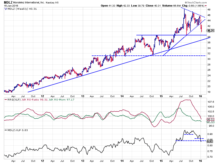
MDLZ went through a nice relative up-move from March to October last year. At the beginning of October, the JdK RS-Momentum line crossed below the 100-level and started to drag the RS-Ratio line lower from pretty high levels. This loss of momentum has now resulted in the RS-Ratio crossing below 100 as well following the start of a new downtrend in the raw RS-Line where we see a new series of lower highs and lower lows emerging. There is plenty of room for a further decline of the relative strength line in coming weeks.
On the price chart, MDLZ has completed a symmetrical triangle and is now heading back towards the support level, offered by the former breakout level between $ 38 - $ 39.
All in all, MDLZ has plenty of room for further declines on oth the price and the relative charts.
Coca Cola Enterprises, Inc - CCE
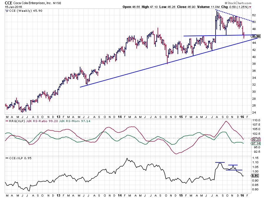
On the price chart, CCE has just broken its previous low that signaled the start of a new series of lower highs and lower lows. The rising support line should be able to provide some support now around $ 44. A break below this level will add some fuel to the downtrend and possibly cause an acceleration lower.
On the relative charts, the picture is more pronounced. The rhythm of lower highs and lower lows is clearly visible on the raw RS-Line. The JdK RS-Momentum line dropped below 100 back in October already and just recently the RS-Ratio line followed with a break below 100 as well.
With both RRG-Lines below a 100, CCE is now inside the lagging quadrant and heading deeper into it.
Strong names inside XLP
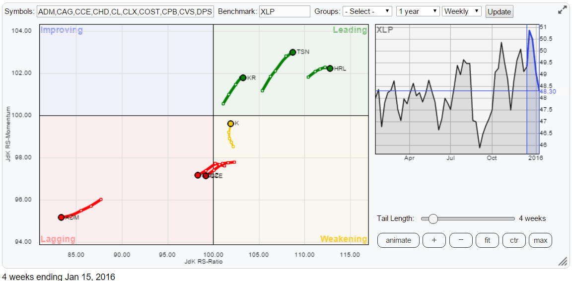
I have re-created the RRG for XLP stocks below only showing the symbols we are talking about as some of them got lost in the clutter. On the positive side, I have picked four names to look at. These are KR, TSN and HRL inside the leading quadrant and K inside the weakening quadrant but turning upward.
Hormel Foods Corp - HRL
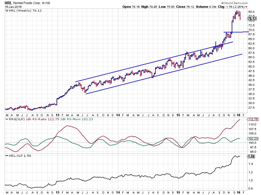
Deep inside the leading quadrant and far away to the right of the plot we find HRL. A quick look at the charts above confirms that HRL is, still, a very strong stock from both a price and a relative point of view.
Despite the fact that HRL is undeniably strong it is doubtful (at least IMHO) whether it is sensible to chase the stock higher from these levels. On the price chart, Hormel is just coming to rest after a surge higher. As a result of this sharp rally, there is quite a bit of downside risk now before support, just below $ 70, will kick in. Such a setback will likely offer better opportunities to get onboard again.
The duration and the steepness of a correction will dictate whether HRL will have to travel through weakening and then back up into the leading quadrant again or move slightly sideways to lower inside the leading quadrant and then move further to the right (= higher on the RS-Ratio scale).
Tyson Foods Inc CI A - TSN
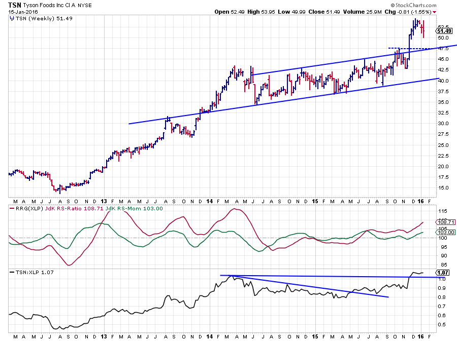
Tyson Foods is well inside the leading quadrant for quite a while already and has been steadily outperforming the XLP benchmark since the RS-Ratio crossed above 100 back in June 2015. The recent break of the raw RS-Line above its 2014 peak was another confirmation of the relative strength of this stock, and it opened up the way for a further relative rise.
After breaking beyond resistance at $ 47.50 on the price chart, TSN rallied strongly and has put in a peak near $ 54 and seems set for a corrective move back to the former breakout level. Any sign of support kicking in near that level ($ 47.50) should offer good opportunities to get (back) in.
From a relative strength point of view, there is no weakness in sight at all.
Kroger Co. - KR
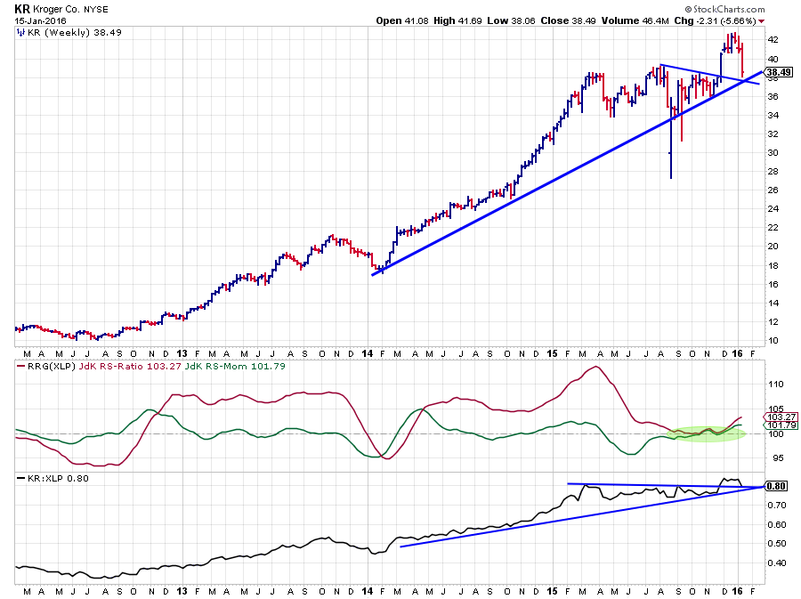
From HRL to TSN to KR. Each stock is lower on the RS-Ratio scale and as you can see on the charts the "downside risk" got smaller each time.
KR already dropped back on the price chart and is now resting on a double support level offered by the rising support line and the former resistance line, connecting the previous two peaks. On the raw RS-Line also an upward break is visible as well as the pull-back after the break.
With both price and relative strength resting at double support levels and both RRG-Lines moving higher above 100, KR looks set for a further up move against XLP.
Kellogg Co. - K
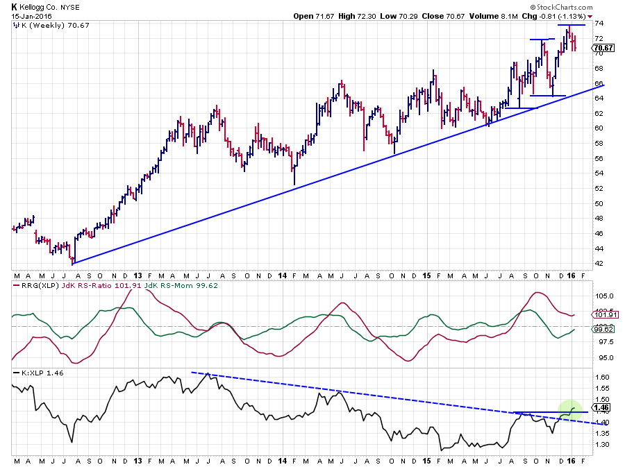
Kellogg (K) is the only one, of the stronger stocks, that is not inside the leading quadrant but inside the weakening quadrant. The RS-Ratio moved into the leading quadrant in August (Both RRG-Lines > 100) just before the raw RS-Line hit on the falling resistance line coming off the 2013 peak in relative strength. While the K:XLP ratio battled with this resistance line, RS-Momentum dropped below 100 causing K to rotate into the weakening quadrant.
In the past few weeks, however, things are starting to look much better for K again. The raw RS-Line has broken the falling resistance and subsequently pushed above it previous high which definitely turned the pattern of lower highs and lower lows in RS around into an uptrend.
As the JdK RS-Ratio managed to remain above 100, indicating that the relative uptrend remained intact during the setback, and RS-Momentum is close to crossing above 100 again, all seems set for a return of K into the leading quadrant and thus suggesting a continuation of the relative uptrend vs. XLP
Julius de Kempenaer | RRG Research
RRG, Relative Rotation Graphs, JdK RS-Ratio and JdK RS_Momentum are registered TradeMarks by RRG Research
Follow RRG Research on social media:
LinkedIn Facebook Twitter
