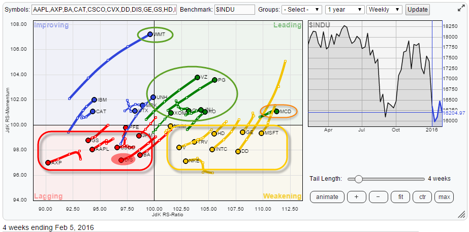
Over the past few days I have been looking at the Relative Rotation Graph of the 30 Dow stocks and its individual charts, and quite frankly I don't even know where to begin. Big swings all over the place, from +6% in DD to -9% in MSFT and anything in between. Long tails and short tails, clusters of stocks rotating towards and into the leading quadrant and vice versa etc. etc.
The RRG of the $INDU stocks shows (some of) these big moves and there are plenty of stocks that are begging to be examined in more detail. I ill try to pick a few interesting ones.
Summary
- WMT pushing towards leading quadrant.
- MCD reaching extreme relative strength levels, risk increasing
- DIS expected to rotate further into the lagging quadrant
- UNH looks risky on the chart despite rotation heading for leading quadrant
- XOM expected to be one of the outperformers inside $INDU
Quick scan
On the first look at this RRG, there is one stock that immediately catches the attention and that is Wal-Mart. The long tail through the improving quadrant while (almost) crossing over into the leading quadrant at, by far, the highest JdK RS-Momentum value in this universe deserves a further inspection of the price chart.
Another one which intrigues me is MCD at the far right end of the chart, just above 100 on the RS-Momentum scale and with a very short tail.
Furthermore, I see three distinct groups on the RRG. There is a group of stocks inside the lagging quadrant that are all heading lower on both axes, indicating established relative downtrends that are still pushing lower. On the opposite side, there is a group of stocks inside, or almost inside, the leading quadrant which are all heading higher on both axes and offering potential opportunities to outperform the Dow Jones Industrials.
Please bear in mind that "outperforming" does not necessarily mean a positive return in absolute terms... A stock that loses 5% while the benchmark is down 10% is still outperforming "the market" by 5%. However, identifying such moves will offer you the possibility to profit in absolute terms by using options, reverse ETFs, outright shorting stocks, in combination with straightforward long positions. The markets, nowadays, offer plenty of opportunities to "translate" a view into a "position".
Wal-Mart Stores - WMT
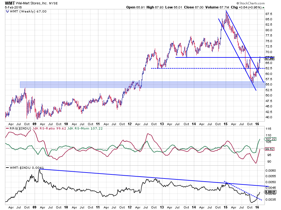 The price chart of WMT above shows a solid downtrend from the peak at $ 87.50 in the beginning of 2015 to the low near $ 55.00 at the end of the year. That low coincided with the 2008 peak and a cluster of peaks and troughs in the beginning of 2012.
The upward break, out of the falling channel also meant a break above the horizontal resistance level coming off the late 2012 lows and the recent lows, set in August/September 2015. The subsequent rally is now pushing against the next resistance level around $ 67. The improvement is clearly visible but so far it almost one straight shot higher. not a series of higher lows followed by higher highs (yet). Therefore, despite the strong improvement, I think there is some risk for a reactive move to correct the recent rise. If and when such a correction materializes and starts to bottom out around the former resistance level near $ 62.50 that could provide a good entry level.
From a relative point of view, WMT is in a long downtrend that started at the beginning of 2009 with the 2011-2012 rally in relative strength resulting in a lower high. The 2015 low in relative strength, caused a lower low in the raw RS-Line, which confirms that the downtrend is still intact. On a shorter time-frame, however, relative strength broke upward and has now room to rally further towards the down sloping trend line.
The JdK RS-Momentum line is still pushing higher at a steep angle, dragging the RS-Ratio line towards the 100-level and a cross into the leading quadrant on the Relative Rotation Graph is now very likely. We will have to see how long this high level of relative momentum can be maintained
So on both the relative and the price charts WMT has broken, at least short-term, resistance. On the relative chart, there is now room to rally higher while the stock is challenging resistance on the price chart, a drop back in price while raw RS remains above its 2015 low, is likely to provide a good opportunity.
McDonalds - MCD
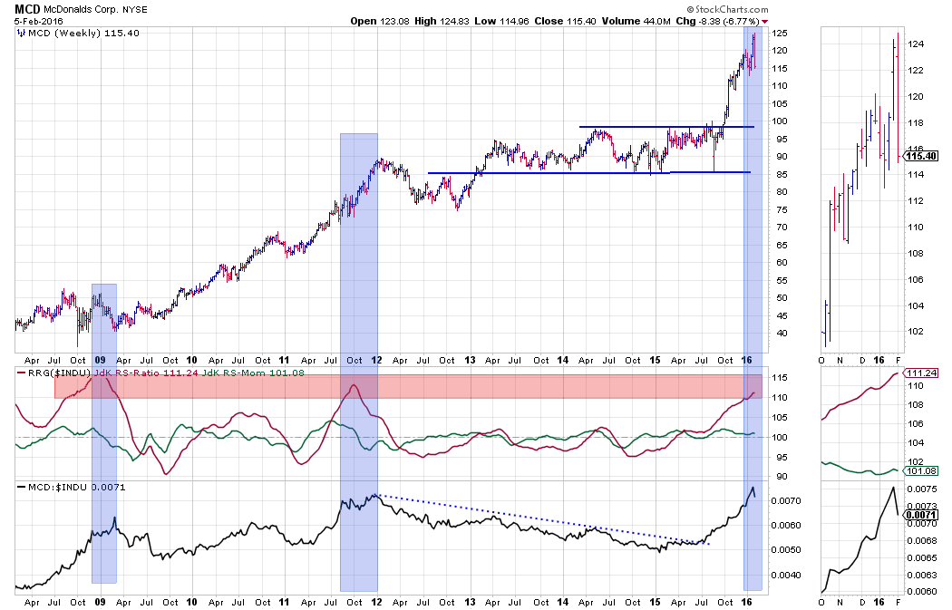 On the price chart, things started to look good for MCD at the end of Q1-2015 when the JdK RS-Ratio crossed above 100, backed by an already positive RS-Momentum. They started to look even better when, shortly after that, the raw RS-Line broke above its falling resistance line. And finally the upward break, out of the range on the price chart, sparked the 25% rise that took MCD to its peak at $ 125.
But..., although I love trend following, sometimes you need to admit that "enough is enough."
Last week's price bar is showing a very nasty reversal with the stock price pushing to a new high and then dropping like a stone to levels far below the previous' price low. Due to the steep rise, the first serious support level is therefore only found near $ 100.
When looking at the price chart of MCD in combination with the RRG-Lines and its raw relative strength line we can see that the JdK RS-Ratio line is reaching pretty extreme levels. This means that chances for a relative rally to continue much further are becoming slimmer and slimmer, and downside risk is increasing accordingly.
Combining this with the nasty reversal on the price chart makes me, at least for the very short term, very cautious for MCD.
Inside the lagging quadrant
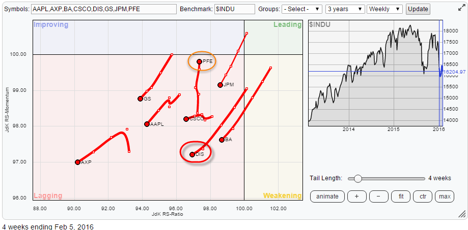 The RRG above zooms in on rotations inside the lagging quadrant. Except for PFE, all stocks inside this quadrant are heading deeper into it with AXP leading the way. AXP together with GS and JPM are confirming the general weakness of the Financial sector in general. The weakness of AAPL has been mentioned more than once in the various blogs on the site so I will pass on that one for now.
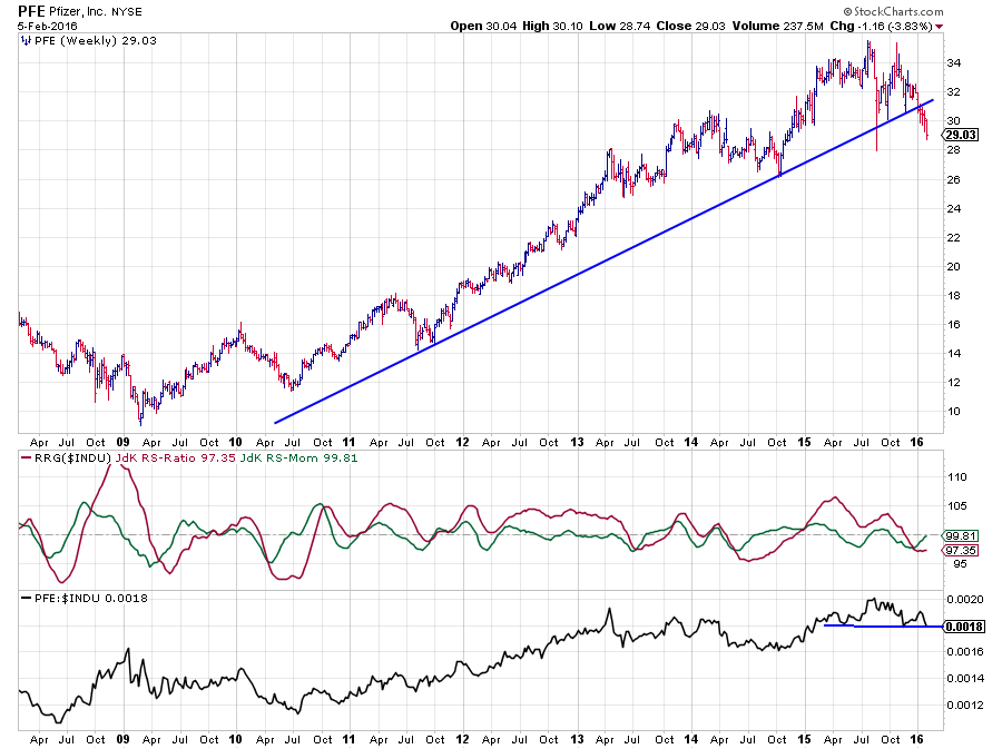 I had a quick look at PFE as it is the only one bucking the general direction of the other stocks on the plot but as far as I can see it is still a stock with a weak relative chart.
The rising trend(line) has already been broken and the relative strength line is resting on support offered by two previous lows but seems to be on the verge of breaking below it.
Once such a break materializes, the decline of relative strength is expected to accelerate. This will then very likely cause a rotation back towards the lagging quadrant for PFE without reaching the leading quadrant.
The stock which I would like to focus on inside the lagging quadrant is DIS.
Walt-Disney Co. - DIS
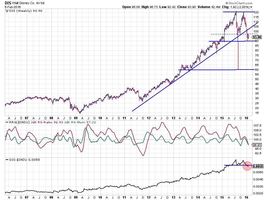 Walt Disney has been one of the star performers inside the Dow Jones Industrials universe for a very long time. After an acceleration of the rally in the first half of 2015, which ended at $ 120, Disney dropped rapidly to a low at $ 90, which was more or less at the level of the rising support line.
Out of that newly formed low at $ 90, as matter of fact it was a small double bottom, a new up-leg materialized which again took DIS back to $ 120. The fact that the stock was not able to push beyond this resistance level was a first sign of weakness.
Almost as rapidly as the rise DIS started to fall again, only to come to a rest around current levels $90, which is the level of the previous low as well as the area of a cluster of highs and lows in late 2014. On the way down the rising support line, was clearly taken out.
The formation that has been formed over the past 12-13 months can be seen as a giant double-top formation that will be completed when the stock breaks below $ 90. In that case, a price target can be pegged near $ 60.. around 30% lower. This is serious! One could even "argue" that a double-top has already completed upon the break of the dotted support line which ignores the spike low at $ 90 but uses the to intermediate lows, out of which the last rally emerged.
With both the JdK RS-Ratio line and the JdK RS-Momentum lines well below 100 and both strongly pushing further down DIS is heading further into negative territory. This weak rotation will now very likely be fueled even further by the recent break of support in the RS-line.
The bottom line is that, in either case and on both price- and relative charts, the outlook for DIS is very negative. There's trouble in Disneyland.
Inside the leading quadrant
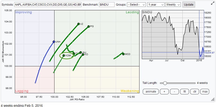 This Relative Rotation Graph zooms in on the top-right, leading, quadrant. Except for CVX, all of the tails are heading higher on both axes. The chart of MCD has been inspected earlier in this post. I have added UNH as it is on the verge of crossing over into the leading quadrant. An inspection of the price chart in combination with the RRG-Lines and its relative strength against $INDU did not make me very enthusiastic.
The stock in this group, which, I think, offers good opportunities is XOM.
Exxon Mobile Corp - XOM
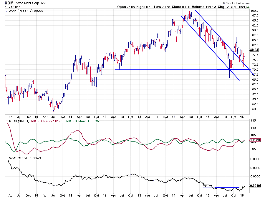 The price chart of XOM shows the down-move from the peak near $ 100 in 2014 to the, first, low near $ 70 mid 2015. The $ 70 - $ 72 area looks to be a good support zone now as it has been respected by three major lows in the past four years. The fact that XOM has not trended lower, i.e. took out the August low in the past few months has caused the relative strength against the Dow Jones Industrials index to improve gradually.
Late last year the RS-Ratio line crossed above the 100-mark and after a short (relative) momentum dip both RRG-Lines are now starting to head higher causing XOM to rotate further into the leading quadrant. The break above resistance in the RS-Line is expected to help this rotation accelerate in coming weeks.
All in all, XOM seems to be getting some renewed energy after a long period of underperformance and could be one of the ouperforming stocks inside $INDU in the coming period
Julius de Kempenaer | RRG Research
RRG, Relative Rotation Graphs, JdK RS-Ratio and JdK RS-Momentum are registered TradeMarks by RRG Research
Follow RRG Research on social media:
LinkedIn Facebook Twitter
