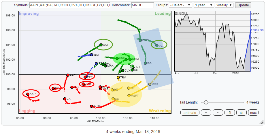
 The Relative Rotation Graph above holds the 30 stocks that make up the Dow Jones Industrials Index ($INDU). The rotational patterns of the individual stocks vary widely. The RRG shows you where the opportunities are but, maybe even more important, also shows you the threats.
Summary
- VZ leads the (relative) way but looks set for a corrective rotation
- WMT, PG and MCD are showing patterns similar to VZ and seem poised for some (relative) corrections
- AXP is the weakest stock based on JdK RS-Ratio but looks to go into a recovery rotation within its longer-term relative downtrend
- GS and JPM continue to move lower on RS-Ratio scale
- PFE rotating back down into lagging quadrant and expected to accelerate lower
- UNH steady in the leading quadrant and ready to move up on relative and price charts
- MMM prepared to break to new highs, relative strength already on the move
- CAT bouncing off support and expected to do well in coming weeks
Quick scan.
A first glance at the RRG above, starting in the leading quadrant, shows that VZ is leading the way from a relative point of view at the moment. Together in the blue shaded box with VZ are WMT, PG and MCD (weakening quadrant). All these companies are still in relative uptrends against $INDU and given their high values on the JdK RS-Ratio scale; they are expected to continue to do (relatively) well going forward. Their shorter term picture shows a loss of relative momentum that is pushing them down on the JdK RS-Momentum scale. This combination suggests that these stocks are going through a pause in their relative uptrend.
Apart from MCD, which has only just moved into the weakening quadrant and is still high on the RS-Ratio scale, stocks like MSFT, GE, DD, HD are now starting to head towards the lagging quadrant which makes their ability to rotate back towards the leading quadrant before reaching lagging questionable. At least worth a closer eye in coming weeks.
Inside the lagging quadrant, we find some financial stocks with (very) weak (relative) charts, which is consistent with XLF being positioned well inside the lagging quadrant on a sector level. AXP is leading the way down and has dropped so far over the past few weeks that a recovery rally looks to be imminent but don't be fooled as the longer term picture still shows a solid downtrend both in relative and price. JPM and GS are steadily moving further into the lagging quadrant.
At the moment, the improving quadrant is holding only a few stocks. IBM and, especially, CAT seem to be very close to crossing over into the leading quadrant.
Verizon Communications - VZ
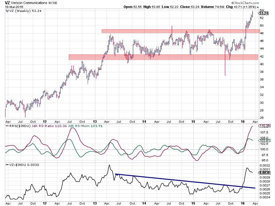 The chart of Verizon shows a trading range between roughly $ 42 and $ 48 that lasted three years. Very early in this year, the price broke above the upper boundary of this range and continued to accelerate to new highs. Based on the width of the range (first) target for the move following the break could be pegged around $ 54 ($6 added to the breakout level at $48).
As you can see VZ is now close to fulfilling that first target after a very steep rally.
On a relative basis, V moved in a downtrend since 2013. The break in price and the subsequent rally caused a turnaround in RS for VZ. After taking out the falling resistance line on the RS chart, relative strength shot up almost vertically and is now reaching the peak level that was seen back in 2013.
Also in the bigger scheme of things, in this particular universe of $INDU stocks 110 on the JdK RS-Ratio axis is a very high level. This can be seen very well when you call up the RRG chart for the $INDU stocks and play the animation over time. As you can see only very few stocks move beyond 110 on the RS-Ratio axis and when they do it is only for s short period before they start to turn lower. Now don't get me wrong, there is nothing wrong with that, and it does not make them "weak" stocks all of a sudden but chances that they have hit their relative highs are increasing which means that risk is increasing and that at least a pause in their current trend is likely.
The good news is that such pauses, or setbacks, will offer renewed opportunities for investors looking for buying possibilities at lower levels. This outlook also applies to the other three stocks in the blue shaded area on the RRG above; WMT, PG, MCD.
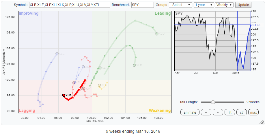
Weak financials in the lagging quadrant
The lagging quadrant on the Relative Rotation Graph for $INDU stocks is dominated by financial stocks AXP, GS and JPM. This confirms, and is in line, with the position of the Financials sector (XLF) on the RRG vs. SPY.
The RRG below zooms in on the rotations inside the lagging quadrant
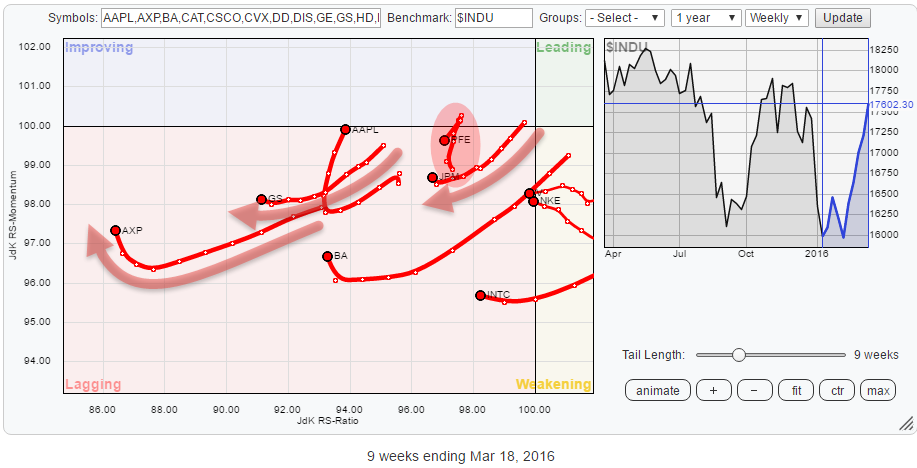
American Express Co. - AXP
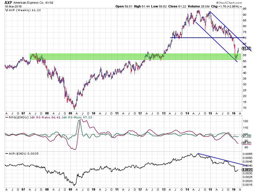 Clearly AXP is leading the way (down) from a relative point of view as it has the lowest reading on the RS-Ratio axis. Given the low reading on RS-Ratio the current rise on the JdK RS-Momentum axis is judged s a recovery within the longer term downtrend.
The chart above shows that price has accelerated sharply lower after breaking below support near $ 70. This decline was caught by the support zone in the $ 50 - $ 55 area, out of which AXP is now rallying. This rally could even move as far as $ 65 or maybe even $ 70 without breaking the current downtrend in price. Any peak formed below $ 70 (level of the latest trough) confirms the strength of the downtrend. The further below $ 70, the stronger the trend.
This weakness in price has translated in a relative downtrend that started in the second half of 2014 while price started to move sideways. The raw RS-Line is now showing a very regular pattern of lower highs followed by lower lows, and this trend was picked up by the RRG-Lines that are now both moving below 100. Just like the stocks in the blue shaded area seem to be set for a corrective move within their longer-term uptrends, AXP seems ready to recover within the boundaries of its downtrend on both the relative and the price charts.
Given the position on the RRG and the position of price inside the falling channel, the upside potential seems very limited with a lot of downside risk attached to any long positions.
Goldman Sachs Group Inc. GS
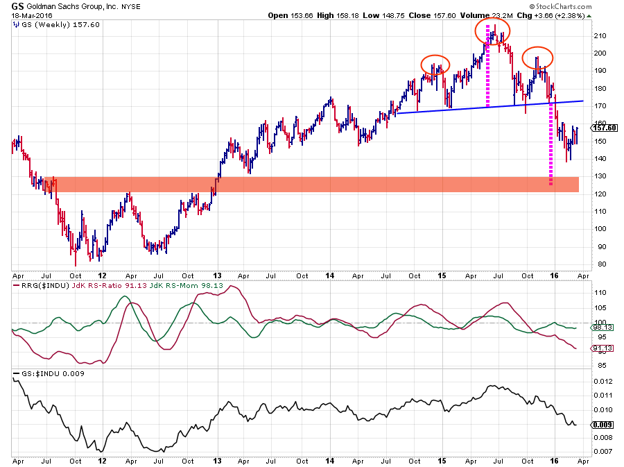 GS is still working its way lower after completing the big Head & Shoulders reversal pattern and has not reached its first price objective off of that pattern yet. Any recovery is GS is expected to get into trouble near $ 170 but probably sooner.
Especially the relative charts for GS inside the $INDU universe continue to show weakness. The RS-Line is steadily moving lower which is reflected in an RS-Ratio line that is nearing lows seen in 2011 and 2012.
J.P. Morgan Chase & Co. - JPM
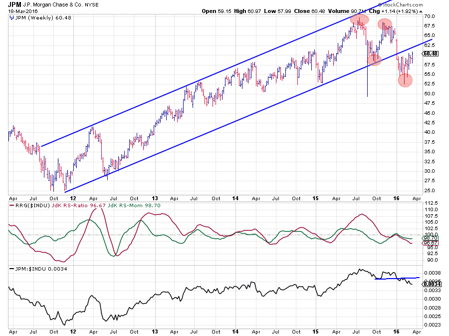 A somewhat similar structure is seen on the charts of JPM. Lower highs and lower lows setting up after breaking out of its rising trend channel and a relative strength that started to move lower late 2015 and recently confirmed that weakness by breaking below its relative lows of October-November last year.
The only difference here is that JPM is in an earlier stage of the rotation compared to GS and AXP which makes it probably the riskiest of these three financials.
Pfizer Inc. - PFE
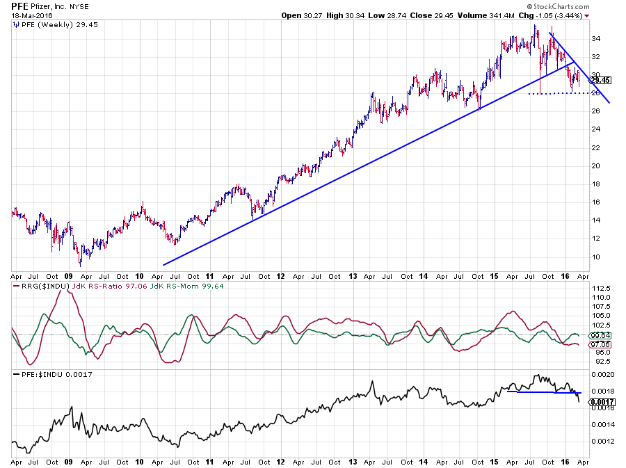 Alongside these three financials, there is one more stock inside the lagging quadrant that deserves our attention. This is PFE. PFE moved into the lagging quadrant late last year when RS-Ratio followed RS-Momentum below 100. At the beginning of this year, the relative strength of PFE bounced off of a horizontal support level which caused RS-Momentum to recover back towards the 100-mark shortly.
This caused PFE to move into the improving quadrant for a very short period but the break below horizontal support in the RS-graph is now starting to take its toll and RS-Momentum is already turning back down at the 100 level while RS-Ratio has barely moved. This causes PFE to rotate back down into the lagging quadrant from improving, and all looks set for an acceleration of the relative decline.
This rotation is animated in the picture below. Watch the tail getting shorter and shorter in the run-up to the 100-level which shows the loss of relative momentum until it almost comes to a standstill with all four observations in the tail at pretty much the same location on the RRG before it starts to accelerate downward again.
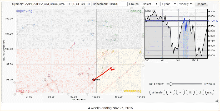 This weak outlook is confirmed when we look at the price chart. The uptrend in price was clearly broken at the end of last year. After the initial decline towards support at $ 28, the recovery is now starting to stall near fresh resistance around $ 30 while a falling trend line is starting to take shape. A break below $ 28 will further confirm the weakness for PFE and trigger a further decline in both price and relative.
Stable relative uptrends and some nice breakouts inside the leading quadrant.
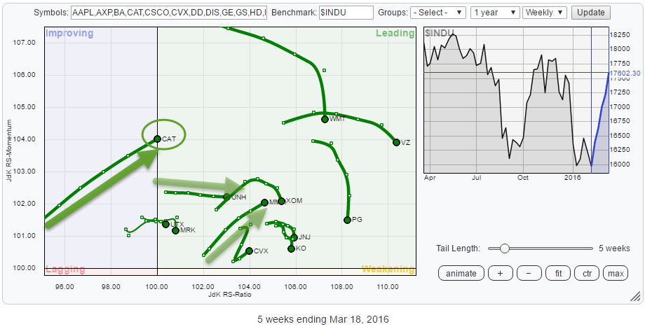 The, zoomed in, RRG of the leading quadrant shows CAT just about to crossover and UNH moving almost horizontally while MMM is powering deeper into the leading quadrant moving higher on both axes at roughly the same pace.
Unitedhealth Group Inc. - UNH
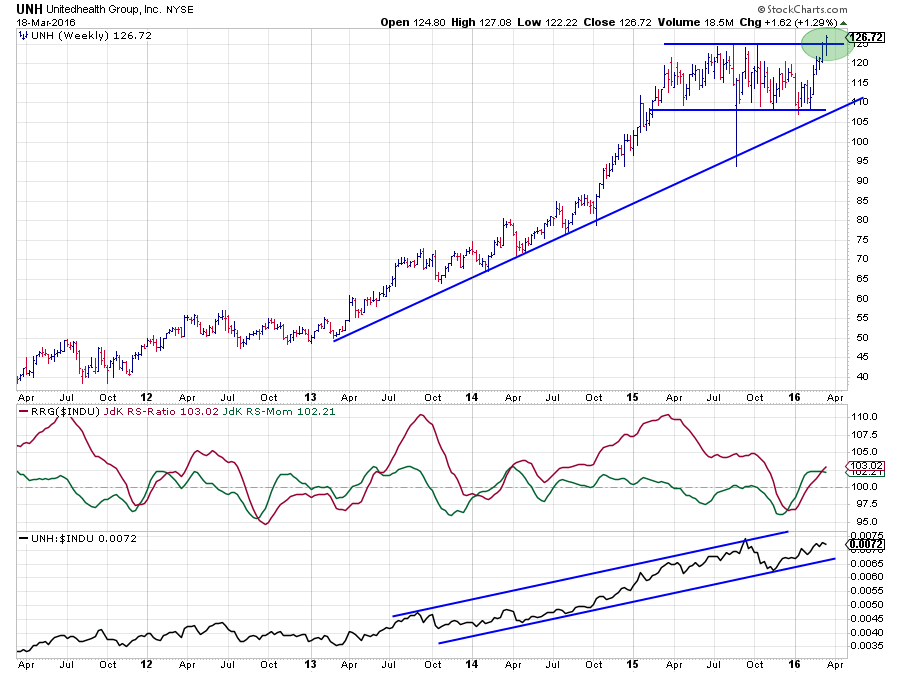 UNH started to outperform the $INDU back in the second half of 2013, reaching its relative peak in September 2015. The sideways move that started to show up in price took its toll on the relative and caused a sharp dip that took the RS-Ratio shortly below 100 and into the lagging quadrant.
At the bottom of the trading range, relative strength picked up again and UNH started to rotate back towards the leading quadrant. The current horizontal move on the Relative Rotation Graph is caused by a relative strength line that is moving higher at a constant rate of change. This indicates a very stable trend.
The recent breakout of the broad trading range on the price chart will very likely add new fuel to the uptrend in price which will almost certain provide new power to the relative (up)trend as well.
UNH seems ready to move higher on both the price and the relative charts.
3M Co. - MMM
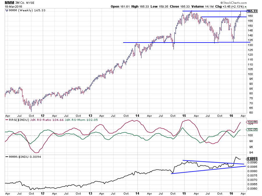 MMM started a new uptrend in price back in 2012 and worked its way higher all the way through to early 2015 when the stock peaked at $ 165. At the same time, the (raw) RS-Line started its uptrend and moved higher alongside price. This caused the JdK RS-Ratio line to hover above the 100-mark all the time with only the JdK RS-Momentum line oscillating around 100 from time to time to digest temporary setbacks in relative strength. This causes rotations to take place completely on the right-hand side of the RRG (the sign for a strong relative uptrend).
After the peak was set at $ 165, MMM dropped in price, and a trading range started to take shape on the price chart with the lower boundary near $ 132.50 and the upper boundary at $ 160 (or maybe $ 165). The relative strength line started to form triangle pattern during the consolidation in price and RS-Ratio dropped below 100 for the first time in over three years, making MMM rotate (briefly) through the lagging and improving quadrants from May to October 2015.
The stock moved back into the leading quadrant again in November 2015 when RS-Ratio crossed back above 100. At the beginning of 2016, MMM left the triangle to the upside, indicating that a continuation of the previous relative uptrend was imminent, confirming the strength that was already visible in the RRG-Lines.
From a relative point of view, MMM looks all set to move higher and outperform the $INDU. On the price chart, MMM is now attacking the horizontal resistance offered by the peak at $ 165 after having cleared the horizontal resistance at $ 160. Another break higher above $ 165 will certainly help MMM to improve further in relative terms as well.
Caterpillar Inc. - CAT
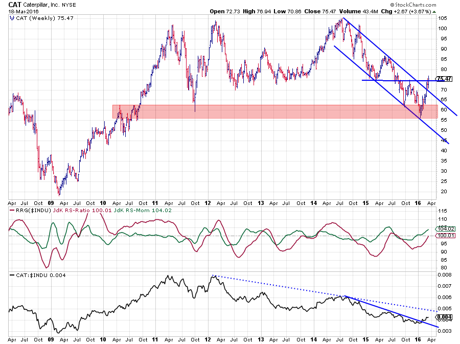
2009 and 2010 were excellent years for Caterpillar. However, after having peaked between $ 100 - $ 105, the stock moved in a very wide range since 2011. Roughly the lower boundary is found around $ 55 $ 60 while the upper boundary, tested three times, is between $ 100 - $ 105. Early January CAT bounced off this support zone and started to rally.
The relative picture for CAT vs. $INDU has been predominantly sideways to down since 2011 but seems to be breaking the first falling resistance line (solid blue line on RS graph). It is a bit early as there is a secondary, more important, falling resistance line waiting overhead (blue dotted line). The RRG-Lines seem to be picking up on a new relative uptrend already, and RS-Ratio has just crossed over 100 which puts CAT inside the leading quadrant, at almost the highest RS-Momentum value in this universe.
The rally that followed after the bounce off support on the price chart has already taken out the falling resistance line and is now challenging the horizontal resistance level that can be seen at $ 75. No doubt that a clear break of $ 75 will help improve the relative outlook for CAT even more.
Julius de Kempenaer | RRG Research
RRG, Relative Rotation Graphs, JdK RS-Ratio and JdK RS-Momentum are registered TradeMarks by RRG Research
Follow RRG Research on social media:
LinkedIn Facebook Twitter
