RRG Charts August 27, 2018 at 02:04 PM
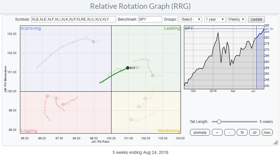
The Relative Rotation Graph shows the rotation of the Health Care sector over the last five weeks against SPY. The dimmed trails are the other US sectors... Read More
RRG Charts August 13, 2018 at 08:20 PM
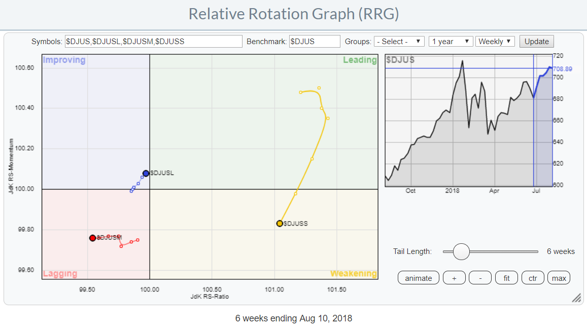
Every now and then I run a Relative Rotation Graph showing the rotation of various size and value/growth indices for the US market. They (can) give good insights into what areas of the stock market are in favor and which ones are rotating out of favor... Read More
RRG Charts August 08, 2018 at 08:05 AM
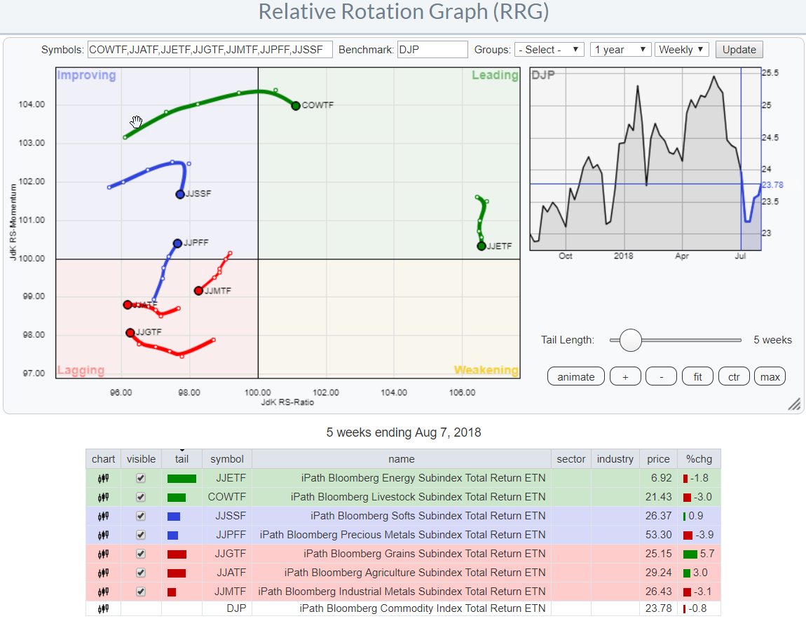
Relative Rotation Graphs are a great tool to visualize equity sector rotation and they are probably most used for that purpose... Read More