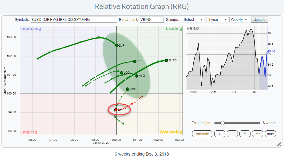
 The Relative Rotation Graphs shows the rotation of various asset classes around a balance benchmark portfolio (VBINX).
The message could not be more clear. Stocks (SPY) just crossed over from weakening into the lagging quadrant while ALL other asset classes are inside the leading quadrant.
This is a pretty clear message that is hard to ignore.
Summary
- Stocks rotate into lagging quadrant while all other asset classes are in leading
- Four red flags for SPY
- Stock/Bond ratio sending an important message
It's A Balancing Act
In this universe of asset classes, stocks are the most important as they make up 60% of the benchmark that is used. The other 40% is a mix of fixed income asset classes, including Government (17%), Corporate (12%), Mortage (10%). On the RRG these assets are represented by ETFs that track them. IEF for Government, LQD for Corporate, and HYG for High Yield (corporate).
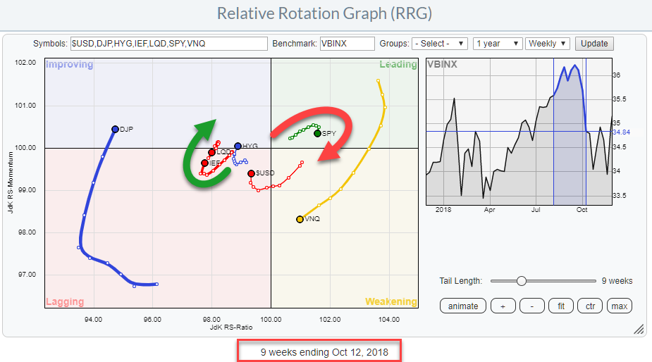
This means that when stocks are weakening, by definition, the fixed income components need to gain relative strength to keep the universe in balance.
That is exactly what we have seen in the rotational pattern since mid-October
What is interesting to see is that also the asset classes that are NOT included in the benchmark, Real-Estate (VNQ), Commodities (DJP), and the US dollar ($USD) have turned upward and entered the leading quadrant on the RRG.
Pretty much every asset class is outperforming stocks at the moment.
And YES I am aware of the fact that over the past ten trading days or so stocks did very well and the S&P is up around 6%. However, I am afraid that this rally is not material enough to turn the tide for stocks at the moment as the long-term structure for the market got hurt pretty badly during October.
Four Red Flags For SPY
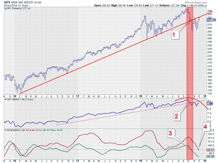 The chart above shows the weekly price chart for SPY with the RS-Line and the RRG-Lines against VBINX.
I see four red flags that make me very cautious with regard to equity allocations at the moment:
- On the price chart, the long-term rising support line that emerged out of the early 2016 low was broken downward in October. After setting a low near 260 the S&P rallied but found resistance at the level of the old support, now acting as resistance (281 at the time). And this is happening again as we speak.
Yesterday (12/3) the market again bounced off that old support line and made a high at 280.
Overhead resistance is, therefore, becoming more and more meaningful and more difficult to break. The path of least resistance is now down towards the lower boundary that can be positioned in the 260-263 area. - On the RS-line a similar process is developing. In October the RS-Line broke below the rising support line. The recovery out of the first low after the break bounced off the old rising support line that started providing resistance. Over the past weeks, a, small, pattern of lower highs and lower lows is becoming visible.
- Also during the month of October, the JdK RS-Momentum line fell below 100 indicating that the JdK RS-Ratio line which measures the relative trend turned around and started heading lower. RS-Momentum serves as an early warning signal. The RS-Ratio line was above 100 since April 2016 indicating an uptrend for SPY vs VBINX. Over the years RS-Momentum has dipped below 100 a few times dragging RS-Ratio lower but until now these dips were temporary and the market managed to curl back up again and bring both RRG-Lines above 100 again. These dips of RS-Momentum below 100 and back, while RS-Ratio is still above 100, are causing the rotations of SPY to complete at the right-hand side of the RRG. Leading-Weakening-Lagging.
The break of RS-Momentum below 100 in combination with the breaks of relative strength and price below a rising support line should be seen as a serious message. - With three red flags for SPY showing up in October, it seems we are now getting confirmation from the RS-Ratio which is dipping below 100 now. Remember this is a weekly chart so the last points on the indicators are still fluid until Friday's close. But eye-balling the developments I expect RS-Ratio to remain below 100 and push SPY into the lagging quadrant.
All in all, this is not the type of market structure that would encourage overweighting stocks as an asset class in balanced portfolios.
The Most Important Ratio To Watch In Asset Allocation
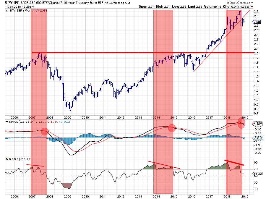 The chart above shows the MONTHLY ratio between SPY and IEF (Stocks versus Bonds). I think that this is a ratio that every investor should look at from time to time as it is such a good gauge for risk-appetite in financial markets.
The chart spans over a decade of this ratio in combination with a plain vanilla MACD and a 9-period RSI.
There have been two prior occasions where the MACD crossed below its trigger line in combination with a divergence between the highs in the ratio and in the RSI. The first one in the middle of 2007 and the second one towards the end of 2014.
The first occasion proved to be very timely as we now know what happened afterward. The second occasion was not bad either as the ratio moved sideways to lower for almost two years after that situation.
And now it's happening again... What will follow? I have no idea. But the odds seem to be in favor of, at the minimum, a very tough period for the Stock/Bond ratio if not a serious decline.
Remember that this is a monthly chart. This structure is not reversed easily. Even it is "just" a temporary pause in the outperformance of stocks over bonds it will take some time and could last a little longer than investors would like to believe.
Let me know what you think of this usage of RRG in the comments below. If you would like to receive a notification when a new RRG blog article is published, simply "Subscribe" with your email address using the form below.
Julius de Kempenaer | RRG Research
RRG, Relative Rotation Graphs, JdK RS-Ratio, and JdK RS-Momentum are registered TradeMarks ®; of RRG Research
Follow RRG Research on social media:
If you want to discuss RRG with me on SCAN, please use my handle Julius_RRG so that I will get a notification.
