 For asset allocation analysis, I generally use VBINX, a balanced index fund by Vanguard that holds 60% in stocks and 40% in a mix of different bonds.
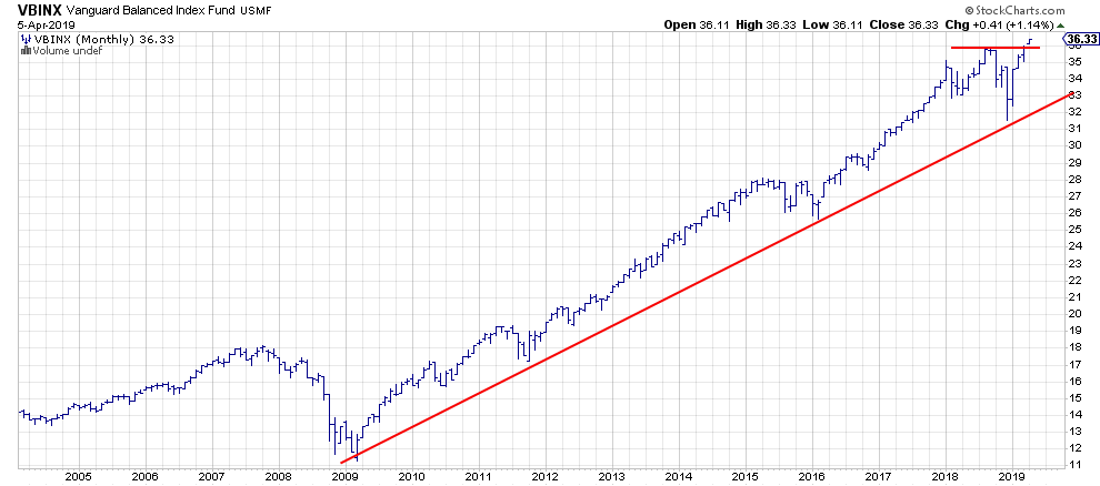
This balanced portfolio (total return basis) just broke to new highs this week. Meanwhile, neither stocks (SPY) or bonds (IEF) have accomplished that, not yet at least...
As we all know, it's hard to argue against markets that break to new highs.
VBINX in an Uptrend
The VBINX chart above shows a nice uptrend out of the 2009 low, marked by a rising support line with four major touch-points so far. The drop below a previous low, as seen at the end of December, has now been negated with the break to new highs.
That December low in VBINX has just became a major support level, and it will be the level that needs to be taken out downward in order to reverse the current uptrend. However, that would mean a 15% drop from current levels, which may be a bit much to accept for a lot of traders/investors. It makes sense to keep an eye on developments on shorter-term time frames.
From an asset allocation perspective, it also makes sense to keep an eye on the behavior of the asset classes that make up this balanced portfolio. These are primarily stocks, government bonds and corporate bonds.
Stocks Crossing Over into Leading Quadrant
The Relative Rotation Graph below shows the rotation of these asset classes against VBINX.
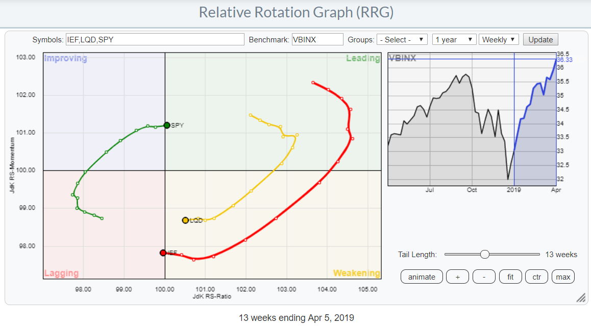 The RRG shows the relative improvement of stocks versus government and corporate bonds. At the moment, SPY is crossing over into the leading quadrant from the weakening, while government bonds are doing the same but in the opposite direction (from weakening to lagging).
The relative momentum that had powered their rotations over the past 5-6 weeks is leveling off now, but the tails are still heading higher (SPY) and lower (IEF and LQD) on the JdK RS-ratio scale. It's not the strongest of rotations, but it's in favor of stocks over bonds nevertheless.
Here's the daily rotation for the same asset classes:
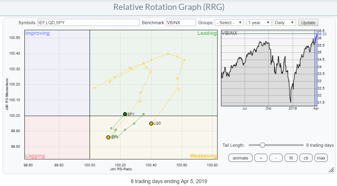 This picture is supporting the crossovers that we see on the weekly RRG. Here, on the daily RRG, SPY just returned to the leading quadrant following a rotation through weakening. Meanwhile, IEF and LQD continue lower into the weakening quadrant after a stint through the leading.
Hence, both the weekly and the daily rotations are sending us signals in favor of stocks over bonds, meaning that's how we should be positioned from an asset allocation perspective at the moment.
What About The Long Term Outlook?
But ...... there's always a but... and in this case it's the long-term picture of the relationship between stocks and bonds. I have used this chart in the past, but here it is again:
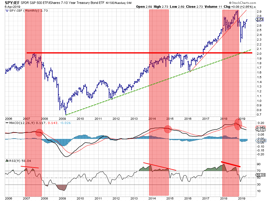 The top chart is the SPY:IEF ratio chart on a monthly basis. In my interpretation, the recent series of higher highs and higher lows that started in 2016 was violated with the drop into the December low. On a monthly basis, that has not changed.
On the MACD and RSI charts plotted below the ratio chart, I have highlighted three situations where the MACD went into a sell signal while the RSI shows negative divergence. Now be careful, as this is a divergence between the ratio and the RSI of the ratio, NOT the price!!
The most recent "sell signal" in the MACD is still intact and the divergence in the RSI has not been reversed yet. For me, this remains an "issue" as it may have a bigger impact down the line.
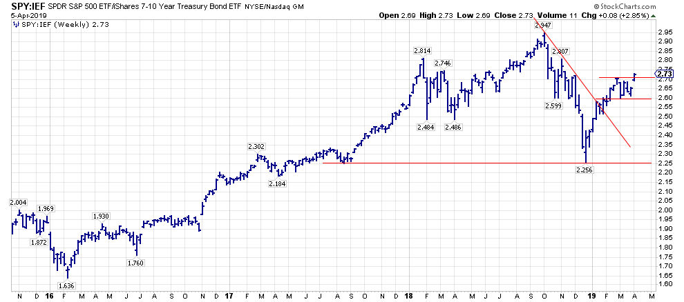 The weekly image of this ratio just broke out of a small consolidation phase and seems to be moving higher. There is still plenty of room to the upside to make this worthwhile.
The gist of all this, IMHO, is that the current situation warrants an overweight position in stocks vs. bonds, still or again, but with a serious threat coming from the monthly chart that seems to be in a recovery following the first leg of a larger move down, supported by weakness in MACD and RSI.
The short-term developments, in this case meaning weekly charts, will probably give us some early warning signals when the big picture starts to change.
Let me know what you think of this usage of RRG in the comments below. If you would like to receive a notification when a new RRG blog article is published, simply "Subscribe" with your email address using the form below.
Julius de Kempenaer | RRG Research
RRG, Relative Rotation Graphs, JdK RS-Ratio, and JdK RS-Momentum are registered TradeMarks ®; of RRG Research
Follow RRG Research on social media:
Feedback, comments or questions are welcome at Juliusdk@stockcharts.com. I cannot promise to respond to each and every message, but I will certainly read them and, where reasonably possible, use the feedback and comments or answer questions.
If you want to discuss RRG with me on SCAN, please use my handle Julius_RRG so that I will get a notification.
