
In our late December year end review, we gave the current cyclical upturn the benefit of the doubt. We were looking for the following positive developments to confirm this stance:
• On the sectors front, early cycle movers really needed to reinstate their uptrend on a relative strength basis
• Internationally, non-US markets needed to show some pick-up (the world needed other successes next to the US)
• Cross asset, equities needed to outperform Long dated treasuries again
See for reference the “Wrap-up conclusion” of our year end review:
http://stockcharts.com/articles/tac/2014/12/fingraphs-following-the-trends-into-2015.html
After a bumpy start to the year and a truly unconvincing January, some of these positive elements may be coming into play. We discussed the Hourly upside breakout last week (see our related article on countertrends: http://stockcharts.com/articles/tac/2015/02/fingraphs-how-to-deal-with-countertrends.html). We will now consider its follow-through based on the three cycle upturn confirmations mentioned above.
Strong performance this week from cyclical sectors:
This short term PerfChart taken from StockCharts.com recaps the various US sector performances since Monday. It really provides a breath of fresh air. Indeed, following weeks of out-performance from Defensive Staples, Healthcare and Utilities sectors, Cyclicals and especially Technology have finally succeeded in taking back the lead.
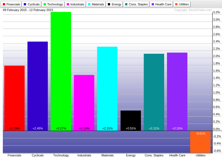
The contrast is particularly strong between this week’s leader and lager sectors (Technology vs Utilities) and we could not resist the following shorter term Trader’s View to highlight it. A Trader’s View is a combination of a 60min, 15min and 4min and delivers a trading perspective respectively over the next few weeks, days, hours.
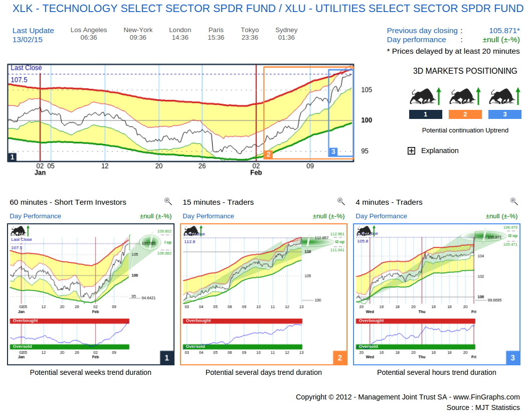
The reversal of fate is impressive. Since late January, the pair has registered a performance differential of more than 10%. This contrasts sharply with the circa 15% underperformance by the Technology Sector (XLK) vs Utilities (XLU) from last September to late January. Now considering this Trader’s View, we can see that, although all three trends are still heading up (3 Bulls), this specific leg could be reaching exhaustion (approaching its green target projection ovals). It is hence important to zoom out in time and consider a longer term perspective to assess the viability of this emerging uptrend.
We present below an Investor’s View of XLK (Technology SPDR ETF) vs the SPY (iShares S&P500 ETF). An Investor’s View is a combination of a Weekly, Daily and Hourly chart and delivers the investment perspective respectively over the next quarters, months and weeks.
Investor’s View – Technology ETF (XLK) vs the S&P500 ETF (SPY):
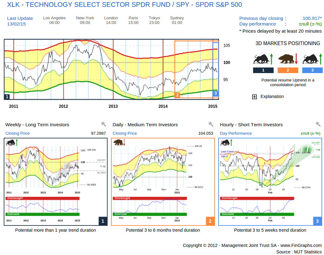
Following the recent outperformance, the Daily (middle chart) which was in a consolidation down has turned neutral (still in a Bear Trend but with No Targets). The Hourly (right hand chart) has accelerated last week and although already Overbought on our Risk Index does have some potential left (green oval) over the next week or so. The Weekly (left hand chart) is in a correction up and would need to move above its corrective target (grey oval) to confirm a longer term acceleration. This would be the case at levels slightly above the late November tops. The 3D Market Positioning message (i.e. the item next to the summary chart) describes this situation: “Potential resume Uptrend in a consolidation period”. Reinstating a Daily Uptrend (middle chart) and moving above corrective targets into Impulsive mode on the Weekly (left-hand chart) could help confirm the sustainability of the cyclical upturn.
We now look at another early cycle moving sector which also showed strong performance this week: Consumer Discretionary.
Investor’s View – Consumer Discretionary ETF (XLY) vs the S&P500 ETF (SPY):
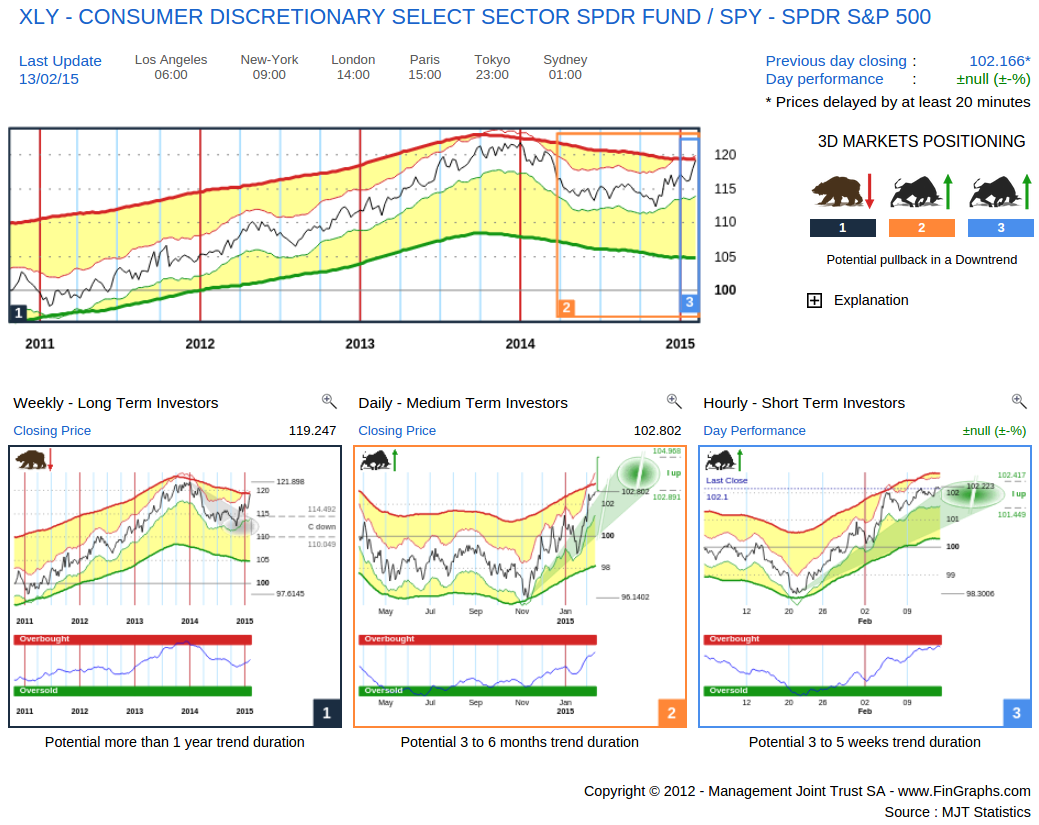
The Daily (middle chart) is pursuing the uptrend initiated late last year and shows more potential over the next few months. It is close to brushing-off the Weekly consolidation (left-hand chart) which has been in place for most of last year. The Daily and its remaining potential do offer promising perspectives in confirming the cycle upturn. The Weekly now needs to confirm it by making it back into a Bull uptrend.
International markets: their slight uptake is encouraging
The MyMosaic below features several international market ETFs (in USD): IEV: Europe, EWJ: Japan, FXI: China). Each one is featured on a Weekly, Daily and Hourly basis (from left to right).
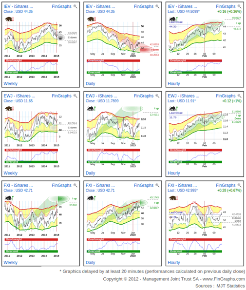
In our view, given the ECB QE program and Abenomics, it is worth looking at Europe and Japan from a USD perspective (also the case to a lesser extent for China). Indeed, as the EURO and the YEN are devalued, company valuations are rapidly adjusted to reflect their intrinsic value (the businesses themselves haven’t really changed that much). Hence, strong market performances in Europe and Japan, as these currencies devalue, are somewhat artificial. However, if European and Japanese market start performing in USD terms, it could signal either a broader base international stock market upturn or that the competitive advantages of a lower currency are finding their way into company valuations.
On our Weekly charts (first column), both Europe (IEV) and Japan (EWJ) have been consolidating over the last several Quarters. On a Daily basis (middle column) they have both formed a base since last October; Japan has even turned positive. Shorter term, on our Hourly charts (right hand column), both markets have been strong over the last few weeks. As for China (lower line), although is has consolidated a bit lately, it is strong across the board.
One would really need to see Europe and Japan shrug off their Weekly consolidations to confirm a cyclical upturn and allow all 4 international stock market engines to plough ahead. It is still too early for now to confirm this.
Slight correction up in interest rates, a bit early to turn euphoristic:
Investor’s View – USD 10Y Swap rate:
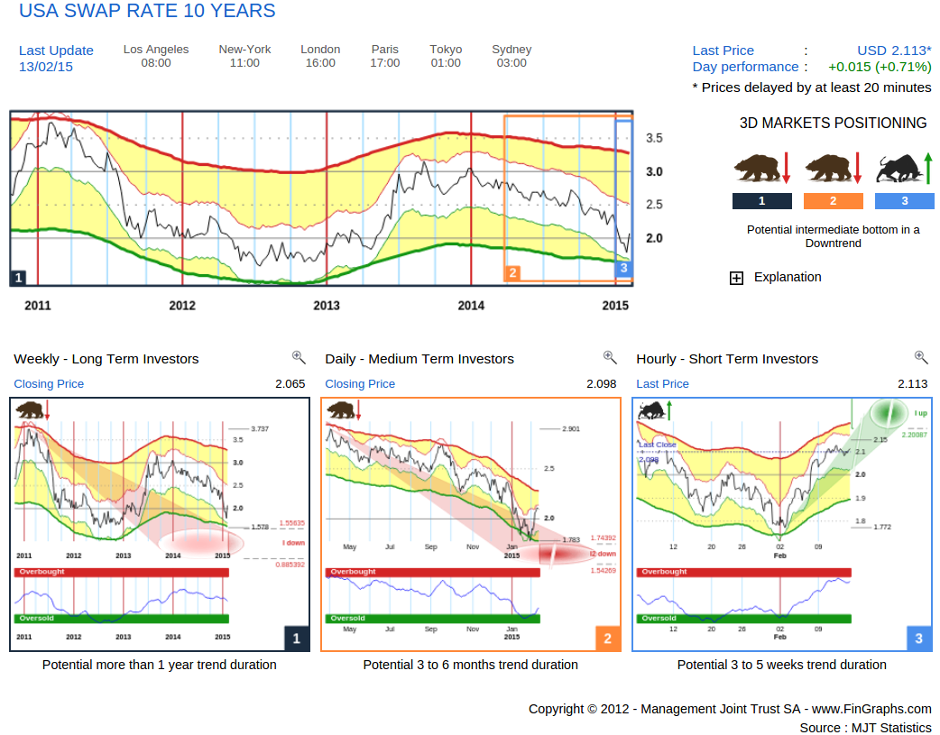
Short term, interest rates are moving up, more than 30 basis points increase over the last two weeks. Yet, this is only correction for now. They remain in a longer term downtrend with the Weekly (left-hand chart) and the Daily (middle chart) still showing more downside potential. Confirming a cyclical upturn and an acceleration of economic growth would imply a more sustained rise in interest rates. In fact, this is what the FED is wanting us to believe (which is correct, let’s just hope it happens). Private demand for capital should increase as prospects for new corporate projects improve (more capex) and consumers spend more and become less saving prone. Ultimately, cost of capital should gradually rise, and with it, interest rates.
It is still early stages and although the Daily (middle chart) is quite exhausted to the downside (Risk Index Oversold, price getting close to Impulsive 2 targets down), it would really need to start turning up into a Bull trend to confirm a sustainable move.
The following cross asset chart can also summarize this situation as one would expect Equities to outperform Long dated bonds in a cyclical upturn:
Investor’s View – SPY S&P500 ETF vs the TLT Long Dated Gov. Bond ETF:
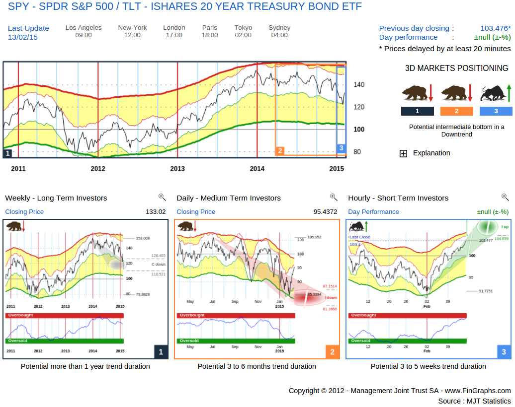
The Weekly (left hand) relative chart has been consolidating since early 2014. It has reached its corrective targets down (grey oval) and could now attempt to move up and resume its long term uptrend. This situation is similar to the ones we have shown above on Consumer Discretionary vs the S&P500 and European and Japanese markets denominated in USD. Here again, the short term move (Hourly right hand chart) looks promising. The Daily (middle chart) now needs to turn positive and challenge the Weekly consolidation down.
Turning to the S&P500 and its recent break-out:
Investor’s View – S&P500
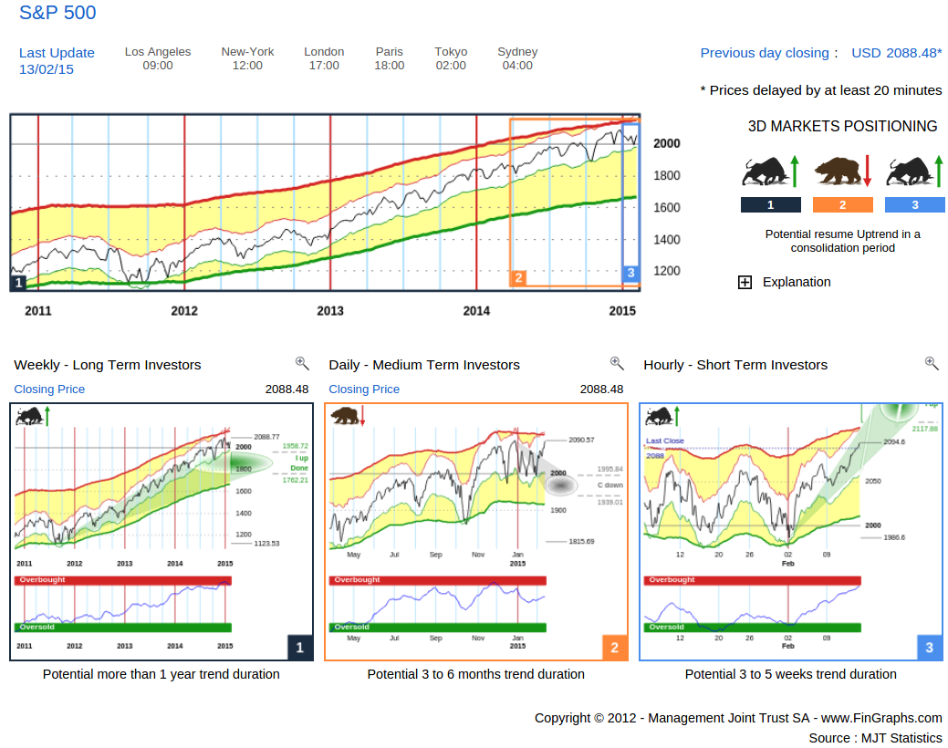
“Potential resume Uptrend in a consolidation period”: the short term Hourly (left hand chart) is showing more potential over the coming weeks. It should help us out of the Daily consolidation which is still currently in place. Weekly potential (left hand chart) is pretty much capped for now (“I up done”). Prices would need to confirm new highs to ignite extended Impulsive 2 targets again (as was the case in late December: Impulsive 2 targets between circa 2’200 and 2’400 over the next few Quarters).
Hence, short term developments are indeed promising for now. As for the medium to long term perspectives, there is some “hope” involved in order for the market (and its internals) to confirm a sustainable cyclical upturn and lead us to higher levels over the next few Quarters.
For more information on our methodology click here (http://www.fingraphs.com/#couponid-STKCHARTS14) and then view the Introduction slide-show and visit the ‘User Guide’ section on our website. Clicking that link also qualifies you for a 7 day demo and a 10% discount on our services if you choose to subscribe.
Have a great weekend, J-F Owczarczak (@fingraphs)