Hello Fellow ChartWatchers!
Now this will probably give away my age, but one of my first memories of television was from the educational children's show called "Sesame Street" and the song that they used to sing called "One of These Things is Not Like The Others". In case you aren't familiar with this, click here to see the song performed by one of the show's biggest stars.
Granted, that game is seems pretty straightforward - even for a monster! - but I find myself thinking about that song every time I use our CandleGlance feature; especially when I use it in conjunction with our Sector Bullish Percent Charts:
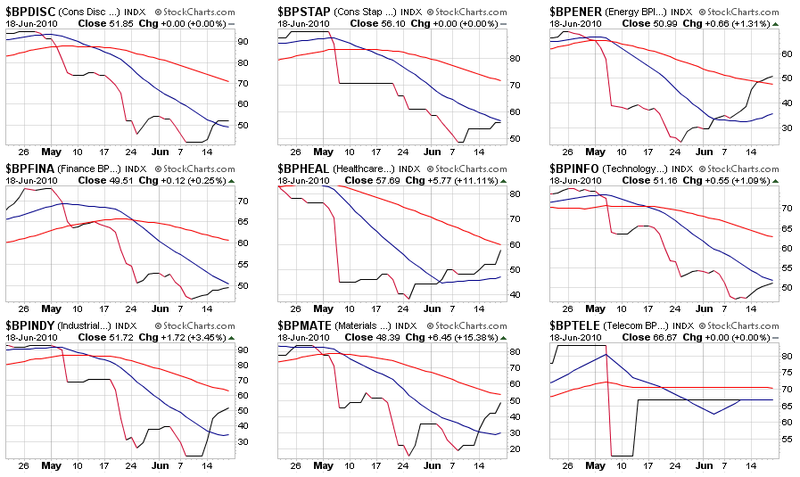
These are nine of our sector-oriented Bullish Percent Indexes. They are based on the P&F charts of hundreds of stocks and show the percentage of those stocks that have "bullish" P&F chart signals. (For all the gory details, please see this article.)
But given this display, all we have to do is what Cookie Monster was doing - find the chart(s) that are behaving differently and see what that tells us about the market.
The first thing to notice is that almost all of the indexes have recently turned around and are moving higher - a very good sign for the market overall. Looking closer you should see that the Energy index ($BPENER) is the only index that is currently higher than it's 50-day Moving Average (the red line). Healthcare, Industrials and Materials are all positioned well above their 20-day Moving Average (the blue line) and just below their 50-day - a pretty good indication of strength returning to those sectors. Consumer Discretionary, Consumer Staples, Financial stocks and Technology stocks currently have the weakest looking BPIs - while all are now moving higher, they are all still under (or just over) their 20-day Moving Average and haven't displayed the same kind of strength that the other sectors have. You might also notice that the 20-day Moving Average for those stocks is still heading down which it has turned up for the others.
The fact that Consumer-oriented stocks as well as traditional bull-market sectors like Technology are still lagging should cause ChartWatchers to pause and reflect about the strength of the current rally. I'll be watching our BPI CandleGlance page closely for signs of more participation by Consumer stocks (bullish) or weakness in the Energy and Financial sectors (bearish) in the coming days.
- Chip
FIXED INCOME ETFS GAIN GROUNDby John Murphy | The Market Message While some money is starting to creep back into stocks, investors are
still showing enthusiasm for bonds. And I'm not talking just about
Treasuries. More impressive gains were seen in other bond categories
like corporate bonds and TIPS. Chart 1 shows the High Yield
Corporate Bond ETF (HYG) closing above its 50-day line for the
first time in two months. Chart 2 shows the Investment Grade
Corporate Bond ETF (LQD) breaking out of a short-term
"symmetrical triangle". It did so on noticeably heavy volume as well.
Chart 3 shows the TIPS Bond Fund also turning
higher. To me, that suggests that investors are willing to embrace
more risk, but aren't yet ready to abandon bonds for stocks.
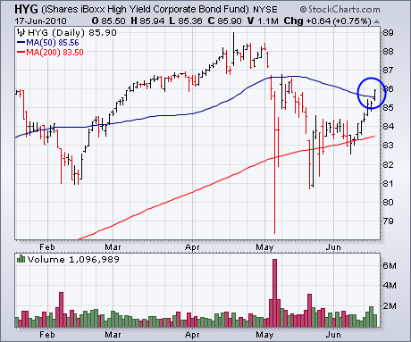
Chart 1
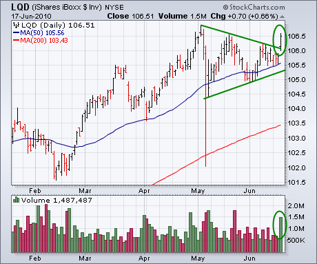
Chart 2
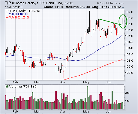
Chart 3
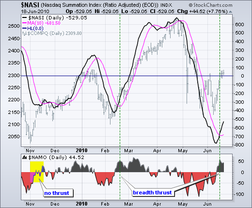
Before getting into this breadth thrust, letâs review the McClellan Oscillator and McClellan Summation Index. Basically, the McClellan Oscillator is the 19-day EMA of Net Advances less the 39-day EMA of Net Advances (advances less declines). Like MACD, it is a momentum oscillator for Net Advances. The McClellan Summation Index is a cumulative measure of the McClellan Oscillator. The summation index rises when the Oscillator is positive and falls when the Oscillator is negative.
Click this image for details
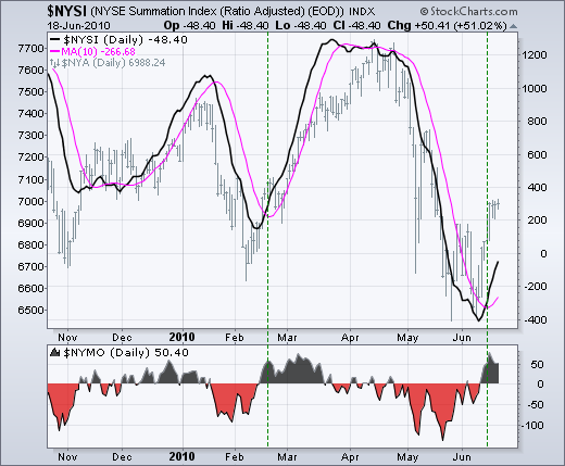
The chart above shows the Nasdaq McClellan Oscillator ($NAMO) in the lower indicator window. Notice how the oscillator surged from below -50 to above +50. This 100+ point swing from negative territory to positive territory is a bullish breadth thrust. A similar bullish thrust occurred in February. The main window shows the Nasdaq McClellan Summation Index ($NASI). Notice how it declined steadily from late April to early June as the McClellan Oscillator remained consistently negative. The bullish breadth thrust in the McClellan Oscillator pushed the Summation Index above its 10-day SMA for the first time since late April. The chart below shows the NYSE McClellan Oscillator and Summation Index for reference. You can click on these chart to see the settings.
Click this image for details
THE VOLUME ISSUEby Carl Swenlin | DecisionPoint.com One of the
issues that has concerned many analysts is the lack of volume supporting
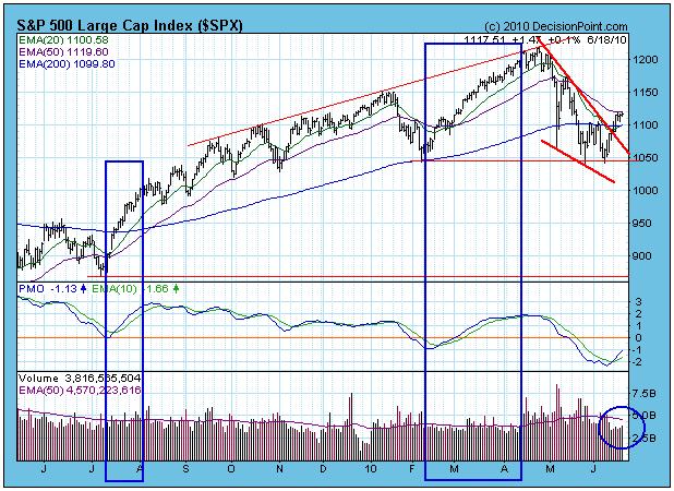
the rally from the June lows, but looking back over the last year we
can see that volume has not been at all impressive for either of the
rallies beginning in July 2009 or February 2010. This is a great
illustration of why we do not use a volume or breadth component in our
primary timing models. In my opinion, only price movement is relevant
when a decision point appears to be at hand.
This does not mean that we don't use volume and
breadth indicators as secondary tools to further assess what price is
telling us, and to dig deeper than the raw volume bars, which since the
beginning of the bull market have not shown enthusiastic support.
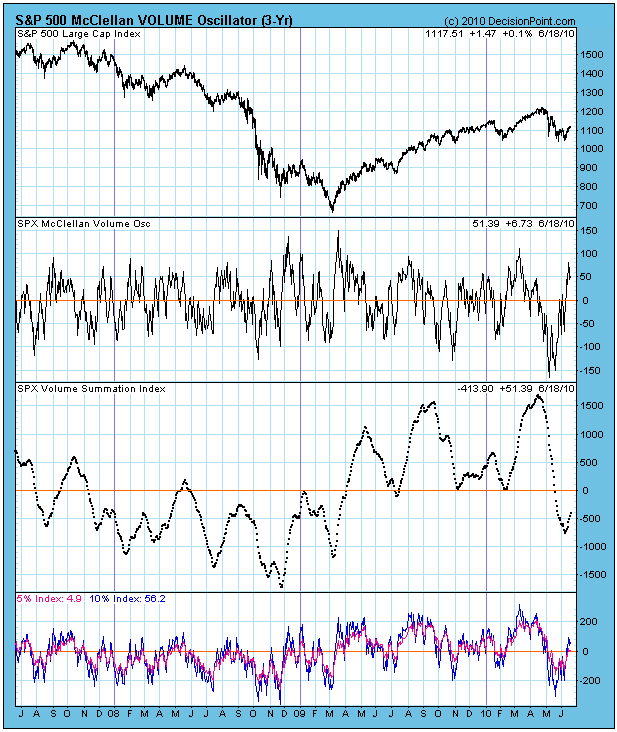
One of the tools we use is the McClellan VOLUME
Oscillator, which is calculated the same as the McClellan Oscillator
except that we use daily advancing and declining volume instead of
advances and declines. The core element of the Oscillator's construction
is to calculate a fast and slow exponential moving average of the daily
advancing volume minus declining volume. These moving averages are
displayed below as the 5% and 10% Indexes. Subtracting the 5% Index from
the 10% Index results in the McClellan Volume Oscillator reading. The
cumulative total of the daily Oscillator reading gives us the Volume
Summation Index.
While the raw
volume has been pretty consistently below average throughout the bull
market, it is what it is, and prices have been rising. The Volume
Oscillator and its components allow us to view the internal quality if
that volume. The convergence and divergence of the two moving averages
expresses the short-term momentum of advance-decline volume through the
Oscillator, and the Summation Index presents a medium-term view.
What we see are
fairly usual index/indicator formations and ranges. The exception being
that the recent
correction brought the 5/10% Index complex more deeply below the zero
line than is typical for a bull market (or bear market, for that
matter).
The recovery out of the recent lows looks
normal and healthy. The 5/10% Indexes are back above the zero line,
which is where they need to be in a bull market, and the Summation Index
has bottomed, although it is still below zero. The Oscillator is in the
overbought range, which is a problem for the short-term.
Summary: While raw volume continues to be a
problem, looking below the surface shows that advance-decline volume
relationships and behavior are normal, and in general support a bullish
outlook.
TIME FOR JUICED ETFS?by Tom Bowley | InvestEd Central The market is at a crossroads short-term. We've been bouncing back and forth after that early May drubbing. So is the rally ending or is it just starting? Well, we can only look at the technical, sentiment and historical indicators and come up with a "highest probability" scenario. Regardless of how you're approaching the market, you need to maintain a sense of skepticism and be prepared to acknowledge that your short-term call is incorrect. So with so many questions unanswered, why is now the time to consider juiced ETFs? It's simple. We're at resistance levels across our major indices. Juiced (or leveraged) ETFs are appropriate, in my view, in rare circumstances when the potential reward justifies the risk being taken. I don't believe in them as an every day trading vehicle. The odds are stacked against the trader who tries to call the market direction every day and who uses ETFs as a way to possibly profit from such calls. Holding for more than one day can cause erosion in the price of both juiced longs and juiced shorts. I've produced videos detailing the effects over time of holding onto these juiced ETFs and it makes little sense to hold over longer periods of time as the risk/reward strongly suggests you'll end up losing.
Let's look at the market technicals first by reviewing a chart of the QQQQ (ETF that tracks the NASDAQ 100 index):
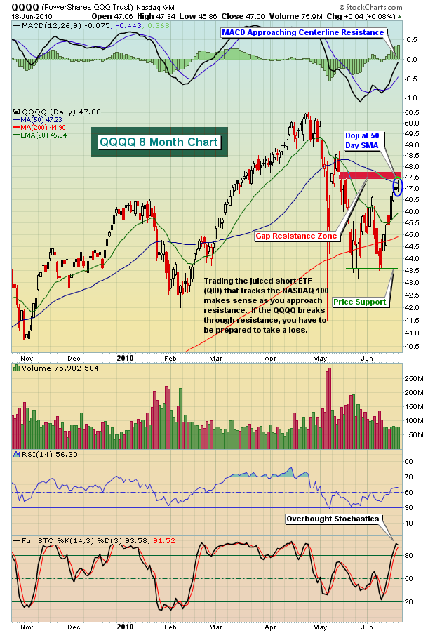
The reversing candlestick (doji) at resistance with stochastics in the 90s after the recent uptrend calls into question any further rally here. Can the market continue this rally? Absolutely. But we're looking for highest probability. The technicals suggest this could be an area where a reversal takes place.
On to sentiment. In late April and early May, the VIX surged as fear grew and the major indices experienced a fall that was eerily reminiscent to September/October 2008. Since that fall in the indices, however, the VIX has been drifting lower as investors have collected themselves and fear has been alleviated to some degree. But on the chart below, the VIX has touched a key support level. Check it out:
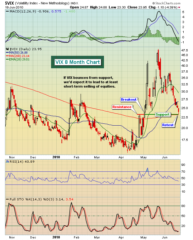
If the VIX bounces, even temporarily, it's likely to trigger more selling of equities in the near-term. That's another short-term negative.
How about historically? How do U.S. equities tend to perform in mid- to late-June? Well, since 1950 on the S&P 500, the June 18th through June 26th period has yielded 45% of days that have closed higher than the previous day. This compares to the "norm" throughout the year of 53%. Clearly, the market's tendency is to trade more bearishly during this period. Furthermore, the annualized return on the S&P 500 since 1950 during this period is -24.98%, a full 33 percentage points below the "norm" of 8.5% annual returns on the S&P 500.
Technicals suggest we are in an area where we could be topping. Sentiment in the form of the VIX says we're at a level where the VIX could bounce, leading to weakness in equities. And history tells us to be very careful this time of year. The odds appear to be stacked against the bulls. Therefore, trading a juiced ETF that moves inversely to the market might make sense here, with fairly tight stops in place of course in the event the recent bull rally marches on.
If you prefer to look at individual stocks, I used StockCharts scanning engine to produce a list of stocks that are likely to move lower if the overall market stumbles. I recorded this as a very brief tutorial on setting up a simple scan searching for technically unhealthy stock candidates to short. If you'd like to view this chat, CLICK HERE
We also offer a FREE Chart of the Day and Video Chart of the Day at Invested Central. The chart for Monday came from the scan that I performed above and can be viewed by CLICKING HERE.
Happy trading!