OUR STORY SO FAR...by Chip Anderson | ChartWatchers Hello Fellow ChartWatchers!
"Distance not only gives nostalgia, but perspective, and maybe objectivity." - Robert Mogan
Perspective. Do you have it? Have you lost it? How do you gain it back?
One of the best ways to gain perspective on the stock market is to use long-term market indicators. One of the best long-term market indicators I know of is the Bullish Percent Index ($BPNYA).
The Bullish Percent Index is the percentage of tradeable NYSE-listed stocks that currently have a "bullish" signal on the right edge of their Point and Figure chart. Click here for the gory details.
$BPNYA is a great indicator for quickly determining the overall "health" of the market. If it is moving higher, life is good. If it is moving down, hang on to your hats.
So where is the Bullish Percent Index now relative to where it has been in the past? Here's a monthly chart of $BPNYA going back to 1987. This chart is one of the best I've ever seen at telling "The Story of the Stock Market So Far..."
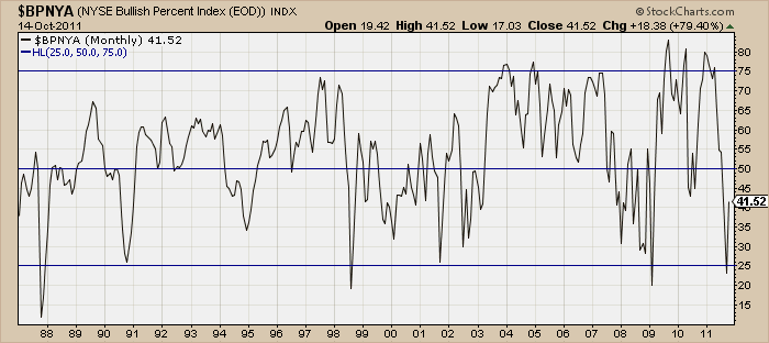
(Membes can click the chart to see a live monthly version. Non-members will see a daily version.)
This chart shows that the important levels for $BPNYA historically have been 25%, 50% and 75%. The index tends to stay between 25% and 50% (slow economic times) OR it tends to stay between 50% and 75% (good times). The current 41.52 rating shows some improvement over September's reading of 23.15 however there is a long ways to go. The indicator has also whipsawed above and below the 50% line many times in the past. As you can see from recent action in 2004 and 2009, a move above 75 is what is really needed in order to have confidence things won't immediately fall back below 50.
Every day we publish Bullish Percent numbers for the NYSE as well as 22(!) other stock categoies every day on our Market Summary End-Of-Day page. They are located at the bottom and all begin with "$BP". Make sure to add them to your market analysis arsenal.
- Chip
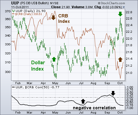
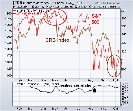
Last Thursday I showed some traditional charts that suggested stocks and commodities were due for a rally. In the case of stocks, a lot of global stock and U.S. stock indexes had reached important support at their mid-2010 lows and were in oversold territory. In addition, I suggested that the S&P 500 had completed the fifth wave in a five-wave decline. That suggested to me that the stock market may have put in an October bottom which should pave the way for a fourth quarter rebound. I also showed the CRB Index testing two important support lines going back a year. I suggested that was a logical spot for commodities to attempt a rebound which would also be good for stocks, and especially stocks tied to commodities like energy and materials. Today, I'd like to show how those traditional chart signals are supported by intermarket trends. Chart 1 shows the inverse relationship that exists between the Dollar Index (green line) and the CRB Index (brown line). The May commodity peak coincided with a dollar bottom. Over the last week, those roles reversed. A sharp drop in the dollar (prompted mainly by a surge in the Euro) gave a boost to commodity prices just as they were testing important support. The 50-day "correlation coefficient" below Chart 1 shows a negative correlation between the dollar and commodities since the start of the year (except for a brief period during August). Chart 2 shows a positive correlation between the CRB Index and the S&P 500 (red line). Both peaked together at the start of May and troughed together over the last week. Both benefited from the falling dollar.
The US Dollar Index ($USD) was hit hard this week with a 2.2% decline. Weakness in the Dollar buoyed oil and stocks, which have been negatively correlated with the greenback. Dollar weakness and Euro strength is also associated with the risk-on trade. Despite this weekâs decline, the bigger trend is still up and support is close at hand. The first chart shows weekly prices with a Double Bottom breakout in September $USD broke resistance with a strong surge that was confirmed by RSI, which broke to its highest level in a year.

Click this image for a live chart.
The second chart shows more details with a daily candlestick chart. There are three reasons to expect support soon. First, broken resistance in the 76 area turns into support. A âthrowbackâ to broken resistance is not uncommon after a breakout. Second, a move to the 76 area would retrace 61.80% of the prior advance. Third, RSI moved into the 40-50 zone. This area acts as support during and uptrend.
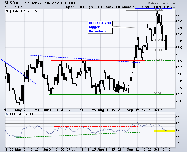
Click this image for a live chart.
RYDEX CASH FLOW RATIO OVERSOLDby Carl Swenlin | DecisionPoint.com One of the ways we have of measuring sentiment is by tracking cash flow into and out of Rydex mutual funds through the use of our Rydex Cash Flow Ratio. The Ratio is calculated by dividing cumulative cash flow (CCFL) of Bear funds plus Money Market funds by the CCFL of Bull funds. We display the results on a reverse scale chart so that high Ratio readings coincide with price lows.
The chart below shows that at the October price lows the Ratio went lower than any time since the 1999 correction. Recent Ratio lows were more extreme than two previous bear market lows, and extremes like that are a sign that sentiment is getting very bearish. Unfortunately, the recent Ratio low exceeded the normal range of the last nine years, so we have to wonder if the limits of the range are expanding permanently.
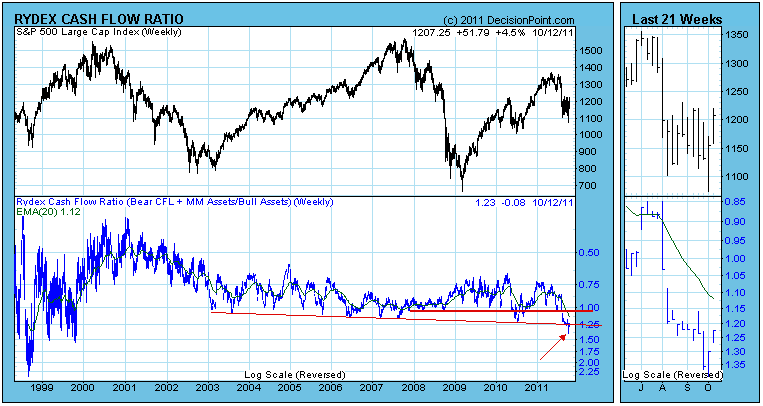
The above chart displays our entire history of the Ratio, and obviously the range was much wider in the early days. The reason for this was that there were fewer assets in Rydex funds back then, which allowed for a more volatile Ratio.
The chart below shows the components of the Ratio calculation. Note that as the market was topping, Bull CCFL fell and Bear CCFL flattened. Then as the market crashed, Bull CCFL decreased, and Bear CCFL increased, as expected.
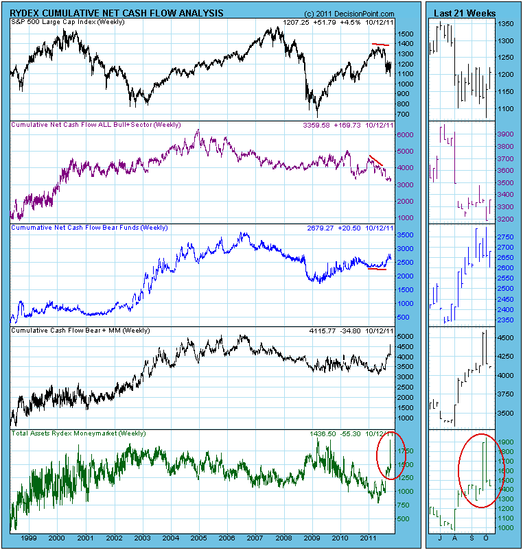
The really significant feature on the chart is the sharp increase in Money Market fund assets as people ran to safety. The next most interesting feature is that (see the thumbnail chart on the lower righ corner of the chart) all that recent inflow has moved out of the Money Market fund and, presumably, back into the Bull funds.
Bottom Line: The Ratio is well off its recent lows, but it is still reflecting very strong bearish sentiment, and this is confirmed by Investors Intelligence Advisor Sentiment and NAAIM Sentiment as well. This taken with other indicators we discussed earlier this week, we believe that the Ratio has signalled an important price low.
The market has spoken. If you're looking for nice earnings surprises for the third quarter, or perhaps raised guidance on a forward-looking basis, look no further than the technology and consumer discretionary sectors. This past week, we saw a very positive earnings report from Google (GOOG), while commodity player Alcoa (AA) and behemoth financial JP Morgan (JPM) both came up short of expectations. Given the way that the various sectors have been trading, you might expect more of the same over the next few weeks. While the overall market may seem directionless with wild swings higher and lower the last several weeks, technology and consumer discretionary have emerged as the relative leaders among the nine sectors. That's where the money is flowing on a relative basis. Utilities had been performing quite well, but the sudden surge in interest rates and equity prices the past couple weeks has lessened their appeal on a relative basis.
One look at the chart below and it's obvious what the market is expecting during earnings season:
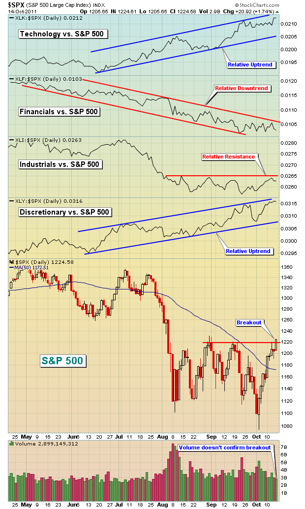
Technology and consumer discretionary are outperforming and there's only one way to interpret this. Those who research these companies and interview management believe these are the two areas where we'll see the best earnings reports and biggest positive surprises. GOOG was the first example. Financials are the primary laggard as money has continued flowing out of the sector during the third quarter. JPM may have served as the poster child for the group with an underwhelming quarterly report this past Thursday.
The relative strength in banks and brokers can be seen in the next two charts:
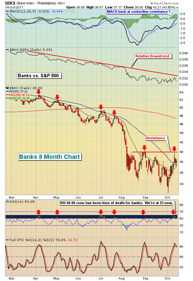
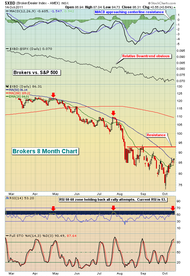
Don't expect much out of these two industry groups as earnings are released because the market is pricing in some very poor results. I want to see some relative strength (ie, improving technicals) before I'd consider the financial sector as a place to invest.
Historically, the market doesn't perform very well when the influential financial sector is underperforming. That means that you'll need to be very selective on the long side within areas of the market where the money is currently flowing. Given Friday's weak breakout volume, I'd remain quite cautious.
I write a daily Market Chatter piece that's provided to our members at Invested Central and covers such areas as price/volume analysis, MACD, other momentum oscillators, historical market tendencies, sentiment indicators (including my own equity only put call ratio - EOPCR - analysis), sector analysis, individual stock trade setups and a final summary. I'm making the Market Chatter available to all ChartWatchers' readers through the end of October at no cost. Click here to register.
I'm also very excited to announce that I'll be making my first trip ever to the Great White North to speak to the Calgary Chapter of the Canadian Society of Technical Analysts on Saturday, November 5, 2011 and Tuesday, November 8, 2011. Greg Schnell, author of The Canadian Technician Blog here at StockCharts and Director of the Calgary Chapter of the CSTA, will join me. Everyone is welcome and I'll be providing details on our website very shortly. Click here for our list of Events. I'd love to see you there!
Happy trading!