Since the sub-prime financial crisis, there has been a lot of discussion about Too-Big-To-Fail, Bank Stress Tests, and Central Banks using unique tools to try and keep the market on an even keel. One of the problems in the world is the deeply indebted government entities. What makes that issue unique is our global commercial banks own government debt as AAA debt to support their loan book. The assumption is that sovereign nations can always raise taxes to get paid back.
One of the keys to recognizing the Financial crisis in 2008 was that the banks started showing lower lows and lower highs while the indexes tried to make higher highs. Something seemed wrong.
For the past year, some of the international banks have been creating that same pattern. While this declining slope on the stocks can seemingly be ignored until it matters, it should at least raise the antenna of technicians. Fundamental investors will continue to think the stocks are trading at great valuations. When banks don't keep rallying with the market, technicians need to spend more time analyzing what is going on.
However, with the Brexit result on Friday, this appears to be a timely review for a variety of reasons.
- Some international banks are dropping to 2009 lows. Yes, already at the lows, not the breakdown levels.
- Banks may also suffer more balance sheet damage from the dramatic currency moves last week.
- Global markets are struggling to find growth. The US has had declining earnings for multiple quarters.
- US Multinational banks appear to be in good shape but the charts have some negative indicators.
- A banker is never going to tell you to sell their stock.
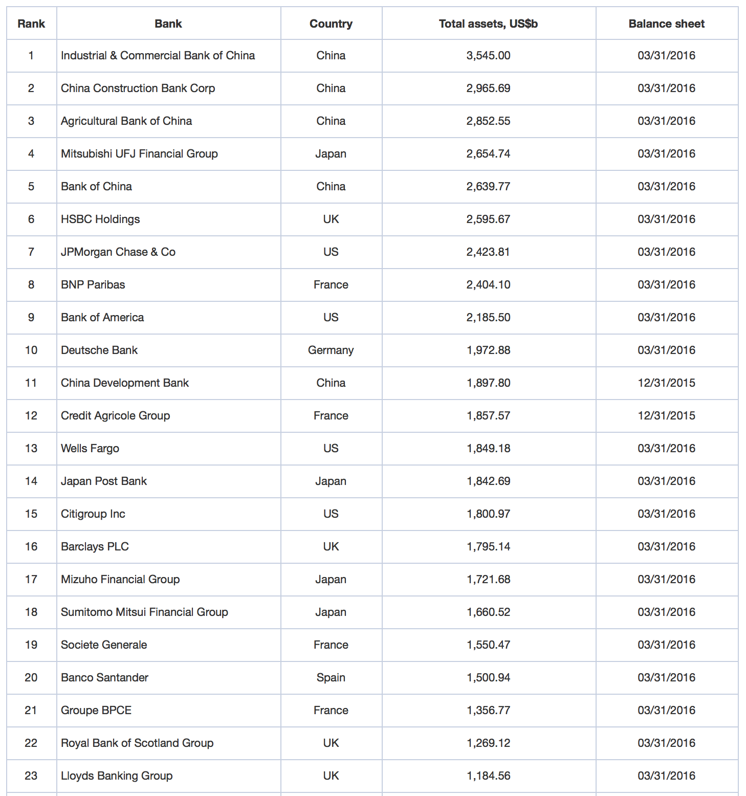
The only way we are going to know if banks generally are getting in trouble is by watching the price action on a wide spectrum of international bank stocks. Here is a screen shot of the world's largest banks. Hat tip to relbanks.com which produced the list. We don't need to know how accurate the data is as this just gives us a feel for the largest banks in the world. We can select from this list.
 On the charts below, I have three indicators.
- The SCTR is a ranking system that tells you which stocks have the best price action. 99.9 is the best, and 0.1 is the worst. Think of it like who is the smartest student in the class.
- The green moving average on the chart represents a longer term average. When it is trending up, that is good. Downtrends are a problem. When stocks trade below long-term averages, you should be cautious with owning them.
- The lower panel is the MACD. This indicator is a momentum measurement that helps us understand when a stock is changing momentum either positively or negatively.
On each price chart, I have three horizontal lines.
- Red - Recent highs or resistance that the stock needs to get through.
- Orange dashed line - where the stock chart changes from bullish to bearish.
- Blue - An important historical support level we do not want to see broken. In some cases it already is.
Probably the largest bank that looks the best is JP Morgan (JPM). Perhaps we can use this bank as a reference chart.
An SCTR level of 30 suggests extreme weakness. On the price action, we have declining peaks since July 2015. Before the final high, JPM had risen over the last four years. But it is now making lower lows and lower highs. The orange line at $58 looks like an important area. It is also where the trend line would connect. This should be support for JPM. A break and weekly close below that would be a trend break for JPM. $52 is a broad 2-year support level. Lastly, $42 which is the level of the stock resistance going back from 2007-2012. When JPM broke above there, it was very bullish.
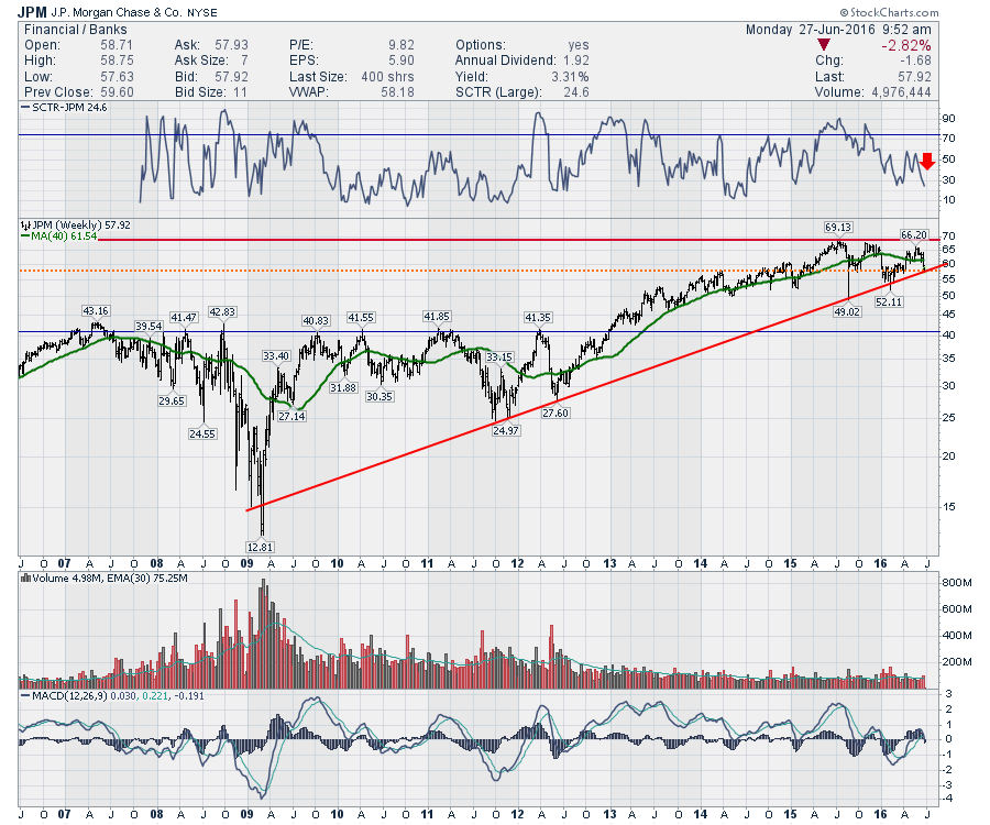 We haven't had a visually-identifiable breakout in volume for JPM but it did trade almost 25% higher volume last week. The MACD appears to be rolling over around zero. On a comparative basis, this is one of the best.
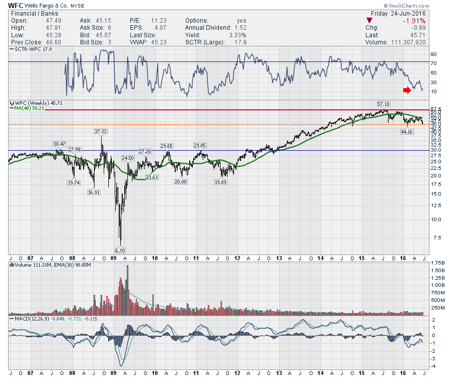
Wells Fargo (WFC) has an SCTR of 17. As an SCTR of 100 is the best-performing stock, Wells Fargo is one of the worst performing large cap stocks. That is a problem. Looking at price, we have a declining green moving average, the stock made highs 9 months ago, and we are testing critical support at $45. The MACD is negative and has rolled over just below 0, indicating a very weak momentum stock has just gotten weaker. This is a weak chart if you are bullish on American banks. $45 must hold.
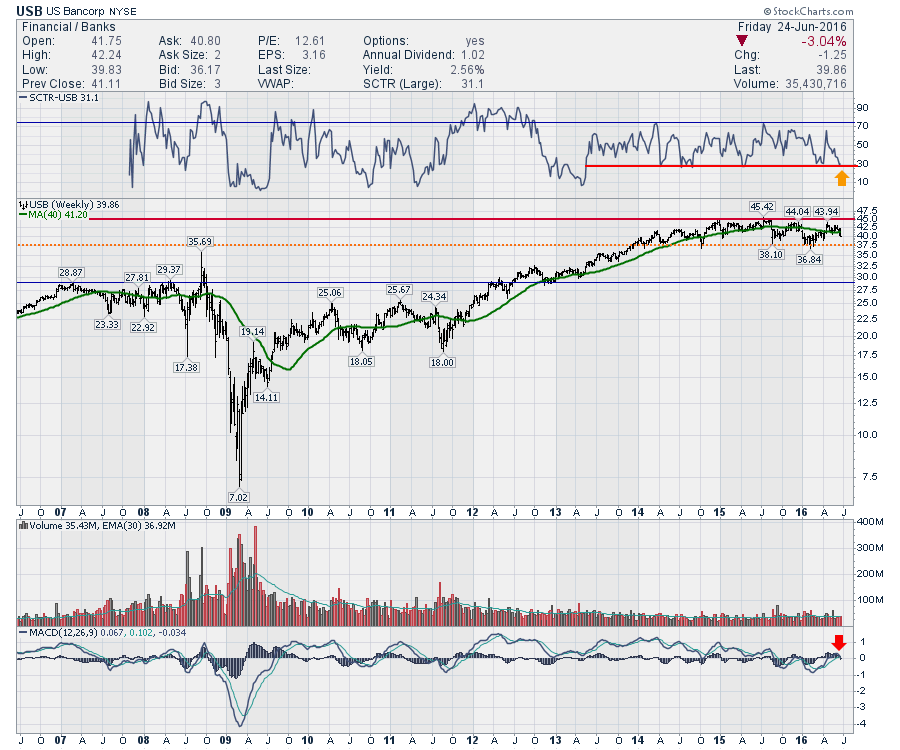
 US Bancorp (USB) is next. The SCTR shows 30. The stock is behaving better than 30% of the stocks in the large cap arena. The bad news is the SCTR is testing the lowest level in 3 years. As the SCTR has oscillated between 30 and 70, USB has been an average performer, just travelling with the pack. Another bank stock with the MACD rolling over near the zero line. This is a dangerous situation as it shows the momentum fading since August 2015 when it went negative and now the momentum rarely turns positive. I have to remind myself that we are still looking at the best stocks.
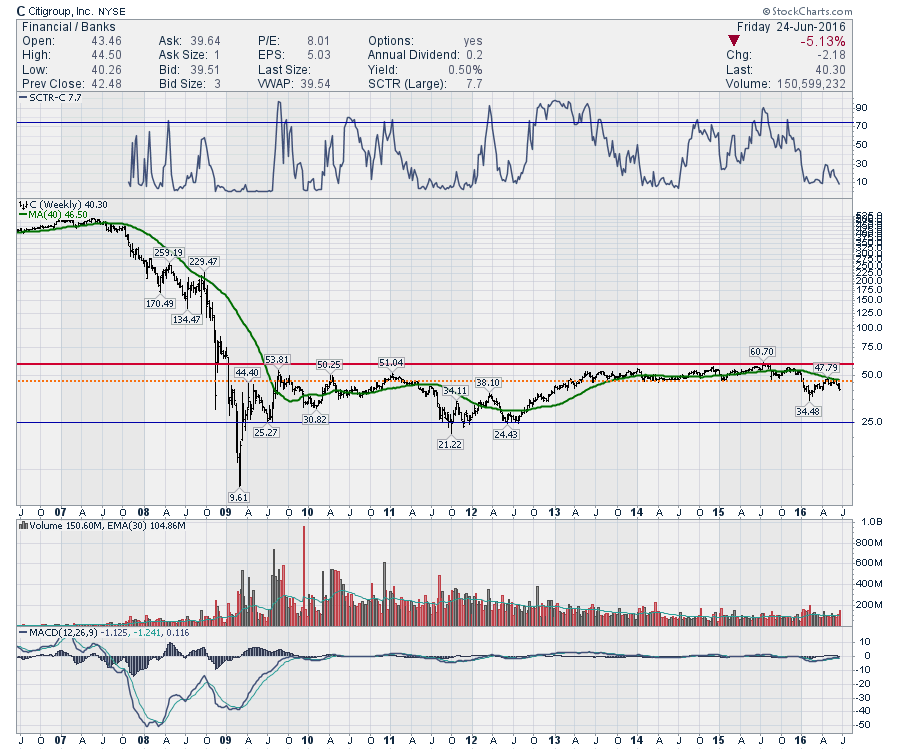
 Looking at Citi (C), it is one of the weaker US large cap banks. Sporting an SCTR of 7.7, we shouldn't get too excited. The dramatic cliff in Citi back in 2007 makes this chart so compressed. Look at the second chart of Citi below, which starts January 1, 2009. That allows us to see what is going on better by removing the cliff.
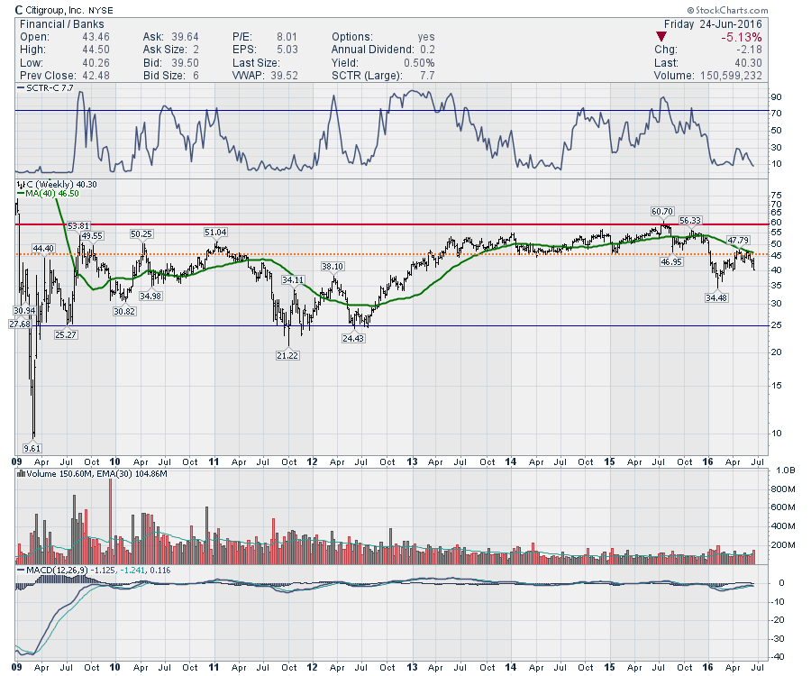
 The chart below is for Citi (C), the same as above, without the cliff. While Citi is nowhere near 2009 lows like some of the charts we are going to get into, the moving average in green has a negative slope. The chart has already fallen below the base of the last 3 years, shown as a dotted orange line. Citi failed to get back above and now looks to be rolling over again. This has a series of lower highs and lower lows like the charts above, but the selling is getting far more aggressive. The MACD was below zero and looks to be rolling over. Very weak. Avoid.
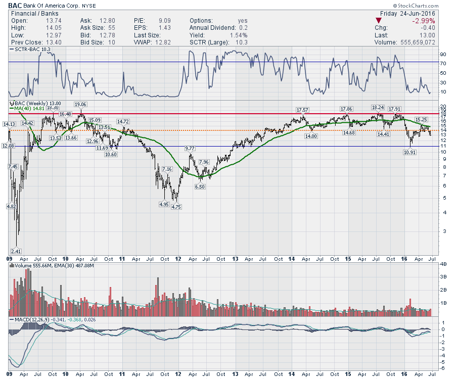
 Bank Of America (BAC) had the same cliff drop as Citi, so the chart has been shortened to start at 2009. The pattern is the same. Lower lows, lower highs since July 2015. The MACD is rolling over below zero showing negative momentum getting worse. This looks like Citi in that the $14 support line in orange has been broken, and the recently rally got above but failed with Friday's close.
 In Summary, the American large cap banks look weak and Friday has rolled the already weak momentum over. This looks to be a critical turning point. These charts need support, right now.
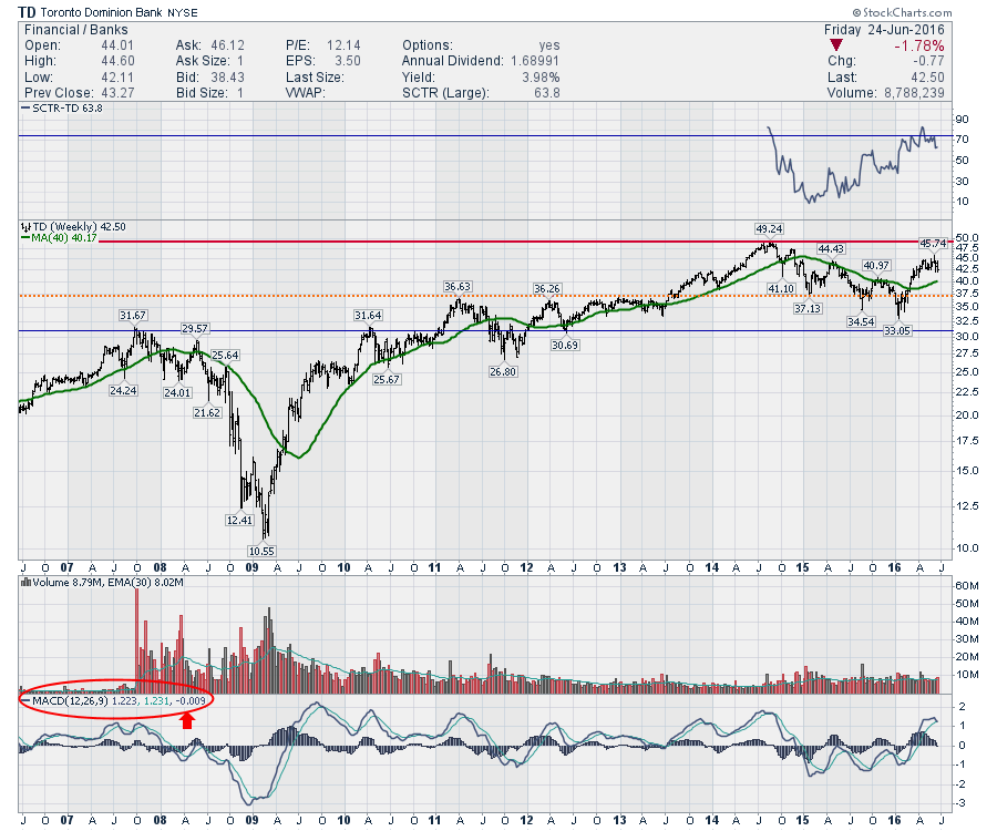
Canadians are a large group who read my work. I'll post one of the typical Canadian bank stocks and then move into the European and Asian banks. Toronto Dominion Bank (TD) fits that description. Looking at the SCTR, this is a much stronger chart. The stock has an SCTR at 63.8 which is still good. StockCharts added some international companies to the SCTR listings in 2014 which is the reason the SCTR starts in that year for a lot of the charts below. All the Canadian banks were rocked by the fallout in oil. The price action recently has surged above the upsloping 40 Week moving average in green which is more bullish than the US charts above. But after spending 3 months going sideways and unable to make it back up to test the former highs, this $44-$45 level looks like firm resistance. The MACD has just gone below its signal line so it has rolled over on this weekly chart giving a 'sell' signal. The actual level is very high on the history levels for the MACD on this chart, so this is still a bullish chart, relaxing at this time. However, if the rest of the banks roll over worldwide, you can probably expect the Canadian banks to follow.
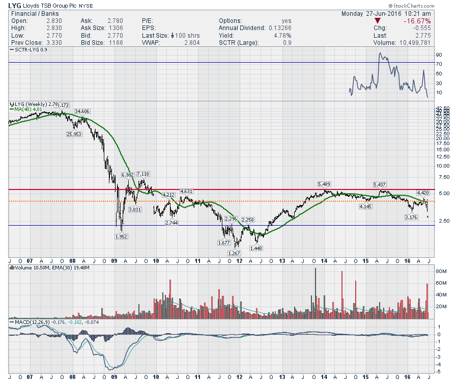
 Here is the centre of Friday's storm, Lloyd's of London (LYG). We can see that the cliff drop from the financial crisis battered this stock. However, the SCTR shows 3.5 which is one of the worst stocks of the large cap peer group. This stock is similar to Bank of America and Citi in that it broke down through the orange support level and has failed to get back through it. The price bounced on Friday, off the same level as earlier in the year, $3.18. Making new 3 year lows is not bullish. But now look at the volume candles. Boom! In London, it traded 2.5 Billion shares on the week, compared to a 30 week average of 820 Million.
 Due to the size of the charts, I'll continue this article, in the next blog. The European and Asian charts are must-see material. Follow this link to read it.
Greg Schnell, CMT, MFTA.
