This is the final installment of 2016 In Review. The first three are:
There were lots of wide swings in the 2016 market as always. With a plunderous start, January had the equities selling off. To finish the year, the banks roared faster than the 8 years before. Commodity related equities bounced out of a five-year bear market while Oil and Gas equities doubled off the lows to finish the year near their annual highs.
Here is the performance of the S&P 500 ($SPX) for the year. Without dividends, the $SPX returned 9.54% after starting the year with a 10% pullback!
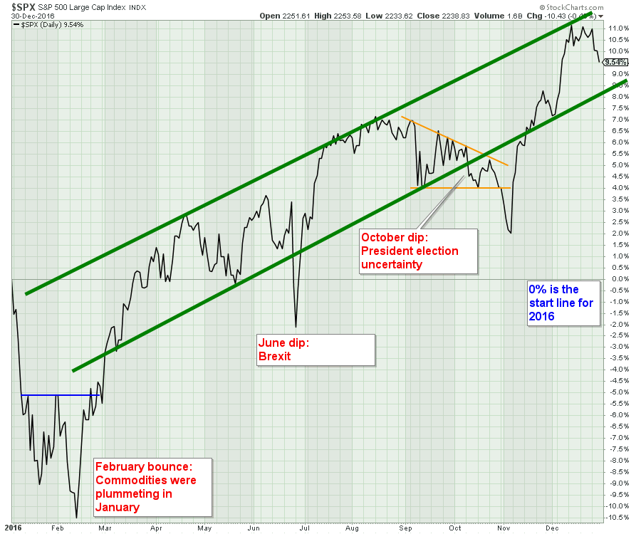
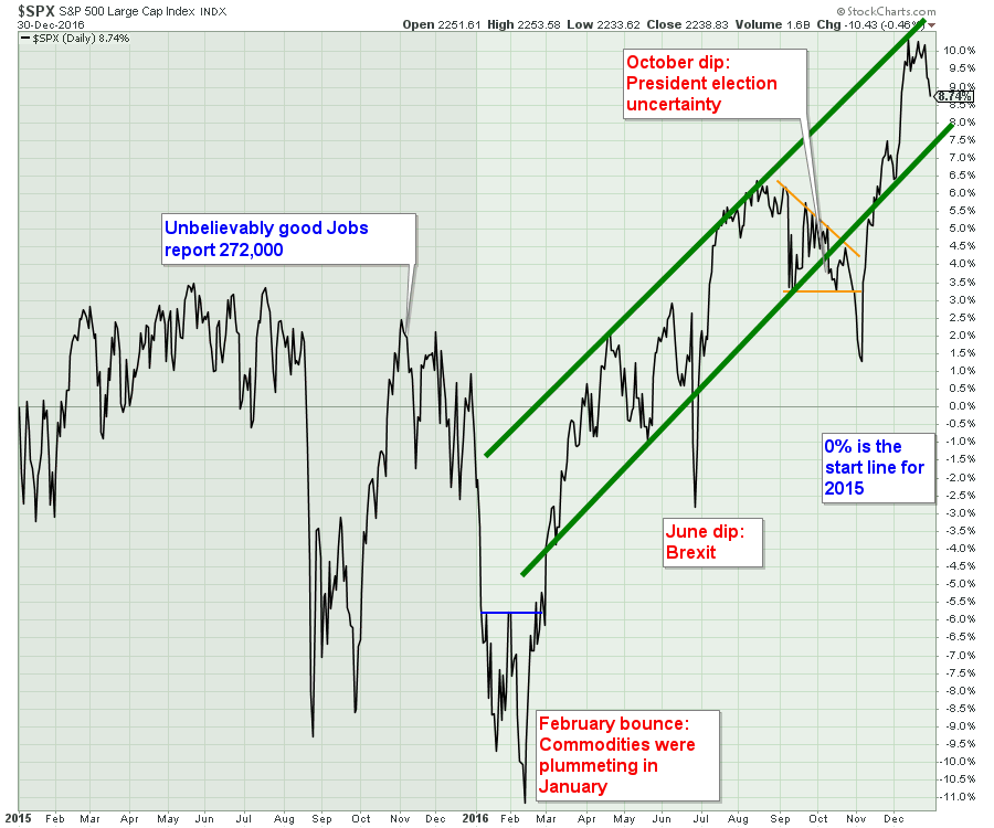
Comparing that to 2015, the year was significantly better. 2015 closed the year close to flat, but 2016 had a lower low and a higher high than 2015 making for a bullish reversal bar that I show on the second chart below. We also had some extreme moves down. When the market gets that stretched to the downside, it is almost always a great climactic buying opportunity. Over the last 10 years, when we get a DOW DOWN 800, it has usually been quickly followed up but a huge upside reversal. August 24th, 2015 had a 1100 point swing on the day from the opening. It was a great buy. 2016 had two events over 800 and two over 500 points. January and February lows had 500+ point swings intraday and marked the lows. Brexit dropped the Dow ($INDU) over 650 the first day and the next day set the low with a two day total decline of 950 points. Another fabulous buy point was created. The election of Trump dropped the overnight futures market down 800 points. By the time the market opened, the market was almost flat and started one of the biggest 6 week rallies.
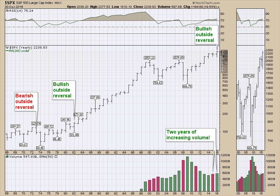
Below is a chart with annual price bars. Going back 50 years, this is only the second Outside Bullish Reversal. Most years, the market makes higher highs and higher lows. Rarely does it make a lower low and a higher high. So write up 2016 as another rare event. If the last bullish reversal was a clue, the investing world is about to get a whole lot better! That started the rally of 1982 to 2000. You had to live through small wiggles like the 1987 crash where a 25% drop would have concerned you (ouch!!). One of the nicest things to notice is a second year of increasing volume. That is good news.
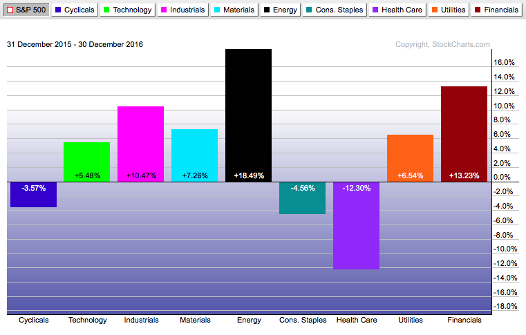
There were five weak sectors heading into January 1, 2016. Base metals (Materials), Energy, Utilities, Industrials and Financials. The major downturn in oil was spreading aggressively across the sectors. The chart below represents 2015 at year end.
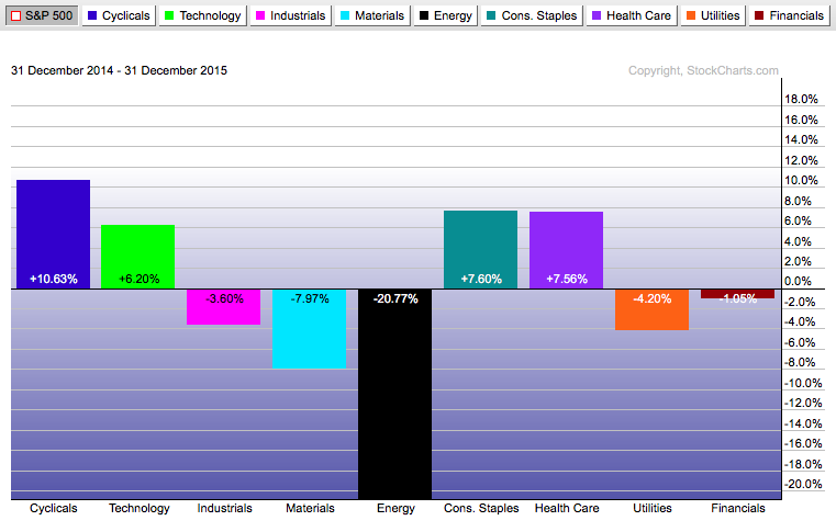
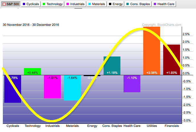
We can see the defensive sectors (Consumer Staples and HealthCare) in 2015 performed well on the chart above. Compare that to the 2016 results shown below. Once Energy started to bounce, everything growth-oriented gained momentum but HealthCare and Consumer Staples dramatically underperformed. This is a great example of the sector rotation principle. Materials look a little weaker on this display than in the 2016 In Review - Commodities article. You might remember the industrial metals and precious metals surged early in the year. They have backed off substantially towards the end of the year. It was a round trip for the precious metals stocks.
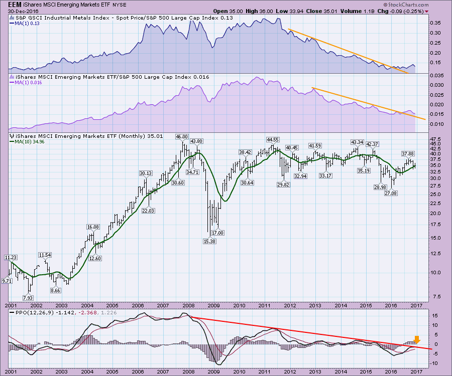
 Going through some of the big themes, I think it is helpful to use themes in investing. Every year, pundits go on television telling investors to diversify overseas. Two things make that difficult. When and where are the difficult questions. Last year, a large contingent said Emerging Markets would be the best place to be. They may have been right, but only because base metals had a good run. Brazil was outstanding. There is a very high correlation between base metals and emerging markets as shown by the two area charts. The monthly PPO could help us see the break in trend in 2017 for EEM investors. If the PPO does start to break out and stay above zero, this is an excellent reason to focus on EEM and probably commodities. The price action is trying to stay above the 10 MMA. Should it fail to hold, this ETF is one of the more sensitive ETF's and investors move out quickly. The $33 level is horizontal support for many years. After breaking it in 2015, the rally of 2016 pushed back above. If it drops below again, we should be wary for the broader commodity markets as well.
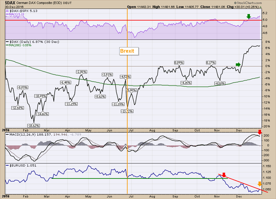
 Germany was another 'undervalued' asset class at the beginning of 2016. It fell 20% into the February lows. The $DAX rallied all year and in October it had returned to even. November and December saw the $DAX surge 6% to end the year up 6%. Recently the $DAX started to outperform on the Relative Strength chart in Purple. That started when the Euro in the bottom panel started to break down. The Euro is testing the trend line now as I mentioned in the 2016 In Review - Currencies Article. The Euro is also ripe for a multi-month rally. The importance of the Euro breakdown can not be understated. Once the Euro broke to three month lows in June, the $DAX started to rally. That rally kickoff also coincided with Brexit. Investors will need to focus on hedged ETF's to play these foreign markets. The second last day of the year gave a MACD sell signal. We'll watch closely!
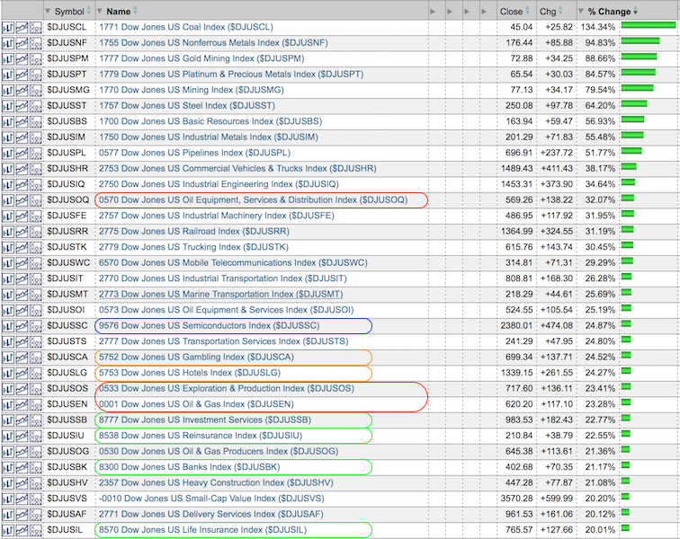
Moving to the best industry groups of 2016, the list was dominated with industry groups inside the two worst performing sectors in 2015. While the basic materials were the best at the end of the year, it is important to remember the precious metals stocks were up on average 150% at mid year. By year end, they were off the list. A few interesting groups show up here. The oil services stocks are outperforming the oil producers significantly (red). Semiconductor is the lone tech group (Blue). While the late surge in banks made them the talk of Wall Street, they were dwarfed by gains in the other areas. A strong banking sector is never a bad thing, so in that vein, we should be happy to see that.
 I outlined Gambling and Hotels as interesting standouts (Amber) on the above list. AirBnB seems to be wreaking havoc on hoteliers worldwide but not in the eyes of investors. The gambling stocks also had a big bounce. That contrasts with the worst industry groups on the next list. Notice that the Travel and Tourism Industry as well as the US Recreational Services were some of the weakest industries (Amber).
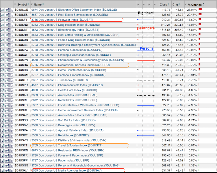
Nike was absolutely soaring in 2015 as part of the Footwear Industry. It made it's high in November 2015. Now it is in one of the worst performing areas of the market. Are we about to see the same reversal of fortunes this year where they go from worst to first again? The list screams three particularly big trends. Direct to consumer stuff was really hard hit. The big ticket stuff like real estate, home construction, and auto related have black arrows. The second area is Retail Consumer related (Blue arrows). While some are in the Consumer Staples area which is out of favor, the Consumer Cyclicals are also being hard hit. I have highlighted a third area (red arrows) which is Health Care related including biotechs.
Lastly, a big surprise for me is the media agencies industry group. These stocks were some of the worst performers, even in an election year. It is at the bottom of this list, but the worst performer is at the top. So while it was a weak performer this year, it wasn't the worst as you can see by the '% change' column which represents the 1-year performance.
 So if the stunning reversal in materials was the big surprise for 2016, perhaps we should be farming this list for reversals and big moves in 2017.
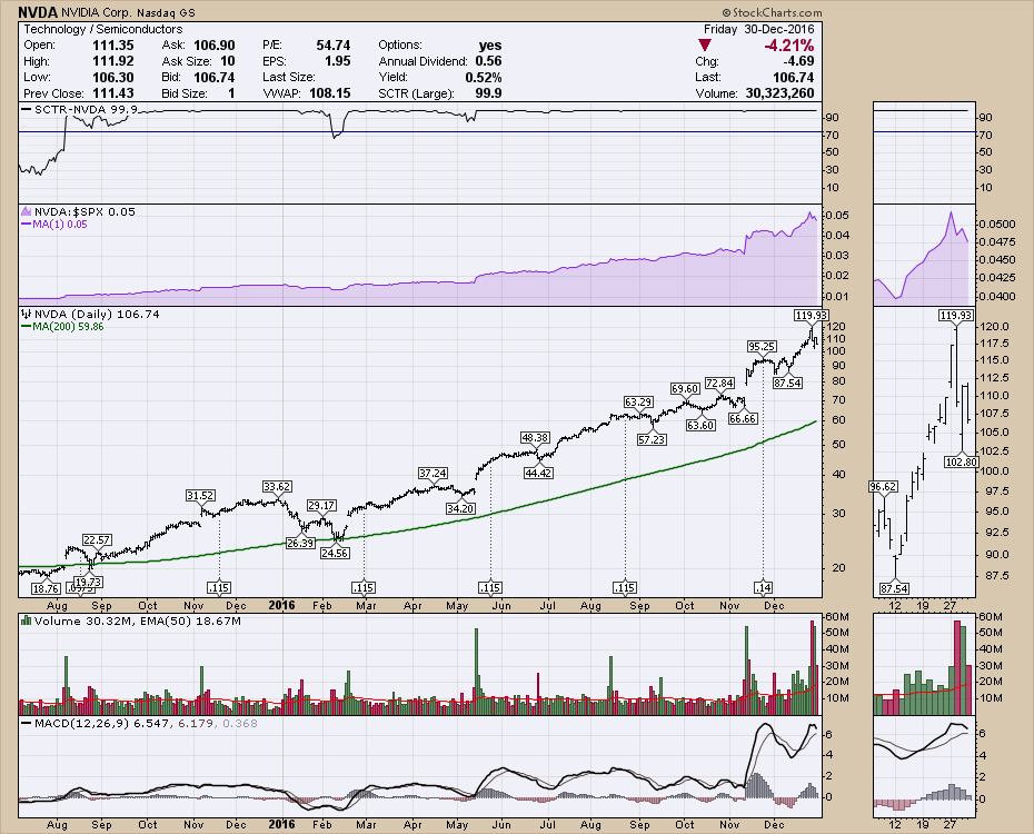
One chart that is worthy of a specific statement is Nvidia (NVDA). This was a smooth ride until the last week of the year. On December 28th, NVDA had an outside reversal bar as you can see in the zoom box. The 2-day move totalled almost 20% of the price of the stock. This is typically a blowoff ending. The volume was 160 Million shares over four days which would imply a climactic ending for now.
 There are so many things to cover in a year end review. An article quickly becomes a book. We have been running full steam ahead since the February low which is now 11 months. That makes a long run which could persist. Rather than defining a certain end point, my favorite group of charts are starting to weaken and might help us recognize when this market needs a larger pause.
Each of the following charts contains three components.
- The Index in the top panel
- The Bullish Percent Index in the second panel
- The % of stocks above the long term 200 day average in the lower panel
What I find particularly important about these 3 as a group is they help you stay long the market while everything is working. However, when they start to disagree, it is time to be aware of the potential for change.
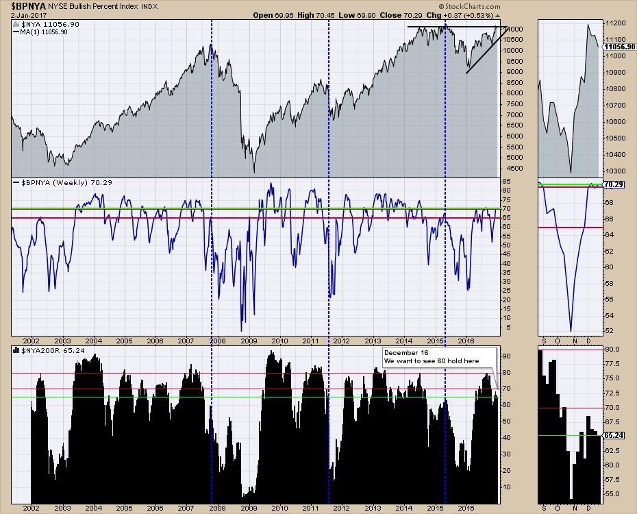
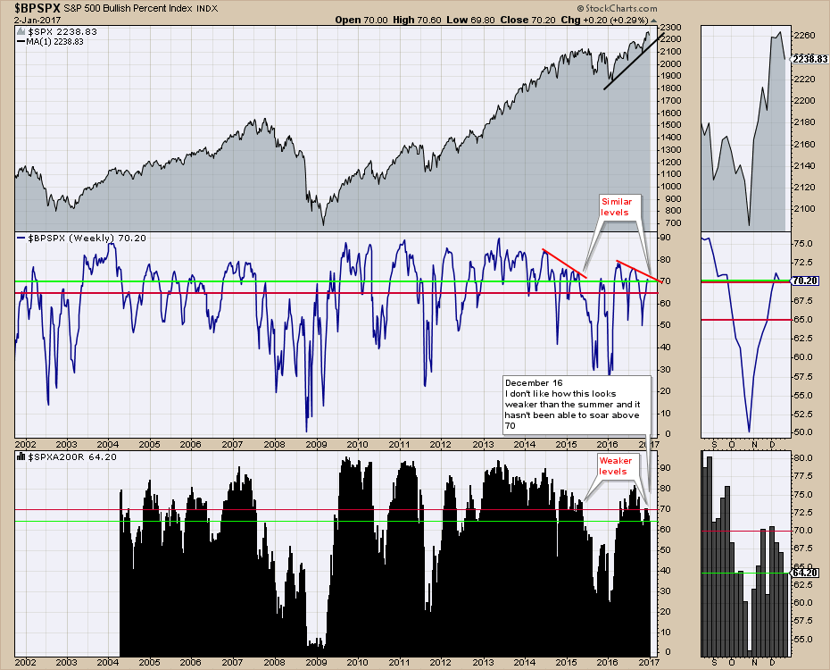
The Bullish Percent Index has been calculated by StockCharts.com as one of the early indicators of breadth based on Point And Figure charts. This index calculates the % of stocks on a buy signal. On a PnF chart, you are either on a buy signal or a sell signal, but the distance between the two levels can be significant. If the market has made a recent high, it is bullish until it makes a lower low. Then it goes on a sell signal. So the Bullish Percent Index usually triggers buy signals faster near market lows but sell signals slower. Here is a link to the full ChartSchool article.
For the % of stocks above the long term 200 day moving average (200 DMA), this is a moment in time. Each stock is above a single line or below. For deeply oversold stocks, you can be rising a long time before you reach the 200 DMA. Conversely, you can oscillate back and forth across the 200 DMA for multiple days in a row. So when the market starts to break down as the number of stocks start to fall away, this single line might be a better clue. It usually weakens before the Bullish Percent Index breaks down.
On the chart below, I have the NASDAQ Composite($COMPQ) with the other indicators. When the two indicators are not in agreement, I start to focus intently on the levels. I have drawn some red lines that are at a level that I picked as being important historically. Above the red lines on both is very bullish. More importantly, it shows a new bullish thrust and that you want to be fully invested as that happens. Then the market pulls back as both indicators fall below their red lines. This associates very clearly with meaningful pullbacks in the market. But there is a sweet spot where the black histograms pull back below the red line and the Bullish Percent Index has not. That is the warning zone which is where we find ourselves to end the year. The lime green horizontal lines are the current levels so we can look back to compare. The Bullish Percent Index is still holding up nicely.
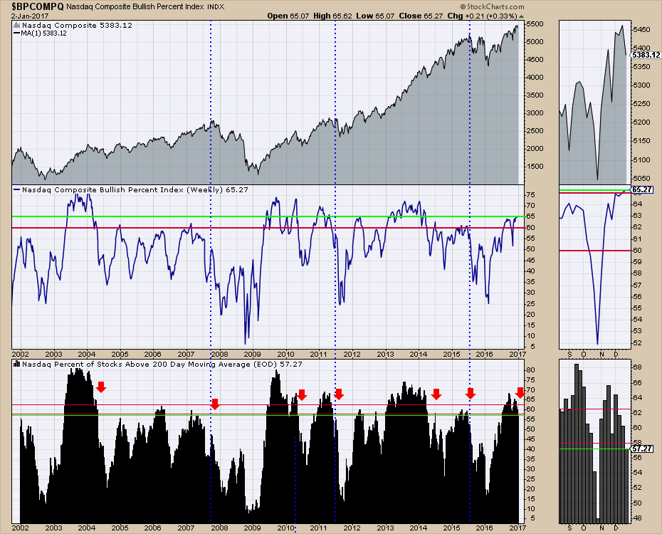 Staying with the chart above, notice the black histograms in the bottom panel. At this point in time I am particularly interested in the areas where the indicator has pushed above both red lines (September), pulled back (October) and then tried to rally (November). Often this second rally is where the market starts to separate. The Spring of 2010 is a good example that is similar to now. I have placed red arrows on some other points in time of the conditions. In the zoom box on the right, you can see the pullback in October heading into the election. Then the bounce. However, the bounce was not as strong as the September surge. Now we are back below the red line with slightly more than 1/2 of the stocks (57%) on the NASDAQ market above the 200 DMA. The NASDAQ Composite is typically a little weaker than other indexes like the $SPX. Let's look at some of the other indexes for clues.
Here is the NASDAQ 100 Index ($NDX). The big heavyweights in the market are in this Index. The Bullish Percent Index has had declining tops since the surge off the Brexit lows. While the Bullish Percent Index still shows 72% which is nice and high, the $NDXA200R in the bottom panel shows only 63% of the stocks are above the 200 DMA and that is down from 75% after the Trump election surge. It is also well below the support level back in 2014 around 69%. We lost 4% this week and this looks vulnerable.
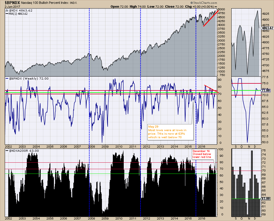
Staying with the chart above, the lime green horizontal line represents the current reading. We are at the level just before the market broke down in 2015. It does not mean we will break down, but it definitely suggests protecting gains you have made in the 4th quarter. Also notice how the surge in 2016 was so much lower than in 2013, 2014, and 2015. With highs around 69% in early December, it looks a lot more like the market condition in 2006 or 2007. The blue verticals mark major market cracks.
Looking at the NYSE, here is the NY Composite ($NYA). The composite is the total of all stocks on the exchange. The Bullish Percent Index still looks strong, but the $NYA200R has just fallen below the level that supported the first half of 2014. The significantly lower high on this recent rally is concerning. While we are only a few percent above the October lows in the indicator, we don't have any real catalyst like an election on the immediate horizon. I am reluctant to use the lows in 2013 as the Fed was actively pushing the market with QE. I like 2005 or 2006 instead. Or is it like 2002 on the far left?
 Lastly, let's look at the strongest group of 500 stocks, the S&P 500 ($SPX). Once again the BPI has declining highs since Brexit. I would suggest this looks more like 2005 - 2006. The good and the bad news for the $SPXA200R inthe bottom panel is it rallied to 70%. That would be the weakest rally if the market keeps going higher. I'll just leave it that any further weakness should be given a serious amount of respect.
 Let me conclude this article with a cautionary tone. Many think we are in the biggest bull market ever. Recently a money manager said he was as bullish as he has been in 10 years! Much like the plunging days where the $INDU down 800 points is a great buying opportunity, having 10 year highs in 'euphoria' without the same accompanying market breadth suggests a major market top or at least a top of importance for traders. If we start to see market conditions detiorate from these threshold levels, we can heed the market's message early on. If it rejuvenates itself quickly, we should be able to hold our positions.
The performance for the last month shows a rotation into Utilities and Consumer Staples. Even the Financials have backed off recently. Perhaps we'll see a turn into some of the beaten down Consumer Staples Industry groups.
 To summarize, the market breadth as I look at it is just barely supportive of higher highs. The big bullish thrust early in 2016 appears to be reaching its apex in terms of price in my work. Maybe we just get a short correction and move onto new highs. Almost all of the pullbacks in the last 5 years have been from some event off shore. For that we have China barely holding above its 2016 trend line. Europe's recent price action has surged on the back of the weak Euro, but the currency charts look set to turn.
If these articles have tweaked your interest, thank you for taking the time to follow the review through the different asset classes. StockCharts finished the year with more members than ever before. Thousands of market watchers find huge value in StockCharts.com every day. We would be honoured to be part of your market review team. Allow me to take a moment to share some of our efforts to help you analyze the market.
StockCharts.com won an industry award in 2016 for the Best Technical Analysis Commentary Team. It is the lowest priced subscription to the best commentary team on the web. Our 'Basic' membership gets you access! Check out pricing at $155 annually. Is it possible any other Technical Analysis company has as broad a commentary team for you at this low subscription?
Greg Schnell, who wrote this 2016 In Review series, features Commodities every week on the Commodities Countdown blog and webinar series. If you would like to stay tuned into Commodities and some of his thoughts on the macro concepts for the equities, currencies and bonds, please join him. You can subscribe at the bottom of his Commodities Countdown blog. You can register for the webinar on the home page of StockCharts each week. Greg also keeps changing a small chartlist that has some important charts for Commodity investors. You can access that here all year long. If you liked Greg's review of the Bullish Percent Indexes And Percentage Of Stocks Above The 200 DMA, those are frequently reviewed on Greg's webinars. Greg also keeps a blog for Canadian investors as well. That blog has been running for 5 years.
StockCharts members enjoy unique privileges. Access to the members only work by John Murphy (4 Books), Martin Pring(20 Books), Arthur Hill (1 Book), Tom Bowley and Erin Heim authors starts with basic membership. Tom and Erin have some free content as well.
Specifically for members, our top three authors are member only. John Murphy has written a market message for 16 years which is a StockCharts favorite. Martin Pring posts an article a week and a webinar that is filled with his unique indicators available on StockCharts. Arthur Hill is a fantastic author who has some of the most detailed work for trend following. Look inside our pricing module today.
Tom Bowley writes a daily snapshot in the morning and offers a couple of webinars each week. Some webinars are for members and some are for the broader audience. Tom recieves a lot of positive comments about his morning review.
If you hired an assistant to help you be aware of all of the new signals in the market, they would compile spreadsheets and major trends on your behalf and put them on your desk. StockCharts.com goes above and beyond that for an additional $95.00 a year. Twice a week, Erin Heim gives a "news broadcast" style webinar on signals through the Decision Point methodology and she publishes four new reports every day. The reports are a fantastic compilation for you, rather than hiring a full time assistant. This is included with your 'extra' membership to StockCharts.com. At $249.00, that is less than a dollar per trading day (253 days last year). It is only $0.40 a day more than a basic membership with four fantastic reports every day as well as a weekly report. Hard to hire staff for $0.40 a day. Crazy good value! Decision Point Reports. Look inside our pricing module today.
Julius De Kempenaar, creator of RRG charts, regularly writes articles explaining momentum and relative strength. RRG software helps to visualize market rotation. This is one of the brightest improvements in Technical Analysis through the last ten years.
We also have Gatis Roze, Greg Morris and Bruce Fraser who share their years of experience. There is also a Top Advisors Corner with numerous authors putting forward ideas for you. Hopefully this broad diverse view of the markets helps you understand why our Technical Analysis team is so compelling.Look inside our pricing module today.
Why become a Pro member at StockCharts? You can have up to 10 Price panels on one chart, so you can watch all the major market clues in one place. You get 5 second automatic chart refreshes at this level. You can have 50 technical alerts at any one time, that notify you about any condition on any stock you want. StockCharts will text it to you, email it or flash it on your screen. You can look back in time, 50 years or more in some cases to see historical examples of extremes. This is very helpful in understanding stretched markets up or down. A good example is the $CRB chart shown above. For less than $50/month, you can have 350 chartlists, alerts, custom scans, Decision Point reports as well as all of the commentary and webinars. Look inside our pricing module today.
Good trading,
Greg Schnell, CMT, MFTA.
