Don't Ignore This Chart! December 31, 2018 at 03:51 AM

Stocks rebounded last week and recovered part of their losses from the prior week. Long black candlesticks formed the week before Christmas and most sector SPDRs recovered with long white candlesticks the following week... Read More
Don't Ignore This Chart! December 28, 2018 at 10:29 AM
With the exception of Brazil and India, the monthly charts are broken worldwide - and the speed of the drop since the break has been alarming. Come 2019, the charts will need to do a lot of work to rebuild a constructive shape. What are we looking for? Let's start at the top... Read More
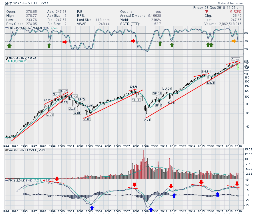
Don't Ignore This Chart! December 27, 2018 at 08:42 AM
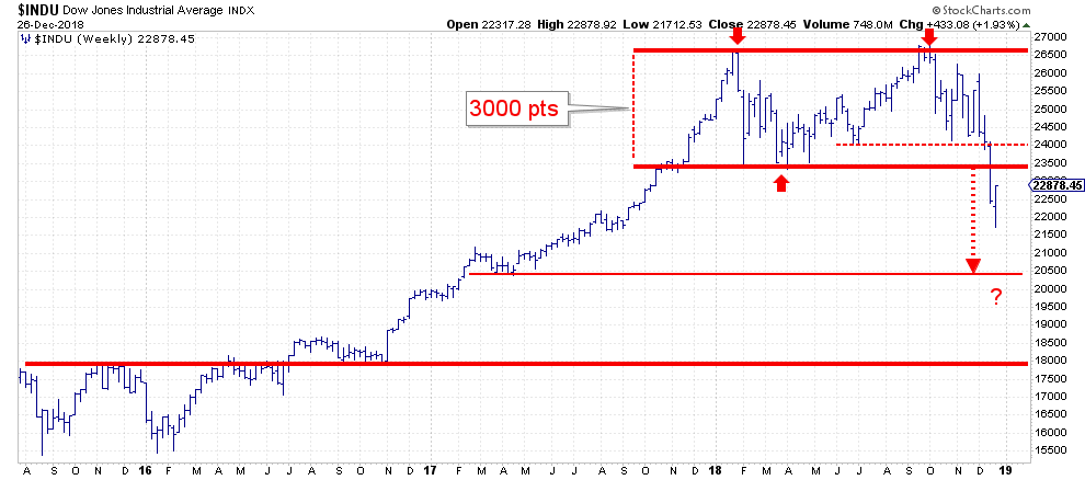
Yesterday, on boxing day, the Dow jumped 1000 points from its 52-week low which, coincidentally, was also set yesterday. Never a dull moment... Read More
Don't Ignore This Chart! December 26, 2018 at 06:15 AM

AD Percent for the S&P 500 dipped below -90% on Monday and this was the sixth reading below -90% this year. AD Percent equals advances less declines divided by total issues. Thus, if 25 stocks advance (5%) and 475 stocks decline (95%), AD Percent equals -90% ((25 - 475)/500)... Read More
Don't Ignore This Chart! December 24, 2018 at 06:59 AM

The Russell 2000 peaked at 1740 in mid August and fell below 1300 over the last 15 weeks. The index is now down 11 of the last 15 weeks and extremely oversold... Read More
Don't Ignore This Chart! December 23, 2018 at 12:05 AM
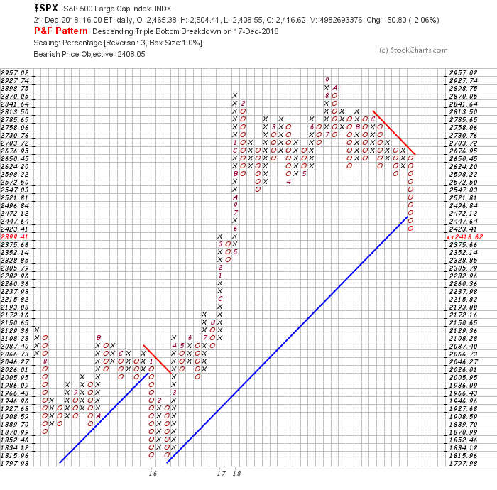
With the ongoing market turmoil, it seems that the P&F charts are plummeting. This style of charting does a great job of clearly illustrating support - you can see when price break downs as support is broken... Read More
Don't Ignore This Chart! December 20, 2018 at 06:07 AM
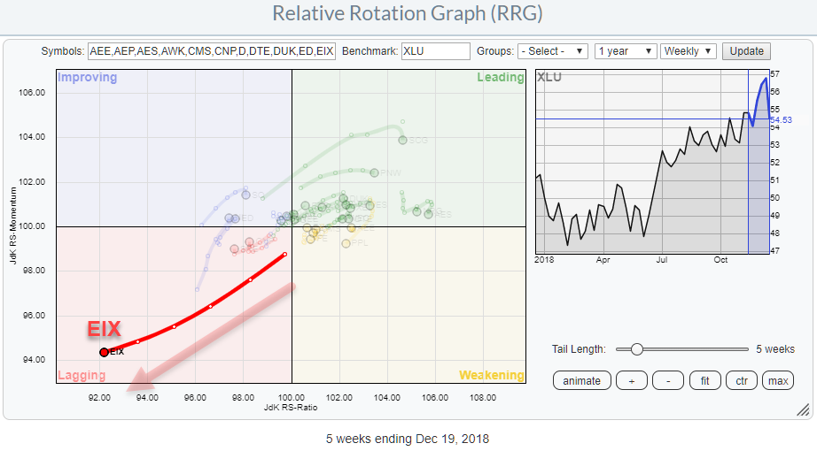
The Utilities sector is acting as a safe haven for a lot of investors that need to park their money in the stock market because they cannot, or are not allowed to, hold all or significant amounts of cash when markets are going down... Read More
Don't Ignore This Chart! December 19, 2018 at 04:04 PM

It was not long ago that the 30-yr T-Yield ($TYX) was breaking above a three year resistance line and the outlook for yields was bullish (bearish for bonds). Admittedly, I was in that camp... Read More
Don't Ignore This Chart! December 18, 2018 at 10:13 PM
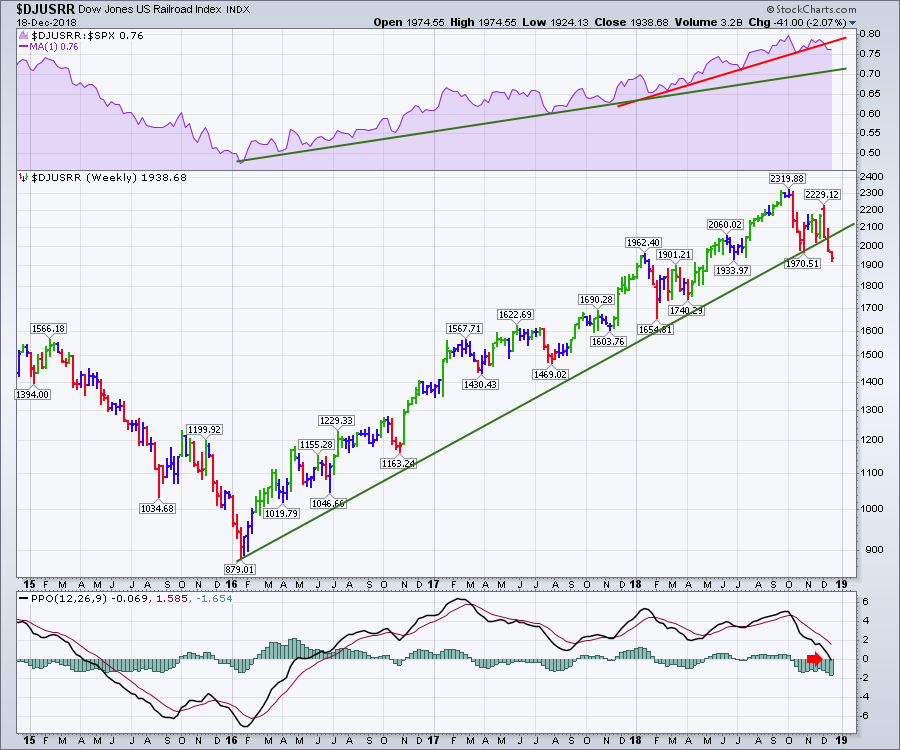
One of the nice traits about the railroads is they are one of my indicators to help with general market direction. I have found that when the railroads start to underperform the $SPX, that is typically a confirming signal of broader market weakness... Read More
Don't Ignore This Chart! December 17, 2018 at 11:51 AM

IBM is one of the worst performing stocks in the S&P 500 this year with an 18% decline year-to-date - and it could get worse... Read More
Don't Ignore This Chart! December 14, 2018 at 10:37 AM
The banking sector has been drilling holes in the bottom of empty Christmas stockings this year. All the big name US stocks are making new lows, but the real concern is the sheer size of the drop... Read More
Don't Ignore This Chart! December 13, 2018 at 08:19 AM
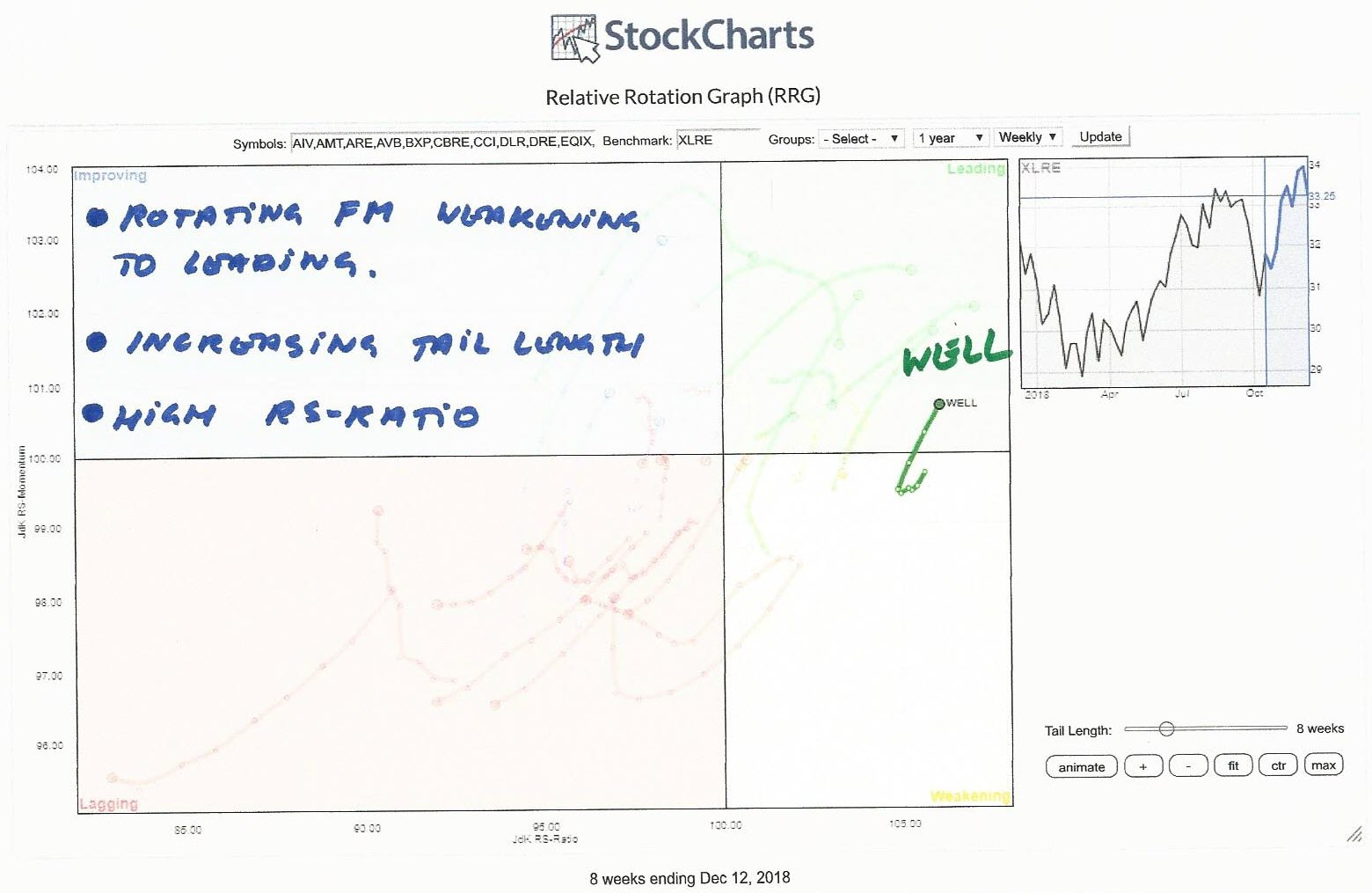
On the Relative Rotation Graph, the Real-estate sector is one of the better performing sectors vis-a-vis the S&P 500 index. The RRG above shows the rotation of all the stocks in XLRE against XLRE... Read More
Don't Ignore This Chart! December 12, 2018 at 12:05 PM

A long-term downtrend, two gaps down and a move back below the falling 200-day could spell trouble for L Brands. The stock has been quite volatile since summer, but the overall trend remains down... Read More
Don't Ignore This Chart! December 11, 2018 at 10:47 AM
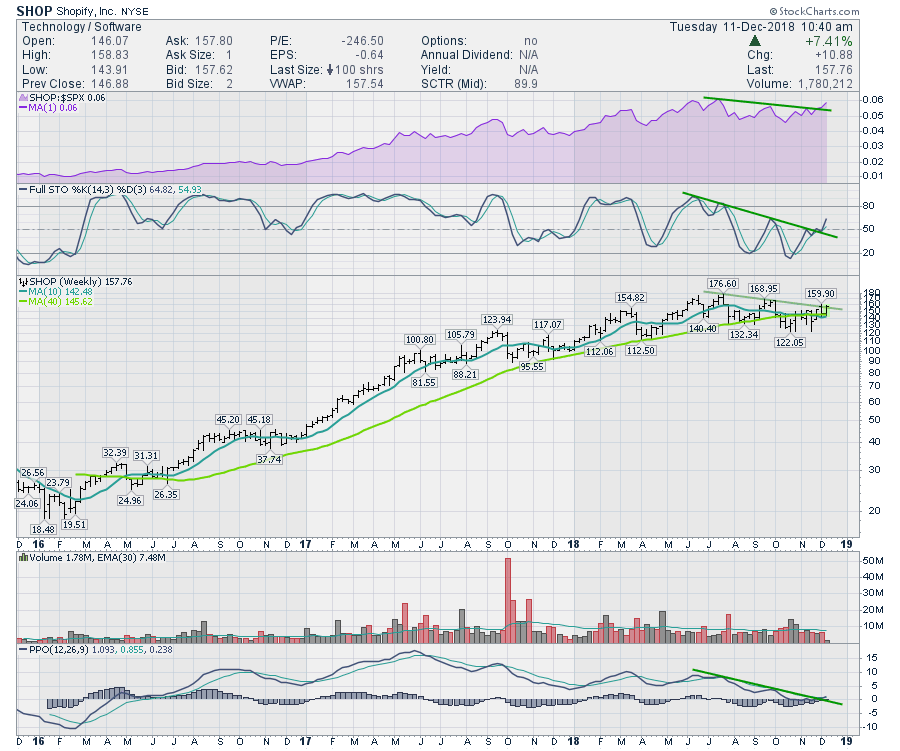
Shopify appears to have all the makings of a stock ready for its next move... Read More
Don't Ignore This Chart! December 10, 2018 at 10:36 AM

Southwest Airlines (LUV) is in a long-term downtrend and the recent failure near the death cross points to further downside. First and foremost, the long-term trend is down because LUV hit a new 52-week low in late October and price is below the 200-day SMA... Read More
Don't Ignore This Chart! December 09, 2018 at 03:49 PM
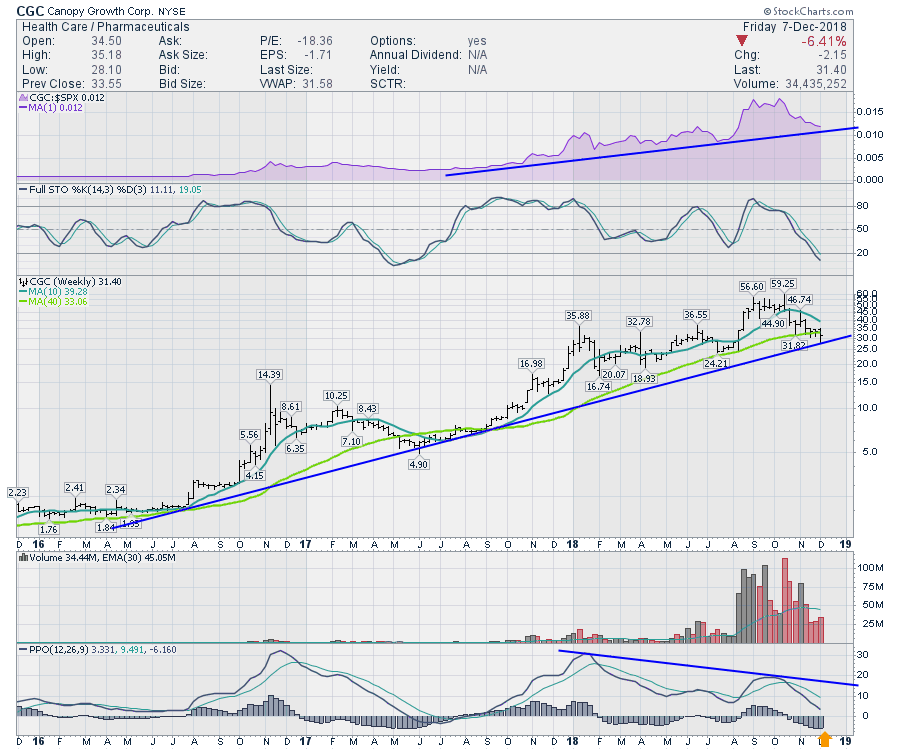
Canopy Growth Corporation (CGC) sits at support to close out the weekend. Is it about to collapse or surge? If you are interested in the most recent parabolic trading industry, marijuana legalization, it matters, as Canopy is widely seen as a leader in the group... Read More
Don't Ignore This Chart! December 06, 2018 at 05:39 AM
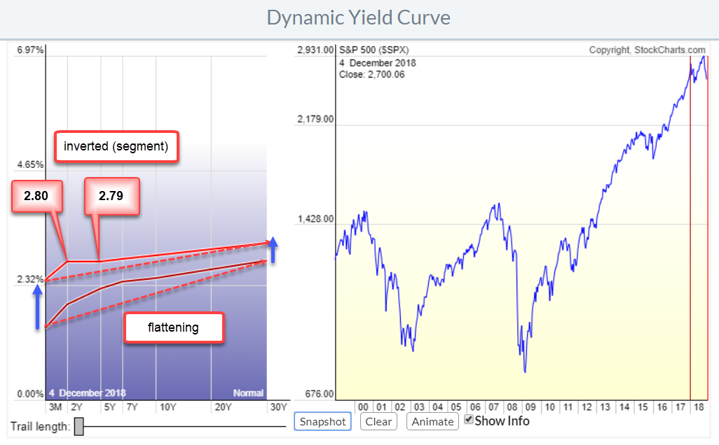
The yield curve has become a popular subject recently. Also, a few commentators on the site have mentioned the yield curve and its recent movements in their blogs recently. Read articles by Chief John, Greg Schnell, and Arthur Hill... Read More
Don't Ignore This Chart! December 05, 2018 at 12:16 PM
The S&P 500 is below its 200-day moving average and most country indexes are also below their 200-day moving averages. Two emerging countries, however, stand out in this crowd: Indonesia and the Philippines... Read More
Don't Ignore This Chart! December 04, 2018 at 07:29 PM
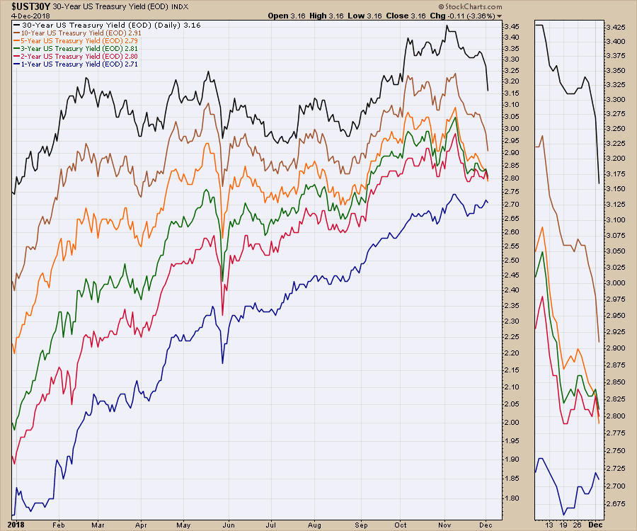
The yield curve has been the talk of the town as the Fed has raised interest rates. With lots of discussion, a part of the yield curve finally inverted this week. The issue at this point in time is the bond market has seen the 2, 3 and 5-year yields invert... Read More
Don't Ignore This Chart! December 03, 2018 at 08:39 AM

Relative strength, an uptrend and a bullish continuation pattern point to higher prices for Cisco (CSCO). First and foremost, Cisco is in a long-term uptrend... Read More