UFO/POPS represents the first and most simplistic pattern in quantifying divergence. A UFO identifies when Price is making a 9-bar high while the RSI is making a 3-bar low; vice versa for a POPS.
In its original concept, these were used purely as warning signs against the trend, as it was clear that other qualification was required in order to prevent false signals. I tested whether the value of the RSI itself had relevance, such as overbought and oversold, and it had no such bias. In fact, the absence of having an overbought or oversold filter opened up an unexpected pattern, namely the ability to produce divergence as a continuation. This seemed somewhat counterintuitive, as every description of divergence is against the trend. However, rare occurrences happen where price will be in an established downtrend, the market opens higher and makes a 9-bar high (normally news-related), and then the trend restarts as the bullish news was ignored. With price already in a downtrend and often making new lows for the move, it is easy for the RSI to be making a 3-bar low.
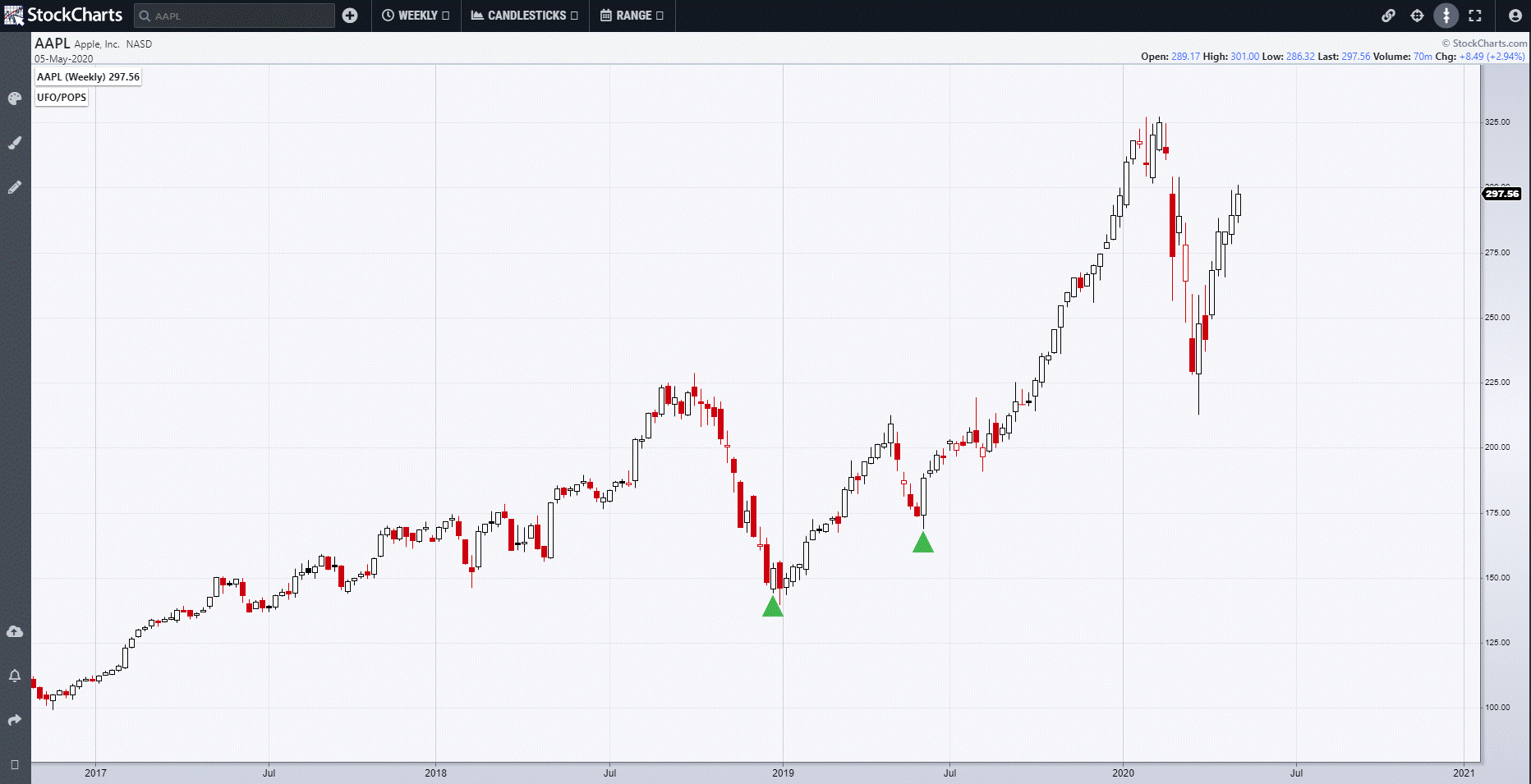
Primarily for stocks, it is buys as continuations that have the most use. The first criteria are to define whether the stock is in an uptrend. One simple way is to make sure that the Fibonacci Retracement of the previous trend has not closed below the 0.618% level. My preference, if it is there as a reference, is whether the current signal is higher than the previous one. POPS can be used on weekly charts for strategic long-term plays, and Apple (AAPL) shows a signal near the lows, but then has a continuation signal in the summer of last year.
Returning to its original use, it was obvious that, in a slow, steady uptrend, there would be too many decisions to be made about what merited a valid signal. This is especially true on individual stocks. Therefore, the first filter and default in StockCharts is to have the Expansion filter switched on. This connects once again with Range Deviation Pivots, stating that the Range of the UFO pattern has to be above a certain criteria of the average of range. This greatly reduces the number of times the pattern appears.
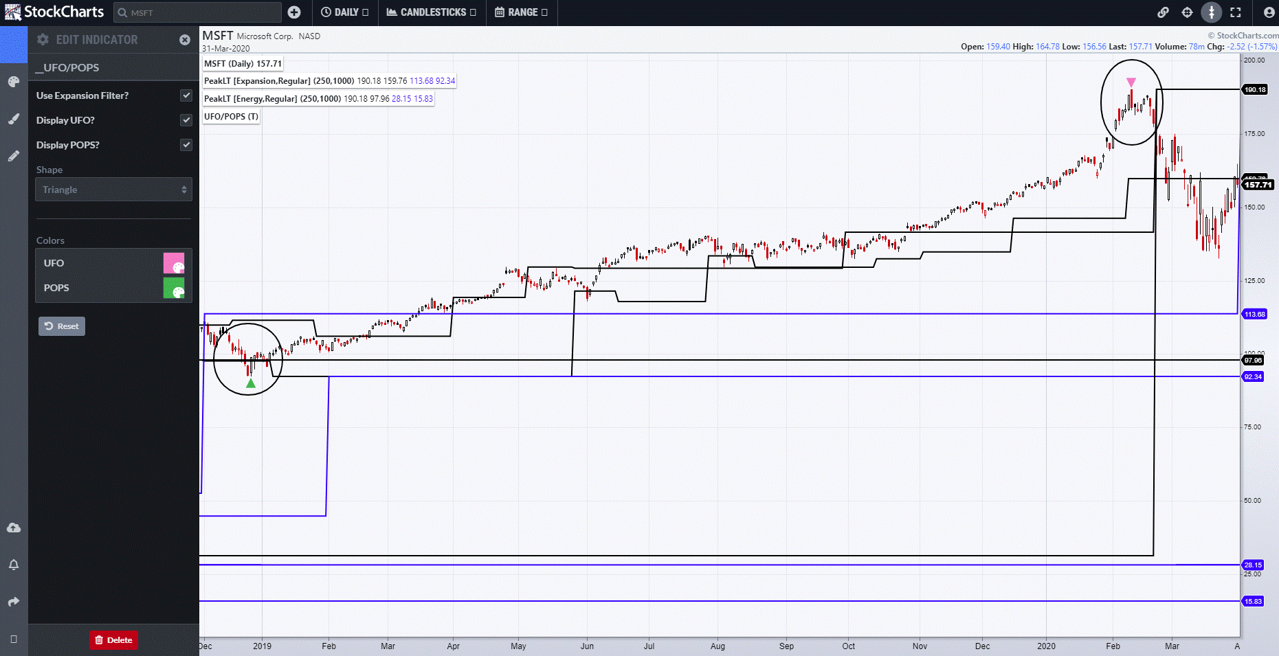
Connecting with other 4th Dimension studies is another way to quantify the power of the divergence that is being produced. Returning to Microsoft (MSFT), which we looked at in detail last week, we knew that price was in the sphere of creating either a Range Relativity Aggressive or Passive - or both. The high was made with a UFO, as circled, and, a few days later, Range Relativity kicked in. In fact, the uptrend began with a POPS in early 2019 (circled) and, this time, was connected by occurring at the Weekly Peak Expansion-based support.
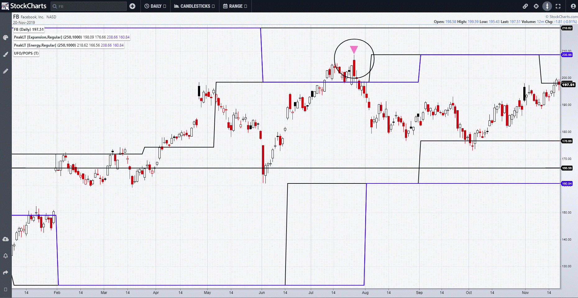
Whilst it is possible to be purely technically-minded with the studies, for stocks in particular there is relevance to connecting patterns with news or fundamentals. When company results are released, there are often conflicting stats and numbers, or different variations from what the market expected, making it very difficult to interpret whether it is bullish or bearish. Well. I don't really care unless it is obvious what it was, and in any case I let the market tell me whether it was bullish or bearish. The interpretation of this is what I call "Good News, Bad Action", or "Bad News, Good Action". It's very important to me for all asset classes, as life is easy when things go as expected but very different when they don't. A classic example of this was Facebook (FB)'s results last summer. Facebook beat expectations with 1.99 per cent against 1.88 expected and, having set aside $3 billion for a FTC settlement, it would only have to pay $2 billion.
Seems pretty bullish to me. Mr. Zuckerberg stated that "we had a strong quarter and continue to grow."
High Fives all round. The market opens higher, moves higher again, then reverses and, by the day's end, a UFO is there. However, that signal was going right into monthly support and it took two days before that support broke and the signal confirmed. The reality is that many stocks, especially popular and big ones, get hyped by pundits and analysts alike, and there is often a move higher ahead of when the results are posted. When they come out, there is no one left to buy, and then these short-term players are caught out and quickly head for the exit. Good News, Bad Action.
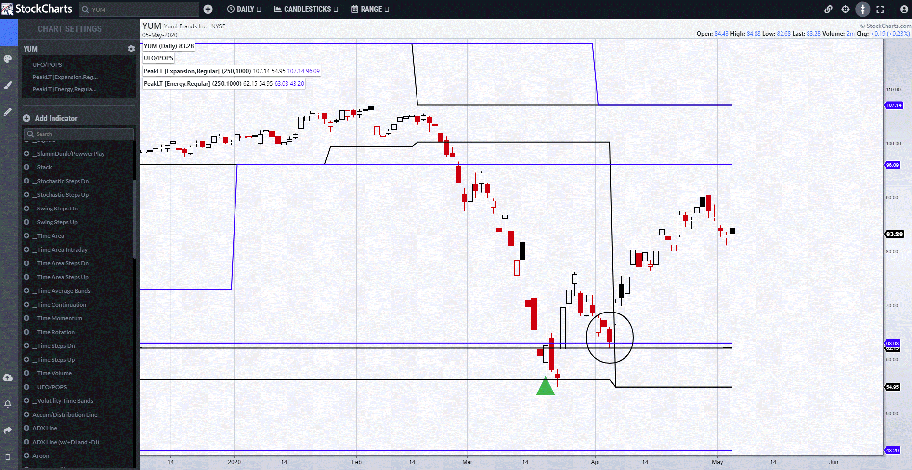
The next example connects with Peak Expansion and Energy. KFC, or YUM, as its parent entity (Yum! Brands) is known, had been slammed before a POPS appeared. Price then closed below the POPS signal low and, in the old days, that would have said that the pattern had failed.
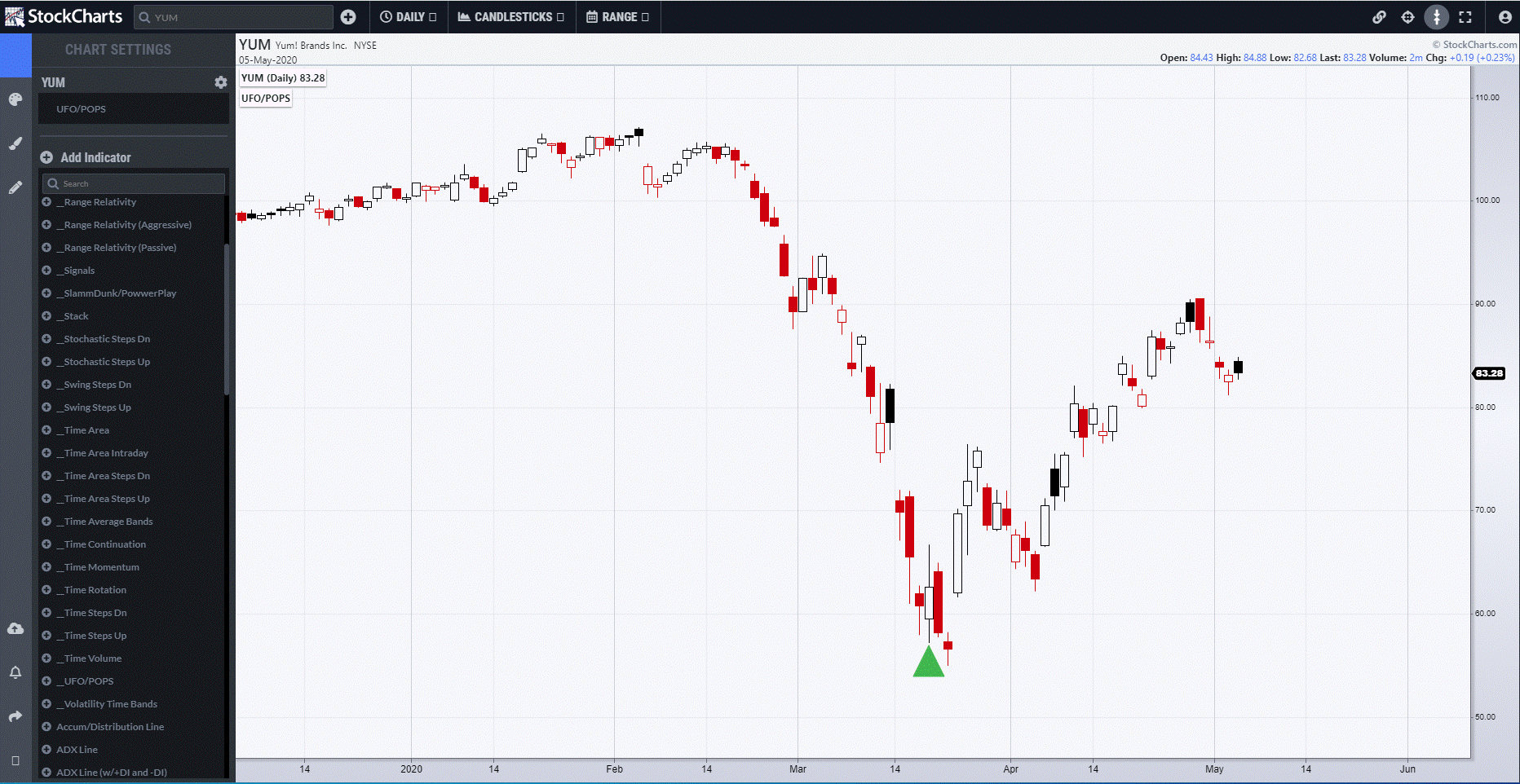
However, Expansion and Energy showed that we were in a major zone of support that price never closed below. It was close, but on the pullback (circled), price held the higher zone perfectly.
I can be contacted at shaun.downey@aol.com to answer any questions.
Shaun Downey