RRG Charts August 31, 2017 at 09:12 AM
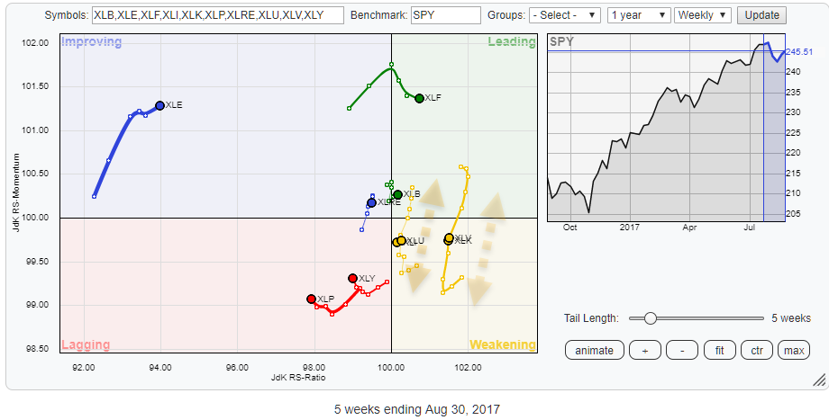
The Relative Rotation Graph above shows the US sector universe based on S&P 500 indices (ETFs). Two sectors stand out on this chart... Read More
RRG Charts August 20, 2017 at 08:30 AM
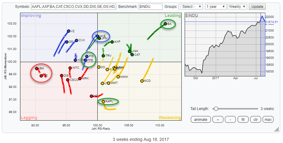
The Relative Rotation Graph above holds the 30 stocks that make up the Dow Jones Industrials Index and compares their relative rotation to $INDU. From the first observation of this chart, a few tails/stocks catch the eye... Read More