
Today, I will answer your questions on if the market is getting close to a sell signal, using my long-term Rip Van Winkle trading system. This system is highly effective at giving profitable trading (buy and sell) signals. Again, nothing is 100 percent accurate. Let’s take a look at a 20-year monthly chart of the S&P 500 and see if my system is giving sell signals, indicating a major correction ahead.
Per the chart, my trading sell signals are hit when two conditions occur. First, the price must cross down through the blue signal line and stay under this line through the end of the next month. If this happens and the money flow indicator (bottom box) is signaling money flowing out of the market, then we have a system sell signal. Many wished they would have been out of the market during these huge downturns (point A) from 2000-03 and also (point B) from 2007-09.
Quiz time. Are there current sell signals (point C) for the S&P 500? Per the chart, you can see the price is trading well above the blue signal line, and the money flow is still extremely positive. So, use the previous rules to determine the answer.
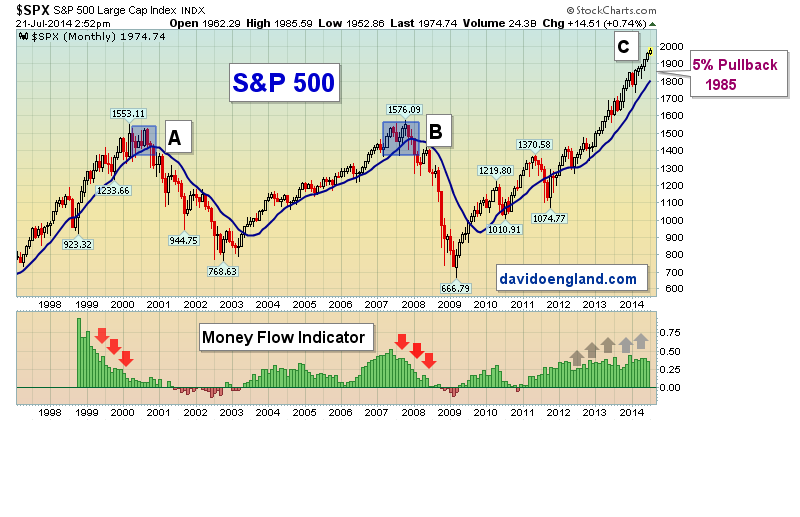
As stated last week, a pullback of 5 to 10 percent would be healthy for the market. Per the chart, you can see a 5 percent pullback from the recent high would take the S&P 500 to 1985, well above my blue signal line at 1974. Speaking of the signal line, all investors should know how to determine a signal line for each and every security in their portfolio. Do you have a signal line for each of your securities? If not, why?
A final point. Per the previous market tops (points A & B), the previous topping action took several months to form. Currently, (point C) we have not had the same multi-month side-ways action. Baring an exogenous event, (that I pray does not happen), as long as the economic reports stay positive each month and corporate profits do not fall off a cliff, I see continued upside in the months to come. If we start to see multi-month action similar to points A & B, I would be extra cautious about additional long positions to your portfolio.
Next week, I wrap up this series with a chart comparing the current market in relation to the previous highs in 2000 and 2007, in relation to P/E levels and the ten-year treasury yields. Very interesting information.
Plan your work, work your plan and learn to share your harvest!
David England,