
Rationales & Targets
The most distressing development since our last issue was seeing major banks take out their December lows with a vast amount of room to spare. We can’t tell you exactly how much is tied up in notional values for derivatives associated with the oil markets but we assume it is a huge number. If it’s only 2% of the total, that equates to as much as $4.7 trillion, terrifyingly close to the total of $5 trillion in total assets for four key players; JPMorgan Chase (JPM), Citicorp (C), Goldman Sachs (GS) and Bank America (BA). The charts of all four look awful and are holding major support by a hair. We would interpret a breakdown from current levels to mean a derivative event—not dissimilar to what we witnessed in the 2008 collapse—may be in progress. Of course, the banks might hold support and rally if oil rallies. This is likely the key going forward.
The mutual fund cash-to-assets ratio fell to 3.5% in December from the 3.7% level of the previous month and as low as this statistic has registered since January 2013, fully two years ago. This is a surprising development. Apparently, funds were big buyers near the mid-December low of Dow 17,067 and SPX 1972. Thus, we see the possibility that a break below these two points might now catalyze a “get me out at any cost” attitude as portfolio managers realize their mistake. The pattern eerily resembles the period from late July into October 2007 with a brief correction leading to new highs, just as now, before the stuff hits the fan big time.
15 Years And Counting
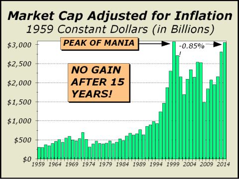
What a strange year it was. As the months came into view, we often happened upon a chart that we were sure would turn out to be the chart of the year. We featured a net liquidity chart in the March 30th issue as our candidate for chart of the year but as time passed, we posted a number of charts every bit as spectacular as that chart in March illustrating record low liquidity. Frankly, today’s featured chart is an equally astonishing perspective, clearly illustrating a bull market that hasn’t gained a dime in 15 years. If one was looking for a reason why the public no longer trusts markets, one need not look any further.
Our featured chart illustrates total stock market capitalization at the end of each year back to 1958, adjusted for the effects of inflation. Why adjust? Inflation pushes up the price of everything over time. For the most part, stocks are a great investment over time. If inflation averages 3.5% per annum and your portfolio appreciates 5% each year, you have true growth. However, the tech mania was one of the largest bubbles in history and had a dramatic impact. Prices soared way too far, way too fast and robbed expected growth from the future by ramming it into the brief period from 1999 to 2000 when the insanity enabled Nasdaq’s P/E to rocket to an astonishing 250 and enabled the S&P 500’s P/E to soar to an equally incredible 35.
The Federal Reserve’s strategy of massive monetary accommodation to fix the subsequent fallout and attendant recession wound up doing far more harm than good, catalyzing a housing mania in 2007-2008 and a second stock mania as well. When that didn’t work out as planned, the Fed made the same mistake and catalyzed yet another mania, albeit mostly confined to institutions. Despite the Fed’s best intentions, since the end of 1999, stocks have gone nowhere adjusted for inflation and total stock market wealth has actually declined by 0.85%. From the early 2000 peak, the decline has been 1.39%. The secular bull market that commenced in 1982 ended at the 2000 manic peak.
For more information, please contact us:
Alan M. Newman, Editor, Crosscurrents
www.cross-currents.net