
Two weeks ago in our latest contribution, we were hoping for continued Dollar strength. We had argued that the US Dollar rally which started mid 2014 on the back of diverging central bank actions and a recovering US economy was beneficial in maintaining an early uptrend cycle equilibrium in world equity markets. US equity markets were climbing a wall of worry as the impact of cheaper oil on consumers seemed to offset the impact of a stronger US Dollar on foreign earnings and US export businesses. European and Japanese markets were thriving as the ECB’s QE program and Abenomics had taken their toll on the Euro and the Yen vs USD thereby boosting export competitiveness in the EuroZone and Japan. We were fearful that if the US Dollar was to start correcting down, these positive dynamics could start moving in reverse. The correction up on Oil could accelerate, thereby confiscating some of the recent cheap oil benefit from US consumers. Consumer Discretionary, a clear leading sector since the beginning of 2015 could falter and with it the general market. The ECB and the Bank of Japan would clearly be taken back footed as strong USD induced rallies on European and Japanese equity markets reversed.
Today, two weeks down the line, and following further Dollar weakness, we can view these correlations at work on the FinGraphs Hourly Mosaic chart below.
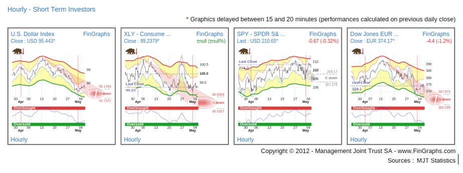
As the Dollar took a new dive last week (first chart), XLY vs SPY (the SPDR Consumer Discretionary ETF vs the S&P500 ETF, or the second chart) completely reversed positive earning momentum from the previous week. SPY (SPDR S&P500 ETF) or the market as a whole faltered (third chart). In Europe on the back of renewed EUR strength, the Dow Jones EuroStoxx600 also took a strong hit (fourth chart). It is also interesting to note that these correlations seem to be moving constantly in sink (up or down).
Our scenario above is not mainstream. Indeed, since the beginning of the year, the strong Dollar has often been named as the main culprit for the slow pace of progress of the US stock market. Many observers are now seeing its correction as a sign of relief. On the contrary, we believe that the strong Dollar may have been one of the main drivers of any progress at all in the US equity market.
Today, we will take a step back and consider the dynamics around the current cyclical upturn. We will also look at what markets seem to be anticipating in terms of inflation and interest hike expectations. Indeed, as the FED has gone silent last week on guidance for the possible timing of interest rate rises (making it data dependent), we will look to the chart for some clues. We will first consider the ratio of equity to bonds which we believe offers a good monitoring tool of the state of the recovery.
SPY vs TLT – Investor’s View (a Weekly, Daily, Hourly chart combination):
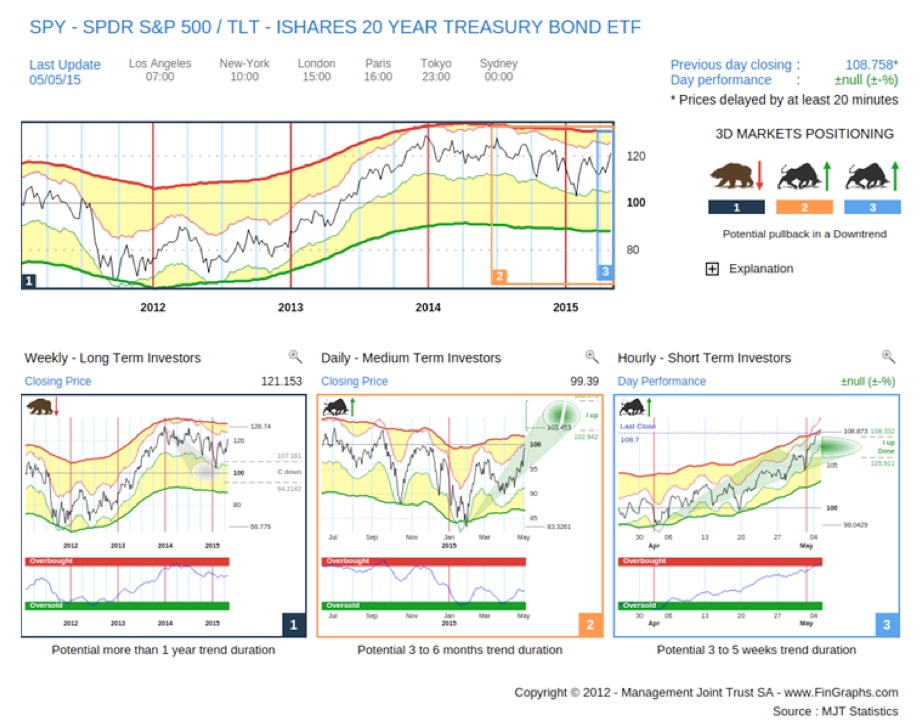
2014 was a positive year for US equities, yet when you consider them versus Treasury bonds, 2014 was more like a defensive consolidation. SPY widely underperformed TLT and finally reached its Corrective targets down (“C down”) on the Weekly (left hand chart) in early 2015. The same can be said of pro-cyclical sectors (i.e. early cycle movers) vs the more defensive ones. From its January bottoms, SPY vs TLT has been resuming its uptrend, Treasuries have entered a period of consolidation and US equity markets have continued up, climbing a wall of worry. It is this cyclical upturn that the FED is targeting and from our Daily (middle chart), the move could reach new highs over the next few months.
So SPY vs TLT is confirming a cyclical upturn, let’s now try to understand the driving forces behind this move. The following Weekly Mosaic attempts to do so:
Weekly Mosaic on SPY, DXY (Dollar Index), Brent Oil and US 10Y Treasury yields:
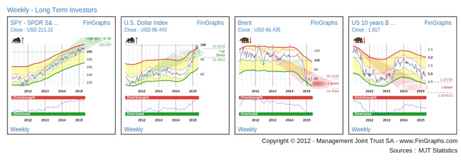
While SPY (first chart) continued its slower pace up initiated in mid 2014, it is interesting to note that despite the Dollar’s acceleration up (second chart) in the 4th Quarter 2014, SPY did brush off its sharp October decline to reach new highs in December. In the meantime Oil (third chart) had tanked. If some of the decline can be attributed to diverging interests at OPEC, it is hard not to relate it to the rise in the Dollar. We believe the benefits of this halving of oil prices in still being felt by consumers despite the recent USD 15 a barrel countertrend up. Furthermore, our Weekly charts seem to indicate that the downtrend probably isn’t over. Finally, rates (fourth chart) which had been moving down since early 2014 did initiate a slight correction up since January 2015. This may be attributed to the correction up in oil prices (and the related commodity inflation) or the perspectives of acceleration US Growth (and the perspective for rate hikes and wage inflation). For now, the move is still too shallow to turn the trend pointing to yet lower targets on our Weekly chart above (i.e. the reaction in the bond market is still pretty shy).
Internationally, the benefits of the EUR and YEN debasing vs USD are even cleared to see.
Weekly Mosaic on EUR/USD, the EuroStoxx 600 (SXXE), USD/JPY and the Nikkei 225:
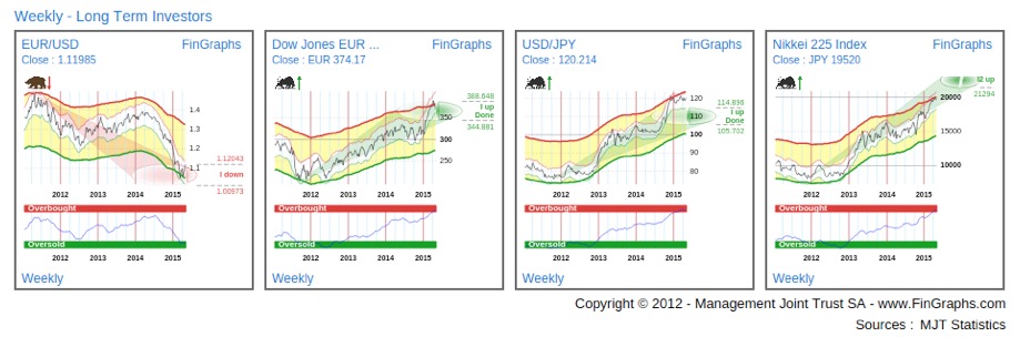
Following a few months of hesitation, SXXE shot up from early 2015 with the confirmation of the ECB bond buying program. In Japan, Abenomics 1 and 2 can both be clearly identified from the chart of the Nikkei 225.
So the cyclical upturn is indeed gathering pace. It found its roots late last year in the prospects for accelerating growth and related FED tightening guidance. It has been supported by the rising US Dollar and the related quasi fiscal stimulus provided by the drop in oil price. Aggressive monetary tactics abroad have also helped the recovery achieve more global breadth.
Now let’s turn to the different sectors to see if their prospects are in line with a cyclical upturn: we will focus on the performance of on late cycle and early cycle movers which should be the most influenced by an acceleration in growth perspectives, a potential rising in inflation expectations and a subsequent hike in interest rates.
Daily Mosaic – Financials, Consumer Discretionary, Technology and Industrials (all vs SPY)
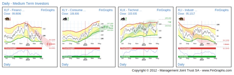
Financials (first chart of XLF the SPDR Financials ETF vs SPY) usually profit from rising interest rates as their margins usually expand in such an environment. More generally, with an acceleration in economic growth, their business volume also increases. Yet, as we can see from the Daily chart above, they have been widely underperforming since the beginning of the year. Although, their Risk Index is Oversold and a short term reaction can be identified, the trend remains negative with more downside potential to come. The relative performance of Financials for now doesn’t seem to reflect the improvement in business perspectives and a potential rise in interest rates.
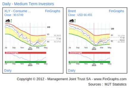
Consumer Discretionary (second chart of XLY the SPDR Consumer Discretionary ETF vs SPY) usually thrive in the early stages of an economic expansion. Since the beginning of the year, we had clearly identified this sector as an early cycle outperformer in this first half of the year. As we have previously mentioned, we believe that Consumer Discretionary may be one of the main beneficiaries of strong rise in the Dollar and concomitant fall in Oil prices. Indeed, the drop in Oil has freed up purchasing power for US consumers, Consumer Discretionary and especially retail have widely outperformed. The chart below registering the underperformance of the wider Consumer Discretionary SPDR ETF vs the Market Vectors Retail ETF and comparing it to the price of Brent Oil clearly identifies this relationship.
Hence with Consumer Discretionary, it’s a bit of a chicken and egg problem. Is the sector reacting to improving growth perspective or is the main driver behind these improved growth perspectives (based on a higher Dollar and a lower price of Oil)? If we revert back to our sector mosaic above, it is interesting to note, that Consumer Discretionary has underperformed as the Dollar started to correct mid March.
Technology (third chart of the XLK SPDR Technology ETF vs SPY) is usually an early cycle mover and although it has worked its way through a volatile consolidation, it now seems to be breaking out (probably thanks to Microsoft’s recent come back). Indeed, the technology sector includes great companies and many of them can now be considered the main drivers of the US economy, yet it is not really an interest sensitive sector. Indeed, if its constituents clearly benefit from economic expansion, their valuation is rather negatively impacted by a rising rate environment (techno companies are usually valued based on longer term cash flow projections and their discounting can be strongly impacted by rising interest rates). It is hard to evaluate which effect dominates here, yet its recent outperformance leaves us with a doubt (is it reacting to an acceleration of economic perspective or to a continuation of our current benign interest environment or is it just company specific?).
Industrials (fourth chart of the XLI SPDR Industrials ETF vs SPY): as the economy picks and especially construction reignites, Companies in the Industrials space will gradually pick up pace and start outperforming. Their out-performance will often signal that an economic expansion is gaining momentum. Yet when considering our relative chart above, they have widely underperformed since the beginning of the year. Our potential price targets suggest that they should continue to do so over the next few months.
We will now turn to assess inflation expectations by considering the following Daily Mosaic. It pictures side by side the relative chart of SPY vs TLT, of TIP (the iShares TIPS Bond ETF) vs IEF (the iShares 7-10 year Treasury Bond ETF) as well as Brent Oil and US 10 year Treasury Bond yields.
Daily Mosaic – SPY vs TLT, TIP vs IEF, Brent Oil and 10Y treasury yields.
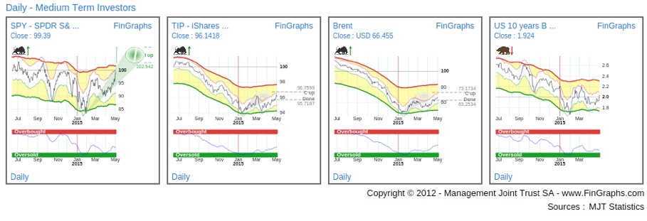
The first chart, as we have already seen above, proxies the re-emergance of a cyclical uptrend following last year’s defensive consolidation (on a relative basis). SPY has continued its measured advance while treasuries (TLT) have started to correct. The development of inflation expectations anticipated by the market can be derived by comparing the price of TIPS (inflation adjusted bonds) to the Treasury Bond ETF with a similar duration, in this case IEF (second chart). When this ratio is on the rise, investors, on average, are seeking additional inflation protection to what is already priced into the nominal Treasury Bond yields. This ratio has also been on the rise since January. It is interesting to consider how correlated this second chart is to the price of Brent Oil (third chart). This leads us to comment that, for now, rising inflation expectations are mostly related to the correction up in oil. Finally, US treasury yields (fourth chart) have also been reacting up. Following a strong move in February (Dollar flat, Oil correction up), the second reaction up in April is more subdued. What we may preliminary conclude for now is that 10Y Treasury yields have reacted up this January but that this reaction is still very tamed, i.e. in the initial stages of a correction up. We will now review the Investor’s View of the 10Y US Swaps to gain further perspective on the trends at play (we are using the Swaps as we do have Intraday data on them to create our Hourly chart, this is not the case for now on US Treasury yields).
Investor’s View – USD 10Y Interest Rate swap rates:
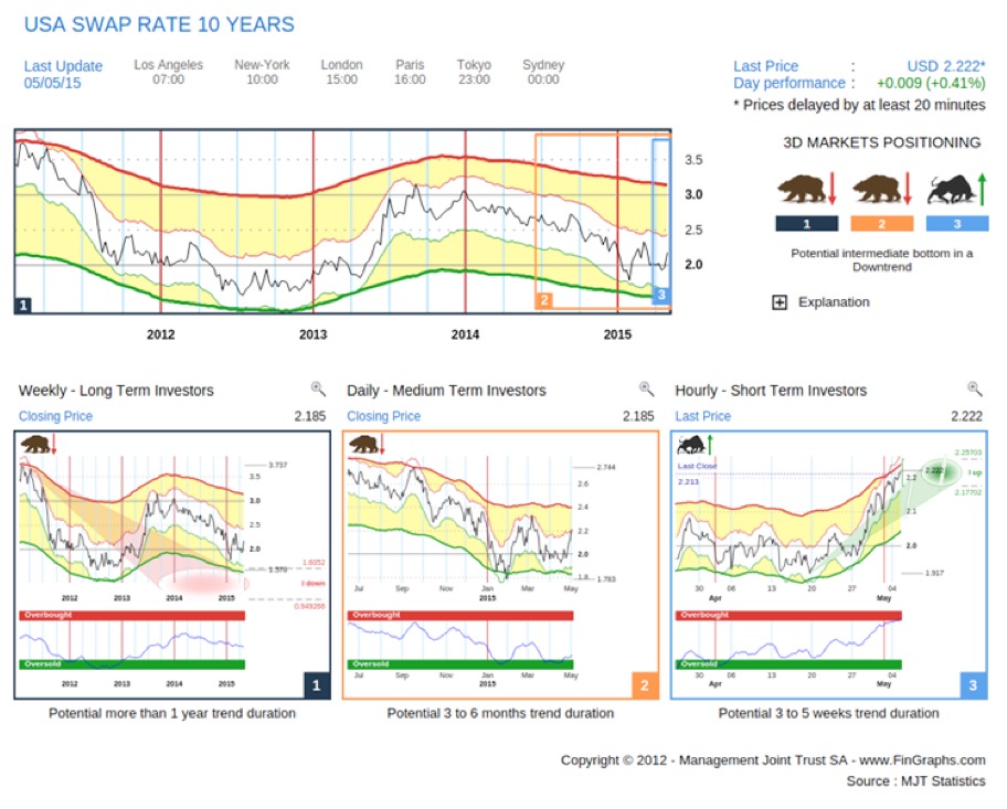
The Weekly (left hand chart) is still in an impulsive downtrend with targets pointing lower possibly to between 1.6% to 1.0%. The time horizon is unclear, yet Weekly charts usually give a perspective over the next few Quarters. The Risk Index is mid range and doesn’t reflect any strong exaggeration for now. Although US yields may have entered a temporary correction up, the Weekly trend for now is still probably down. The Daily (middle chart) is neutral following its reaction up from January (still in a Bear with no targets). The Risk index is quite Oversold and turning, which may support further upside momentum in this countertrend. Yet, to cast doubt over the Weekly trend, it would really need to accelerate, turn positive and ideally make it above its corrective targets up. This is not yet the case, despite the strong short term rally that we are seeing on our Hourly (right hand chart). To summarize, it’s hard to see more than an intermediate correction up for now in long dated US yields. If you were to consider the yield curve or the spread differential between a 10Y$ Swap rate and a 2Y$ Swap rate (which for now you cannot do on FinGraphs, hopefully soon), you would come to similar conclusions: on our Weekly charts, the trend would still be positioned towards a flattening of the curve over the next few Quarters. The Daily is in a slight correction up, but hasn’t really accelerated yet.
As I am writing this afternoon, the worst US Trade Balance (March 2015) since 2008 hit the screens. Exports increased slightly and Imports soared. Yet what would you expect, when the current recovery is widely consumer based thanks to the strong Dollar and the drop in oil prices. “You can’t have your cake and eat it”. At least, the US is allowing the rest of the world to catch up.
Now considering the FED and its drive to tighten in 2015. We believe that the strong Dollar and the related crash in Oil have provided a beneficial, quasi fiscal, stimulus to the US economy and that the current cyclical upturn is widely driven by this impulse. Indeed, other interest sensitive sectors are still lagging (think Financials or Industrials) and the anticipation of inflation is just starting to react up.
In its statement last week, the FED has removed any guidance on when it is likely to raise interest rates. It also had to dismiss the disappointing preliminary Q1 GDP estimates as mostly influenced by transitory factors. Yet, there are also signs of hope in the recent data releases: consumer spending has accelerated at the end of Q1 (increased USD purchasing power?), more surprisingly given the strong Dollar, initial unemployment weekly claims just registered a 15 year low and even wages now seem to be growing at a year on year 2.6% rate. All eyes should now be on this week Non-farm payrolls numbers. If they surprise to the upside, it may provide encouragement to the now data dependent FED. In a way, the FED has painted itself into a corner: if it raises too early, it runs the risk of choking off a recovery which is still pretty thin in terms out-performance by cyclical sectors. If it delays its decision too long, it may loose the market’s confidence: growth perspectives may be revised down, the Dollar would continue to correct, oil continue to rebound, positive consumer trends could reverse and other international markets could move lower again. With higher oil prices, inflation expectations would probably follow suit, which against a background of slower economic growth may remind us of stagflation.
Hence, we believe the FED needs to solve a difficult conundrum and we understand why it has become very data dependent. As a last chart, we will look at the investor’s View of Brent Oil.
Brent Oil – Investor’s View:
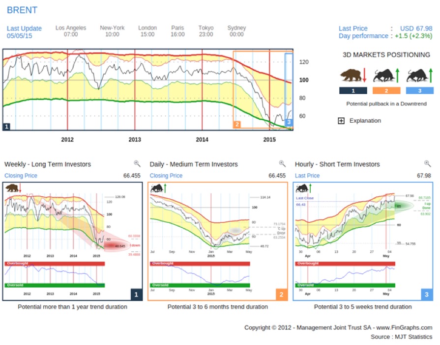
The Weekly (left hand chart) trend is still pointing lower over the next few Quarters. We would really start worrying if the Daily (middle chart) correction up made it into impulsive territory (i.e. above the outer boundary of its corrective targets up). On Brent Oil, this would be slightly above USD 73 / barrel (above USD 66.4 / barrel on WTI): Such a move would cast doubt over the long term Weekly downtrend.
Previous article mentioned in this paper:
Let’s hope for continued Dollar strength (21st April 2015):
http://stockcharts.com/articles/tac/2015/04/fingraphs-lets-wish-for-continued-dollar-strength.html
For more information on our methodology click here (http://www.fingraphs.com/#couponid-STKCHARTS14) and then view the Introduction slide-show and visit the ‘User Guide’ section on our website. Clicking that link also qualifies you for a 7 day demo and a 10% discount on our services if you choose to subscribe.
We wish you all the best with your trading week, J-F Owczarczak (@fingraphs)