
I like getting answers ahead of time. And so I tend to be more open-minded than others about where I am willing to look for such answers. If you look at the same things everyone else looks at, you'll get the same answers. This one’s going to blow your minds away, so proceed slowly.
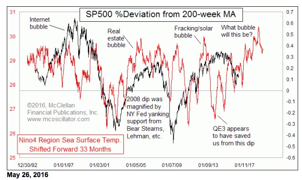
There is a relationship between the El Niño & La Niña cycles and the stock market, but it takes a trick of chartistry to see. That’s what this week’s chart is all about. It shows the changes in the sea surface temperature (SST) in the NINO4 region of the Pacific ocean compared to a detrended representation of the SP500; the data are from NOAA’s web site. The key trick is that the NINO4 data are shifted forward by 33 months to achieve a better alignment of the chart structures. Making that adjustment reveals the future path for this detrended measure of the SP500’s movements.
So what the heck is NINO4?
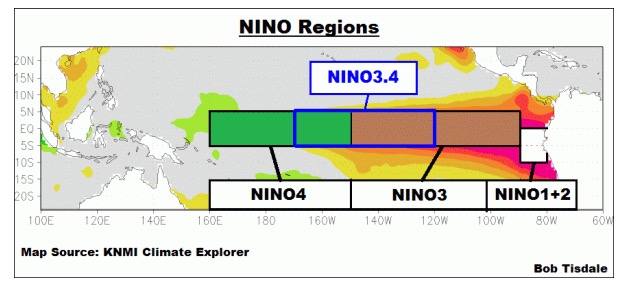
Meteorologists who study the El Niño and La Niña phenomena of ocean surface temperatures divide the equatorial Pacific Ocean into different regions for analysis. Here is a graphic showing what each region refers to, courtesy of climatologist Bob Tisdale, and it is used here with his permission:
The reason to look all the way out to the NINO4 region, which is way the heck out in the middle of the Pacific Ocean, is that the other regions show a heavy influence of annual seasonality. Here is a chart of all of them, so you can see what I mean:
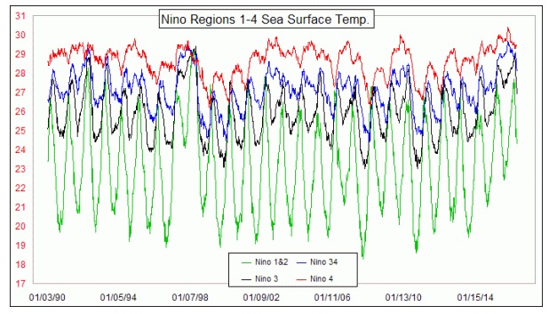
The closer a region is to South America, the greater the seasonal effect. We could adjust that effect away with a statistical seasonality adjustment, or alternatively we could just use the data series least subject to that effect, which is the NINO4 series.
Turning back to the top chart, it does not explain to us why there should be any relationship at all between global average temperatures and stock price movements. It just shows that there is such a relationship. My presumption is that the connection is agricultural, with a connection via food price inflation, and thus the Fed, and thus all subsequent lagged responses. But irrespective of whether we can figure out any cause-effect relationship, when there is enough data to show that a relationship exists, then at some point we can set aside the “why” question.
How much data is enough? That’s a somewhat philosophical question. But seeing this relationship “work” for the most part ever since 1993 (23 years and counting which is as far back as the data go) seems to be good enough to show that there is something to it, even if it is not perfect. The warming of the early 1990s led to the Internet bubble. And the cooling which began in 1998 led to the big stock price selloff in 2000-02. The ensuing waxing and waning periods for ocean temperatures saw their echoes about 33 months later in the movements of the SP500.
Why 33 months? I have no answer. I only see what the data have been doing over 1376 weeks of the NINO series of temperature data. 33 months is the lag period which results in the best fit between the two patterns.
Looking closer, we see that the recent quiet action in stock prices is the echo of a corresponding quiet period in ocean temperatures almost 3 years prior, ahead of the recent big upward spike that has led to record global average surface temperatures. The echo of that quiet period for temperatures is foretells a bottom in stock prices equating to Oct. 16, 2016.
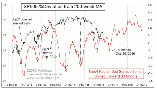
After then, the SST data suggest we should see a pretty significant bull market, lasting into 2018 before the collapse of the very recent El Niño should have its echo as a collapse in stock prices.
Past El Niño surges in ocean temperatures have seen their echoes in an Internet bubble, a real estate bubble, and a fracking and alternative energy bubble. It would be mere supposition to guess how the upcoming bubble is going to be characterized. But we should accept that there is enough evidence now to believe in this phenomenon, and to accept its validity even if we cannot understand why it exists. Get ready for a big new bull market after October 2016.
But also know that the peak of the most recent El Niño came the week of Nov. 18, 2015. Add 33 months to that, and it projects a top for stock prices in August 2018. That's pretty close to the June 2018 target from crude oil's 10-year leading indication.
Tom McClellan
The McClellan Market Report
www.mcoscillator.com