In my March 11th article for StockCharts, entitled "Identifying Opportunity From Fear", I pointed out that the benchmark S&P 500 (SPX) was testing formidable underlying support at 2856 to 2822 and said that, should this area be broken, it would clear the way for an additional 5% decline to 2604. It turned out that 2856-2823 was just a minor speed bump, as the US broad market index subsequently collapsed by an additional 20% decline into to Monday's 2192 low. The question I have been getting from clients this week, over and over again, is "when will we know that a bottom is in, and that it's safe to go back into the market?"
When Does Fear Become Opportunity?
Because this market decline is a public health/medical related issue, rather than a financial one, there isn't much to compare it to. There was the 1918 influenza pandemic, but that was 100 years ago and medicine, technology, and life itself have changed a lot since then. What we do have, though, are quantitative metrics that enable us to measure this market collapse against other historically important declines.
Chart 1 below plots SPX monthly in the upper panel, with the index's 12-month (1 year) rate of change plotted by the blue line in the lower panel. The green dashed line shows that the broad market index is closing in on a 40-year negative (bearish) extreme in price momentum that had previously coincided with major market bottoms in 1988, 2001 and 2009.
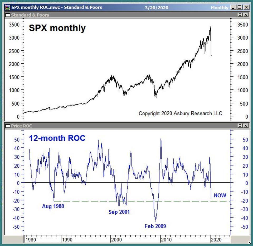
Chart 1
This metric does not indicate a buying opportunity. At least, not yet. Rather, it is a quantitative, historic indication that the US stock market has sunk to an extreme level of pessimism level that has previously coincided with other important market bottoms. However, other metrics we track are corroborating the potential importance of this extreme.
The Fear Gauge
Another way to get some historical context on the current situation is by measuring investor fear. Chart 2 below plots the S&P 500 daily since 2006 in the upper panel, with the CBOE Volatility Index - better known as the VIX or the Fear Gauge - plotted in the lower panel.
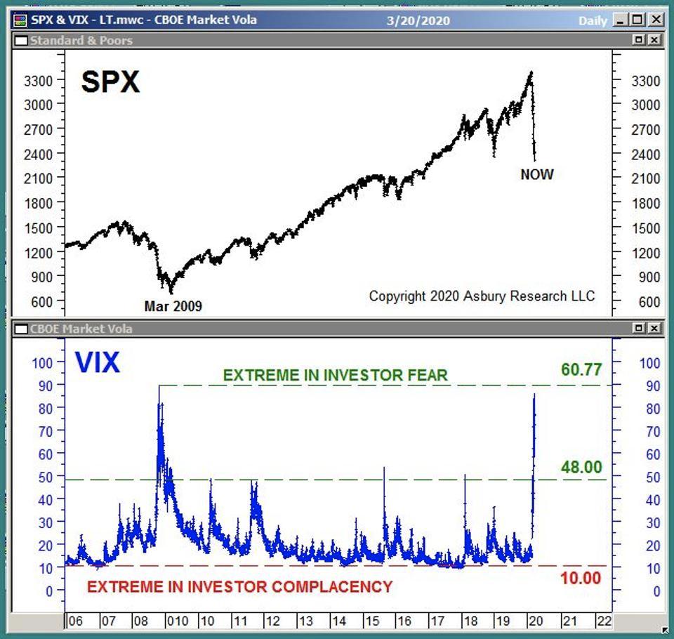
Chart 2
The chart shows that the VIX, which traded as high as 85.39 last week, is testing its March 2009 extreme of 89.53 - and that the latter coincided with the US stock market's previous major bottom in March 2009. This bottom marked the end of the 2008 Financial Crisis — which was at a time when investors were terrified of the idea of buying stocks.
The Game Board
People say the market has a memory. But it's really the collective intelligence of investors that has a memory, and this memory reveals itself in price charts. Chart 3 below plots the S&P 500 weekly since 2007 and highlights the important levels of underlying support below the market. These support levels typically represent important old highs, old lows and trend lines that represent buying or selling patterns.
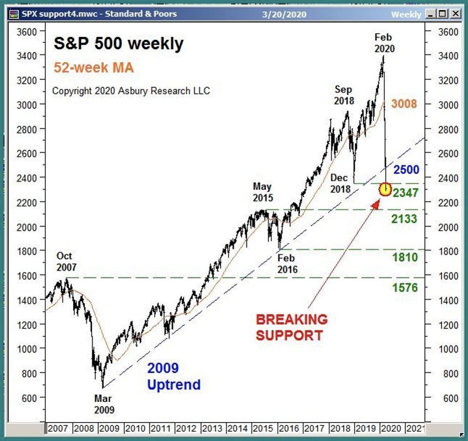
Chart 3
The colored highlights point out that SPX declined below its 2009 uptrend at 2500 (blue) and December 2018 benchmark low at 2347 (green) last week.
This breakdown, especially during a period of extreme investor fear like this one, clears the way for a potential decline to the next important underlying support level at 2133, which is the May 2015 benchmark high. Below 2133, the next major level is an additional 15.1% lower at 1810, which is the the February 2016 benchmark low.
When A Support Level Becomes Actionable
Strategic metrics tell you where, by historical standards, you should start looking for a market bottom. The lower panels of Charts 1 and 2 display strategic metrics. Tactical metrics tell you when a strategic bottom has become actionable.
Charts 1 and 2 above indicate that, by quantitative historical measures, the US stock market is depressed enough, and investors are afraid enough, to produce a strategic market bottom. What is still missing, though — at least according to our analysis at Asbury Research — is tactical evidence that a bottom is actually in place.
For perspective, the previous in-house tactical signal we had was on February 24th, when our Correction Protection Model (CPM) moved to a Risk Off status — from Risk on in mid October 2019. When CPM shifts back to a Risk On status, it will indicate to us that market internals have improved to the point that they are once again conducive to a price advance. Then, we will use a chart like Chart 3 above to "game out" just how much capital to put back to work, as well as where and when to add more.
For the average individual investor, there are a number of technical/quantitative tools available in most basic online charting packages that can be used as tactical signals. But, more importantly, I suggest investors first identify the key levels in the major indexes you invest in - your "game board" - so you can define your risk and plan your entry and exit levels accordingly, no matter what the market does next. This way, you are always making investment decisions based on a rational, logical plan rather than on fear or greed.
John
John Kosar, CMT
Chief Market Strategist, Asbury Research
You can sign up for Asbury Research's free bi-weekly Stock Market Update by clicking here.