In this article, we are going to look at a few potential early turning signs in the corn futures market, which has been in a downtrend and large range since 2012. We will also look at an ETF related to the corn futures market. Investors and traders who do not trade futures can use ETFs as a proxy, learn technical tools to track a futures market to invest in, or trade with ETFs or even individual stocks. You'll find ETFs easily on StockCharts.com for just about any futures market.
The symbols we will look at in this article are:
- $CORN - continuous futures
- CORN - Teucrium Corn Fund
There are many other companies that are tied to the Corn futures markets - they can easily be looked up on the internet for analysis.
Note: None of the markets, ETFs or stocks listed in this article are recommendations to buy or sell; this article is intended for educational purposes only.
In my technical analysis-based approach, I use methods to try and uncover early footprints of a change in character of a market. When applying this type of method and combining price behavior, pattern recognition and indicators, such as RSI as we will use in this article, we not only can learn to identify turning points, but also the price points or price behavior that indicate the analysis is invalid and we start again. In other words, sometimes the first attempt will fail, but learn to stick with your method and know it well.
Chart 1 below is a monthly chart of the $CORN futures continuous contract. The ETF CORN is shown as a price comparison in the upper section, in purple.
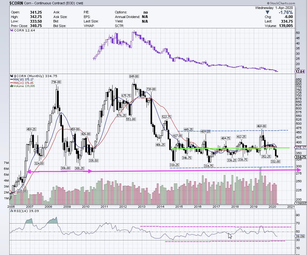
CHART 1: Monthly $CORN Futures
This chart is looking back to 2006 to the present, April 2020. We can clearly see corn has been in a downtrend and formed a very large range from the end of 2014 to the present.
The lower window has the RSI indicator plotted and dashed pink horizontal lines marking the high and lows of the RSI range. RSI ranges can be a very good tool, among others, to use to help detect a change in character of price. It is a good tool to also spot divergences. There was a clear divergence of RSI and price at the 2012 price highs, where price made a higher high and the RSI made a lower high.
The price range is marked with blue-dashed horizontal lines, and you will notice a green horizontal line through the center. When ranges are formed, there tends to be a center that price will trade up, down and around many times. It is important to note the center price, as it is an area of pause or uncertainty before either the bulls or bears eventually, but decisively, move price away from the center.
If you follow the dashed portion of the green horizontal line to the left of the chart, you will see previous price areas of coiling the market made around that price level before moving strongly to the upside. Here, we are seeing price moving from the center, around the 375 area, down towards the lower end of the range. This is where there may opportunity, especially with such a large, well-defined range.
The lower end of the range, based on previous price behavior, has acted as support. Price may act as support again on a test to this area and move back up towards the center of the large range (coil).
Identifying this large pattern can now let us do some detective work, in order to potentially spot a reversal around the lower end of the range for a move back towards the center (or possibly further). Here is where we can also identify where the price behavior would negate the analysis. Strong bars through the lower end of this range would likely negate the analysis for a move up.
Let's talk about different scenarios of price behavior around these types of ranges. Knowing different price behaviors can set the next move for a trader. It can tell them they are wrong in analysis, or correct and follow price accordingly.
- Successful breakout with follow-through trending move.
- Failed breakout attempt, price returns back into range, many times back towards the center.
- Failed breakout on one end, reverses and successfully breaks out other end of range. These can be the strongest breakouts because they have fooled the most people.
- Failed breakout on one end, price reverses and breaks out on opposite end, fails a second time and returns into range.
Ranges such as this will eventually have a breakout move in one direction or another. You can see that from this timeline, where this has formed over several years and needs a large catalyst to move it out of the range.
When they have a successful breakout, momentum accompanies the breakout, which can be seen on indicators (such as volume), momentum indicators (such as MACD and others), strong bars in direction of the breakout, successful retests of the breakout area and trending-type behavior in the aftermath.
Chart 2 is a section of the monthly $CORN chart, so we can see the price levels of the range.
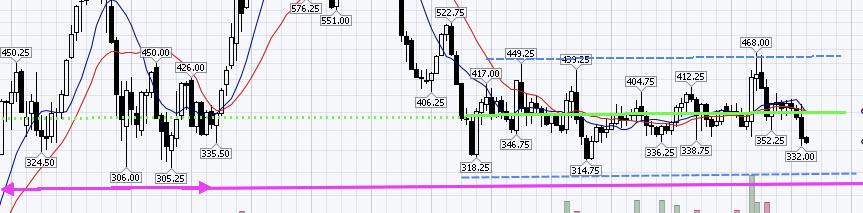
CHART 2: $CORN Monthly
Slightly below the dashed blue lower horizontal line, to the left of chart, are lows around 305. As I mentioned, false breaks can occur. This is a scenario to watch here. If price were to break the lows of the range below the 314 area, test just above 300 and quickly move back up above 314-318, that may indicate a false move to the downside. However, if there are large, strong bars with momentum breaking the lows, that would indicate a successful breakout to the downside. Evaluating these levels and scenarios can help traders determine how much risk is needed.
Let's now drill down to a Intraday time frame to help us locate potential setup opportunities.
CHART 3: 60-minute $CORN Futures
The 60-minute view in Chart 3 is showing buy patterns forming. There is an AB=CD buy pattern (please refer to the book Trade What You See, How to Profit From Pattern Recognitionfor detailed description of these patterns, or visit my website at www.tradingliveonline.com) and, if the price exceeded the X point of the pattern and continued lower, there will be Fibonacci extensions of this pattern marked in the yellow circle, which, as you can see from studying Chart 2, are just at the lower end of the large range we covered in Chart 1. This would be a Butterfly reversal buy pattern, as described in the aforementioned book.
As anyone who has experience with technical analysis can verify, any pattern can fail. The Butterfly pattern is no exception. Determining risk in advance is crucial for any trading or investment decisions.
For traders or investors who would use the ETF CORN as a proxy for the futures, let's look at a 60-minute chart of that symbol and do some analysis.
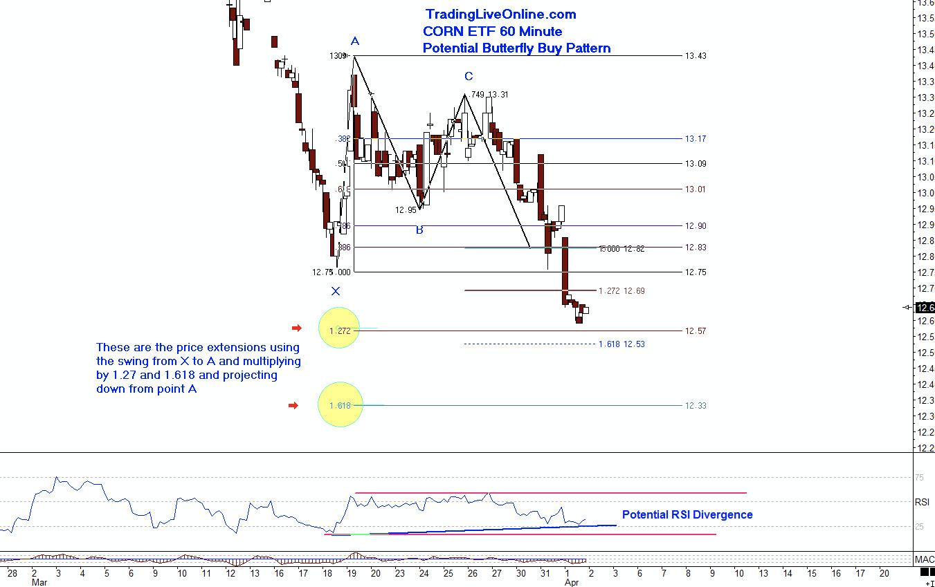
CHART 4: 60 Minute ETF CORN
If you refer back to Chart 1 and the upper portion of chart, with price comparison of the ETF CORN to the futures, you will notice the ETF has been weaker in price than the futures market. While the futures $CORN has formed a large range, the ETF CORN continued lower in downtrend fashion. Although there is a Butterfly buy pattern visible on Chart 4, it is not prudent to step in before some type of confirmation.
There is potential bullish divergence on the RSI, but this may need more confirmation, such as a stronger move up.
The Butterfly patterns are among the stronger reversal patterns, meaning that, when the markets do turn, there can be powerful moves. However, when they fail, those moves can also be very powerful. I urge you to study this pattern and feel free to email me or visit my website for materials. This pattern is also covered at length in the previously-mentioned book.
There are several methods traders and investors can study for entry in this type of scenario - here are a few to study:
- Trend line breaks
- Candlestick confirmation
- Wait for price movement to upside, then use a retracement (formation of higher low)
From here, we will monitor these markets for validation or invalidation of the analysis and patterns. We never know what price will do. Time will tell if these levels do provide an opportunity for a tradable move back up into the range.
If you would like to learn more, please feel free to contact me at ljouflas@msn.com or through www.TradingLiveOnline.com.
Best wishes for successful trading!
Leslie Jouflas, CMT