Larry Williams | Focus on Stocks I May 2024
Gold, black gold, is what Crude Oil has become. The entire world runs on energy. 98% of our cars and transportation, our lights, the device you are using to read this... virtually everything we can do is thanks to crude oil and coal's conversion to electricity. We may go fully renewable at some point in the future, but that point is still a long way off.
Some say the cost of crude is what causes inflation; often, that appears to be the case. Just as often, though, it looks like this slippery black gold rallies after inflation picks up. You will see my work on this later.
For now, I want to focus on the dance between crude and the stock market.
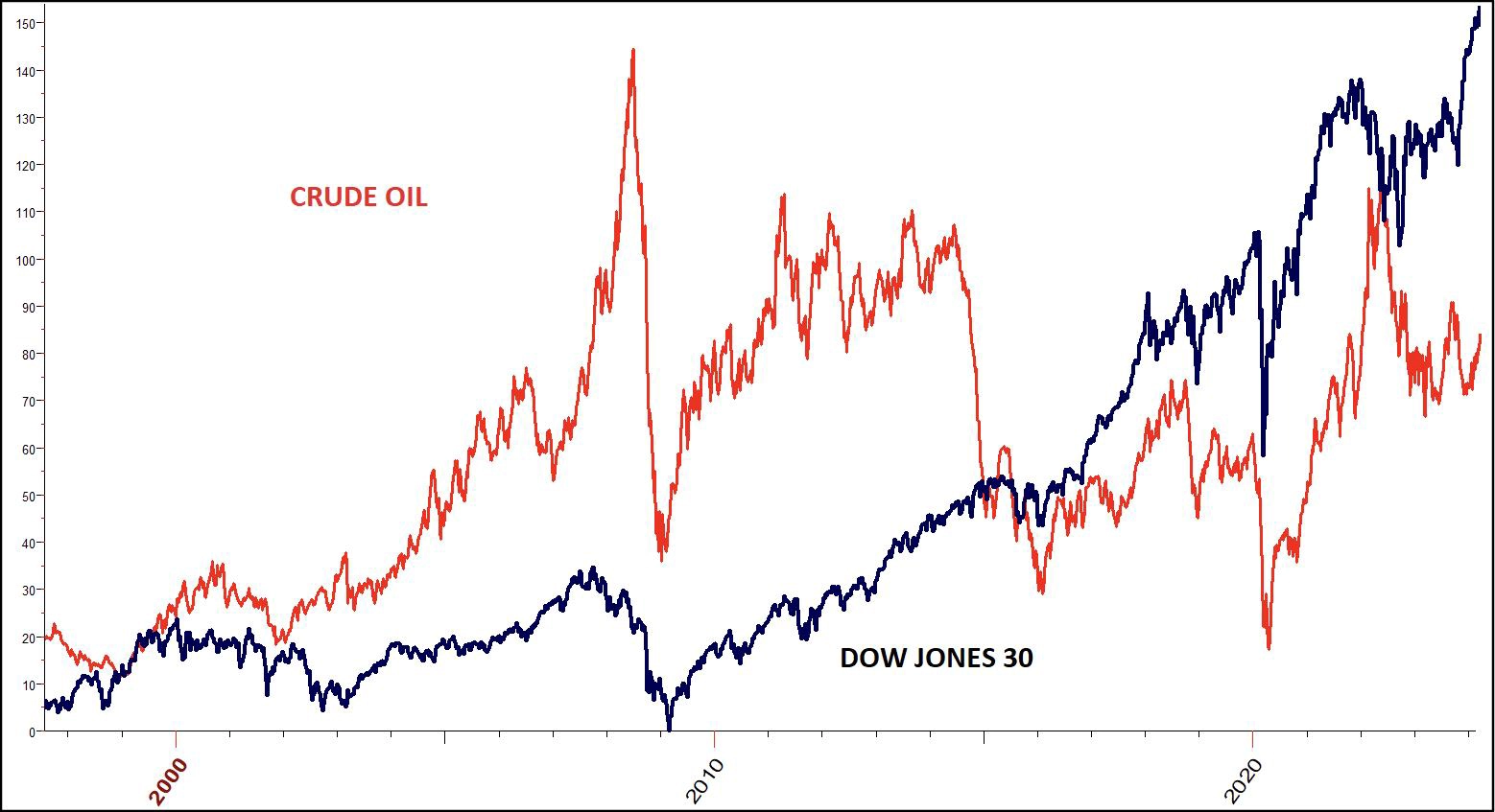
Chart 1: Dow Jones Industrial Average (DJIA) with Crude Oil 1997 to date
First, let's look at how stocks and crude generally move together. In Chart 1, it is clear they generally top and bottom about the same time.
(Here is a special tip for you; major buy signals in stocks have been great times to buy Crude Oil. Stock traders could use USO as it is the largest ETF for Crude Oil.)
Next, I want to share with you a chart of Crude Oil with one of its most important cycles.
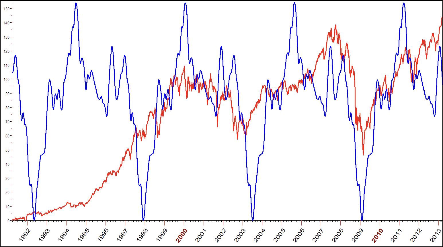
Chart 2: DJIA with Crude Oil Cycle 1992-2013
The blue line is the Crude Oil cycle but applied to stock prices. There are a lot of things to learn here. For one, cycle lows in crude have simply been great times to buy stocks. Meanwhile, cycle highs have sometime given birth to bear markets, like 2000, but not 1994-1997.
With that in mind, let's look at the next chart with 11 more years of data to see what holds up.
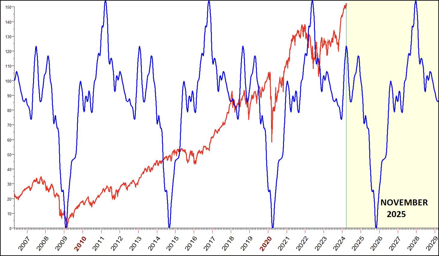
Chart 3: DJIA with Crude Oil Cycle 2007 to 2029
Again, we see the cycle lows – known in advance – have been great buy points. There is another one coming along in late 2025. Projected cycle highs do not seem to be as reliable or effective in calling market tops. Try as I might, I so far have still not been able to get an effective (reliable) stock market sell signal from the energy markets.
It has been argued by many that inflation is just the cost of energy. If so, we should see that relationship on a chart stacked with the price of Crude and real inflation* as shown in the next 6 charts.
Lots to see and learn here, so I have broken the data down into 8-year windows. Let's look!
*I am using here the Sticky Price Consumer Price Index, less food and energy. This way, Crude prices are not in the equation.
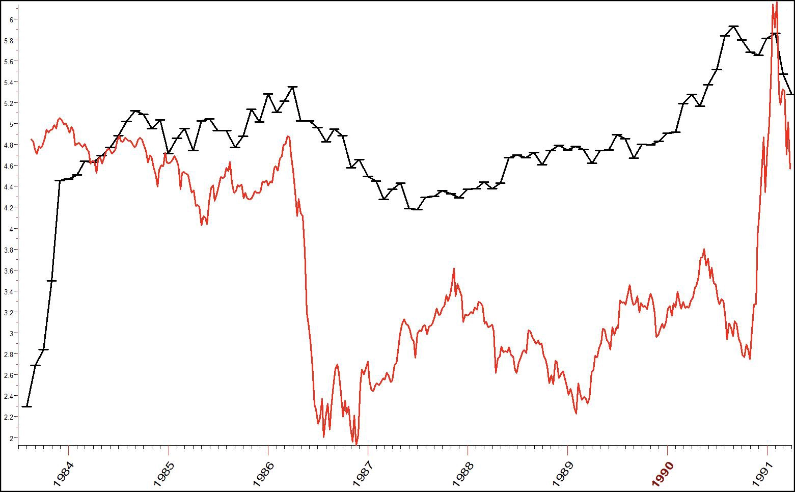
Chart 4: Inflation (CPI) with Crude Oil 1983-1991
We have reliable crude prices back to 1983, so let's begin the journey there. Crude is in red. CPI, or sticky inflation, is in black.
Wowza! Crude rallies then CPI advances. What a match... seems like they dance together, with most peaks and troughs coming at the same time. Here is the payoff; I have shifted crude prices 8 months into the future. In other words, during these 8 years, the general trend of inflation could have been known over half a year in advance.
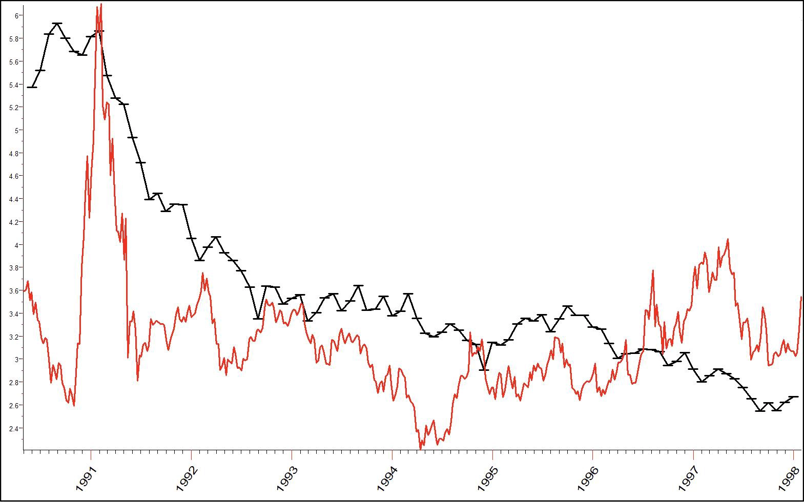
Chart 5: Inflation (CPI) with Crude Oil 1990-1998
Moving forward now to 1990 to 1998 with the same shift in Crude Oil, inflation seems to pretty much increase/decrease after Crude rallies and declines. Will this hold up? Do we have a reliable way to predict inflation? The answer lies in the data. So let's keep looking.
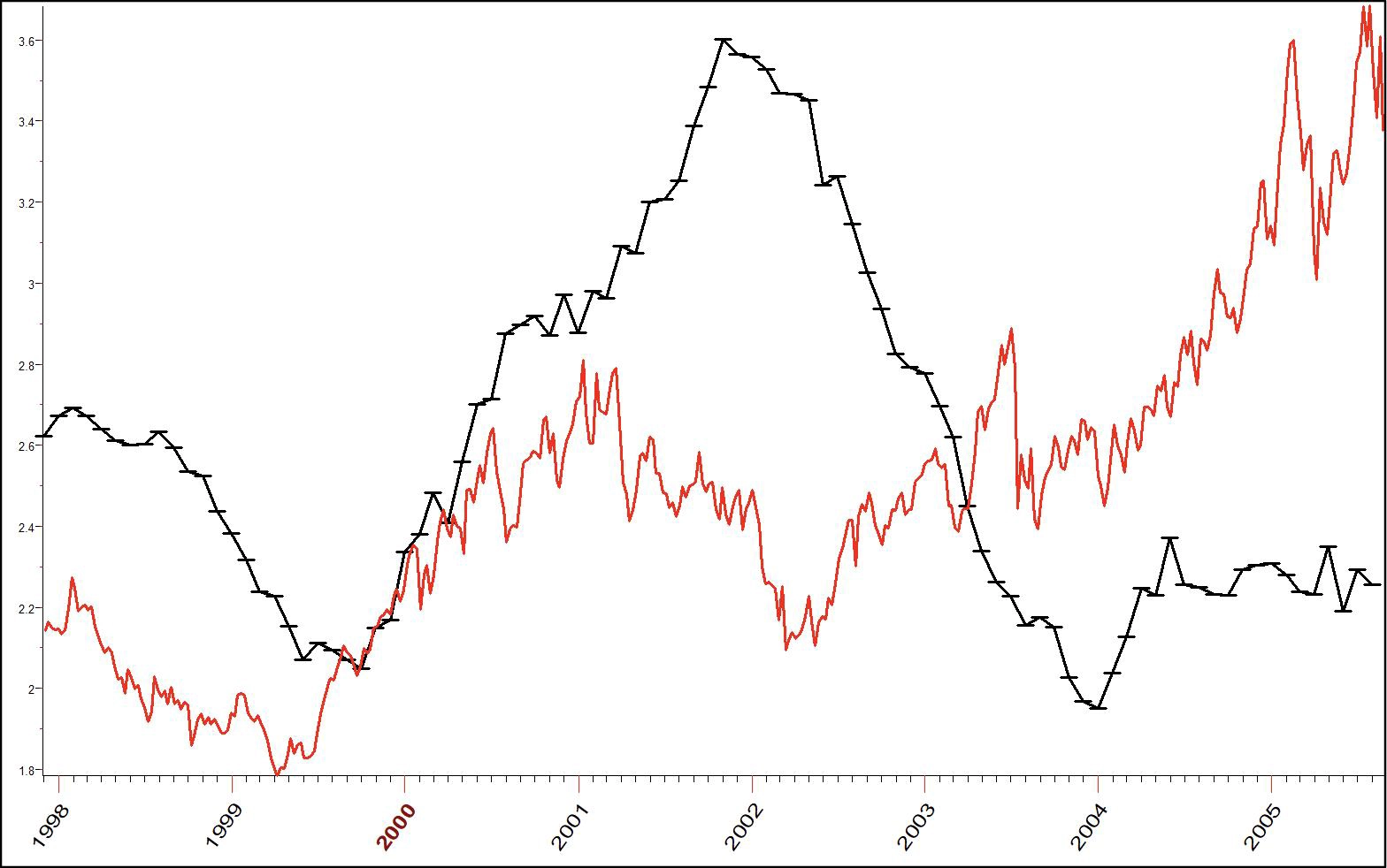
Chart 6: Inflation (CPI) with Crude Oil 1998-2005
The next 8 years reflect the same pattern. Crude Oil was a good indication of the general direction of inflation as well as when to expect it to rise and fall. They stayed with the same song on the dance floor. Perfect? No. Helpful? Undoubtedly.
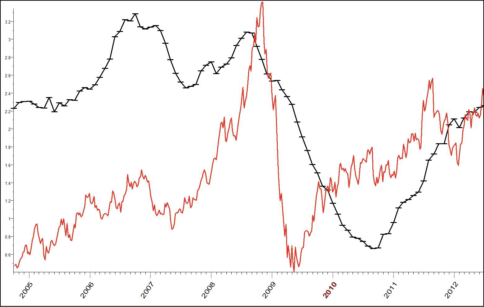
Chart 7: Inflation (CPI) with Crude Oil 2005-2012
Starting in 2005, inflation picked up, as we see in the black line of Chart 7. Was Crude a good harbinger of this? Looks that way to me. Not only was the 2006 increase in inflation forecast, but also the dip down; then, another leg up in inflation was led by the upshot in Crude that began in 2008.
Again, keep in mind the red line of Crude price has been pushed forward 8 months. So the 2008 peak inflation was known by the turn down in Crude at that time.
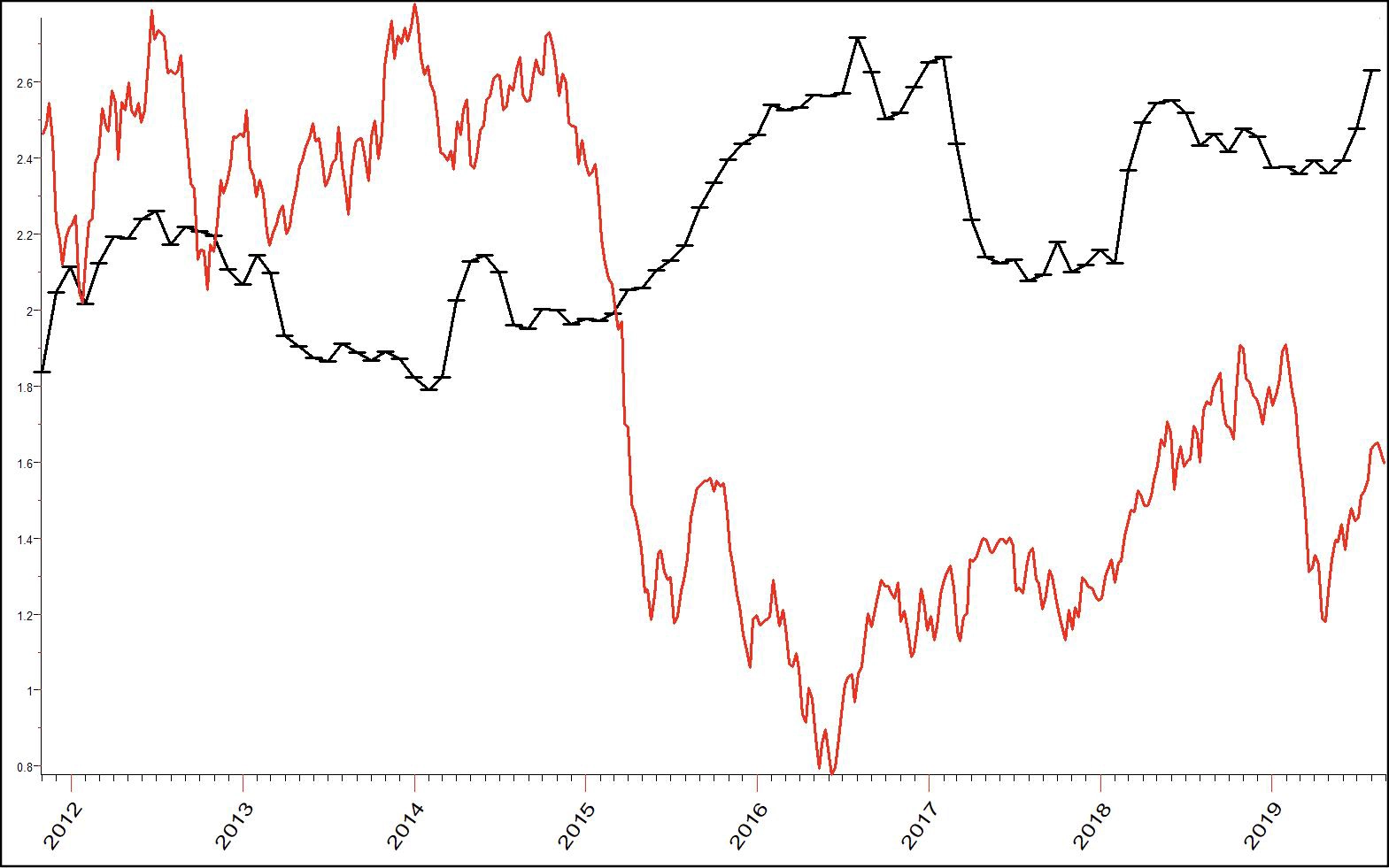
Chart 8: Inflation (CPI) with Crude Oil 2012-2019
Inflation had 3 up waves from 2012 to 2020. Crude forecast the first and third wave, but did not forecast the 2015-2017 increase in the cost of living (as shown by CPI). At the start of 2018, the relationship got back in step. Why was it out of step from 2015-2017? I have looked, but have no idea, other than it is an imperfect world. I do think though, after looking at the history shown in these charts that it is fair to say that, whenever there is a significant increase in the price of Crude, inflation will follow.
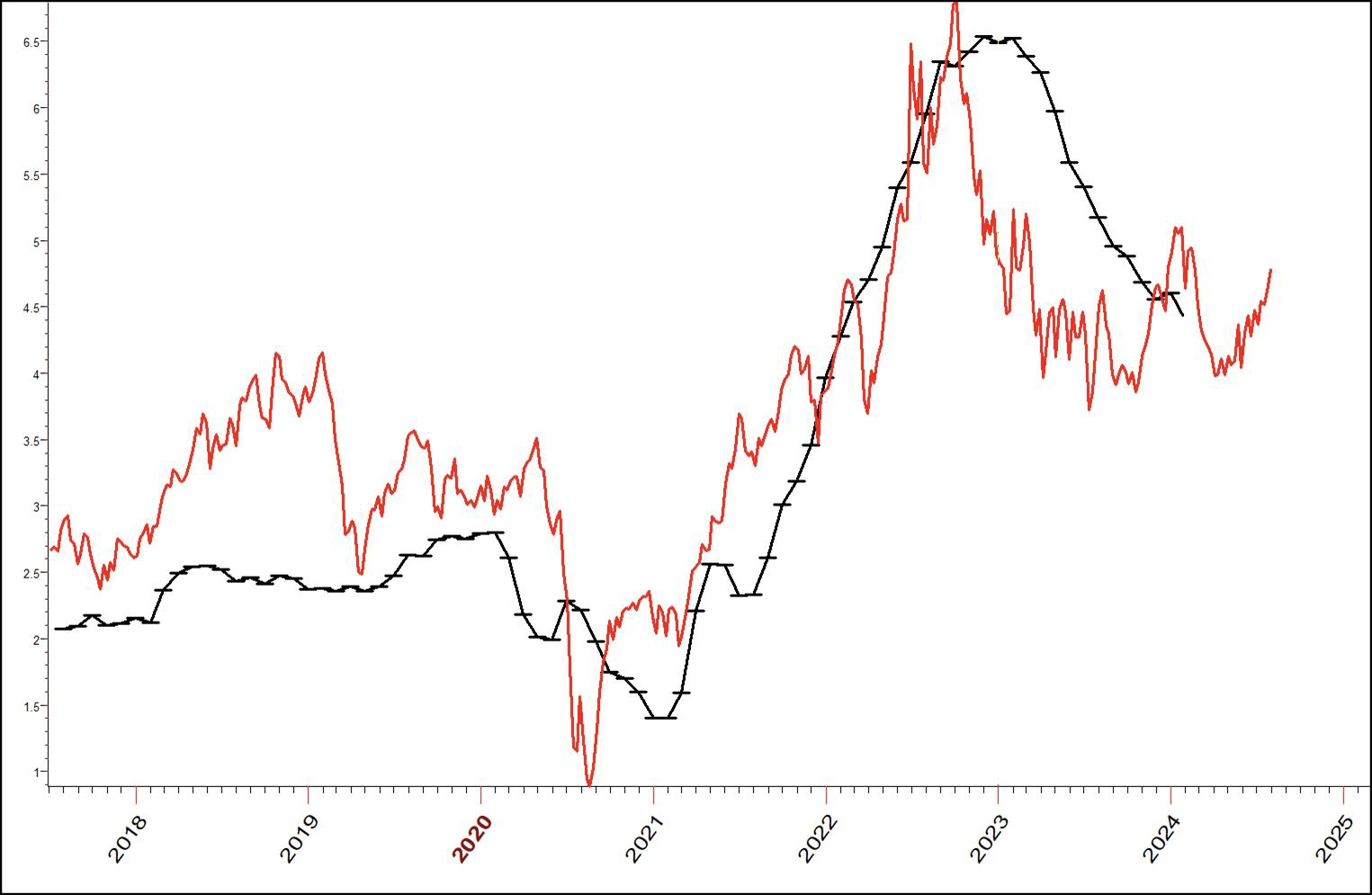
Chart 9: Inflation (CPI) with Crude Oil 2017-2025
Okay gang, we have learned a little from our study of the last 40 years regarding the interaction between Crude and the CPI. So let's closely look at Chart 9 to see what the message is "right here, right now."
If we think that the past repeats, then the only conclusion I can see is that inflation will start to pick back up with the release from the FED in May. We can conclude Crude Oil may not be the total cause of inflation, but it is a large factor. That further suggests they will not cut the discount rate.
I know, I know, academics say we cannot forecast the futur eof the stock market or economic data. I think I can prove them wrong. Here goes.
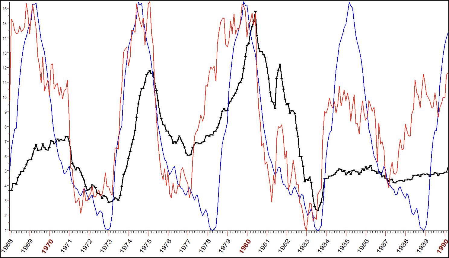
Chart 10: Inflation with Short-Term and Long-Term Cycles 1968-1990
We begin the study starting in 1968. This gives us over half of a century of data to learn from. In Chart 10, you see inflation in black, while in red I have placed the short-term cycle for inflation. Blue is the master or long-term cycle. I think we have enough history here to draw some valid conclusions.
Clearly in the window of 1968 to 1990, inflation peaked and trough-ed with these cycles. The more erratic short-term cycle was a good leading indication as to what was in store.
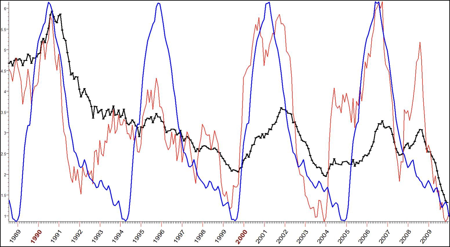
Chart 11: Inflation with Short-Term and Long-Term Cycle Forecast 1989-2009
From 1989 to 2009, we see pretty much the same pattern. This suggests, at least, a cadence to inflation, if not some sort of economic heartbeat for the ebb and tide of the cost of goods in the United States. The red, short-term cycle, at times, is spot on for calling the turns, while, at other times, it seems to be more of a precursor of the future than a hard and fast trail. Yet it does give a good leading indication.
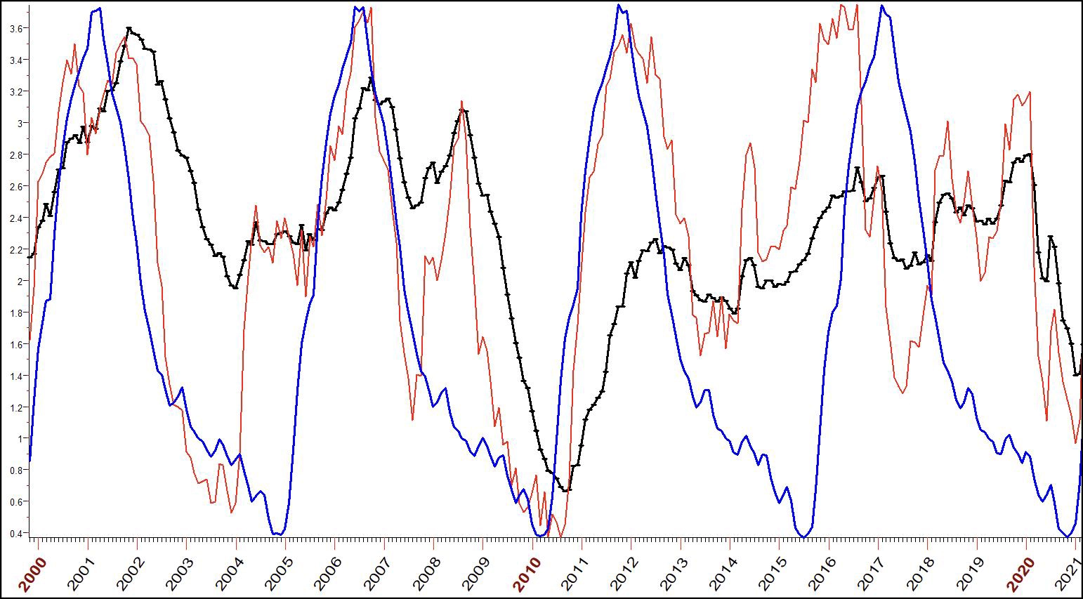
Chart 12: Inflation with Short-Term and Long-Term Cycle Forecast 2000-2021
These same relationships held up well for the next 20 years, not perfect, but knowing the future is never perfect. Helpful though? That's for you to answer. The cycle forecast was early but correct for 2001-2002. In the 2005-2010 time window, the short-term cycle just nailed it, but then was not as precise in 2014
My point is these are tools. Have they in the past indicated the time zones to expect increases and decreases in inflation? I think so, but the past is water under a bridge. How can all these squiggly lines help us prepare for the future?
My academic friends would jump here saying, "Larry, you are just massaging numbers from the past. These things cannot be predicted!" To respond, I would show them this chart from my 2022 annual forecast, predicting a decline in inflation.
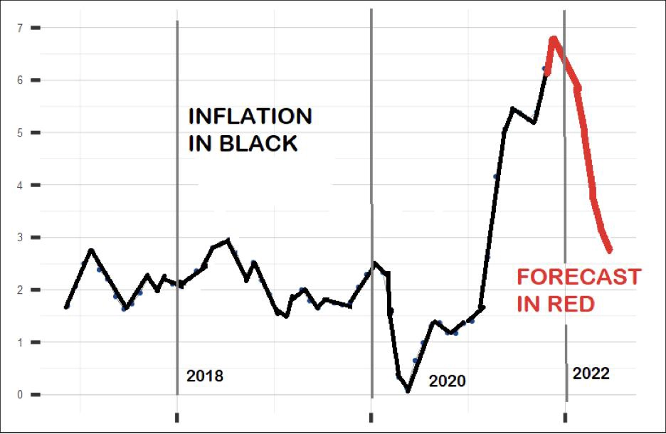
Chart 13: Inflation Projection from 2022 Annual Forecast Report (Chart 22 in Forecast 2022 Report)
Back then, Wall Street was in a panic over inflation. Talk on the street was inflation was about to pick up and kill stock prices. My forecast, written in December 2021, was greeted with jeers, not cheers by numerous of my readers. I could make no argument other than "that's the cycle, and we don't know yet if it is right or wrong."
Well, we do know, as we can see from the next chart documenting inflation up to date with my newest forecast of what is in store. Inflation continued declining in all of 2022, 2023, and so far this year.
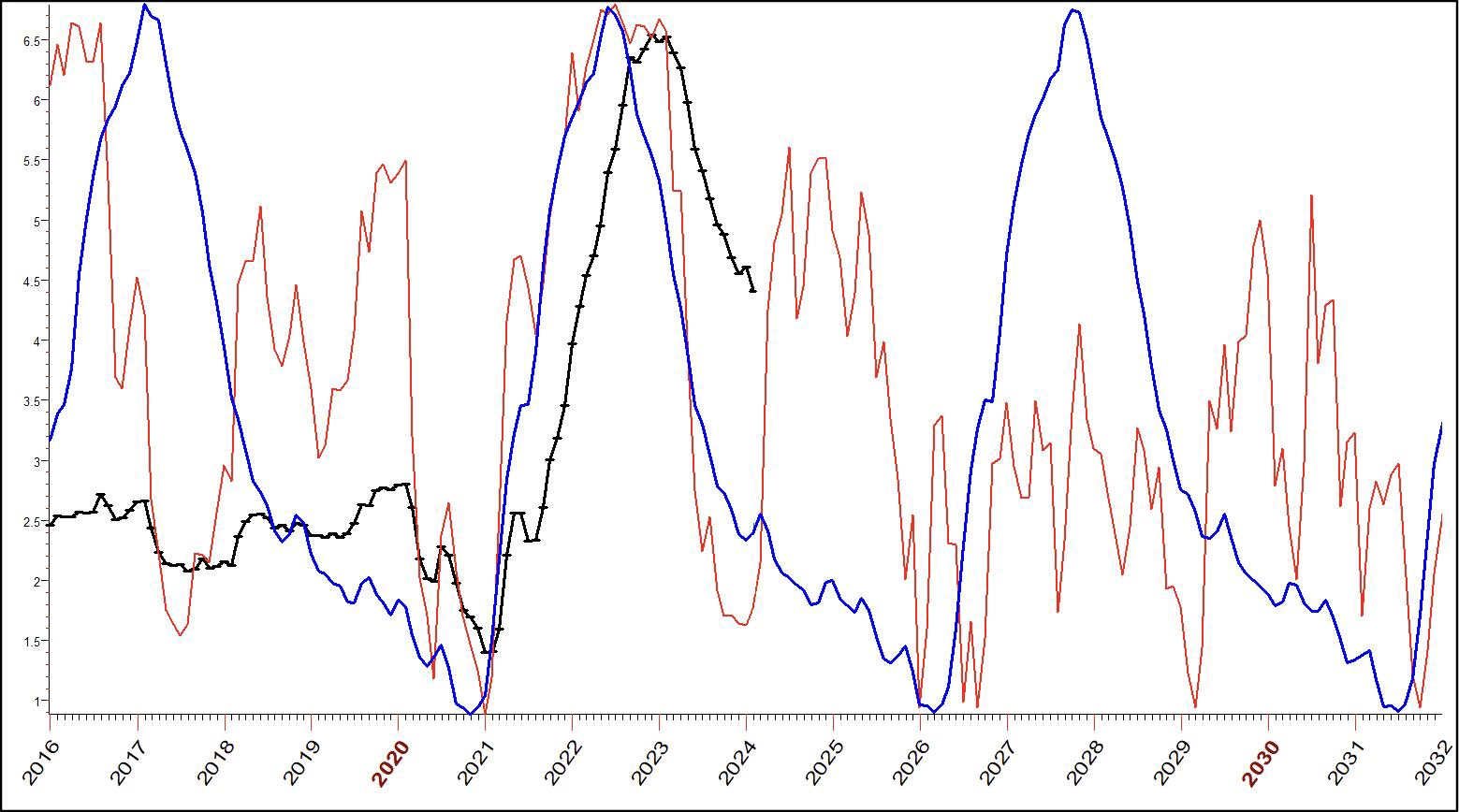
Chart 14: Inflation with Short-Term and Long-Term Cycle Forecast to 2032
I am willing to go way out on a limb here because these two cycles have been so consistent in the past. My expectation is (see short-term cycle) a stop in the down move and, most likely, a bounce back up in the inflation numbers.
Starting next year, we will again see inflation numbers head lower until mid-to-late 2026 when they again begin that long trek back up.
There it is, fellow traders, my forecast for inflation.
That's the $64 question (dating myself here, you youngsters can google that one). Big deal – we can forecast inflation pretty well, but to what use? How can we turn this to our advantage?
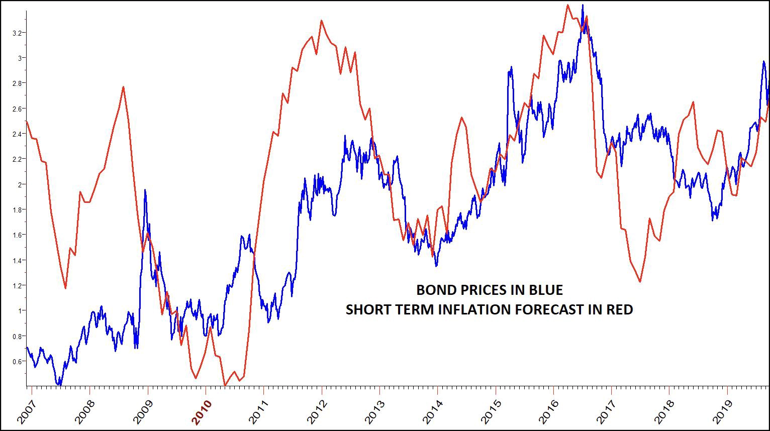
Chart 15: Inflation Cycle Compared to Bond Market 2007-2019
The trick to timing is to know in advance when the turns are coming; that's where cycle projections can help us the most. In Chart 15, the red forecast turning points (up and down swings) were known for more than a year in advance. By and large, knowing this would have been helpful as 30-YearBond prices generally followed not only the pattern, but the time and length of the swings.
That can only lead us into the next chart, a chart showing the shorter-term cycle of inflation for the next 2 years. Each of us will have to conclude how that can help us with positions in the bond/interest rate markets.
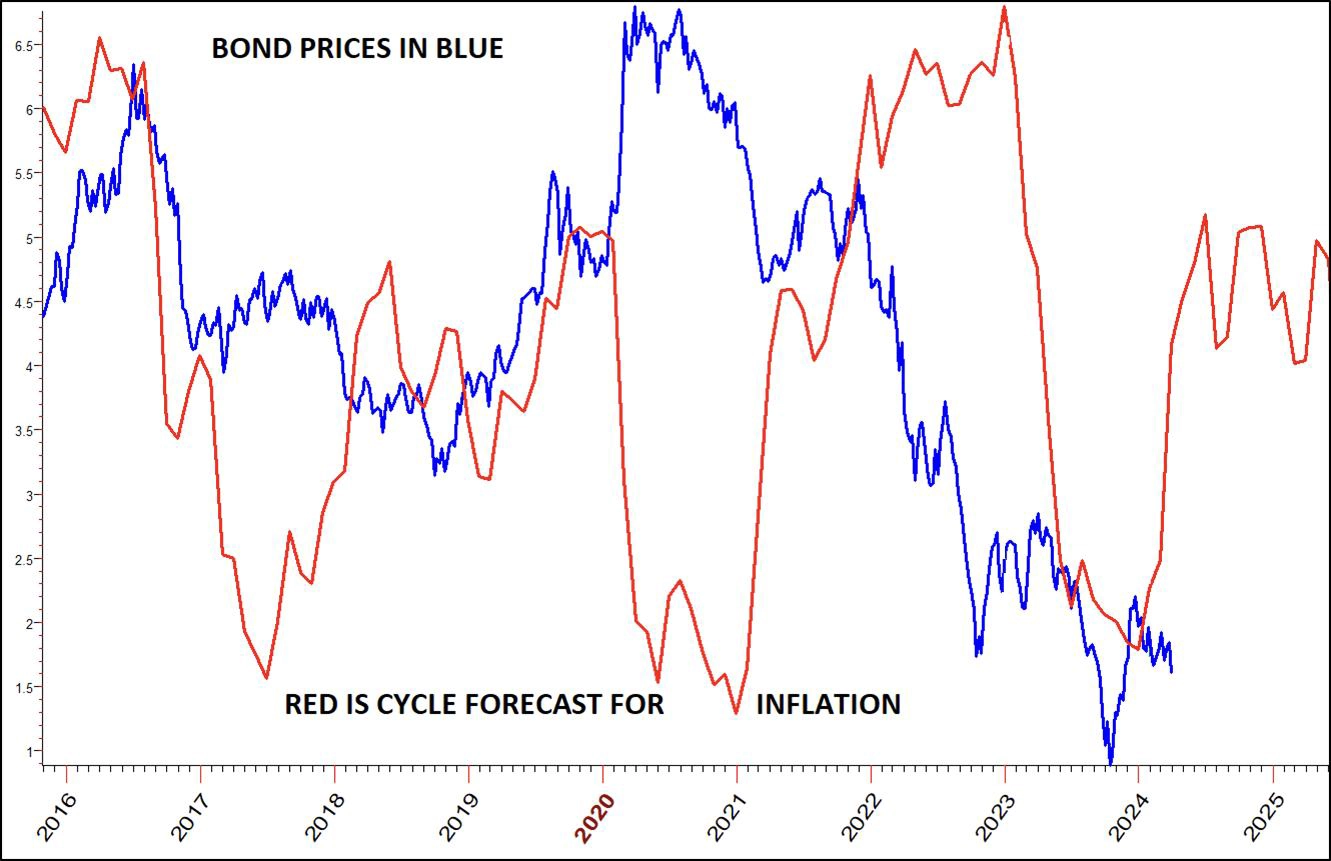
Chart 16: Inflation Cycle Forecast for Bond Market to 2025
The bottom line is it looks like the crash in bonds is about over. There is a fundamental reason; when inflation picks up, bonds rally.
With this clue to the future from inflation, let's look at the actual and current cycle in the 30-year Bond Futures Contract.
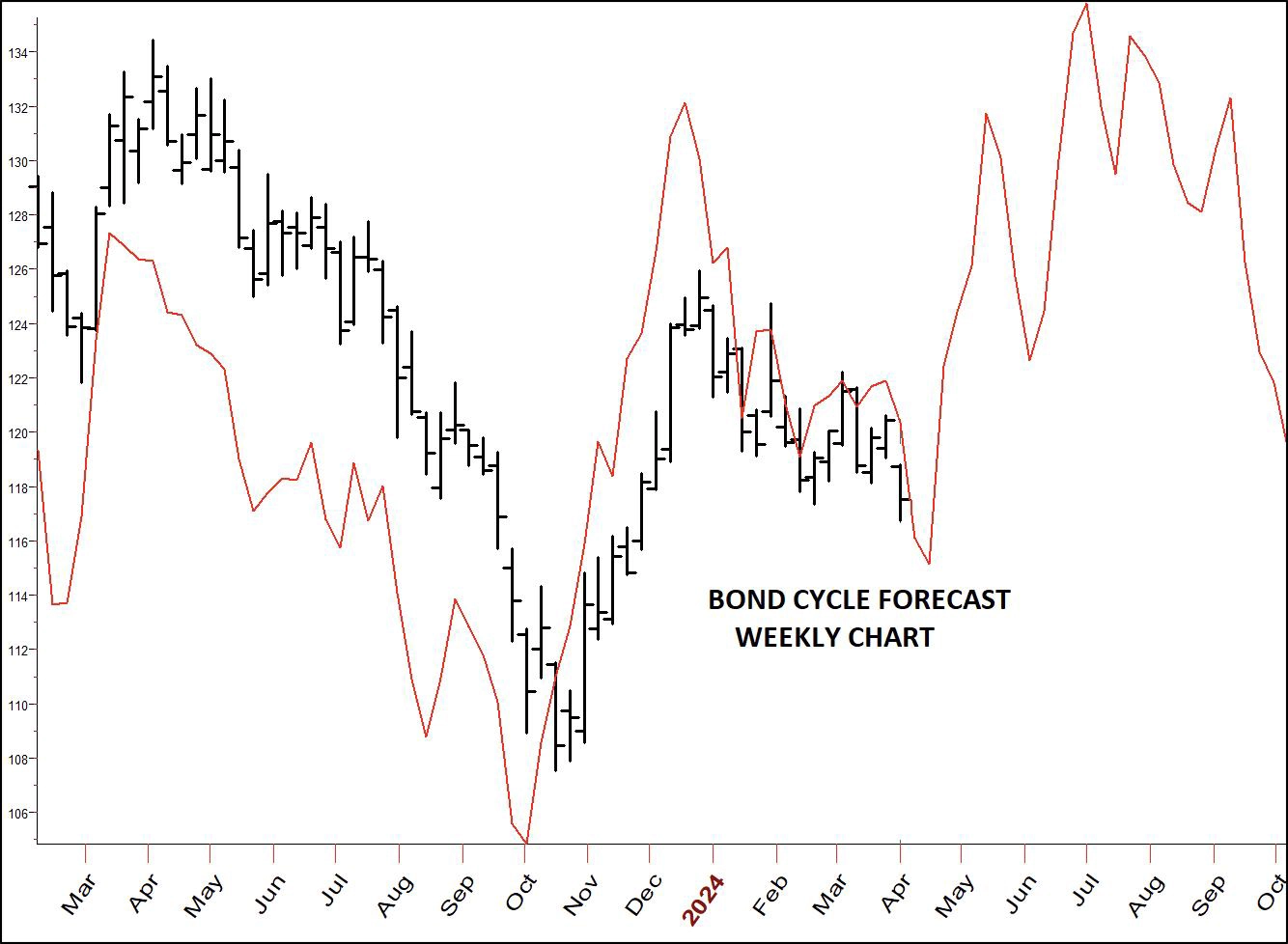
Chart 17: Weekly Cycle Forecast for Bond Market to 2025
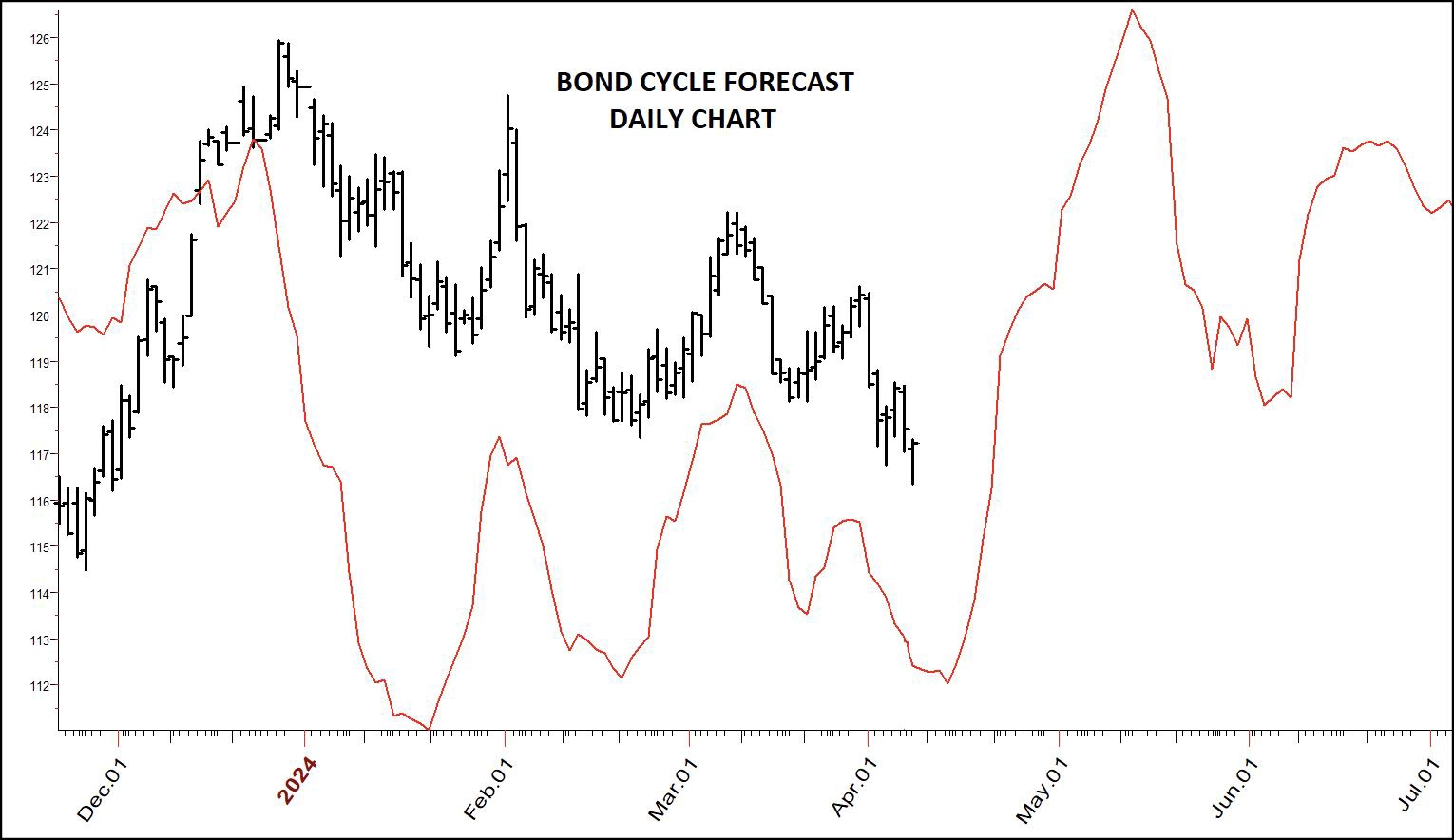
Chart 18: Daily Cycle Forecast for Bond Market to 2025
In Chart 18, I have used daily charts to (hopefully) fine tune all this. Both views suggest it is rally time. Stock traders can buy the ETF for bonds, TLT.
You are more likely to die of heart disease than anything else. It is the leading cause of death in America. In the last reporting year,695,547 people died from it, with cancer close behind at 605,213. If you wantto live a long life, you need to avoid heart problems. It is just that simple.
Preventive measures are diet, exercise, weight and blood pressure control. People who exercise later in life live longer than non-exercisers and are at reduced risk for high blood pressure, heart attacks, premature death, diabetes, strokes and even some cancers.
Exercise is a two-way sword with very sharp edges. Seven years ago, I was diagnosed with arterial fibrillation (A-Fib), an erratic and irregular heartbeat. I was surprised. After all my blood pressure was good, as was my diet. I exercised, having finished 69 marathons plus some ultra-marathons and many half marathons. At first, I could just feel my heart flutter. Later on it was more. I became dizzy, on the verge of blacking out. Occasionally I did.
Why me? Now I know the answer; about 20 percent of almost 1000 long-term competitive endurance athletes, mostly middle-aged men, said they had been diagnosed with atrial fibrillation (Clinical Journal of SportMedicine May 2023, 33(3): p 209-216). I found lots of other studies backing this up; extreme sports lead to A-Fib. In fact, most of my long-distance running buddies have suffered from this.
Competitive athletes appear to be almost two and half times more likely than non-athletes to experience atrial fibrillation (British Journal of Sports Medicine, Oct 2021;55(21):1233-1238).
THE BOTTOM LINE; There can be too much of a good thing. You need to exercise... just not to extremes.
Doctors started me off on a beta blocker to control the irregular heart. The drug caused such awful leg cramps I stopped, eventually having cold laser A-Fib surgery (heart repair). Problem solved, regular heart ever since then.
Last summer, my doctor pointed out my blood pressure was high – not terrible, but higher than it should be. He said he could prescribe medication which has side effects, or add beets and/or beet juice to my diet. I opted for beet juice via an organic beet powder. I mix it into a juice (1 teaspoon) each day. It was amazing... my blood pressure got back into the better range of 120/80 in about a week. I continued "beet-juicing"for 6 months. Now I take it once a week. Just took my blood pressure while writing this, and, after a cup of coffee, it was 105/86.
Wow, what a mixed bag this is.
The Cleveland Clinic says an ideal blood pressure is less than 120 mmHg systolic and less than 80 mmHg diastolic. This is what most now advise. However...
The American Academy of Family Physicians (AAFP) recommends that you get your systolic blood pressure below 140/90 mmHg (Am FamPhysician, Nov 10, 2022;106(6):721-722). The American Heart Association based its recommendation of treating blood pressure to 130/80 on the SPRINTTrial. The International Society of Hypertension recommends an"essential" blood pressure target of < 140/90. The AmericanDiabetes Association this year revised its target blood pressure to < 130/80for people with diabetes. The International Society for Hypertension and theAmerican Heart Association recommend a blood pressure of < 130/80 for thosewith established atherosclerotic cardiovascular disease (Hypertension,May 2020;76(5):1391-1399)
Prior to 2017, your doctor wouldhave told you the ideal range is 130/80. Were the numbers lowered because itreally matters, or it sells more drugs? I sure wonder.
Often, during my marathons and ultras I developed severe leg cramps. The worst was the Death Valley Marathon, where I still hold the record for the slowest time. After the Cuyamaca ultra, I had ultra-cramps. A fellow runner said, "Here, chew on this." I did and soon the cramping stopped. "What the heck is that," I asked, only to learn it was magnesium.
Clearly, magnesium can stop muscle cramps in your legs. I wondered, your heart is a muscle, can magnesium help there? Oh, yes!
Here's what I found:
"We concluded that high Magnesium intake is associated with lower risk of major CV risk factors (mainly metabolic syndrome, diabetes and hypertension), stroke and total CVD. Higher levels of circulating Mg are associated with lower risk of CVD, mainly ischemic heart disease and coronary heart disease."
"Increasing dietary magnesium intake is associated with a reduced risk of stroke, heart failure, diabetes, and all-cause mortality," Dietary magnesium intake and the risk of cardio vascular disease, type 2 diabetes, and all-cause mortality: a dose–response meta-analysis of prospective cohort studies | BMC Medicine | Full Text(biomedcentral.com).
"Hence, low serum magnesium levels appear to correlate with an increased risk for neurological events, [strokes] defined as ischemic stroke and/or carotid revascularization. (Amighi J, Sabeti S,Schlager O, et al.. Low serum magnesium predicts neurological events in patients with advanced atherosclerosis. Stroke 2004;35:22–7.10.1161/01.STR.0000105928.95124.1F)
In a different study involving 40 patients with acute ischemic strokes, low-serum magnesium concentration was found to correlate with the intensity of neurological deficit at 48 hours after the onset of ischemic stroke, as measured by the National Institute of Health Stroke Scale. Severity of paresis was also higher in patients with low-serum magnesium levels.(Cojocaru IM, Cojocaru M, Burcin C, et al.. Serum magnesium in patients with acute ischemic stroke. Rom J Intern Med 2007;45:269–73.)
And this: "myocardial magnesium content is found to below in patients who died of sudden cardiac death. Sudden cardiac death secondary to magnesium deficiency may be secondary to cardiac arrhythmias and coronary artery vasospasm. Finally, repletion of magnesium has been found to reduce the risk of arrhythmias and death after an acute myocardial infarction." (Eisenberg MJ. Magnesium deficiency and sudden death. AmHeart J 1992;124:544–9. 10.1016/0002-8703(92)90633-7)
Magnesium deficiency is also considered a risk factor for atherosclerosis(plaque buildup in the arteries).
My father died of a stroke. So I take 200mg of magnesium threonate every day. This seems to be the best overall form of magnesium, as it crosses the brain barrier; hopefully, it may help in strokes.
Keep in mind I have no medical training. I just explain here what I am doing based on research and experience. This may or may not even work, so hard to ever know. My heart-to-heart talk is over. Now let's get back to the markets...
It seems simple; we are in a bull market; prices have declined, so a buy point is coming. "Nailing" that point is a bit more difficult. My WillVal "valuation model" is a tool that can help us a great deal. This indicator looks at the price of the Dow Jones Industrial Average futures contract vs the High Yield Bond Index. Have a look.
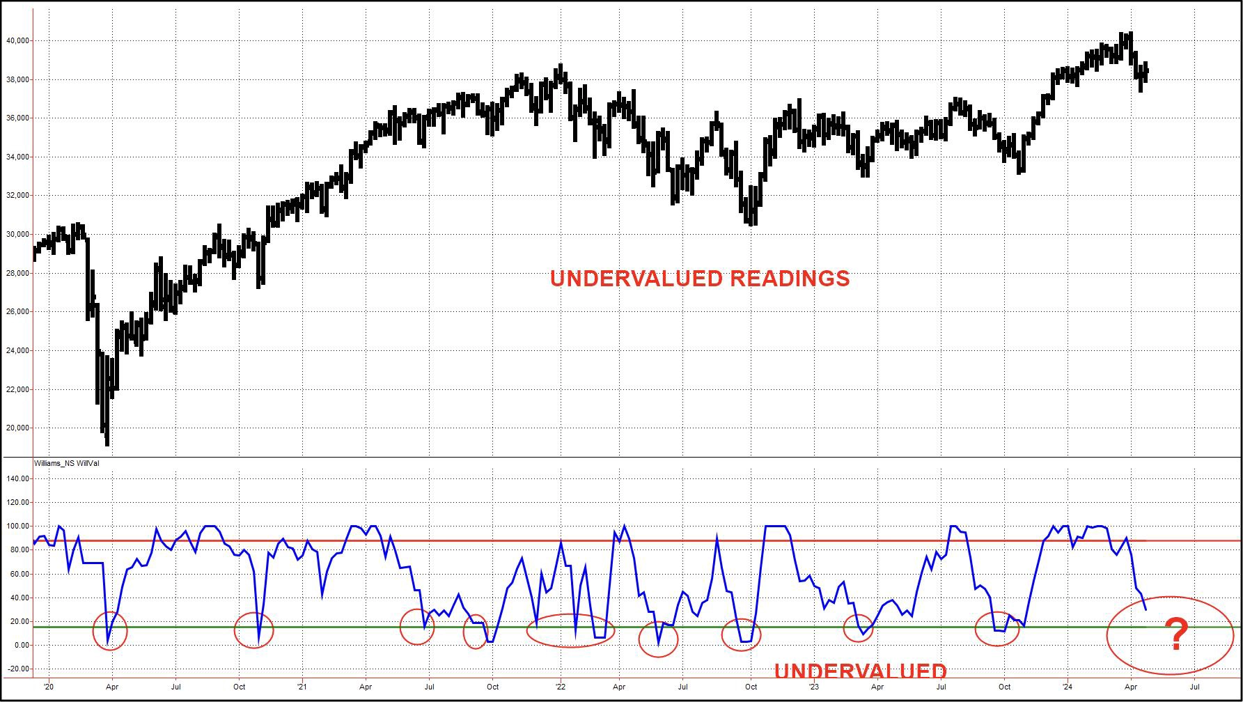
Chart 19: WillVal Dow Jones Industrial Average
All of the best times in the last 4 ½ years to buy have come when the index drops into the undervalued area. This tells us stocks are at a value point relative to bonds. WillVal is an oversold indicator. Look at the 2021 mid-year readings, when price was at high levels. This unique gauge of value reflects the tipping point between stocks and bonds. We are getting close.
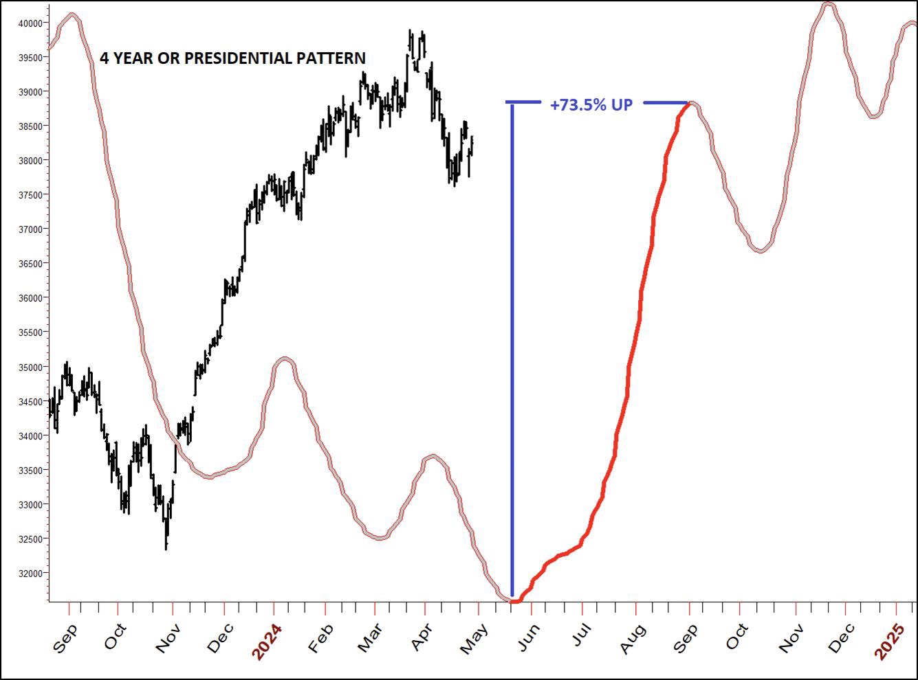
Chart 20: Four-Year Cycle, a.k.a. Presidential Cycle
In Chart 20, we see the pattern stocks have followed in the last 35 election years. The sweet spot has been to buy in the middle of May, with the expectation of a rally into September. In fact, 73.9% of the time, that has taken place. Will it this year? No one knows for sure. Those are the odds, and as you know... I am an odds player.
Keeping in mind this historical record, lets now turn our attention to current market action. I'll begin with the current cycle projection for the Dow Jones.
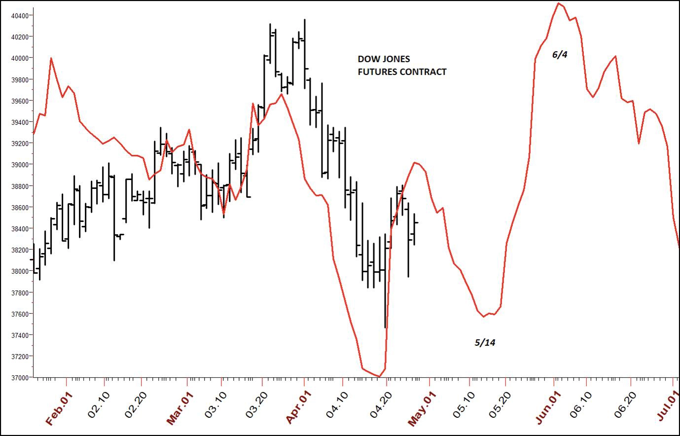
Chart 21: Cycle Projection for Dow Jones Industrial Average Futures Contract
Next, how does the future look for the NASDAQ?
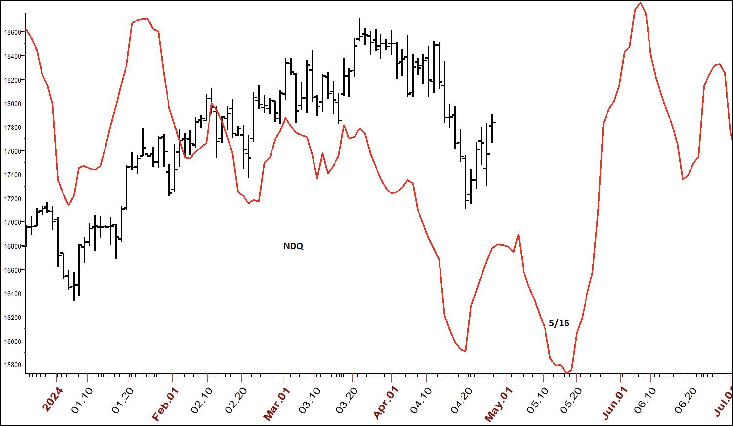
Chart 22: Cycle Projection NASDAQ Index
Finally, here's what to expect for the S&P 500.
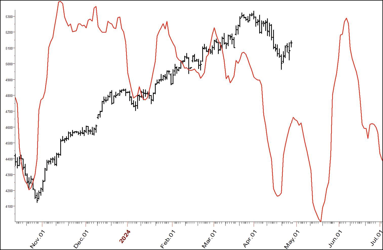
Chart 23: Cycle Projection for S&P 500 Futures Contract
I would like to see the current rally fail and break to new lows, Path B in the following chart. That is my expectation.
Yet, as Mike Tyson said, "Everyone has a game plan until they get punched in the nose". That means I will be looking to see which of these patterns the market will follow.
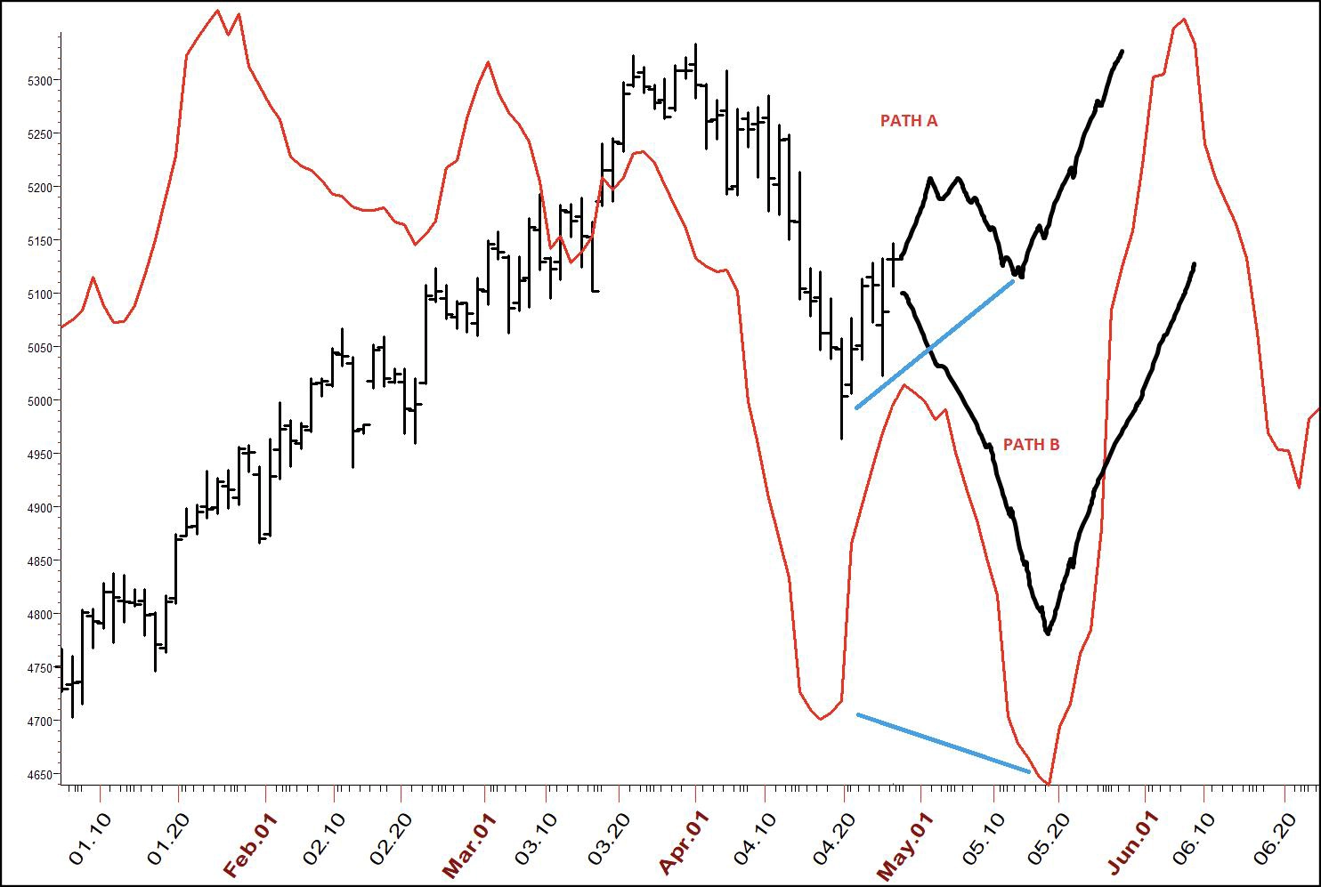
Chart 24: Price Paths to Watch
The most bullish is Path A. If we get into mid-May with without making new lows, I think the coming rally will rattle the cages of the bears, with fireworks all the way up.
The bottom line is to start buying stocks in the middle of this month.
Now all we have to do is find a winner or two from the almost 6,000 issues traded on the NYSE and NASDAQ. It's a big haystack.
This is always a battle, but there are no Garrett Troopers here. We welcome the war of selection. There are many tools at our disposal. What I like is to develop a list of fundamentally strong stocks as well as the current most active flyers as their momentum is hard to stop.
My next step is to test, looking for issues among these that are at or close to cyclical rallies. Those stocks are then put on the front of the burner to look for entries. In doing that over the last few days, I was surprised to see that the recent "big guns," like NVDA, GOOG, PANW, CRWD and many others, are not in what I would call a cyclical buy zone. That was not what I was expecting. My hopes were at least a few of the recent Wall Street "roadside attractions" would be approaching buy zones, but few were.
There is an important lesson here... buying good stocks, as many did at the recent highs, can be a very painful experience. The point I am trying to make is that to be really successful at this we need to take action, but only at the right time. Timing is a key pillar to market success.
With that in mind, I am presenting 7 stocks that fit our selection criteria but also, critically, are in the right time zones. The cycle projections are giving us a path to expect these issues to traverse. For each stock, I am also showing the true seasonal pattern as well as my Money Flow index. The index is very helpful in telling us when a stock has been accumulated by the funds.
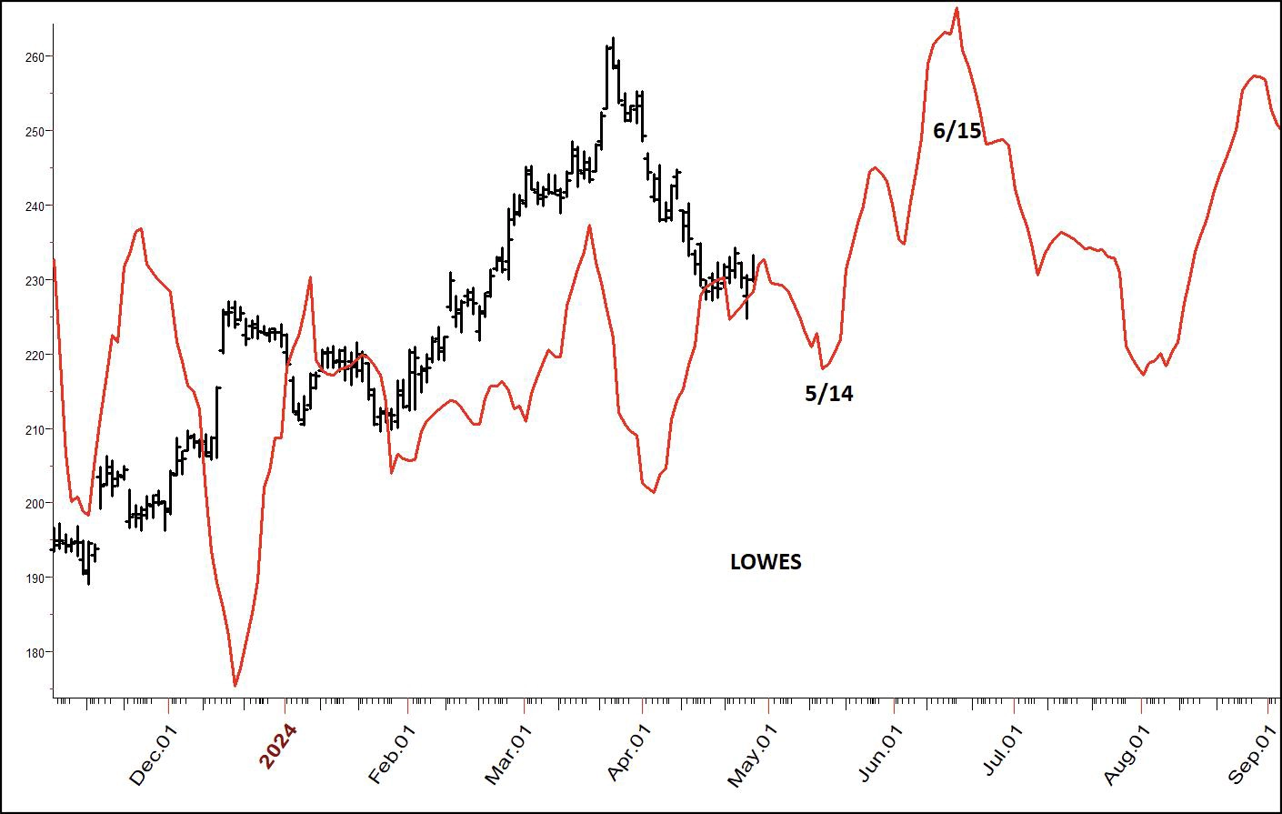
Chart 25: Lowes (LOW)
I've always been surprised that Home Depot (HD) is in the Dow Jones Industrial Average and not Lowes (LOW). I shop at both and think Lowes has better quality. The stocks perform similarly and, recently, Lowes has been the stronger of the two.
As you can see, there is a cyclical low coming up in May. So, somewhere between now and then, you want to look for a breakout to the upside. That could be a trendline, close above a moving average, etc., but clearly, we're getting in the timeframe for the stock to rally.
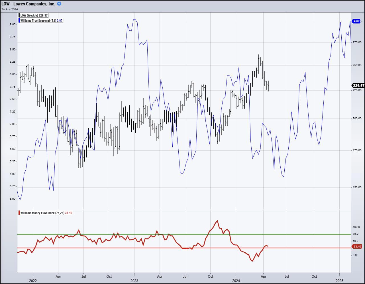
Chart 26: LOW True Seasonal & Money Flow Index
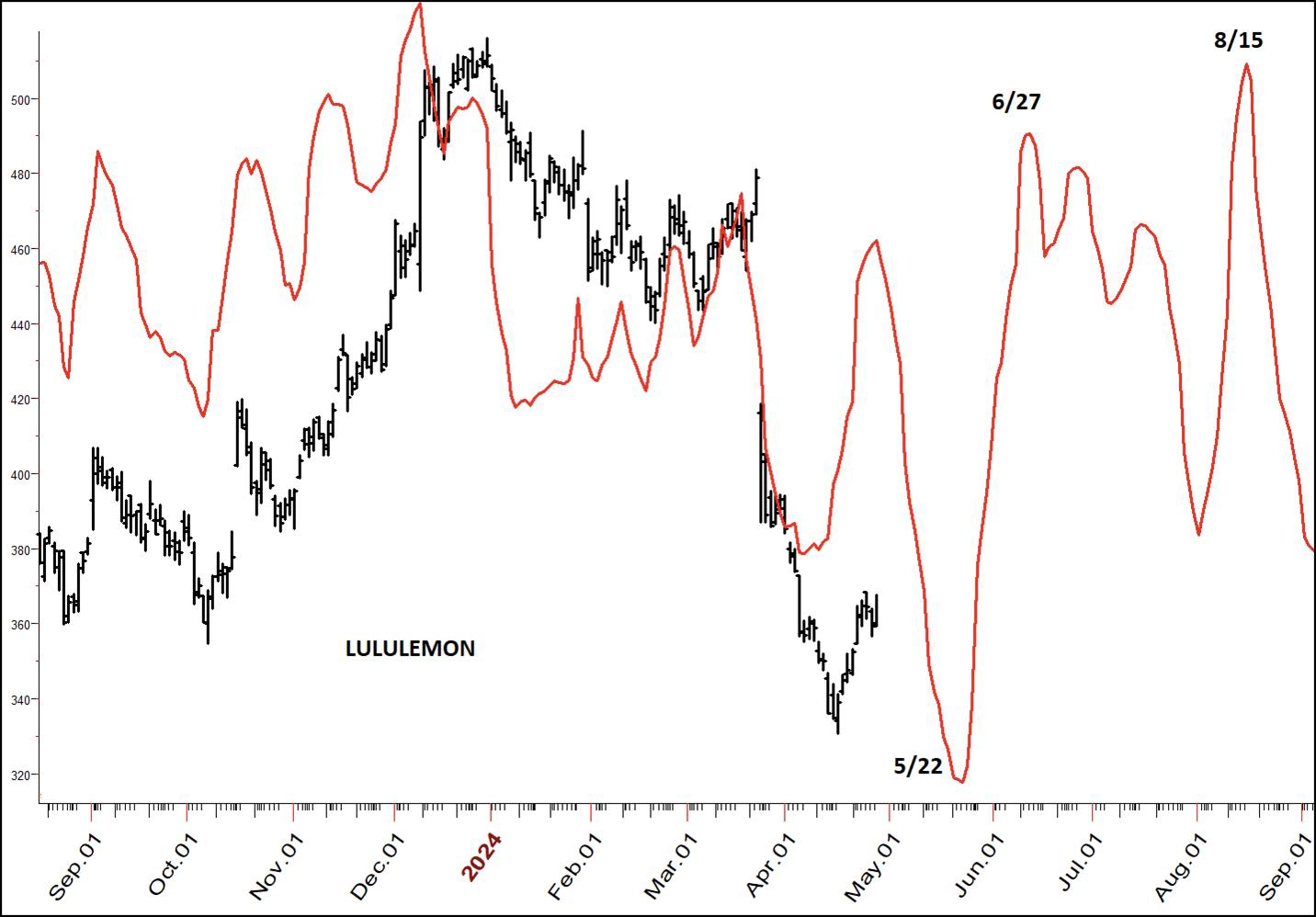
Chart 27: Lululemon Athletica Inc (LULU)
Looking at the above chart, it looks like we have a real lemon of a stock here. And it is! This is Lululemon (LULU). Following strong Christmas sales, the price has been beaten up. But it has now entered a cyclical low.
We have several things going here. The stock is substantially oversold, close to a cyclical low, and recently has been a popular issue. This means that, once it starts to move to the upside, buyers will come in.
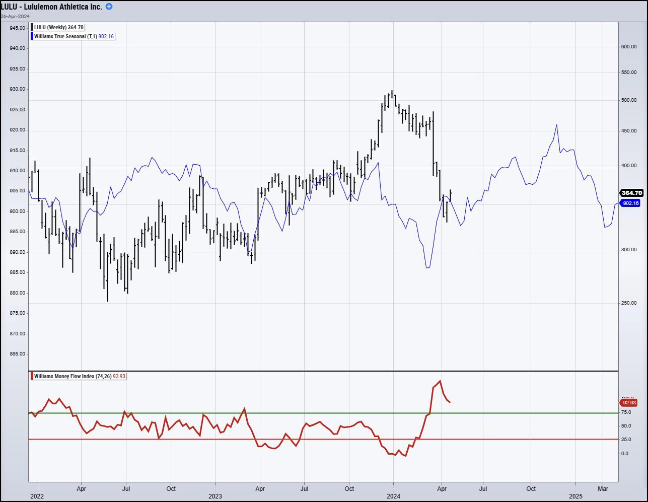
Chart 28: LULU True Seasonal & Money Flow Index
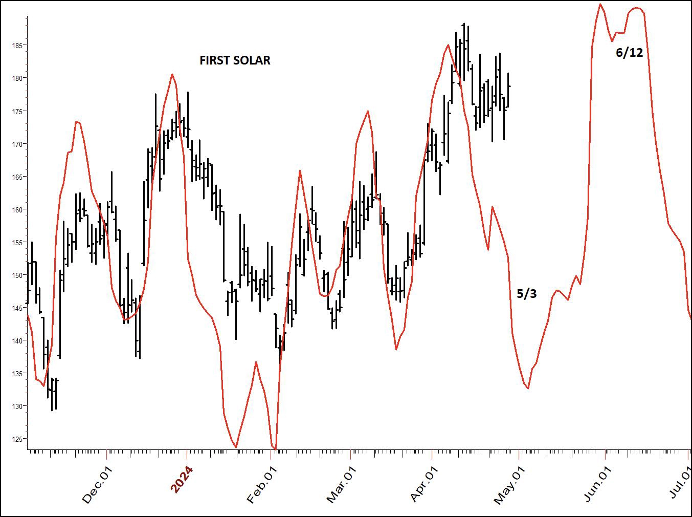
Chart 29: First Solar (FSLR)
Alternative energy has become the talk of the day, and there are many companies making money in this business. First Solar (FSLR) is shown in Chart 29. Its recent performance has been good. For this industry, FSLR touts a good price-earnings ratio of 23. The earnings have been increasing. So this is not just some fly-by-night solar company; it's the real deal, and the real deal is approaching a cyclical low.
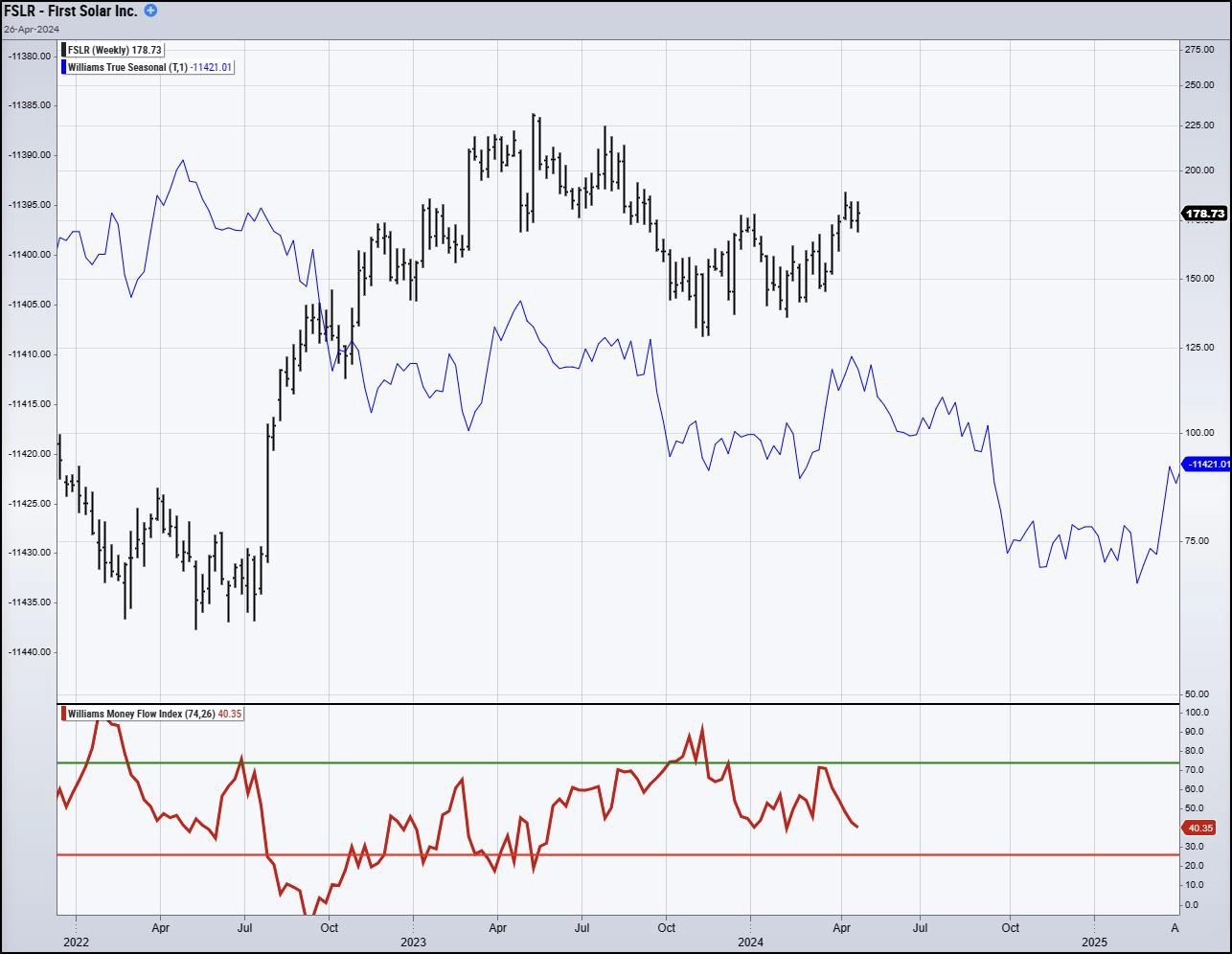
Chart 30: FSLR True Seasonal & Money Flow Index
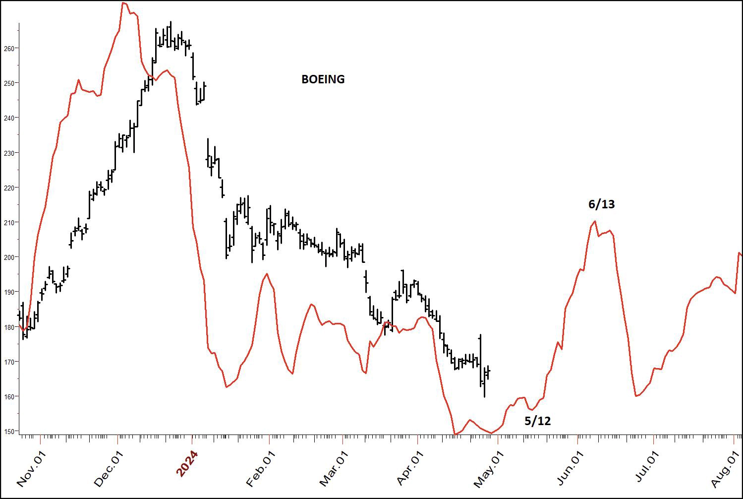
Chart 31: Boeing (BA)
Here's another stock that has been really beat up... Boeing (BA). It has been beat up by the newspapers as well as social media, leading to a substantial decline. The question is, will Boeing go out of business? No, they're too big to fail. You can see what my cycle is saying. Look for an entry.
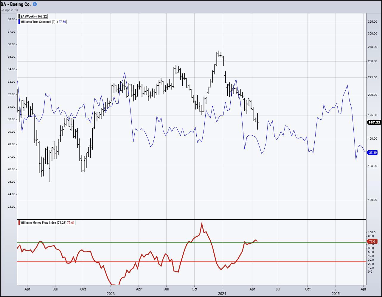
Chart 32: BA True Seasonal & Money Flow Index
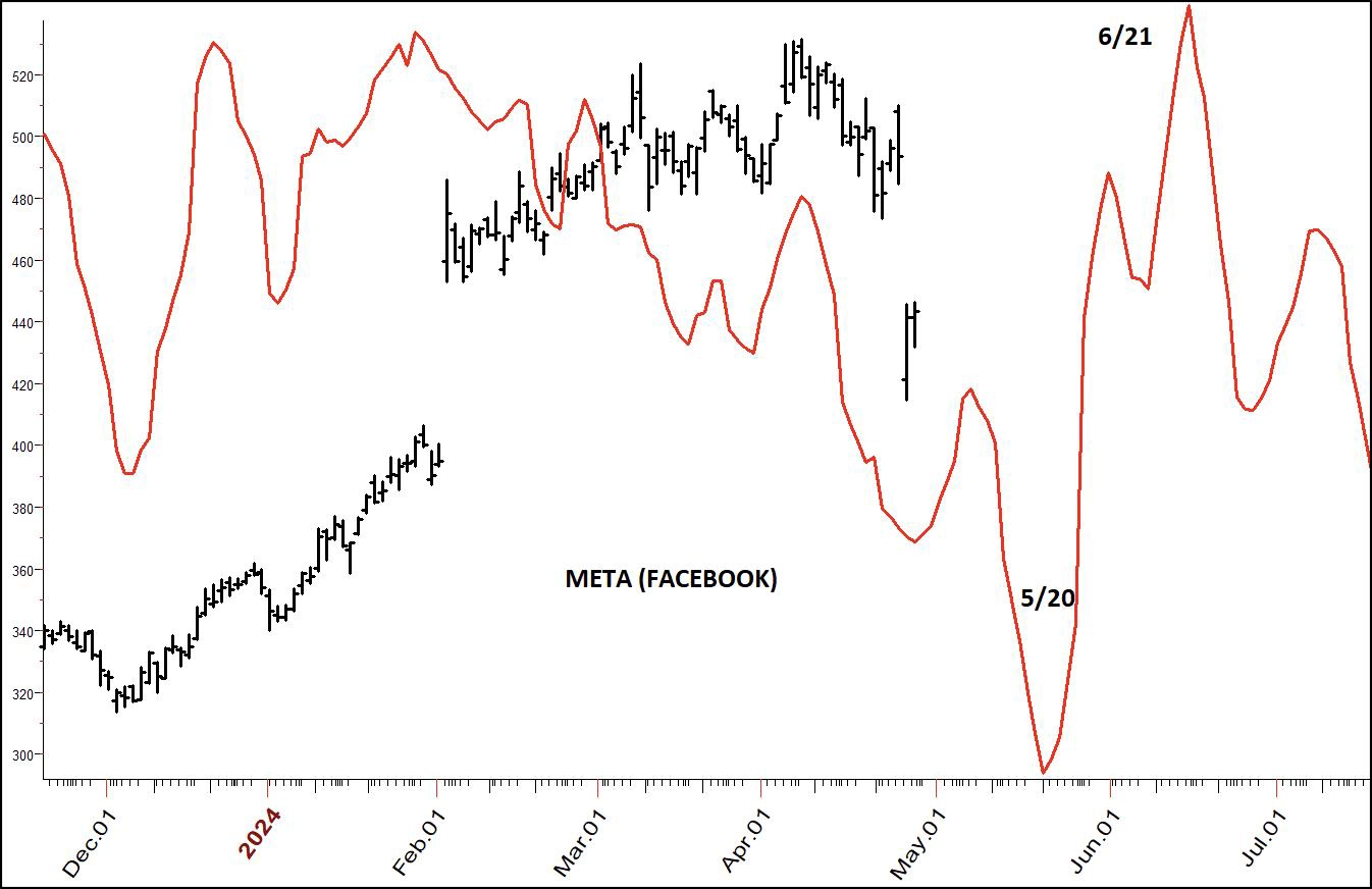
Chart 33: Meta Platforms Inc. (META)
I've never been a Facebook follower ... I have all the friends I want and too many of the ones I have owe me money ... so this is a stock I've never followed. Yet, what I see here I really like.
It's been a hot stock. For a hot stock, it carries a decent P/E ratio of 25. Yet, with a twist of whatever logic Wall Street uses, the stock got hit hard after announcing positive earnings increases. Indeed, the walk down Wall Street can be bizarre and not make much sense.
Looking at Chart 33, we see that big gap last February. Technical analysis says we should start to fill that gap, looks like that's what we're doing. Perhaps more importantly we see a cyclical low coming up later this month. I will be looking for buy points around the 15th of the month.
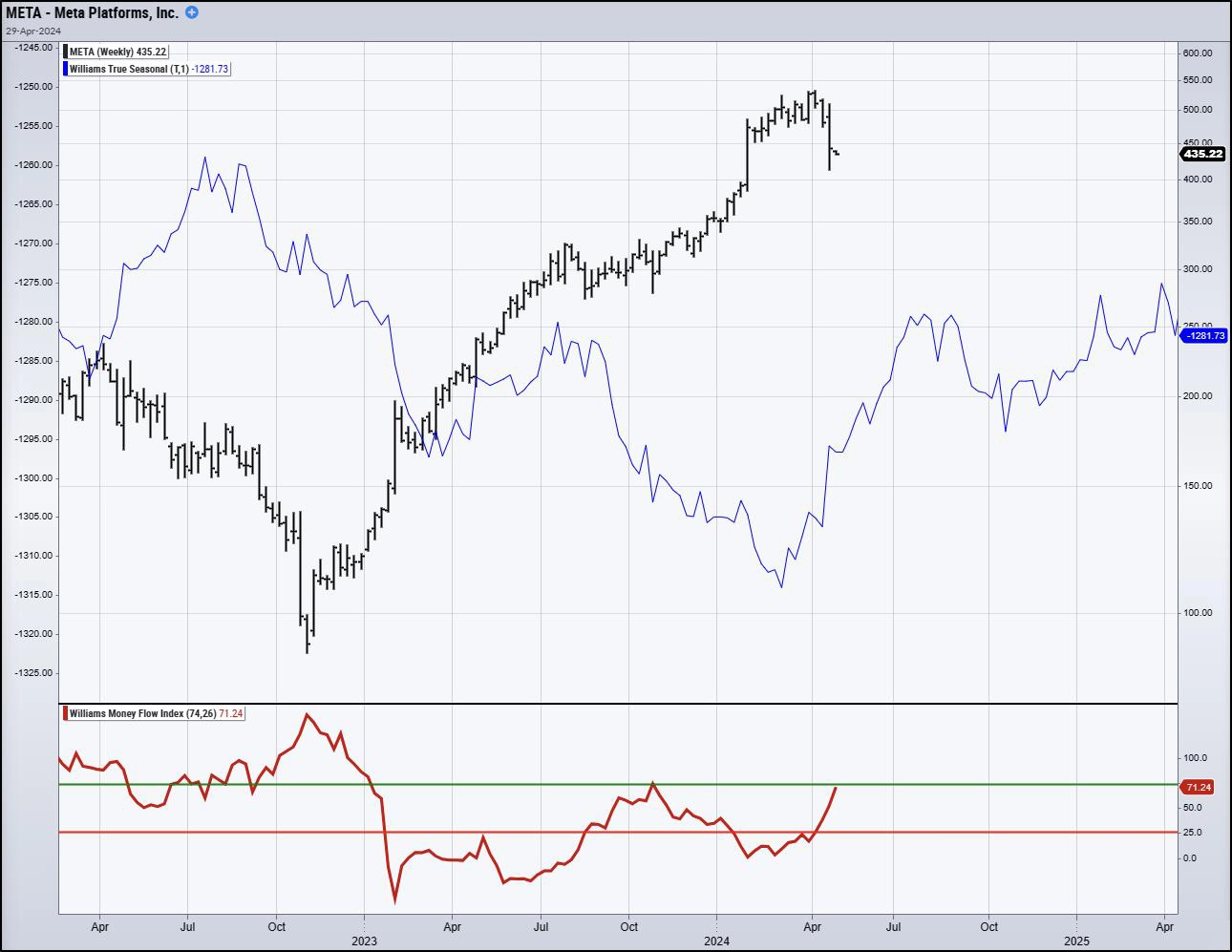
Chart 34: META True Seasonal & Money Flow Index
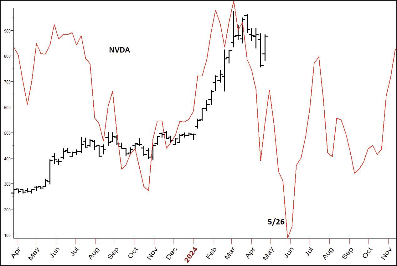
Chart 35: Nvidia (NVDA)
Here's the stock that everyone still wants to own, Nvidia (unless they bought it when it was close to $1,000 a share before the drop to $800). NVDA appears to have a cyclical low coming at the end of this month. Those who like the stock should pay attention to that.
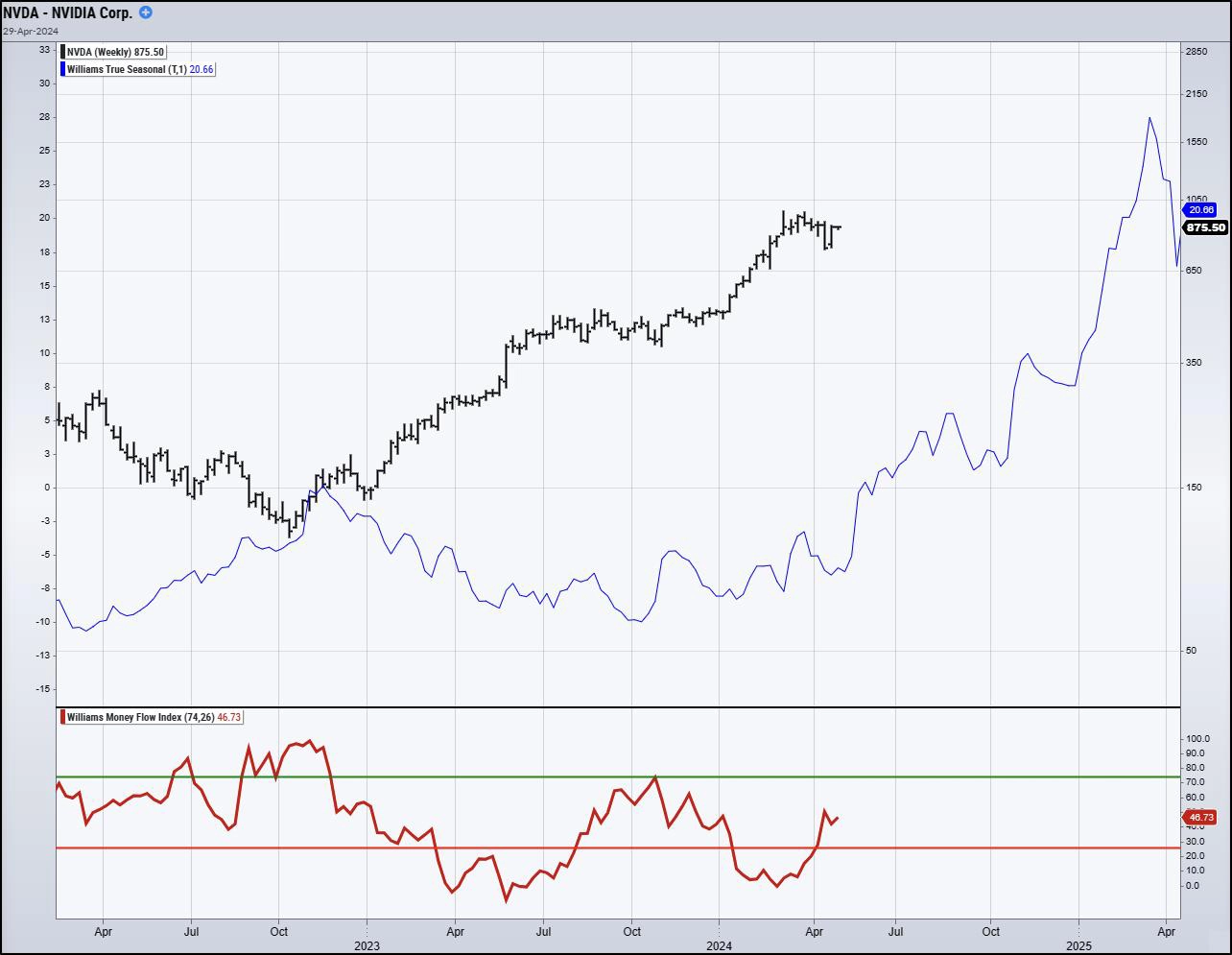
Chart 36: NVDA True Seasonal & Money Flow Index
Not everyone can afford such a pricey security. So let's turn our attention to a market that trades very much like this one. Below, we're looking at at Marvell Technology (MRVL)...
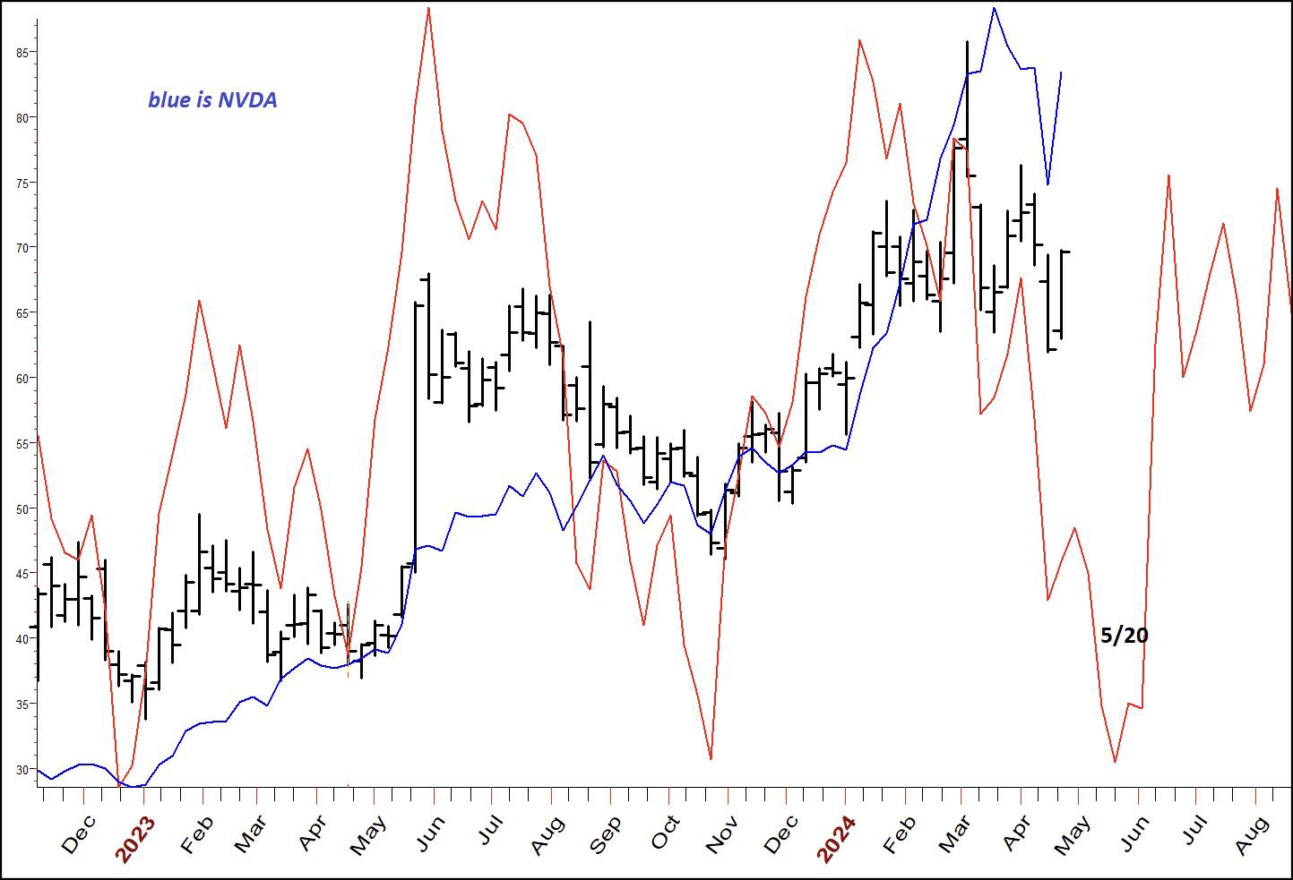
Chart 37: Marvell Technology (MRVL)
The blue line is the closing price, on a weekly basis, of Nvidia. You can see they do trade with a similar pattern. This is the poor man's version of Nvidia, since it is trading in the 70s and not the 700's. It is also scheduled for a low around the end of this month.
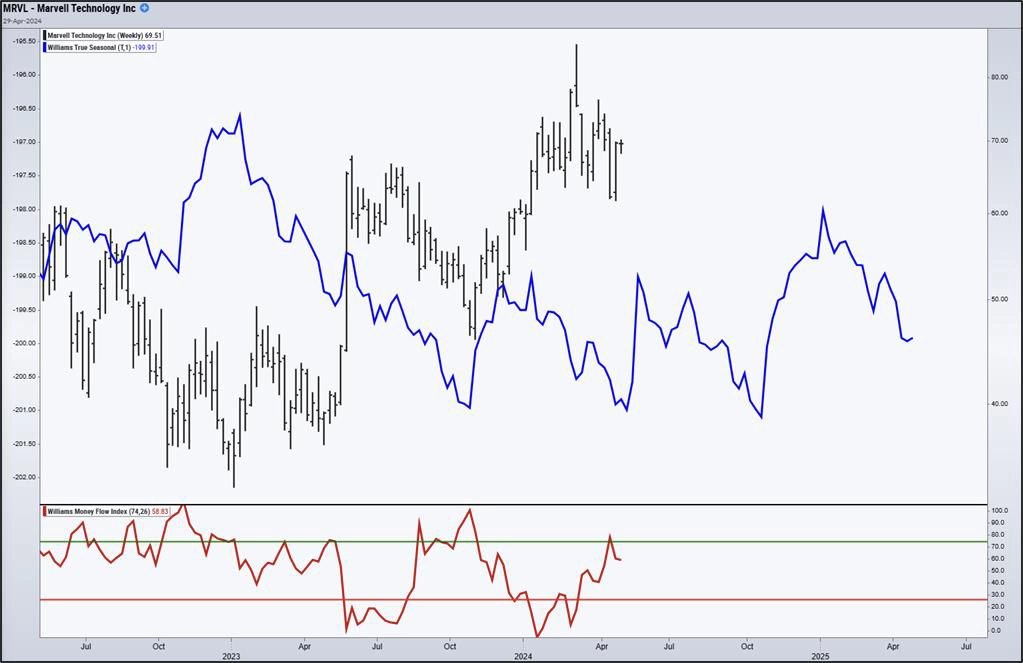
Chart 38: MRVL True Seasonal & Money Flow Index
There are a few other markets I want to comment on this month. I think we have rallies coming in the bond market, and further extensions of the bull moves in Crude Oil and Gold. Let's start with Gold, the market that has received the most ink from commentators in the last month.
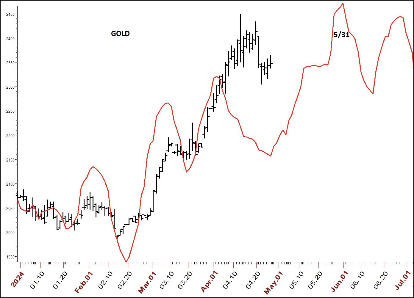
Chart 39: Gold Projection
We have been going through a rotational pullback. That should lead to at least one more up-leg, lasting to month's end. Stock folks can trade the ETF for this which is GLD.
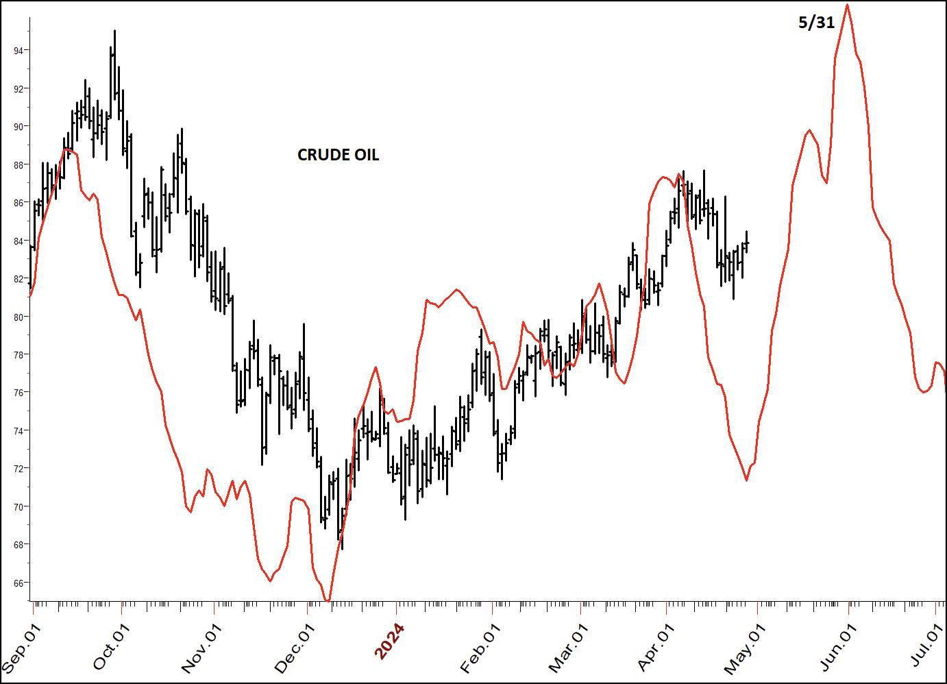
Chart 40: Crude Oil Projection
Crude Oil traders should expect a rally which is a further extension of the upper bull move seen so far this year. The ETF I follow for this is USO. However, there are others you may want to look into.
It looks to me like the current of move should continue to the end of the month. So my strategy is to buy breakouts after small congestions. Note the time frames here are similar to gold. It appears both of these hard assets are dancing to the same investor demand tune.
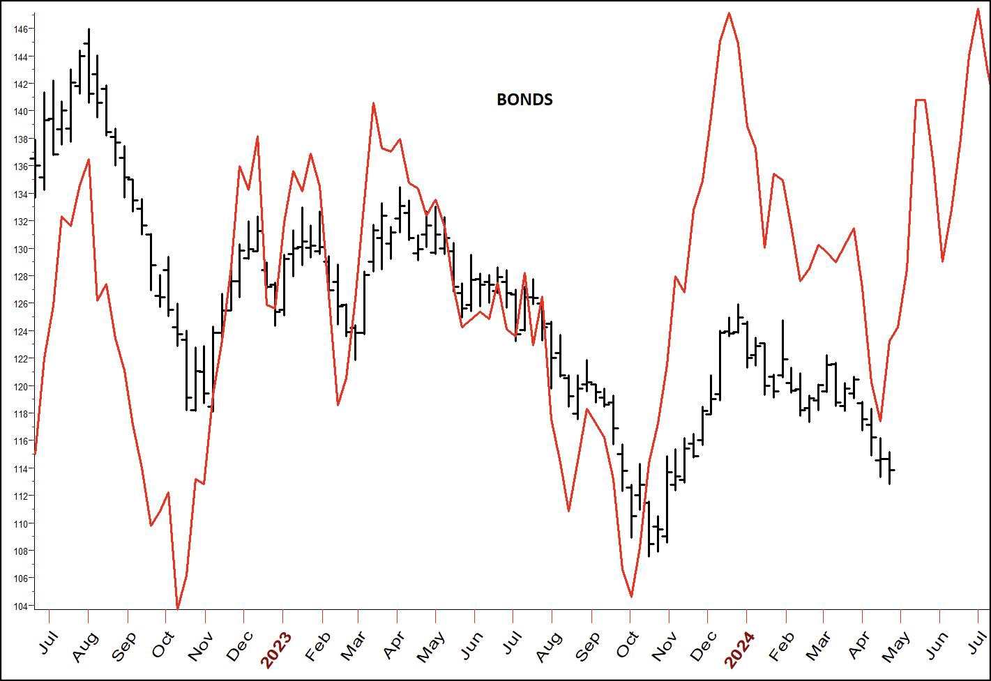
Chart 41: Bonds Projection
As you know, I've been bullish on bonds, looking for entry. I've been once stopped out, but will get right back in when I see a more significant trend change. Typically, getting above the highest high of the last five or six days has been a good trend change in this market, or you could use the highest close of the last 8 days. I'm certain you have other techniques, oscillators, Bollinger bands, trendlines, etc. If any of them give you an entry, it should be worthwhile to take it. Of course, as always, we use protective stops.
After looking at my cycle studies, I have to think that the big year we have seen in cryptocurrencies and bitcoin is over. Here are my cycle projections to back up my thinking:
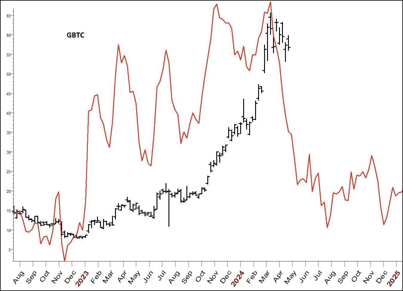
Chart 42: Bitcoin Projection (GBTC)
After looking at my cycle studies, I have to think that the big year we have seen in cryptocurrencies and bitcoin is over. Here are my cycle projections to back up my thinking:
Hopefully, we will see a turn back to the upside around the middle of this month. I'll be able to add more to that with the next family meeting.
In June's Wealth is Not Health, I will finish up with heart issues and talk about the most important supplement I take.
Good Luck and Good Trading,
Larry Williams
Get the game-changing combination of Larry’s expert market insight with StockCharts’ award-winning charting and analysis platform.
Monthly market reports with charts from Larry Williams
Mid-month live Family Gathering per month, ask anything you want!
Membership to StockCharts.com