The current market pull-back is getting serious. Check out the current Nasdaq chart:
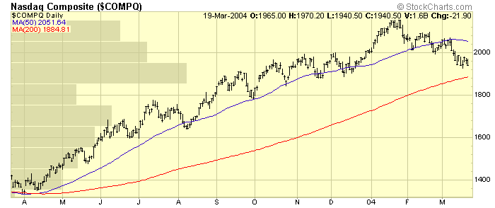
See the long "Price-by-Volume" bar sticking out from the left side of the chart around the 1900 level? That represents the largest support level for the Nasdaq during the course of the past 12 months. If prices were to move below 1875, there's not much near-term historical support left. Staying above 1900 is very important for the index right now.
Our other newsletter contributors have more on the current state of the market below, but first I want to look at the newest indicator we've added to our site - the Money Flow Index.
THE MONEY FLOW INDEX
Since the site first got started, we've provided everyone with one of my favorite indicators, the Chaikin Money Flow (CMF). A variation of the Accumulation/Distribution line, the CMF combines price and volume movements into a single indicator that can be used to verify signals generated by other "price-only" indicators like the RSI and the MACD.
While the CMF continues to serve us well, we've just added its close cousin, the Money Flow Index in the new Beta release of our SharpCharts2 charting engine. The Money Flow Index (MFI) is a bounded oscillator that ranges between zero and 100 with an "overbought" level at 80, an "oversold" level at 20, and a center line at 50. Whereas the CMF uses the position of the close relative to the mid-point of each day's bar, the MFI uses the average of each day's high, low, and closing price to determine if money is "flowing" into or out of the stock.
In many ways, the MFI is less sophisticated than the CMF and that simplicity can result in premature signals. Consider the following chart:
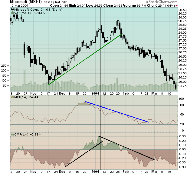
Notice that the MFI topped out on 22-Dec (blue vertical line) whereas the CMF waited until the first week of January before turning lower for good (black vertical line). Of course, this suggests an extremely valuable use for the MFI - as a confirmation indicator for the CMF. Savvy chartwatchers would have noticed the developing divergence between the MFI and the CMF during the final weeks of 2003 and would have become more cautious about their MSFT positions.
As with all of our charting tools, I urge you to start using and experimenting with the MFI and see if it can help your investing track record. Remember that, for now, only our Beta edition of SharpCharts2 has the MFI (and TRIX) indicators. To get started, click here.
NASDAQ 100 LEADS MARKET LOWER... The Nasdaq 100 QQQs were the
worst percentage losers on Friday and reflected continuing weakness in
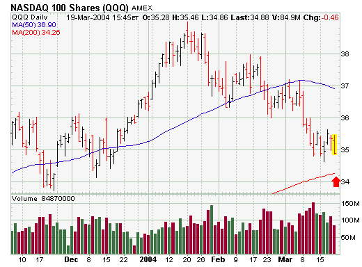
the largest technology stocks. The daily chart shows the QQQ ending the
week on a down note. The only saving grace was the relatively light volume.
With the SOX leading the way down today, it looks like the QQQ will probably
test its December low and its 200-day average just above 34. The final
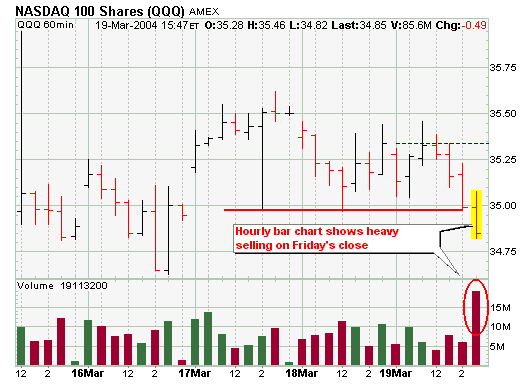
chart shows the hourly bars for the past week. Of particular notice was
the last hour's volume bar. In the last hour of trading on Friday, the
QQQ fell to a three-day low on the heaviest volume for the week. That
shows some fairly heavy selling near the close on Friday.
Breadth stats reflect continued preference to be overweight small and mid-caps, while underweight techs and large-caps. As the AD Volume Lines show, the S&P Midcap Index and S&P SmallCap Index remain the strongest. Both indicators for MID and SML remain above their 89-day EMAs, although the AD Volume Line for MID is currently testing the 89-day EMA (black arrow). The AD Volume Line for the Nasdaq 100 declined below its 89-day EMA in early March and remains weak (red arrow). The AD Volume Line for SPX is finding some support near the 89-day EMA and has yet to make a clean break (blue arrow).
The trend and condition of the market
should dictate the kind of actions we will take, so these are the first
things we should evaluate during the process of making investment/trading
decisions. This process is necessary for all time frames, but for this
article I will focus on the longer-term.
TREND: On a weekly-based chart
we can evaluate the longer-term trend of the market using trend lines
and moving averages. We can see that the long-term trend line drawn
from the 2000 price top has been violated to the up side, and a new
up trend is in the making. For a more objective definition of the
trend I use the 17-week (fast) and 43-week (slow) exponential moving
averages (EMAs). When the fast EMA crosses the slow EMA, it generates
a buy or sell signal depending on the direction of the crossover. Currently,
the 17-EMA is above the 43-EMA, so a buy signal is in effect and
the trend is officially up. The 10-year period on the chart shows how
effective the 17/43-EMA relationship is for catching long-term trends.
CONDITION: Next we want to determine the condition of the market within
the trend. Specifically, is it overbought or oversold? Again we can
use the relationship of the 17/43-EMAs, only this time we look to
see how far they are apart. Comparing other periods where corrective
action has taken place, we can see that the 17-EMA is well above the
43-EMA and showing the market to be very overbought. Also, the weekly
PMO (Price Momentum Oscillator) has had a very long run from its October
2002 low, and it too is very overbought.
Finally, we can see that
the market is already reacting to the overbought condition. The rising
trend line from the March 2003 price low has been violated, and
the PMO has topped and generated a crossover sell signal. These events
imply that the current correction will continue for several more
weeks; however, in the context of a long-term rising trend it is not
likely that we have seen the final top for the bull market, but, of
course, that remains to be seen.
ACTIONS: In a rising trend we look for
opportunities to buy, but during a correction it is not likely that
we will find very many. In fact, with the correction in progress, the
more immediate priority will be to appropriately adjust stops on long
positions and raise some cash for the time when the correction is finally
over and new buying opportunities begin to pop up all over the place.
The past two-month trading period is one at the present time considered a "correction"; however, there are nascent signs it may be something quite a bit larger than just your "garden variety" correction. First, we note that trendline resistance is proving its merit by turning prices lower, which up to this point during March has allowed prices to form an "outside reversal month" lower. Now, whether this collective pattern remains in force and the monthly close near its low will be determined next...but it is negative nonetheless at this point.
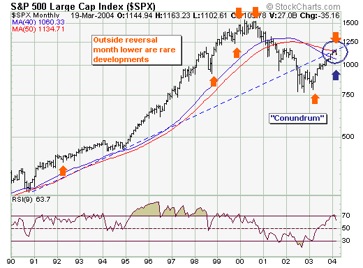
Secondly, and a bit more of a "conundrum" if you will - is the current price level relative to the location of the both the 40-month and 50-month moving averages...it is in between.
What to do?
Our strategy will be simple - we will respect the correction to 1060; but at that point make a determination as to the strength of the rally off that low. If strong - we become aggressive buyers until otherwise noted; if weak...then we aggressive sellers upon its completion. Outside of this - the ancillary technical evidence suggests the probability of the latter is greater...but we must remain objective.