At the height of last Wednesday's big decline all of the major averages except one had moved below their 200-day (40-week) moving averages. This was the first time that had happened since the start of 2003 and it is another important technical milestone that occurs as a significant uptrend turns into a significant downtrend. First the 50-day MA is broken, then the 50-day MA starts moving lower, then the 200-day MA is broken, and finally the 200-day MA starts moving lower.
Each of those milestones is important and watched closely by the market. Don't believe it? As soon as the S&P 500 moved below its 200-day MA on Wednesday, the market started rallying. Money managers said to themselves "Things have fallen enough, let's start buying some bargains." Wednesday's afternoon rally (+196 points on the Dow) erased the morning's losses, but the psychological technical "damage" remained. Having broken the 200-day MA once recently, the market may not be in such a buying mood the next time it happens.
Later in this issue, John Murphy, Carl Swenlin, Richard Rhodes and Arthur Hill provide even more reasons for using Technical Analysis, but first...
GETTING AHEAD WITH "BEHIND"
One of the best parts of my job is introducing you to important new features that we've added to StockCharts.com. Last week, we quietly added one of the best new features ever - overlaid charts. Overlaid charting allows you to place the chart from two or more ticker symbols or indicators on top of each other on the same chart. You can find this new feature in the "Beta 4" version of our new SharpCharts 2 charting engine.
To create an overlaid chart, simply select "Behind" from the dropdown located to the left of any of the "slots" in the "Indicators" area below the chart. Before now, you could only select "Above" or "Below" from that dropdown. The addition of "Behind" opens up whole new worlds of charting possibilities. Here are some examples:
Comparing a Stock's Price Movements to an Indicator's Signals:
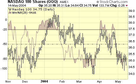
Here we have the 28-day William's %R overlaid (underlaid?) with the Qs. This chart shows you quite clearly how the indicator has moved into the overbought and oversold areas ahead of significant reversals by the stock in late 2003 as well as in March 2004.
Note: The vertical scale for QQQ is on the right, the vertical scale for William's %R is on the left.
Comparing a Market Index to several Market Breadth Indicators:
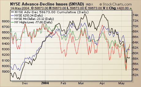
Here we see the NYSE Composite Index in blue, the cumulative NYSE Advance-Decline Line in black, the NYSE McClellan Oscillator in red, and the NYSE New Highs-New Lows in green. Notice how, at the start of April, the McClellan Oscillator (red) turned lower before the other indicators did?
Note: Right now, overlaid indicators can only appear in "Line" mode. In order to chart the Advance-Decline line in Cumulative mode, I have to make it the "primary" ticker symbol for the chart. The other lines were added to the chart using the new "Price" indicator and the new "Behind" position setting.
Intermarket Analysis:
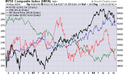
Here's a chart that John Murphy followers will love - the four major Intermarket indices overlaid all on one chart. While we still recommend using our interactive PerfChart to perform Intermarket analysis, this chart can also shed light on the topic. For instance, the recent weakness in bond prices really stands out here.
Overlaid charting opens up a whole new world of possibilities for your analysis. Watch out for even more features to appear over the next month or so. In the mean time, please give "Beta 4" a try and use the Feedback link on that page to let us know what you think!
CPI AND PPI NUMBERS SURPRISE ECONOMISTS... The most frequently seen words in the financial press are "economists were surprised". It seems they're always being surprised by something. This week it was the "surprising" jump in the CPI and PPI inflation numbers. The fact that economists were surprised is a story in itself. It shows what happens when people ignore the clear messages being sent by the financial markets. And when they ignore the obvious. Take commodity prices for example.
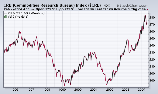
The CRB Index has been rising for two years and recently reached the highest level in a decade. Rising commodity prices are a leading indicator of inflation. One of the reasons for that is because companies have to pay for rising raw material prices. In time, they have to start passing those increased costs on to their customers. It's simple economics -- and common sense. An increasing number of companies have announced planned price increases to no one's surprise but economists.
For months, economists have been dissecting rising inflation numbers to exclude surging food and energy costs -- as if they don't count in the inflation picture. Now with gasoline and crude oil prices trading at record highs, they've suddenly started talking about the inflationary impact of rising energy prices and the potential dampening effect that has on the economy and the stock market. Where have they been for the last few months as the market deterioration sent the same message. Long-term rates have jumped to the highest level in almost two years. Here again, economists told us there was no problem there because there was no sign of inflation. This week they suddenly started to take notice. That's why we look at forward-looking markets and not backward-looking economic numbers.
Now, the only one left to convince is the Fed. Trouble is the Fed is populated by economists.
Although there is more than one way to interpret volatility, the simple fact is that the S&P 100 Volatility Index (VIX) and the Nasdaq 100 (VXN) trend lower when the market trends higher and trend higher when the market trends lower. In other words, these indicators actually trend and move inverse to the underlying indices.
VXN broke below its 200-day SMA in Dec-02 and remained below for over a year. Similarly, VIX broke below its 200-day SMA in Mar-03 and remained below for almost a year (red arrows). These breaks coincided with a strong and sustainable uptrend that lasted from Oct-02 to Jan-04 in NDX and from Mar-03 to Mar-04 in SPX.
A little intuitive reasoning would suggest that upside breakouts in VIX and VXN would be bearish. VIX is leading the way higher with its second break above the 200 day SMA in three months. VXN was turned back at the 200-day SMA in March, but broke above with a gap higher on Tuesday (red arrows).
Contrarians may argue that more fear is actually bullish. However, it is also abundantly clear that the OEX and NDX move inverse to VIX and VXN. As fear increases so does selling pressure and this drive stocks lower. An important trend change appears to be afoot in these volatility indices and this is likely to adversely affect on stocks.
At the end of April the XAU monthly Price
Momentum Oscillator (PMO) -- not shown here -- topped at very overbought
levels, rendering a long-term sell signal. This action confirmed the
sell signal top on the weekly PMO a month earlier, shown on the chart
above. Both the monthly and weekly PMO can issue long-term signals,
but the monthly PMO is much more serious.
Nevertheless, the weekly
PMO shows that the longer-term overbought condition has been relieved,
and the daily PMO (not shown) is becoming overbought, so we should
be looking for a bounce from around the rising trend line support
at 75 or 70. I think it will probably be a strong rally, and may even
turn the monthly and weekly PMOs back up, but, in my opinion, sentiment
is not yet as bad as it ought to be in order for gold stocks to put
in a bottom. I base this opinion upon Rydex Precious Metals Fund
net cash flow, which still doesn't reflect the degree of capitulation
that we ought to see, considering how badly prices have been hit.
Rather
than trying to catch a falling knife, I think that waiting for
the weekly PMO to bottom (on a weekly closing basis) will provide a
margin of safety for those wanting to trade the next rally.
To learn more about Decision Point's PMO click here.
The recent capital market turmoil across the oceans and through all
asset classes be it bonds or stocks or gold, has exacerbated certain
risk-reward relationships between these asset classes as the "carry
trade" is being unwound. And while these relationships may become
even "more skewed" in the weeks and months ahead - we believe
the time is approaching whereby asset allocators will begin to favor
bonds over US stocks. Increasingly, this relative valuation will come
to bear upon investment gains...and must be exploited as the next larger
picture trade for the coming year.
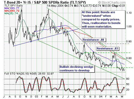
That said, our proxy for this relationship is TLT vs. SPY (Lehman 20+
yr. Bond Fund vs. the S&P 500 Index), which allows us to exploit
relative gains using equities only. Since March-2003, prices moved lower
in a very distinct downtrend - forming a declining wedge pattern that
shows each successive low is losing momentum. And while no major levels
of resistance have yet been violated - the pattern appears ready to conclude
is slide and resume its upward trajectory. Thus, we would become interested
in "speculatively" purchasing the ratio upon a move above the
.75 to .77 level from its current .74 trough, which may develop in the
days or weeks ahead given the negative divergence forming between prices
and the stochastic.
