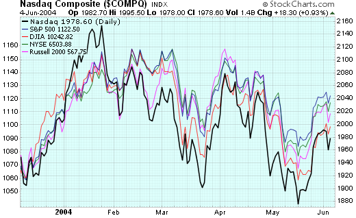
Last week saw the major markets put in another "lower high" for the current downtrend - the third major one since things started moving lower back in March. This three-point downtrend is easiest to see on the Nasdaq's chart, but it appears on most of the other major charts to one degree or another. Here's a new "behind" chart (discussed in our last newsletter) that shows the three-peak downturn for the majors:

Later in this issue, John Murphy looks at Energy stocks, Carl discusses NYSE Member Buying, Arthur Hill is bullish based on Elliott while his friend Richard Rhodes expects a pull-back.
MORE SHARPCHARTS2 TIPS AND TRICKS
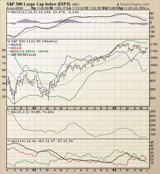
Let's look at a long-term chart of the S&P 500 using some of the new tools that are available to us via the SharpCharts2 Beta workbench. Here's a weekly chart of the index going back to mid-2002:

Above the chart is a standard MACD display showing that the weekly MACD histogram went negative back in March for the first time since late 2002.
"Behind" the price bars (in blue) is the S&P 500 Bullish Percent index ($BPSPX) - a market indicator based on the P&F charts of all of the stocks that make up that index. Notice how it's movements "mimic" the movements on the prices bars up until February, 2004? Since then, it has moved lower while the index has moved sideways. This kind of bearish divergence hints at hidden weakness inside the index that is being masked by strength in a small number of components.
On top of the price bars is a standard Bollinger Band display and, below the chart, is the BBand Width display. Notice that the BBWidth is at its lowest point on the chart right now. That means that the index has been moving "sideways" (relatively speaking) for quite some time now. This is also confirmed by the low ADX reading. Also notice that the red "-DI" line (indicating a downtrend) moved above the green "+DI" line for the first time in a year at the start of May.
All-in-all, a picture of weakness for the S&P 500 and a great example of the kind of composite charts that our new SharpCharts2 workbench can deliver.
One of the principles of intermarket behavior is that commodity-related stocks usually peak before the commodity. That's why the next chart is so interesting. While energy prices hit a record high early this week, the Energy Select Sector SPDR peaked in late April. That created a negative divergence with the rising commodity. The three peaks formed since early March also have the look of a potential "head and shoulders" top. To confirm that bearish pattern, however, the XLE would have to break the "neckline" drawn under the March/May lows. The relative strength line has been dropping for three weeks and is testing the up trendline starting in February. A break of that line would be a negative sign for the energy sector.

There are two distinct advances and two declines on the weekly Nasdaq Composite chart with the fifth wave still to come.
The first advance started in October 2002 and ended in December 2002 to form Wave 1. The second advance from 1253 to 2154 is clearly the longest in both duration and price appreciation, which is typical for a Wave 3 move.
The first decline extended from December 2002 to March 2003 and formed Wave 2. The second decline extended from 2154 to 1865 and retraced 23.6-38.2% of the Wave 3. This is a bit shallow, but the pattern looks like a falling flag and quite similar to the Wave 1 decline.
The falling flag is a bullish continuation pattern and a move above the upper trendline and prior high (2080) would signal a continuation higher. A breakout would project further strength to 2209 at a minimum and 2423 at a maximum. This target zone is based on Wave 5 being 38.2-61.8% of Wave 3.


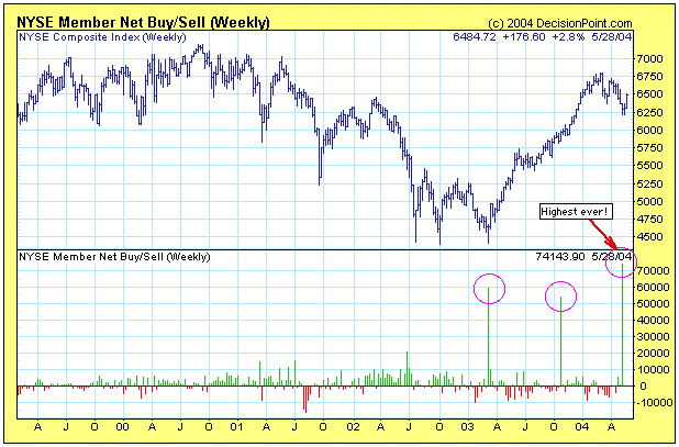
In the week ended May 15, 2004 NYSE Member
Net Buy/Sell numbers hit a new, all-time high of net buying of +741,439,000
shares. There are only two other occasions of net buying that even
come close to this -- +540,105,000 shares in the week ended November
14, 2003, and +588,248,000 shares for the week ending March 28, 2003.
As you can see by the chart, there is no other week that even comes
close to these three huge buying spikes.
You will also note that each
of the two prior buying spikes occurred immediately prior to a significant
market advance, and, in my opinion, the current buying spike is an
extraordinarily bullish event.
NYSE Members are the middlemen who
make their money by accumulating stock during declines and selling
back it to us at a profit during the next advance. If they have acquired
this much inventory, I think we can assume they expect to distribute
it at higher prices over the next several weeks.
Can they be wrong?
I suppose so, particularly if there is a catastrophic event affecting
stocks prices (and highly likely that they have this position
fully hedged), but it makes no sense to me that they would load up
on stocks to this extent unless they are pretty sure they will be able
to turn this inventory at a profit.
As you can see on the chart,
most of the time it is hard to make much sense of the net buy sell
numbers, but significant amounts of NYSE Member buying or selling
should serve as red flags, because it is their business to insure that
their positions unwind in their favor.
NOTE: NYSE Member Net Buy/Sell numbers
are available from Barron's (print and online), and they are released
by the NYSE two weeks in arrears so that we can't know what they are
doing in real-time.
Over the past two week's, sentiment has
gone from "highly bearish" to "highly bullish" - a change in circumstances
that shows confusion above all, but the fact remains the current
rally in the major indices has reached the important 50%-60% retracement
levels typical of countertrend rallies. Therefore, there is reason
for caution at this junction, and we find other "esoteric" reasons
for being so: a change in leadership between "mid-cap" and "small-cap" shares
that has accompanied the transition from bearish to bullish to bearish
markets. Quite simply, we use the S&P 400 and S&P 600 ETFs
- MDY and IJR (exchange traded funds). In bear markets, MDY
tends to outperform, in bull markets IJR outperforms.
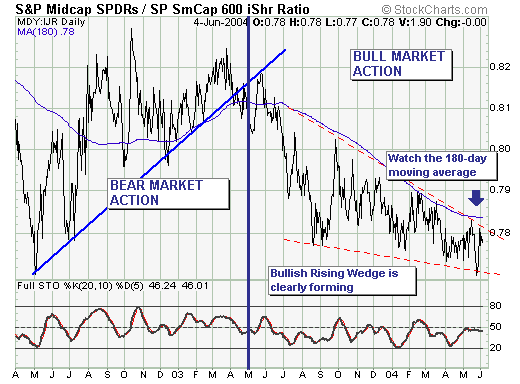
This brings us to our ratio chart, which
is showing distinct signs of a "rising wedge" bottom formation, which
would imply the current rally is in the process of "stalling" and
will not reach new highs as many anticipate, but rather resume their
recent trend towards lower lows. In our opinion, the determining
factor is the ration breaking out above their 180-day moving
average. Be prepared.
