Stocks moved sideways last week with most of the major averages finishing within 1% of where they started. The Amex was the big "winner" - up 1.7% - while the Nasdaq lost 0.6% and everyone else finished up somewhere in between. In this week's newsletter, John Murphy looks at the relationship between the US Dollar and Commodities, Carl Swenlin looks at how the mid-caps are doing, Richard Rhodes looks at Interest Rates, and Arthur Hill looks at the Nasdaq's "Big Picture". But first, I'm kicking off a ten part series on John Murphy's 10 Laws of Technical Trading:
LAW #1: MAP THE TRENDS
Murphy's Law #1: Study long-term charts. Begin a chart analysis with monthly and weekly charts spanning several years. A larger scale "map of the market" provides more visibility and a better long-term perspective on a market. Once the long-term has been established, then consult daily and intra-day charts. A short-term market view alone can often be deceptive. Even if you only trade the very short term, you will do better if you're trading in the same direction as the intermediate and longer term trends. - John Murphy
The "Gallery View" tool at StockCharts.com was custom designed to give you the long-, mid-, and short-term view of any ticker symbol in our database. It is the quickest, easiest way to follow John's advice in Law #1. To create a Gallery page for any stock, simply go to our homepage, find the blue box labeled"Easy as 1-2-3", select "Gallery View" from the first dropdown box, enter your ticker symbol in the second box, and click the "Go" button. Here's an example of what you'll see:

Starting at the bottom and moving up, the "Point and Figure" view gives you the long-term story for the stock. While P&F charts may look strange at first, they are probably the best way to analyze a stock's long-term situation. The automatic trendlines can easily show you if the stock is currently trending up or down in the long-term. In the case of IBM above, the red downtrendline that began last February is dominant however, the stock is currently in a rising column of X's after creating a Low Pole reversal pattern on June 8th.
Moving up to the "Weekly View", we see that IBM had trouble getting above 90 in early 2003 and then reversed right at the 100 level in February 2004. Subsequently, it moved below the 40-week moving average and recently hit a low of 85. The stock has been underperforming the S&P 500 since hitting its high in February. There is a positive development on the chart however as the weekly PPO (a cousin of the more popular MACD indicator) has recently moved back above its signal line. The "Weekly View" also gives us a go view of IBM's current volume trend - down.
The "Daily View" gives us a better picture of that recent positive development. There we see that the stock is faltering again just after clearing the resistance level at 90. While the PPO and the Chaikin Money Flow are still moving higher right now, their upward progress is starting to slow.
The "Intraday View" shows us the IBM tested the 90 level near the start of the past three days. On Wednesday and Thursday, the stock recovered and moved higher. On Friday however, the stock's price eroded throughout the day and, significantly, closed below 90 - a sign of technical weakness.
At this point, we have a solid understanding of IBM's technical situation - the context that the stock has been trading in both recently and over the past couple of months and years. That context gives us a much more objective outlook on the stock and how we should trade it (if at all). So remember, never forget John's Law #1. Tools like our Gallery View make it really easy to follow this part of John's advice.
During the two years prior to 2004, a falling U.S. dollar pushed commodity prices to the highest level in more than a decade. During the first half of this year, a rebound in the dollar has coincided with a downside correction in commodities. That may be changing. Chart 1 shows the dollar rally stalling near its 200-day moving average during May (see circle) and again during June (see red arrow), and showing signs of rolling over to the downside. On Friday morning, the announcement of a record first half account deficit pushed the dollar even lower. Right on cue, gold prices jumped nearly $7.00 and commodity-related basic material (and cyclical) stocks led Friday's market bounce. That may have to do with expectations that commodity prices are headed higher again. Chart 2 shows the CRB Index starting to find support just above its 200-day moving average. Its daily stochastic lines are in oversold territory under 20. Further weakness in the dollar -- and an upturn in the CRB -- would help commodity-related stocks.


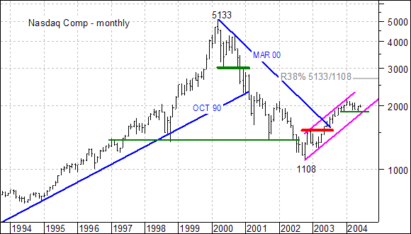
The
advance since October 2002 is certainly impressive on its own
merits, but pales when compared to the prior decline. The advance has
not even retraced 38% of this decline and formed a rising price channel.
As long as the lower trendline holds, the trend is firmly bullish and
further strength is expected (as outlined above).
A
failure to hold above 2000 AND a break below the May low at 1865 would
be quite negative. At best, it would signal a retracement of the Oct-02
to Jan-04 advance. At worst, it would signal a continuation of the prior
decline (5133 to 1108).


I'm very pleased to announce that we now have a chart showing the S&P 600 Small-Cap stocks above their 200-EMA, 50-EMA, and 20-EMA. But wait! There's more! We also have this chart for the S&P 400 Mid-Cap, S&P 500, Nasdaq, Nasdaq 100, S&P 100, and NYSE Composite.
In my opinion, this is a much better picture of breadth than advance-decline numbers, particularly since decimalization has introduced so much volatility into them. (A change of only a penny can classify a stock as an advance or decline.) The relationship of a stock's price to these three moving averages gives us concrete evidence regarding market strength in the short-, intermediate-, and long-term. By "concrete" I mean that when price is above a moving average, it is bullish. When it is below, it is bearish. When we can see a summary of all the stocks in a given index, we have a pretty good idea of how broadly based the strength or weakness is in that index.
These charts also tell us whether the index is overbought or oversold in the three time frames.
Another interesting feature of this chart is that we can see the negative divergences in the 200-EMA and 50-EMA. You'll notice that intermediate-term internals began to weaken well before the April 2004 top in the S&P 600 Index, but the long-term 200-EMA top came in January of this year. Internal tops can lead the actual price tops by quite a bit because the larger-cap stocks will carry the cap-weighted index, while the smaller-cap stocks are falling into a ditch.
Now the price index has broken a rising trend line, and the internals are quite a bit weaker and show less support for the snapback rally. This is definitely cause for concern.
The charts for the large-cap indexes are showing similar weakness internally, but prices reflect that participation in the bull market is narrowing, with the large-cap stocks carrying those cap-weighted indexes.
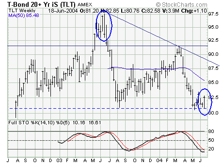
From a fundamental perspective...the past several months shows US interest rates to have risen very sharply as US economic data continues to show strength - from employment to manufacturing to retail sales et al. Moreover, higher energy prices led by gasoline and crude oil have further thrown a "negative light" upon interest rates; which in combination have caused sentiment to become decidedly negative. In fact, the 10-year note futures are now showing their largest short interest in quite some time...perhaps ever.

Consequently, this argues for a "catalyst" or "watershed event" to turn yields lower - and in fact Chairman Greenspan's renomination hearing commentary before the Senate sent bond yields plummeting. To us, this doesn't argue as to a watershed event; however, the "outside reversal week" lower price pattern in which yields formed last week argue for lower yields in the intermediate-term. This very pattern developed at the lows...and now at the highs.
Therefore, we are willing to venture into the long side of the bond market, for if short covering develops before the June 29-30 FOMC meeting as we anticipate...then the proper position is to be long either the bond futures or the Lehman 20+yr. Bond Fund (NYSE: TLT). That said...we are doing exactly...and looking to add more as prices move higher...doing more of what is working for you.