We've passed the halfway mark for 2004 and the markets don't have much to show for it. As you can see in the PerfChart below, the market continues to move sideways in a broad range that's rarely over 5% above or below where it started the year.
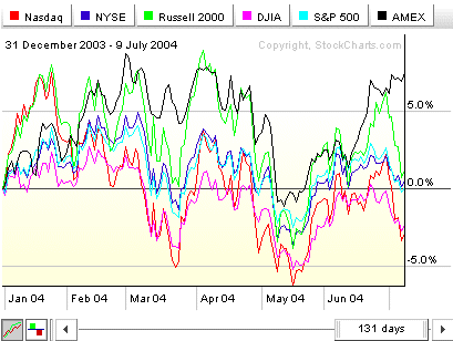
The Amex is the "big winner" so far - and has shown some nice relative strength during the past couple of days - but this is mostly a picture of a market that is moving sideways. Are we just "marking time" until the end of the summer doldrums? Time will tell, but at this point, it's a market for short term traders.
We've got great articles from John Murphy, Carl Swenlin and Arthur Hill for you below, but first, let's return to my ten part series on John Murphy's 10 Laws of Technical Trading:
LAW #2: SPOT THE TREND AND GO WITH IT
Murphy's Law #2: Determine the trend and follow it. Market trends come in many sizes -- long-term, intermediate-term and short-term. First, determine which one you're going to trade and use the appropriate chart. Make sure you trade in the direction of that trend. Buy dips if the trend is up. Sell rallies if the trend is down. If you're trading the intermediate trend, use daily and weekly charts. If you're day trading, use daily and intra-day charts. But in each case, let the longer range chart determine the trend, and then use the shorter term chart for timing. - John Murphy
This law echoes many of the lessons from Law #1 that we discussed in the last issue. Certainly, our Gallery View tool can help you determine which trend you want to follow, but when you get down to the nitty-gritty, you'll need to switch to our SharpCharts workbench and it's "Period" setting to zoom in on any potential trading stocks. Here's an example of how to do it:
The Energy sector has been one of the strongest sector this year and Williams (WMB) has been one of the strongest stocks in that sector. (I used our S&P Market Carpet to spot WMB). Since the stock has been strong for some time, let's investigate trading it on a daily basis. That means we should start by finding the trend on the weekly chart. Here's a weekly chart that I created that shows us several trend indications:
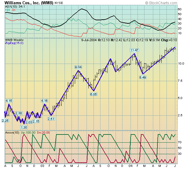
In the middle of the chart are the weekly price bars for Williams overlaid with a 15% ZigZag line. The ZigZag line will only change direction if the price falls (or rises) by more than 15% from the last time the line changed direction. Notice that Williams has not lost more than 15% since setting the 8.49 low at the end of February. Thus, the 15% ZigZag is indicating that the trend us UP.
Above the chart is another popular trend indicating indicator, Wilder's DMI system (which includes the ADX line). This is a 10-week version of the DMI. Notice that the green "+DI" has been above the red "-DI" line since they crossed in mid-April. In addition, notice that the black ADX line is rising again and has been above zero for the entire chart. These indicate that the stock is in a strong uptrend (duh!). Also notice where the +DI and -DI lines switched position back in early January - that confirmed the downtrend that started in December.
Below the chart is the Aroon indicator, another popular trend indicator. The interpretation is very similar to that of the DMI - when the green "Aroon(up)" line is above the red "Aroon(down)" line, the stock is trending up and vice versa. The Aroon's signals are often easier to spot than Wilder's DMI system's. (Note: In actual practice, you should use either the Aroon or Wilder's DMI, not both. Use whichever gives better signals for your style of trading and then stick with it.)
Bottom Line: Williams is still in a strong uptrend on the weekly charts. That means we should be looking to "buy the dips" on the shorter-term (daily) charts. Here's an example:
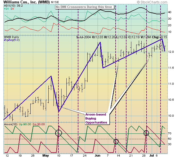
Now we're using the same indicators to look for trend changes on this daily chart. Like many stocks that are in a strong up-trend, Williams has not provided to many chances to "buy the dips". In fact, the ZigZag and the DMI indicators don't show us any "downtrends" at all. On the other hand, the Aroon indicator's graph contains three places (black circles) where a minor pull-back occurred and good potential entry points appeared.
Note, there are many other ways to determine the trend of a stock from a chart (including the "Mark 1 Eyeball" approach). The Aroon and DMI are used as examples here. If you are comfortable with the Aroon's signals (and know how to set effective stop-losses) the chart above could have given you some nice trading results.
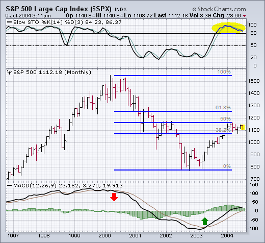
This is a good time to stand back and try to put things into a longer-term
perspective. First of all, let's see why the 2004 rally has been stalled.
The monthly bars in Chart 1 show that the S&P 500 ran into major
chart resistance at its early 2002 peak. The horizontal blue lines also
show that the S&P had retraced 50% of its 2000-2002 bear market.
The monthly stochastic lines also show an overbought condition over 80.
That was a logical spot for the cyclical bull market to stall. And stall
it has -- for the entire first half of 2004. The monthly MACD lines have
been converging since the start of the year (which usually reflects loss
of upside momentum), but are still in positive territory. The last sell
signal was given near the start of 2000. The last buy signal was given
in the spring of 2003.
While if is often difficult, if not impossible, to predict the fundamental catalyst, the approaching technical catalyst is clear for the Semiconductor HOLDRS (SMH). Key support and resistance are readily identifiable as well as two important patterns. With the group holding great sway over the market, the impending breakout is likely to have far reaching consequences.
The potential bullish setup looks like a falling price channel. SMH more than doubled from Feb-03 to Jan-04. The subsequent decline retraced 38-50% and formed a falling price channel. A move above 39 would break the upper trendline and prior high. This would signal a continuation higher and project a move above the January high. Obviously, this would be bullish for the Nasdaq and overall market.
The opposing pattern is a head-and-shoulders reversal. The left shoulder formed in Sept-03, the head in Jan-04 and the right shoulder is currently under construction. A move below 34 would confirm the pattern and project further weakness to around 24.


The S&P Equal-Weight Index (SPEWI) was developed by Rydex Fund Group in collaboration with Standard & Poor's. It is composed of the 500 stocks in the S&P 500 Index (SPX), but each stock In the SPEWI carries an equal weighting (rebalanced quarterly) versus the cap-weighting of the SPX. (The cap-weighting of the SPX results in the 50 stocks with the highest market capitalization carrying about 70% of the entire SPX weighting.)
The SPEWI trades as an ETF (Exchange Traded Fund) named Rydex S&P Equal Weight ETF with the symbol RSP. Note, it is not a mutual fund in the Rydex Group -- it trades like a stock. I continue to cover this stock because it continues to illustrate how much better equal-weighted portfolios can perform.
Since the 2000 market top, RSP has out-performed the SPX, with the exception of the final leg of the bear market in 2002. It lost only 40% during the entire bear market versus 50% for the SPX. Since the 2002 low, RSP has gained about 75% versus only 50% for the SPX. And, more important, RSP moved to new, all-time highs at the end of 2003, while the SPX is still well off its 2000 peak.
While recent RSP performance has been superior, the relative strength line at the bottom of the chart tells us that it lagged the SPX from 1994 to 2000. I think this was probably caused by the increasing popularity of indexing during that period, which would have caused an unusually high demand for the high-cap stocks in the SPX.
Watching the relative strength line, which is RSP divided by the SPX, will tell us when a shift back to large-cap stocks is taking place, but, as long as the relative strength line is rising, RSP will be a better bet than the SPY (the ETF that tracks the S&P 500).
Decision Point has a series of indicators derived from the S&P 500 stocks, and virtually without exception, these indicators are themselves unweighted, which makes them much more useful with RSP than with the SPX. Subscribers should check the Straight Shots section of the DecisionPoint.com Main Menu.


