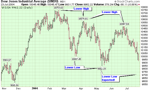
I'm always amazed when the "respectable" financial press gets themselves into a lather about the Dow crossing 10,000. From some of the headlines, you'd think that Friday's close at 9962 was completely unexpected and very significant. "Dow tumbles to below 10,000", "Investor angst drops Dow", and "Dow loses fizz to close below 10,000". Of course, then a villain must be found and soon afterwards, one was: "Markets fall on Microsoft, Amazon reports".
Astute ChartWatchers - like you! - should not be surprised at all by this news. Astute ChartWatchers know that the Dow has been in a downtrend for several months now. Downtrends create lower-highs and lower-lows. As soon as the Dow started lower at the end of June - creating its second lower-high and confirming the downtrend - astute ChartWatchers have been expecting a move down to somewhere below 9852, the previous lower-low. Astute ChartWatchers know that Friday's move has very little to do with earnings - it's part of a larger downturn in market sentiment that began back in February.

In a similar vein, all of our commentators are bearish right now. Carl Swenlin's got another article "debunking" some of the standard wisdom being presented as fact by the financial media. Richard Rhodes sees the tech sector heading lower and John Murphy presents a lower long-term target for the S&P. But first, Part 3 of my series on Murphy's Laws...
LAW #3: FIND THE LOW AND THE HIGH OF IT
Murphy's Law #3: Find support and resistance levels. The best place to buy a market is near support levels. That support is usually a previous reaction low. The best place to sell a market is near resistance levels. Resistance is usually a previous peak. After a resistance peak has been broken, it will usually provide support on subsequent pullbacks. In other words, the old "high" becomes the new "low." In the same way, when a support level has been broken, it will usually produce selling on subsequent rallies -- the old "low" can become the new "high." - John Murphy
Support and Resistance are very important technical concepts that are often overlooked, especially when one gets too deep into indicators and oscillators (and all the other "-ators" out there).
Support and resistance seem "magical" to newcomers. "How can some number cause a stock to change direction?" Support and resistance occur because investors have good memories. They know where they bought their current stocks and how much money they've made (or lost) since buying. They also remember how happy (or scared) they were the last time their stock hit a particular level. Put simply, support and resistance are echoes of human nature.
As such, investors should always be aware of important support and resistance levels for the particular stock or market they are following. Many times the standard "Mark 1 Eyeball" is the best tool for finding such levels. Look for points in the "recent" past where a stock reversed direction, then check out the volume around that time. The higher the volume, the more likely it is that the stock will reverse again at that level.
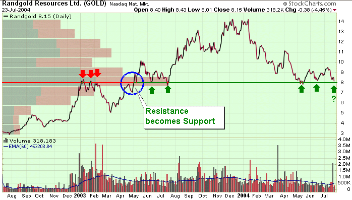
If the "Mark 1 Eyeball" isn't working for you, SharpCharts "Price by Volume" overlay and our "Support/Resistance" annotation tool may do the trick. Here is an example of their use:

Randgold Resources (GOLD) has an affinity for 8.0. Notice how the horizontal Price-by-Volume bar for the 7.5 to 8.5 range sticks out much farther than the other bars? That means that whenever GOLD has been near 8.0, volume has increased. 8.0 is a level that makes large numbers of shareholders want to buy or sell their shares.
By adding a Support/Resistance line at 8.0 with our ChartNotes annotation tool, we can clearly see where 8.0 was initially a resistance level (3 red arrows) and then, in May 2003, then stock punched up through 8.0 which then became a support level (2 green arrows). That is a perfect example of the phenomenon that John was referring to in Law #3. Those green arrows were great buying opportunities as the stock soon shot up over 70% in the following months.
Recently, 8.0 has been providing more support for GOLD, but without the strong volume spikes that often accompany these tests. The "Resistance becomes Support" phenomenon may be about to work in reverse soon (green question mark). I suspect that GOLD shareholders will be nervously watching the stock next week.
The monthly S&P 500 bars show why it's important to keep an eye on percentage retracement levels -- as well as chart levels. I've shown this chart before, but it's worth showing again. The 2003 S&P rally not only stalled at its early 2002 peak (near 1177) but after having retrace exactly 50% of its 2000-2002 bear market decline. Assuming the S&P breaks its 2004 low, it's logical to assume that it could retrace anywhere from 38% to 50% of its 2003 advance. Based on the retracement lines shown in the previous chart, that would call for a possible decline to the 1025-975 region (see box). That means that things will probably continue to get worse until they can start to get better.

With the peak at 45.78 in January 2004, the Semiconductor HOLDRS (SMH)
came relatively close to its high at 50.19. However, the Software HOLDRS
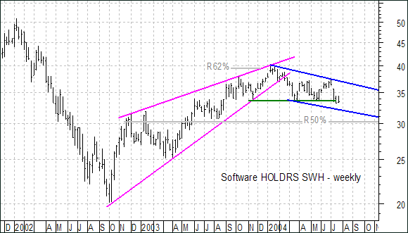
(SWH) peaked at 40.20 and fell well short of its 2002 high at 50.91.
SWH only retraced 62% of its prior decline and formed a classic rising
wedge (magenta trendlines). Not only did SWH underpeform SMH, but the
retracement and the pattern are also typical for bear market rallies.
This suggest that the current decline is impulsive and SWH is headed
lower.
At the very least, the current outlook is decidedly bearish and the
stock appears headed for a bout with support around 30. This support
level is confirmed by broken resistance (turned support), the 50% retracement
mark and the lower trendline extension of a falling price channel (blue
trendlines). It would take a move above the upper price channel trendline
(37.5) to start thinking bull again.


I have written on this subject before, but I was inspired by a recent article by Larry McMillan (optionstrategist.com) to visit if again.
Recently the NYSE A-D Line hit new all-time highs, and this is being cited as strong evidence that the market is headed higher. Unfortunately, this is a case of bullish analysts shopping for indicators that support their case, and ignoring indicators that don't. Here's why.
The NYSE Advance-Decline Line is a cumulative total of each day's advancing issues minus declining issues. It is one of the oldest, simplest, most widely watched, and, until recently, most useful technical indicators in existence. The problem is that the NYSE Composite Index is composed of about 2,040 common stocks, but the advance-decline data published by the exchange (and used to calculate the Advance-Decline Line) is derived from all issues traded on the NYSE, about 3,500 issues, many of which are interest rate sensitive and are more of a reflection of what is happening in the bond market than the stock market. Because of this, NYSE breadth (advance-decline) data and many of the indicators that use it should, in my opinion, be considered unreliable.
This doesn't mean that usable breadth data aren't available. There is, of course, the Nasdaq Composite Index, and at DecisionPoint.com we calculate advance-decline data for the S&P 500, S&P 100, Nasdaq 100, S&P 400 Mid-Cap, and S&P 600 Small-Cap Indexes. All of these are composed only of common stocks, and they give a completely accurate picture of breadth for each of those market indexes.
In the chart above we compare several A-D Lines. As you can clearly see, the NYSE A-D Line is completely disconnected from the price index and bears no similarity whatsoever to the other A-D Lines. NYSE breadth numbers may be telling us something, but, as yet, I don't think anyone has figured out exactly what it is.
We are planning to develop a common stock only version of the NYSE Composite A-D Line, but I think it will add little to the coverage we already have. The A-D Lines for the S&P 500 and Nasdaq 100 Indexes provide individual indicators that are directly related to those specific indexes, and this quite important considering how many people trade those indexes.
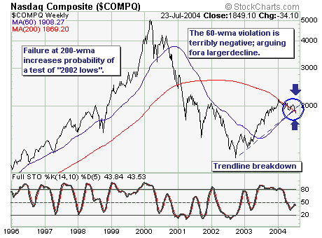
The current technology "malaise" has run for
all intents and purposes for the past six months; however, the recent
earnings and guidance "misses" have put it on the front burner as expectations
for difficult 2H 2004 comparisons have come one quarter early. The
question is whether this is warranted from both a fundamental and/or
technical perspective - we believe the answer is yes.
However, rather than go into the fundamental
challenges; we will simply focus upon price action...which on a longer-term
basis is just beginning to deteriorate. To explain, the 200-week moving
average has "capped" price movement repeatedly, which has applied
sufficient pressure to lead prices below trendline and 60-week moving
average support levels. These simple negative breakdowns should be
given enormous consideration when seeking to be a buyer of technology,
as one must define one's time horizon. But for our money...we will
simply seek to sell all rallies back into breakdown resistance
levels as the longer-term trend has clearly changed to bearish.
