We had some good response to last issues do-it-yourself approach to analyzing the Dow chart so let's try it again. Ready? Study the chart below and decided for yourself if it is bullish or bearish and why:

My take is that this chart looks pretty bearish right now. The index appears to be struggling with both the 200-day MA and the 10,300 resistance level. It put in a local top at 10,390 on Sept. 8th but quickly fell back below 10,300 and has moved sideways since then. Unfortunately, the Sept. 8th top is still well below the 10,487 top that appeared in June. That means that the index is still in an intermediate term downtrend - see the "Weekly View" on our Dow Jones Gallery Page for a clearer view of this trend.
The MACD momentum indicator has rolled over and is crossing back below its signal line. The price-and-volume-based CMF indicator has just moved back below zero confirming a short-term bearish stance. Finally, the 50-day MA remains far below the 200-day MA something that requires technicians adopt a bearish bias in their analysis.
Are there any bullish signs on the chart? Well, the 50-day MA is starting to turn up and the 200-day MA continues to rise however to majority of the technical signs point lower right now.
So how'd you do? Do you agree or disagree? Even if you don't agree, it is always instructive to compare your chart reading skills with someone else's. Hopefully this has helped.
For more technical opinions, keep reading! You'll find articles by John Murphy, Richard Rhodes, Carl Swenlin, and Arthur Hill in addition to the next installment in my continuing tour of "Murphy's Laws". Enjoy!
LAW #7: LEARN THE TURNS
Law #7: Track oscillators. Oscillators help identify overbought and oversold markets. While moving averages offer confirmation of a market trend change, oscillators often help warn us in advance that a market has rallied or fallen too far and will soon turn. Two of the most popular are the Relative Strength Index (RSI) and Stochastics. They both work on a scale of 0 to 100. With the RSI, readings over 70 are overbought while readings below 30 are oversold. The overbought and oversold values for Stochastics are 80 and 20. Most traders use 14-days or weeks for stochastics and either 9 or 14 days or weeks for RSI. Oscillator divergences often warn of market turns. These tools work best in a trading market range. Weekly signals can be used as filters on daily signals. Daily signals can be used as filters for intra-day charts. - John Murphy
John pretty much covered the key points in his description of Law #7. Here's an example of what he's talking about:

First, notice that the RSI doesn't move from overbought to oversold as "wildly" as the Stochastics oscillator does - you'll rarely find an RSI reading above 90 or below 10 and your often find the RSI indicator near 50. On the other hand, the Stochastics Oscillator "loves" to swing quickly between readings below 10 and readings above 90 and it truly"hates" hanging around 50 - while it often reverses near there, it rarely stays near the center line for long.
Because the Stochastics Oscillator is so jumpy, we offer a "Slow" and a "Fast" version. The fast version is essentially the "raw" version of the oscillator. The slow version is simply the fast oscillator that has been smoothed some by running it through a Moving Average calculation. You can see on the chart above how the two lines are similar, but the "Slow STO" link is smoother.
I've added some annotations to the chart that point out one of the "Divergences" that John mentioned which warn of market turns. You can see where both of the Stochastic Oscillators put in a higher trough when AMZN was putting in a lower one. (The RSI was characteristically non-committal at the time.) Soon afterwards, the stock zoomed up 20+ percent. There's another divergence later on that same chart - see if you can spot it.
More Info:
This ChartSchool article has more on Oscillators in general.
If you want an excellent book on the subject, check out Chapter 10 of John's own "Technical Analysis of the Financial Markets".
For more on the RSI, check out the book "RSI - The Complete Guide" by John Hayden.
Note: John's entire 10 Laws of Technical Trading can be found in our "ChartSchool" area under "Trading Strategies". If you missed any of my previous articles on Murphy's Laws, the ChartWatchers Archives page will take you to any of them.
WHY WE USE MOVING AVERAGES ... You've probably noticed that I rely very heavily on moving average lines. There are some good reasons for that. The main one is that they are one of the simplest ways to spot trend changes. But not all moving averages are equal. The 50-day moving average, for example, is most useful in spotting "intermediate" trend changes which can last anywhere from one to three months. A 20-day moving average is better for spotting "short-term" trend changes which can last for days or weeks. The 200-day average helps determine the direction of the "long-term" trend of a market, which can last for months and even years. Of the three, the 200-day average carries the most weight. For timing purposes, however, the 20- and 50-day lines are more useful. My favorite is the 50-day line. While a crossing of the 20-day line gives an earlier trend signal, the crossing of the 50-day line suggests that the trend has more staying power. This is true for the timing of entry and exit points. Buy signals are given when the price crosses over a moving average line. In that sense, upside moving average crossings are good for buying purposes. Crossings below the moving average lines can be used for selling purposes. They're not perfect, but they are very helpful. Moving averages also provide good discipline. A simple rule to sell a stock that closes under its 50-day moving average can prevent a lot of losses.
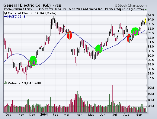
USING THE 50-DAY AVERAGE ON GE... The next chart shows why I find the 50-day most useful. Since we're following GE today, let's compare the daily price of GE to its 50-day average for the last year. The blue line is the 50-day average. [That's computed by adding up the closes for the last 50 trading days and dividing the total by 50]. Buy signals are given when the price closes over the blue line (see green circles); sell signals are given when the stock closes below the blue line (see red circles). The first two buy signals were given last December and May. In both cases, the stock rose after that. The first sell signal was given during March. The stock fell heavily after that. [The signals don't always work out that well, but they did in the case of GE]. Let's examine the last two signals more closely and bring the 200-day average into play for GE.
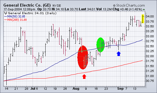
COMBING MOVING AVERAGE LINES... The next chart examines the last two GE moving average "signals" and also shows why it's important to keep an eye on the 200-day average. GE gapped under its blue 50-day average in early August (see red circle). As it turns out, that wasn't a great signal. Notice, however, that GE stabilized above its (red) 200-day average (see red arrow). That suggested that the "long-term" trend was still up. Within two weeks of issuing a "sell" signal, GE crossed back over its 50-day line to issue a new "buy" signal. That signal is still in effect. Notice that GE never closed back under its 50-day line after issuing a buy signal. That's another test of a moving average signal. Once a market closes above a moving average, that line becomes a support level. If it closes under the moving average, the signal becomes suspect. The blue arrow in late August shows the stock dipping under the blue line "intra-day" before closing higher. Intra-day moves don't count. Only the "closes" matter. This example shows the strength and weakness of moving averages. They may cause occasional "whipsaws", but they help keep us on the right side of the market. That's why we use them and why I call your attention to markets that cross their 50- and 200-day averages. It's a simple way to alert you to potential trend changes. You can then examine the market more closely using other charting tools. For weekly charting, the 10-week average replaces the 50-day, and the 40-week replaces the 200-day.
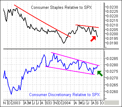
There is a most interesting development between the Consumer Discretionary SPDR (XLY) and the Consumer Staple SPDR (XLP). Relative to the S&P 500, Consumer Discretionary stocks (cyclicals) surged (green arrow) over the last few weeks while Consumer Staple stocks declined (red arrow). Weakness in staples and strength in cyclicals bodes well for the market and the economy overall. In addition, the pattern looks like a large falling wedge and it would take a move above the June high to turn bullish on cyclicals again.
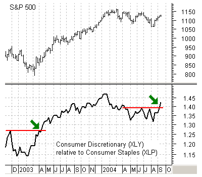
Taking this relationship one step further, we can see that Consumer Discretionary shares have recently started outperforming Consumer Staples shares. This price relative shows the Consumer Discretionary SPDR (XLY) relative to the Consumer Staple SPDR (XLP). Notice that XLY outperformed XLP from Feb-03 to Jan-04 and this coincided with stock market strength. In addition, XLY underperformed from Jan-04 to Aug-04 and this coincided with stock market weakness. Also notice the breakout in Apr-03 and the recent breakout in Sep-04. If this relationship is any guide, outperformance by XLY bodes well for the overall stock market.
Daily charts can be used to fine tune entry and exit points, but they should be interpreted within the context of what weekly charts and indicators tell us. For example, some shorter-term indicators show the market to be overbought, but the weekly chart implies that another leg of the bull market is just beginning.
At the beginning of this year the market began a corrective phase that lasted about eight months, climaxing with the shakeout selling into the August lows. As you can see on the chart, bull market correction often conclude when the price index dips below the moving averages. The fact that prices are now back above the moving averages (which are also rising), is a good sign that the correction is over.
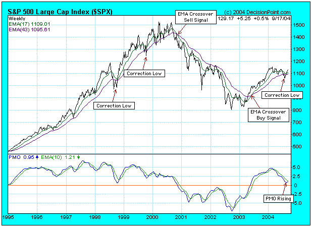
Another good sign is that the Price Momentum Oscillator (PMO), which topped in overbought territory in the first quarter, has now bottomed near the zero line. You can see how the PMO remains above the zero line during bull market corrections -- in bull markets the zero line is an oversold level for the weekly PMO.
There is nothing not to like on this chart. A lengthy correction has been successfully concluded and the market environment is very positive. I have no opinion on how long or high the rally will go, but I assume it will last for at least a couple of months. We want to see the PMO continue to rise and cross above its 10-EMA. If the PMO turns down below its 10-EMA, it would be a strong sell signal.
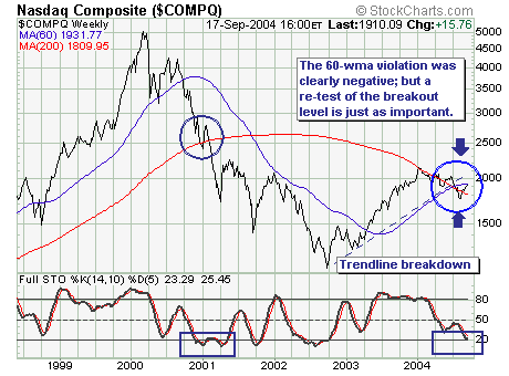
The current Nasdaq Composite rally is at an �inflection point� much in the same manner it was during the week of July 14th as prices slid to new yearly lows. The simple indicator we are looking at is the 60-week moving average, which in the past has an enviable record as an inflection point. If prices breakout above this level, then higher prices will develop; however, if the 60-wma acts as resistance as we believe it shall given the declining 200-wma�then a larger decline will be underway. Thus, if one is inclined to be short technology shares�this is certainly the �best risk-adjusted� time in which to do so.
