There's some good news on the Dow chart this week. Despite Thursday's Merck-induced dip, the index moved higher on Friday and solidified last Tuesday's reversal at the 9977 level. That reversal was very significant as it was the first step in establishing a new uptrend for the index. Check out the chart below to see what I mean:
.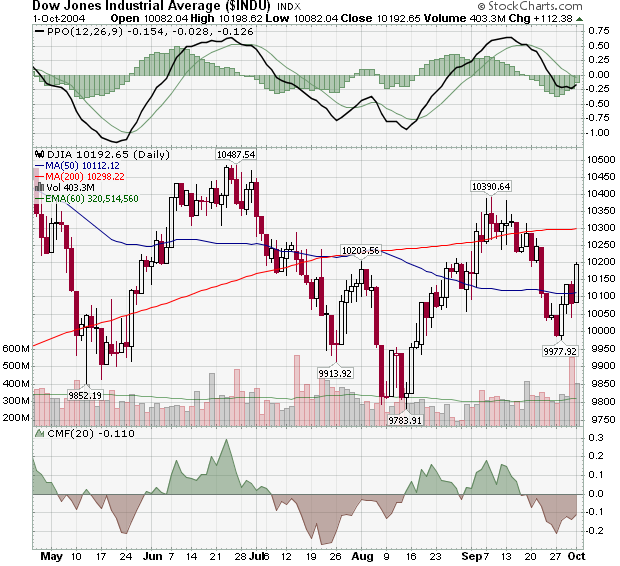
The turn at 9977 was much higher than the previous reversal back in August at 9783. While that's a very bullish sign, cautious ChartWatchers might want to wait for confirmation before getting too excited. Classical peak-and-trough analysis says that confirmation will happen when/if the index moves about the previous peak at 10390.
Why be cautious right now? Well, we only have to look back to the short-lived uptrend in late July for the answer. July's low of 9913 was higher than the previous low (the 9852 from mid May), but confirmation didn't happen and the index moved even lower by mid-August.
Still, with the 50-day MA starting to move higher and the PPO and CMF turning up, things look positive for the short-term.
Before I get into this week's look at Murphy's next law, I wanted to remind everyone to check out all of the areas of the newsletter including John Murphy's call for Nasdaq leadership and Carl Swenlin's look at the amazing 9-month cycle effect.
LAW #8: KNOW THE WARNING SIGNS
Law #8: Trade MACD. The Moving Average Convergence Divergence (MACD) indicator (developed by Gerald Appel) combines a moving average crossover system with the overbought/oversold elements of an oscillator. A buy signal occurs when the faster line crosses above the slower and both lines are below zero. A sell signal takes place when the faster line crosses below the slower from above the zero line. Weekly signals take precedence over daily signals. An MACD histogram plots the difference between the two lines and gives even earlier warnings of trend changes. It's called a "histogram" because vertical bars are used to show the difference between the two lines on the chart. - John Murphy
Check out this chart of QQQ as you read John's description of Law #8. Above the chart is the standard daily MACD plot that contains the thick MACD line, the thin MACD Signal line and a small version of the MACD Histogram. Behind the QQQ candlesticks is a much larger version of that same daily MACD Histogram. Beneath the chart is the weekly MACD indicator (Just multiply the daily parameters by 5).
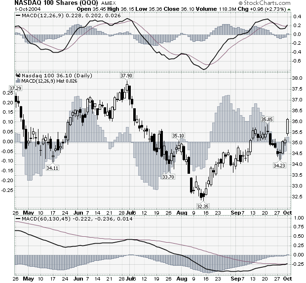
So what do you think? Bullish or bearish? According to Law #8 is now a good time to buy the Q's or short them?
Hopefully, you can see that the Q's look pretty bullish right now from this chart. Not only has the daily MACD lines just had a buy signal - which you can see because the Histogram has just moved back into positive territory - but the weekly MACD has also just given a buy signal - its first one in a long time.
Note: I used the Beta version of our new charting tool - SharpCharts2 - to create this chart. Our older charting tool cannot place indicators "behind" the price plot like I did with the histogram above.
More Info:
In addition to our 4-part ChartSchool article on the MACD, we also have Gerald Appel's book "Winning Market Systems" in our bookstore.
Note: John's entire 10 Laws of Technical Trading can be found in our "ChartSchool" area under "Trading Strategies". If you missed any of my previous articles on Murphy's Laws, the ChartWatchers Archives page will take you to any of them
NASDAQ 100 TOPS 200-DAY LINE... One theme I keep repeating is the need for Nasdaq leadership during any fourth quarter rally. I'm happy to report that on the first day of the fourth quarter the Nasdaq 100 led a very impressive market rally that could carry through the rest of the year. Chart 1 carries three bullish pieces of information. First, the Nasdaq 100 Shares (QQQ) broke through their 200-day moving average. Second, the QQQ did so on the strongest volume in a month. Third, it was the strongest percentage gainer of the major market indexes and continues to show new market leadership. The QQQ/S&P 500 ratio line, which bottomed in mid August, hit a new two-month high today. Let me demonstrate why Nasdaq leadership is so important to the rest of the market.
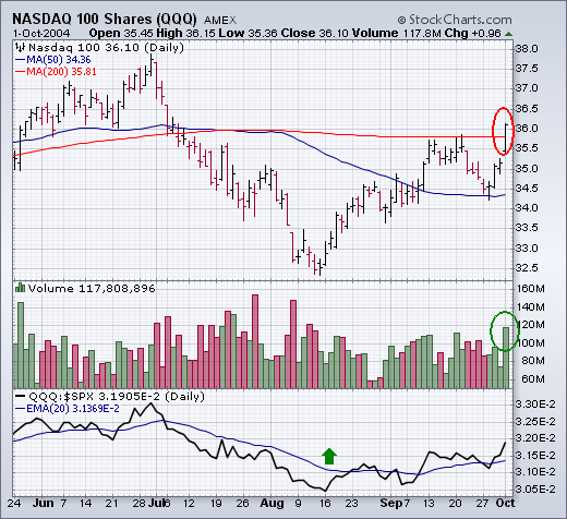
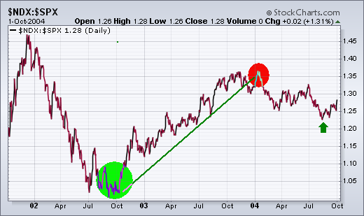
WHY NASDAQ LEADERSHIP IS IMPORTANT ... Chart 2 is a ratio of the Nasdaq 100 divided by the S&P 500. When the ratio is rising, the Nasdaq is outperforming the S&P which is good for the market. When the ratio is falling, the Nasdaq is underperforming the S&P which is bad for the market. The Nasdaq/S&P ratio bottomed in October 2002 (green circle) which marked the end of the three year bear market that started in early 2000. The Nasdaq led the S&P higher throughout the entire 2003 market rally. The Nasdaq/S&P ratio peaked at the start of 2004 (red circle) which started a downside market correction that lasted until August. The green arrow to the bottom right shows the ratio bottoming in mid-August. [That's the upturn shown in Chart 1]. The main point of the chart is to demonstrate that a rising ratio (Nasdaq rising faster than the S&P 500) is a necessary ingredient if the market is starting another upleg.
It’s beginning to look like déjà vu all over again for the iShares Lehman
20+ Year T-Bond Fund (TLT). This bond ETF has been in a steady uptrend
20+ since
May as rates have fallen. May just happens to coincide with the Fed’s first interest rate hike. Rates have risen at the short end of the curve (<2 years), but declined at the long end and TLT represents the long end (>10 years).
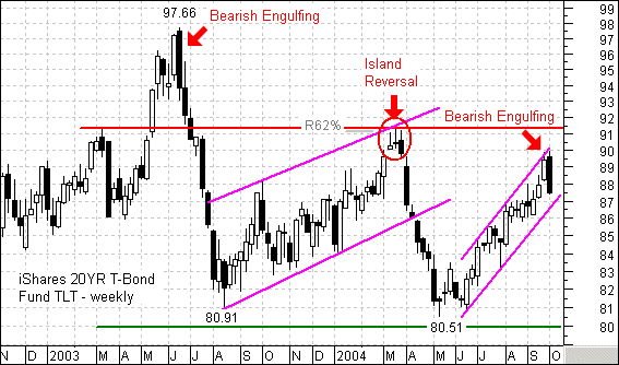
As noted in last week’s report, TLT looks vulnerable to a pullback, consolidation or even a sudden reversal. This bond ETF traded to the upper trendline of a rising price channel and formed a bearish engulfing this week. Notice that a large bearish engulfing pattern foreshadowed the Jun-03 peak and an island reversal foreshadowed the May-04 reversal.
As the recent past shows, TLT can fall fast and the employment report is due next Friday. The last two declines erased 15% and 12 % in around two months (16-Jun-03 to 14-Aug-03 and 17-Mar-04 to 13-May-04). These are big moves for bonds and it was difficult to get out of the way as a virtual free fall occurred. Weak employment numbers and a softening economy have propped up TLT for the last few months. Recent GDP numbers show a firm economy and a strong employment report would surely send TLT tumbling further.
We are currently expecting a price low associated with the 9-Month (40-Week) Cycle, but let's first review some cycle basics.

The vertical lines show the location of all Nominal 9-Month Cycle troughs since 1996. The normal expectation is that the price index will arc from trough to trough, but sometimes other forces override normal cycle pressures, as happened in 1999 and 2000 when the market was transitioning from secular bull to secular bear. Because we are depicting "nominal" cycle projections, all the lines are of equal distance from one another, and they show where the cycle trough is assumed to be located. In other words, we believe that cycle periodicity is consistent, but price movement doesn't always conform to the cycle ideal.
The price crest associated with the current 9-Month Cycle occurred in the first quarter. Early tops are often followed by severe declines; however, the market entered a consolidation pattern instead. It appears that the price low for the cycle occurred in August, and that the current retracement toward that low could be a successful retest which coincides with the cycle trough, which is due now.
Bottom line is that we're looking for an important price low associated with the cycle trough, but that low can arrive a month or more on either side of the projected date. Assuming a successful retest, the cycle structure suggests that a rally out of the cycle trough could result in prices finally making a breakout from the trading range. However, at this writing, we have negative readings on other indicators, and there is considerable downside risk until the retest is complete. While we wait, let us be reminded that the cycle could run long by several weeks, in which case the August lows would be vulnerable.
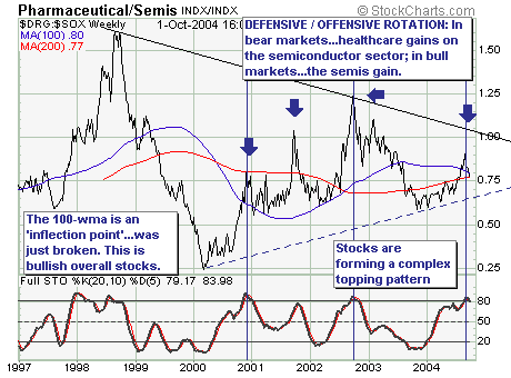
Our comments will be quite short and to the point: In bull markets the more �aggressive' semiconductor sector leads the more �defensive' healthcare sector as market participants favor stocks with higher �betas' in order to increase performance. Over the past several weeks, that is exactly what has started to happen as many hedge fund managers have quite a bit of performance to make up between now and the end of the year.
Looking at the technicals, the Drug/Semis ratio moved back below its 100-week moving average this week (see chart below). Given that development, we must consider last week's trading action to be bullish for equities. While we are uncomfortable with this viewpoint given the major structural issues at hand, the current market environment demands that we listen to the technicals and thus we are closing out selective short positions and putting on selected long positions.
