Last time we talked (on October 2nd) there was reason for optimism with the Dow. Oh, how times have changed...
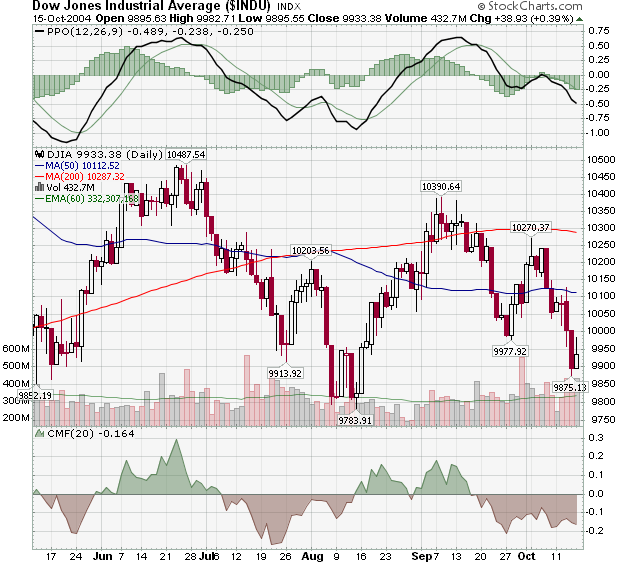
Unfortunately for the bulls, the promising uptrend that was created by the trough at 9,977 didn't fully materialize. After flirting with the red 200-day MA line around 10,390, the index retreated back below 10,000. Friday's 39 point gain probably won't hold up as the market really needs to test the August low (9783) before it can start another strong rally.
The other important development on this chart has to do with the 200-day MA. Can you spot it?
The 200-day MA is now moving lower for the first time in quite a while. In fact, you have to go back to April 2003 to find the last time the Dow's 200-day MA was moving lower. This is a very bearish development and means that everyone's default position on stocks should be bearish.
This week's issue is jam-packed with charts and commentary starting with my look at John Murphy's 9th Law of Technical Trading. John follows that with the key reasons for the recent market weakness. Richard Rhodes looks at the Large Cap/Small Cap ratio, Carl looks at the Large Cap/Volatility Ratio, and Arthur Hill (who has a great article is this month's Stocks & Commodities magazine) looks at the long-term Nasdaq chart. You'll want to see why he ends his article with the word "Gulp"...
LAW #9: TREND OR NOT A TREND
Law #9: Use ADX. The Average Directional Movement Index (ADX) line helps determine
whether a market is in a trending or a trading phase. It measures the degree of
trend or direction in the market. A rising ADX line suggests the presence of a
strong trend. A falling ADX line suggests the presence of a trading market and
the absence of a trend. A rising ADX line favors moving averages; a falling ADX
favors oscillators. By plotting the direction of the ADX line, the trader is
able to determine which trading style and which set of indicators are most
suitable for the current market environment.
As we saw with the Dow Jones chart in the last issue, determining when a new trend has started is difficult at best. If only there was a way to see how "strongly" a stock is trending. Well, that's exactly what the ADX line does! Check it out:
![http://stockcharts.com/h-sc/ui?c=$INDU,uu[h,a]waclyyay[df][pb10!b40][vc60][iUl14]](//d.stockcharts.com/img/articles/2004/10/6a0105370026df970c0105371e8b0c970b-pi.png)
Here's a longer-term, weekly Dow chart. The blue vertical lines show where the Red and Green +DI and -DI lines cross inside of the ADX indicator window. Ignoring some lag -which is common with a 14-week indicator like this - you can see that those blue lines divide the chart into a downtrending period, an uptrending period, and a mixed period (from April onwards). The best example of using the black ADX line that John was talking about can be seen during the downtrend period (from April 2002 to May 2003).
Initially, the ADX line is quite low as the new downtrend gets established. By July 2002, it is rising quite quickly meaning that the downtrend is strengthening. This is the time when, according to John, you should favor moving averages for trading signals.
The downtrend bottoms out in early October, just as the ADX hits its peak. The ADX then begins a slow decline that lasts until May 2003. That is the period on the chart during which John says you should favor Oscillators for trading signals.
More Info:
The ADX was developed by Welles Wilder as part of his "Directional Movement Index (DMI)" system. It was first described in his book New Concepts in Technical Trading back in 1978.
Note: John's entire 10 Laws of Technical Trading can be found in our "ChartSchool" area under "Trading Strategies". If you missed any of my previous articles on Murphy's Laws, the ChartWatchers Archives page will take you to any of them.
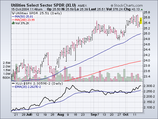
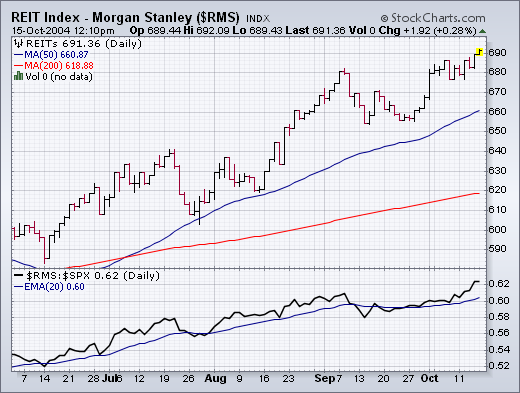
The biggest market feature of the week was the fact that Energy and Materials were the two weakest sectors. This is a reversal of recent trends. The loss of leadership by those two former leaders contributed to this week's market selling. At such times, money moving out of former leaders usually finds it's way into former laggards. We haven't seen too much of that yet. Utilities (Chart 1) and REITs (Chart 2) continue to hold up very well. That may be the result of low interest rates or, more likely, a pursuit of dividend-paying stocks. That may also explain why value stocks have done better than growth stocks. Two groups that usually attract money in this environment are consumer stocks -- either staples or retailers. Although neither group has created much excitement, there are some stocks in each group that are showing good chart action. Yesterday, I showed McDonalds hitting a new six-month high. Here are a few others.
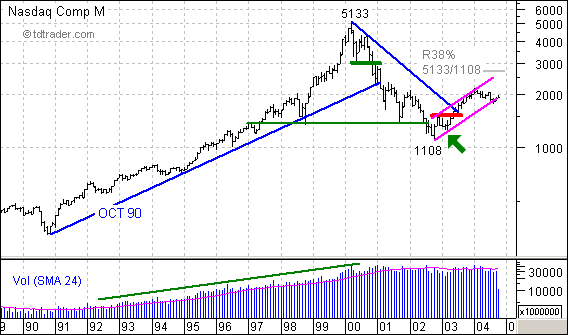
Monthly charts are good for perspective and some projections. First, you can see that both volume and the index steadily advanced from 1991 to 2000. Volume has leveled out over the last 4-5 years, while the index suffered a sharp decline to 1108. The recovery over the last two years carried the index back above 2000 and retraced a mere 25% of the prior decline.
Over the last nine months, the Nasdaq basically consolidated around 2000 and traded over to the lower trendline of the rising price channel. It looked as if this trendline was going to be broken in August, but the index managed to stave off the break and keep the channel alive (not sure about the kicking part).
Two things are clear. First, the last reaction low was at 1253 in Mar-03 (green arrow). The low came about with the breakout above resistance (red
line) in May-03. Second, the decline in 2004 is relatively puny compared to the prior advance (1108 to 2153). In fact, it looks like a mild correction or falling consolidation.
As a falling flag, a break above the June high (2056) would signal a continuation higher and project a move towards the upper trendline and 38% retracement. However, further weakness below the August low would break the trendline extending up from 1108 and call for a continuation of the prior decline (5133 to 1108). Gulp.
An indicator that has recently become quite popular is the SPX/VIX Ratio. I have tried to convince two of its proponents that it is a calculation that makes no sense, but to no avail. Nevertheless, I will present my argument here for your assessment.
Ratio calculations are most commonly used to demonstrate relative strength between two price indexes, or to determine the price acceleration/deceleration of a single index. For the relative strength calculation you divide one price index by another. For example the chart tools on both DecisionPoint.com and StockCharts.com web sites have an indicator named "Price Relative", which on the default setting will divide the selected stock price by the SPX. The resulting indicator is an index that rises and falls based upon the relative strength of the stock versus the SPX.
For the Rate of Change (ROC) calculation for a single price index we simply divide today's price by the price from a previous date. This results in an indicator that expresses speed and direction of the price index.
The SPX/VIX Ratio (which divides the S&P 500 by the CBOE Volatility Index) makes no sense because it divides a price index, with a theoretically infinite range, by a range-bound indicator index . The result of this calculation is an indicator that behaves quite differently when the S&P 500 is below 400, as it was in 1990, compared to when the S&P 500 was over 1500 points, as it was in 2000. You can see what I mean on the chart below.
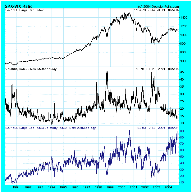
It is hard for me to construct a rationale for this indicator, but I think the current assertions are that the recent ratio spike near 90 is warning that we are near another important top like the 2000 top, which also had a ratio spike near 90. I will not argue about whether or not we are near a major top -- it's possible -- but a single previous data point in a 15-year period doesn't prove the hypothesis.
I think the VIX chart taken by itself is more constructive and informative. Note how the upward spikes mark periods of extreme fear brought on by severe market declines. Currently the VIX is near the lower end of its range, indicating that investors are very complacent; however, this behavior is much like it was in the 1990s, a time when the market was advancing. We can see by the historical range of the VIX that, while people are indeed complacent, they are not as complacent as they can get.
As for the SPX/VIX Ratio, with all due respect to its proponents, it expresses a relationship that has no meaning. I think this is evident when we view the longer-term chart.
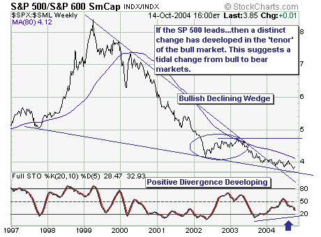
For all intents and purposes, the cyclical bull market that began in March-2003; and during the entire move to higher prices - S&P 500 Large Cap index performance 'lagged' that of the S&P 600 Small Cap index. However, the 'winds are a changin' as they say; the S&P 500/S&P 600 Ratio is showing signs of bottoming given the bullish declining wedge breakout.
If this is the case as we suspect, then subtle, but material change has taken place that will prompt the major market indices to move lower in a series of lower higher and lower lows...the definition of a downtrend.
Thus, if one is long...then one should define their risk tolerance at these levels; but if one were to be more aggressive...then short positions are warranted on all countertrend rallies.
