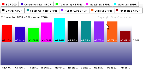
Nothing helps the markets like a lack of uncertainty. With the election resolved quickly, a big relief rally got underway on Wall Street with the Materials, Energy and Consumer Staples sectors posting the biggest gains. Let's go to the charts:
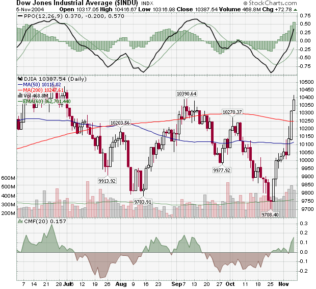
Notice on the daily Dow chart above that Friday saw the index test its next mid-term resistance level - the 10,390 high set back in early September. Assuming that it continues higher next week, what are the Dow's next resistance levels? The answer appears clearly on our weekly Dow chart below:
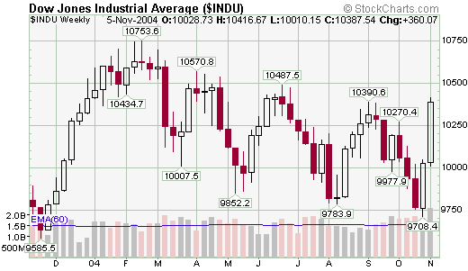
10,487 from mid-June and 10,570 from the beginning of April would be the next goals - but let's not get ahead of ourselves just yet...
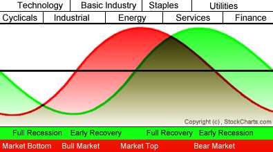
Back to the sector picture, notice that the strongest performing sectors over the past couple of days - Materials (AKA "Basic Industry"), Energy, and Consumer Staples - are positioned near the middle of our Sector Rotation model. That suggests that the current economic cycle is maturing. Confirmation of this possibility would occur if Consumer Staples and Consumer Services take off in the coming months while Technology and Finance continue to lag.
This week brings us to the next-to-last article in my series on John Murphy's 10 Laws of Technical Analysis.
LAW #10: KNOW THE CONFIRMING SIGNS:
Law #10: Include volume and open interest. Volume and open interest are important confirming indicators in futures markets. Volume precedes price. It's important to ensure that heavier volume is taking place in the direction of the prevailing trend. In an uptrend, heavier volume should be seen on up days. Rising open interest confirms that new money is supporting the prevailing trend. Declining open interest is often a warning that the trend is near completion. A solid price uptrend should be accompanied by rising volume and rising open interest. - John Murphy
"Pssst! Hey you! Over here... Have I got a hot stock for you. It's in a hot sounding sector, momentum is moving higher and it's breaking out right now! A savvy investor like yourself shouldn't pass up such a golden opportunity. MDKI - Check it out!"

Hopefully everyone reading realizes that I was just kidding above - but let's pretend some more. What's wrong with the above chart? Actually - nothing. MDKI is rallying after bouncing off of 3.20 and has just had a bullish MACD cross-over with the MACD in positive territory - all of those are very positive technical developments. The problem is what is not on this chart - Volume! Let's look at a different chart for this same stock:
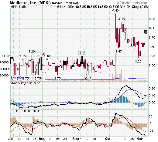
This chart has the volume action overlaid in light red/black histogram bars behind the candlesticks. It also include the Percentage Volume Oscillator (PVO) which is essentially the MACD for volume. Suddenly things don't look so rosy for MDKI. Volume has been declining ever since the big spike up on October 8th. The rally over the past 3 days has occurred on ever lighter volume. In addition, the PVO (which indicates "volume momentum") is low and getting lower. This doesn't bode well for the short term.
Of course, T/A is all about playing the percentages - there's nothing on this chart that guarantees that MDKI will head lower soon, but without the all important confirmation from Volume, the odds are not good.
Side Note: John mentioned "Open Interest" in addition to volume. Open Interest is the number of options or futures contracts that are still unliquidated at the
end of a trading day. A rise or fall in open interest shows that money is
flowing into or out of a futures contract or option, respectively. In futures
markets, rising open interest is considered good for the current trend. Open
interest also measures liquidity. Unfortunately, StockCharts.com currently doesn't provide access to Open Interest information yet. Confirmation from volume is the way to go.
Note: John's entire 10 Laws of Technical Trading can be found in our "ChartSchool" area under "Trading Strategies". If you missed any of my previous articles on Murphy's Laws, the ChartWatchers Archives page will take you to any of them.
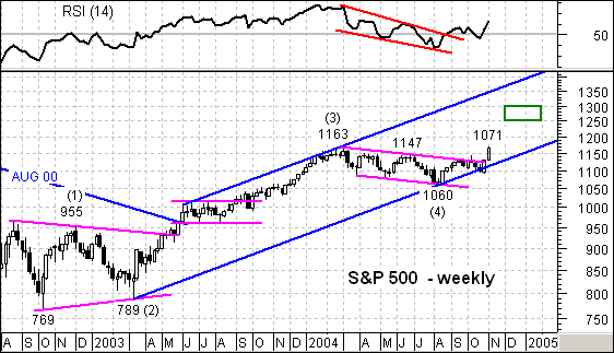
For once, the S&P 500 is stronger than the Nasdaq 100 as the index has already broken above its 2004 high (1163). The overall pattern looks like an Elliott 5-Wave advance and the 2004 decline formed Wave 4. In addition, this decline looks like a falling flag that overstayed its welcome with the August low at 1060.
Regardless of the length of pattern, the breakout above the upper trendline and 2004 high signals a continuation of the Mar-Jan advance. Should the rising price channel remain intact, a move towards the upper trendline can be expected (1350-1400). This seems a bit extreme and a more reasonable target would be around 1250. A Fibonacci 62% of Wave 3 would project a move to around 1300 (1163 – 789 = 374, 374 x .62 = 232, 1060 + 232 = 1292).
For signs of failure, turn to the late October low at 1090. This low was part of the sharp advance in the last week of October. Should the index fail to hold a breakout above 1150 and move below 1090, the 2004 falling price channel (bears) would be back in force.
While it is widely reported when a stock is hitting a new 52-week high or low, I've always been curious as to where stocks are in relation to their 52-week range the rest of the time. To determine this I developed the "Rel to 52" scale. We simply assign a value between zero (at the 52-week low) to 100 (at the 52-week high). A stock in the middle of its 52-week range would get a Rel to 52 value of 50. This value is reported in one of the columns in our downloadable spreadsheets.
Decision Point also tracks the "Rel to 52" for each stock in certain market indexes, then we average them. The results make for an interesting indicator that give us a sense of how all the stocks are faring, not just the small percentage that are hitting the extremes of the one-year range. We have this indicator for the SPX, OEX, NDX, and Dow.
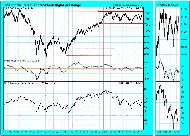
One of the things that stands out on this chart is the fact that, even in the depths of the bear market, the average Rel to 52 value was between 35 and 40, indicating that most stocks were not making new lows along with the S&P 500 Index. Conversely, notice how the Rel to 52 near the March 2004 market top was about 87, indicating that most stocks were participating in the rally.
The thing to remember is that the Rel to 52 is affected not only by up or down price movement, but also by the changing width of the 52-week range. For example, you can see how the range expanded in 2003 up to the March 2004 high, at which point the range was 375 points. Since then the bottom of the range has been rising along the higher lows of the 2003 portion of the bull market, and now the range is only 120 points wide. In the event of a longer-term price reversal, new lows would begin expanding rather quickly because the bottom of the range is relatively close.
While I have had my spreadsheets set to calculate and collect these data for several years, I had forgotten about it until just recently. There is probably more to learn from this chart as we study it and think about what we see, but it already offers a unique perspective on new highs and new lows.
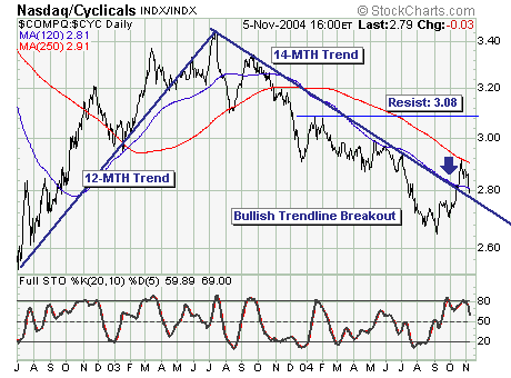
Two weeks prior, a major bullish key reversal' higher developed in the S&P 500 Index; this led to Friday's new relative high. Given this, proper sector' positions are required to take full advantage of racing with the strongest'. In the past this meant buying high-beta technology shares; but over the past month the cyclicals have outperformed technology.
This is a potentially negative signal; the March breakout above the February high, and the August breakdown below the May low each failed. This breakout/breakdown was very obvious to all players just as Friday's breakout; thus it is far too early to sound the all clear' bell.
That said, the Nasdaq Composite vs. MS Cyclicals ($COMPQ :$ CYC) ratio shows that once trends become engrained, they remain trending for 12-14 months. The September low in the ratio broke bullishly above trendline resistance and the 120-day moving average; if this current correction holds, and then breaks out above the 250-day moving averagethen a 10-12 month period of Nasdaq Composite outperformance will be confirmed. If not, the Friday's breakout is likely to be short-lived indeed.
