HELLO FELLOW CHARTWATCHERS!by Chip Anderson | ChartWatchers
As you may have noticed, once again we are able to send out the newsletter in HTML format thanks to the good people at ConstantContact.com. We hope you enjoy the convenience of having the entire newsletter in your inbox rather than having to click a link to see it. As always, we want you feedback on changes like this, so feel free to tell us what you think.
The other big change this week is the launch of the "Beta 5" version of our new SharpCharts2 charting engine! With this release, SharpCharts2 is almost complete. You can find a complete list of the new improvements in the "Site News" section below. Be sure to test it out and let us know if you have any problems.
Our columnists have also been busy. John Murphy kicks things off with a look at the market's current Elliott Wave picture. Richard Rhodes is feeling bullish about technology stocks right now. Carl Swenlin shares the historic perspective for years that end in "5". And Arthur Hill looks that the sector picture for the Nasdaq 100.
Here we go...
HELLO FELLOW CHARTWATCHERS!by Chip Anderson | ChartWatchers
Today we have a special mid-week edition of ChartWatchers for you. Yesterday, John Murphy published a column and the long term outlook for Gold and the Market as a whole. The column received a very large number of positive comments from his subscribers and we thought we'd share it with everyone.
We are also using this opportunity to clean out our newsletter subscriber list. You are getting this message because someone (hopefully you) entered your email address into our newsletter subscription form at some point in the past. If you no longer wish to receive these free, bi-weekly newsletters from us, simply click on the "SafeUnsubscribe" link at the bottom of this message.
We'll be sending out our regularly scheduled edition of ChartWatchers again this weekend with articles from all of our regular commentators.
Now here's John...
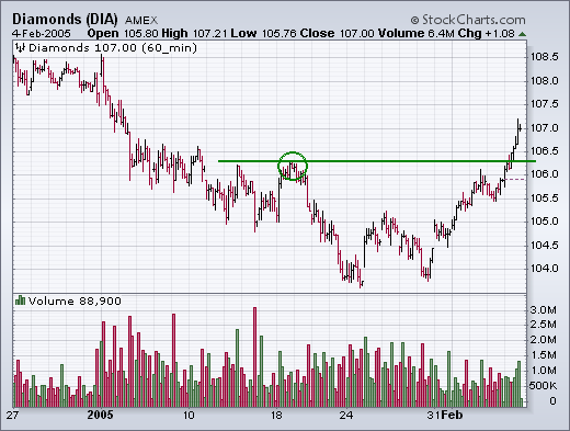
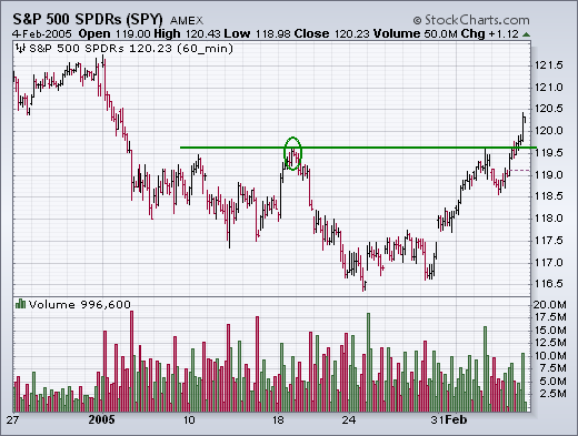
DOW AND S&P 500 CLEAR RESISTANCE BARRIER... The hourly bars for the Dow Diamonds and the S&P 500 SPDR show both having cleared initial resistance at their mid-January highs. [Both also closed back over their 50-day moving averages]. Small cap indexes accomplished that earlier in the week, which hinted that the large cap indexes were heading in the same direction. I also showed the improvement in market breadth figures earlier in the week. That greatly increases the odds that the blue chip averages are headed for a challenge of their old high.
IT LOOKS LIKE MARKET IS IN FIFTH WAVE OF FIFTH WAVE ... From a longer-term perspective, very little has changed. I've written several times about the possibility of another upleg which could challenge (and maybe even exceed) the late 2004 peak. My work, however, still suggests that another upleg would probably be the final one in the cyclical bull market that started in October 2002. Or, to put it in Elliott Wave terms, I believe the market has begun the fifth wave of a fifth wave. [The fifth wave of the cyclical bull market started in August. The fifth wave of that fifth wave started this month]. I've been asked if there's a calendar date for a possible top. One possibility is March which would be the two-year anniversary of a major bottom. The other would be April. After January, April is the next strongest month in the first half of the year. One of the reasons I recently suggested some profit-taking during January was because that was the tail end of the strongest three month span of the year that normally starts in November. April ends the strongest six-month span that also starts in November. If the market does move to new high ground, my best guess for a top would be April.
GOLD INDEX STILL TESTING TRENDLINE SUPPORT... Back on January 10, I wrote about the Gold & Silver Index (XAU) being in a support zone defined by the rising trendline shown in Chart 1. The trendline starts in April 2003 and is drawn under the April/July 2004 lows (see arrows). The third arrow still shows potential trendline support near 90 in the XAU Index. Chart 2 applies Fibonacci retracement levels to the rally that began last May. It shows that the XAU has retraced close to 62% of that uptrend. That also makes the area around 90 a potential support level. That lower horizontal line also shows potential chart support along the summer highs (see circles) and the September low just above 90 (see arrow). That's the good news. The bad news is that despite being in support, and in an oversold condition, gold stocks haven't shown any bounce at all. In fact, they've been the weakest market group during 2005. Which brings us to another charting technique that I wrote about in mid-January to help pinpoint a buy signal. That's a Point & Figure chart.
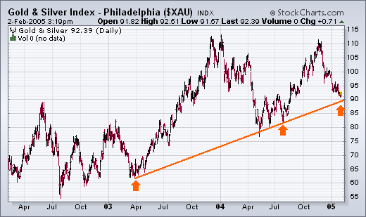
Chart 1
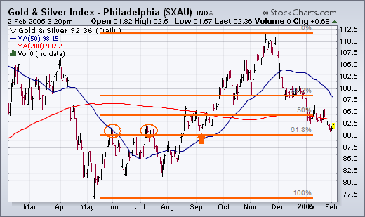
Chart 2
GOLD HASN'T GIVEN P&F BUY SIGNAL YET ... This is the same headline that I wrote on January 14 in another discussion of gold stocks. I was referring specifically to the lack of a buy signal given on a point & figure chart of the XAU Index. An updated version of that chart is plotted in Chart 3. Each box is worth one point. The x columns represent rising prices while the o columns represent falling prices. A sell signal was given during December at 98 when an o column fell below a previous o column. Since then, prices have continued to trend lower. In order to give a buy signal, the last x column has to rise above a previous x column. For that to happen on this chart, the XAU would have to rise to 97. It closed today at 92.35. The reason for incorporating P&F signals into your work is that they give more precise buy and sell signals than bar charts and, as a result, inject more discipline into trading decisions. Gold stocks are a good example. Although I happen to think that the XAU has declined to a level where it should start to do better, it's usually safer to wait for the market to prove itself. One way to do that is to wait for it to move back over moving average lines on the bar chart. Another is to wait for a Point & Figure buy signal. Or both.
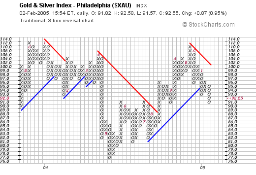
Chart 3
BUT OIL STOCKS HAVE ... This is the second part of the headline that I used on January 14. I was trying to show that while gold stocks hadn't given a p&f buy signal, oil stocks had. At the time, the P&F chart of the Energy Select Sector SPDR (XLE) was giving a buy signal at 35.75 as the last x column exceeded a previous x column (Chart 4). Since then, the XLE has risen to a new high. It tacked on another couple of x's today (see green boxes) to close at 38.70. There's another lesson here. And that has to do with taking what the market is giving us. The point in trading is to make money in the market. That's done by buying something that's starting to move up. We can't always be sure in advance what that's going to be. It's one thing to have our analysis suggest that something should be going up. It's another to actually see it going up. That's why we use charts to trigger buy signals. And, while you're waiting for a buy signal in one group, try not to miss a good move in another. Take whatever the market is giving.
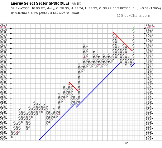
Chart 4
UNDERSTANDING POINT & FIGURE ... I've received a number of messages asking for more information on how to create and read Point & Figure charts. Stockcharts.com provides an excellent explanation which you can find under P&F Charts on the main menu. Once you get to the p&f page, simply click on "Understanding Point & Figure Charts" and you'll find more than enough to get you started. If you want to read even more on the subject, Chapter 11 in my book on Technical Analysis of the Financial Markets is devoted to p&f charting. I highly recommend that you learn more about this form of charting. [P&F charts are older than bar charts]. Each form of charting offers some benefits. Why not take advantage of both?
DIVIDE AND CONQUERby Arthur Hill | Art's Charts
To understand the Nasdaq and Nasdaq 100, it is important to look at the individual parts. These two indices can be broken down into four key industry groups: semiconductors (SMH), networking (IGN), software (SWH) and internet (HHH). While retail, telecom, hardware, biotech and other industry groups certainly play a part, these four are the key drivers and the first place to look for signs of weakness or strength.
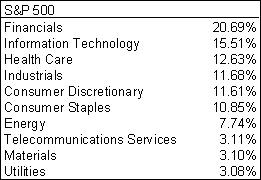
The same approach works for the S&P 500. This index can be broken down into six key sectors: Finance (XLF), HealthCare (XLV), Consumer Discretionary (XLY), Information Technology (XLK), Industrials (XLI) and Consumer Staples (XLP). Even though Industrials and Consumer Staples each make up over 10% of the index, I tend to focus on the other four sectors, which make up over 60% of the index when combined.
In particular, the retail group is a major influence on the Consumer Discretionary sector and retail spending drives ~2/3 of GDP. As it name implies, the Consumer Discretionary sector represents cyclical stocks and these are more prone to economic fluctuations than the other sectors. This makes it an important component of the S&P 500. And finally, notice that Energy, Materials and Utilities (combined) account for less than 15% of the index. However, their influence is growing.
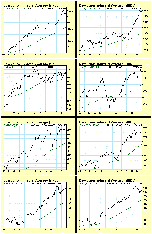
The Decennial Pattern refers to the fact that years ending in the number five (5) are up years for the stock market. This is not just a statistical tendency. In fact, this has been the case for every year ending in 5 since 1885. Furthermore, the price low for these years has been made in the first quarter of every year except 1965. Many find this evidence quite compelling, however, John Hussman (hussman.com) demonstrates in his 1/24/2005 weekly commentary why the decennial pattern is "statistically unimpressive." Nevertheless, there could be more to this pattern than luck and serendipity. Years ending in 5 are also either the first or third years of a presidential term, and these tend to be up years.
While the Decennial Pattern is a bullish sign for 2005, I wouldn't bet the ranch on it. Every year has it's own character, and it is better to follow the trend and remember that getting heads 100 consecutive times flipping a coin, the odds of getting heads on the next toss are still 50-50.
Below are charts of the last eight years ending in 5 (that's as far back as we have data). Our thanks also to Peter Eliades (stockmarketcycles.com) and Tom McClellan (mcosillator.com) for the research used in this article.
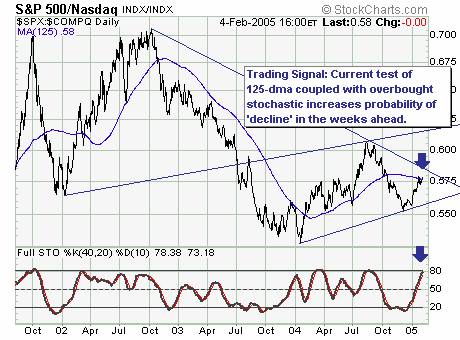
Last week's market rally was impressive to be sure. Now, the question whether the decline off the early January highs are in fact intermediate-higher or more short-term in nature. Previously, we postulated the monthly key reversals' in the major indices put them in a position to decline further; however, that isn't clear any longer. In fact, the S&P 500/Nasdaq Composite Ratio is now testing the critical 125-dma trading signal' we use; if prices breakout above it then technology shares are expected to underperform . But, given the 40-day stochastic is overboughtthen the probability favors a turn lower.
CONCLUSION: The probability is increasing that a larger technology leg higher has now begun. Thus, an aggressive long trade would be the semiconductor sector' given their recent strength.
