MAKING MONEY WITH SHARPCHARTS2
This week - tax week (ugh!) - I wanted to show you three examples of the kind of analysis that you can only do with SharpCharts2. These examples illustrate important technical analysis techniques that just weren't possible with our older charts. Hopefully, these examples will inspire all our ChartWatchers to dive into SharpCharts2 with both feet and take the time to learn what a truly powerful charting system it is.
Exploring Bollinger's %B Indicator
In his latest book, John Bollinger presented several new indicators that felt would help chartists interpret Bollinger Bands better. One of those was the "%b" indicator. %b "tells us where we are in relation to the Bollinger Bands and is the key to the development of trading systems via the linking of price and indicator action." (p.60). %b will equal 1.0 when prices are at the upper Bollinger Band. It will equal 0.50 when prices are in the middle of the bands. And it will equal zero when prices are at the lower Bollinger Band. As John Bollinger suggests, %b can be easily used to create simple trading systems - for example "Buy when %b is below 0.1 and sell when %b is above 0.9." The following SharpCharts2 chart can be used to visually evaluate such a system:
Notice how the oscillation of the green %b line corresponds to the movement on the price bars within the shaded Bollinger Bands area? The chart also shows how each time prices move above the shaded area, the green line moves above 1.0 on the left vertical scale. Similarly, when prices moved below the lower Bollinger Band, the green line sank below zero. Can you spot the three buying points and two selling points of the simple trading system I mentioned above?
Creating the Chart: Start by plotting prices as brown OHLC bars with a standard Bollinger Band overlay that's plotted with the "Area" style and "gold" color. I used daily bars with "Fill the Chart" duration and a bar setting of 5 with a Gap setting of zero. Volume and Legends are turned off. Next, add a standard %b Indicator to the chart using the "Behind Price" position and a green color. Click here to see the live result.
Note to Free Users: Starting from scratch, you can create a chart that's very similar to this one, only without the Area style and color choices seen above.
Detecting MACD Changes Sooner
Most ChartWatchers are very familiar with the MACD indicator and its partner the MACD signal line. The MACD signal line is commonly used to create simple trading system (buy when it crosses above the MACD line, sell when it crosses below). SharpCharts2 adds another tool to your indicator arsenal that can help you evaluate changes in momentum oscillators like the MACD - the Slope-of-an-Indicator indicator.
Slope is a simple concept: take two points on a graph and divide the change in height (the "rise") by the change in horizontal distance (the "run"). (On StockCharts, we then multiply that result by 10 for clarity.) The slope of a horizontal line is zero. The slope of a vertical line is infinite. The slope of a rising 45-degree line is +10 and the slope of a falling 45-degree line is -10. Typically, for financial data, slope varies between +10 and -10 with occasional spikes outside of that range - that is especially true for the slope of "smoothed" data - MAs, EMAs, and (for our purposes) the MACD Line.
Slope can be used to detect trend changes early on - especially for smoothed datasets. Check out the following SharpCharts2 chart:
The lower indicator panel contains a standard MACD plot (colored green) with the Slope of the MACD Line plotted on top as a thicker blue line. (The thin red line is the MACD Signal Line and the green bars are the MACD Histogram). Notice how, in mid-January the Slope of the MACD starts to move lower several days before the MACD crosses it's signal line? The slope started moving lower by 13-Jan whereas the crossover (green and red lines) didn't happen until 17-Jan. In that case, almost 100 Dow points would have been saved by a simple slope-based system. Use the chart above to visually study the following system: Buy when the slope turns up after first moving below -5.0; Sell when the slope moves lower after first moving above +5.0. Do you see the same 4 buying points and 4 selling points that I do?
The price candlesticks are plotted above a 20-day Price Channel zone. When prices hit the top of that zone, the index is setting new monthly highs. Similarly, the bottom of the zone represents the monthly lows. Note how nicely (in this case) the buy and sell signals from our simple MACD Slope system correspond to monthly highs and lows.
Creating the Chart: Start with a "Fill the Chart" Candlestick chart with a Bar width of 5 and a Gap of 1. Add a blue Price Channel overlay with a 20-period setting and an "Area" style. To make the candles more visible, crank down the "Opacity" of the Price Channel overlay to 0.3. Now add the standard MACD indicator in the "Below" position. Using the controls to the right of the MACD indicator, set the color to "green" and the Opacity to "0.5". Finally, choose "Slope" in the the MACD's "Overlay" dropdown and set its parameter to "6". (Six is half of the MACD's first parameter - 12 - and is used to get faster signals.) If you did everything correctly, you'll see something like this chart.
Note to Free Users: Unfortunately you need to subscribe to our site to use the "Indicator-of-an-Indicator" feature from this chart.
Show me the Volume!
CandleVolume charts are perfect for seeing how and when money moves into and out of a stock - especially when combined with our "Volume by Price" overlay. In a CandleVolume chart, the width of each candle is proportional to the volume for that particular day. Fat candles mean high volume days, skinny candles mean low volume days. Check out the following chart:
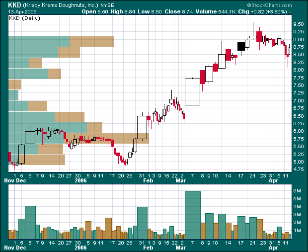
See how the tall volume bars at the bottom of the chart really stand out? That's a key feature of CandleVolume charts.
The horizontal bars sticking out from the left side of the chart are the "Volume by Price" bars. They are the total volume of all days where the stock's price closed within the vertical height of the bar. For instance, the bottom of the longest bar is at 5.60 and its top is at 5.85. You can see that there were lots of price candles that closed within that price range on this chart (many from late December through 17-Jan). All of the volume for those bars were totaled together to determine the horizontal length of the bar. (Note there is no scale displayed for those bars - just compare them to the other bars on the page.)
Now look at KKD's big move at the start of March. It's even more impressive on a CandleVolume chart isn't it? Lots of big bars in a row like that indicate that there is very strong interest in a stock. Note however that the horizontal bars during that time aren't as impressive. Longer horizontal bars indicator stronger support/resistance levels. If KKD falls back below $8.00, this chart suggests that it won't find lots of support until it is back around the $6.00 level.
Creating the Chart: Start by selecting "CandleVolume" from the "Type" dropdown in the "Chart Settings" area. Make sure the "Range" is "Fill the Chart" and the "Size" is set to 620. Next set the "Volume" dropdown to "Separate". Make sure the "Color Prices" and "Color Volume" checkboxes are checked. Finally, add a "Vol by Price" overlay. The final result should look similar to this chart.
Note to Free Users: Good news! You can create this chart completely from scratch.
The bottom line here is that SharpCharts2 provides all of our members with a tremendous amount of flexibility when it comes to creating charts - way more than our old system ever did. Once you start to use the power of overlays, you will wonder how you ever did without them.
Read the Site News section below for more information about SharpCharts2!
P.S. The simplistic trading systems presented here are meant as starting points for your own personal analysis. Never adopt a trading system without first understanding it thoroughly. Always use good money management techniques to manage stock market risk. See the "Trading Strategies" section of our ChartSchool for more information.
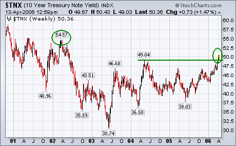
Last week the yield on the 10-Year T-note broke through its 2004 peak at 4.90%
to reach the highest level in four years. Today the TNX has moved through the
psychological level of 5%. That doesn't come as much of a surprise considering
that the trend for bond yields is now higher. I suggested last week that the
next upside target for the TNX was the early 2002 peak at 5.45%. While I remain
convinced that bond yields have embarked on a new uptrend, there's still another
technical hurdle that they have to overcome to prove that the long-term
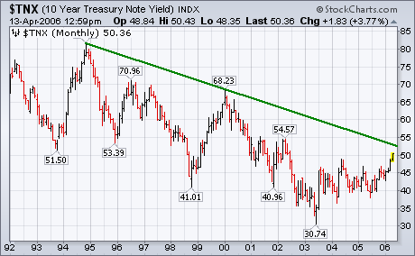
downtrend in long-term rates has finally ended. The monthly bars in Chart 2 show
the downtrend in yields from the 1994 peak. I've drawn a down trendline over the
1994 and early 2000 peaks. Needless to say, a move above that resistance line
would be the final sign that the era of long long-term rates has finally ended.
The most immediate result of rising bond yields is falling bond prices.
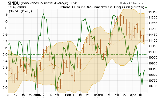
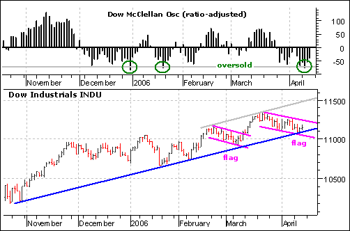
The decline in the Dow Industrials over the last few weeks looks like a bull flag. This downward sloping flag is a potentially bullish pattern that requires confirmation with an upside breakout. Notice that the Dow formed a similar falling flag in late February and early March. The breakout at 11100 in early March confirmed this flag and led to a new reaction high. For the current flag, a break above 11250 would confirm the pattern and signal a continuation higher. The upside target would be the upper channel trendline or to the 11500-11600 area.
In addition to the flag, the Dow is trading at trendline support and the Ratio-Adjusted McClellan Oscillator is oversold. The Dow firmed over the last two days near support from the October trendline. This trendline has now been touched four times and a break would be quite negative. As long as this trendline holds, the trend since October is clearly up. The McClellan Oscillator dipped below ?70 for the third time in five months. The prior oversold dips in December and January led to impressive bounces. The combination of trendline support and an oversold McClellan Oscillator increases the odds of a bounce as we head into earnings season.
One way we can gauge sentiment regarding a particular market or sector index
is by watching asset levels and/or cumulative net cash flow in and out of the
related Rydex mutual fund. In general, cash flows should rise and fall along
with prices. When divergences occur, price movement should be questioned. For
example, a large price move accompanied by a small increase in cash flow
indicates there is probably not broad support behind the price move and that the
rally could fail. Or, a sharp decline that does not result in proportional cash
outflows probably indicates too much optimism and the likelihood of an
additional decline sufficient to cause capitulation.
In the case of Rydex Energy Fund we can observe that, as we would expect,
money flowed out of the fund when prices declined from the January top. After
the correction was completed, prices once more advanced toward the January high;
however, this price advance was not confirmed by money flowing back into the
fund. In fact, assets and cash flow have remained flat during the price advance.
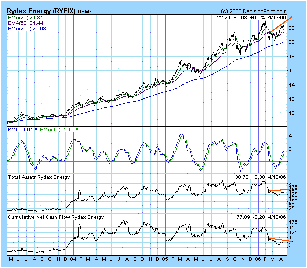
How can the fund's price advance if money is not pushing the move? Remember,
the fund's price is actually its NAV, which is the net asset value of the
securities owned by the fund. The value of these securities will change as a
result of their being traded in the market. The fact that fund asset levels and
cash flow do not confirm price changes indicates that volume associated with the
move is drying up. In the case of Energy Fund, we can assume that the advance is
not likely to be sustained.
At DecisionPoint.com we track assets and cash flow on all 47 Rydex funds.
They are invaluable sentiment indicators.
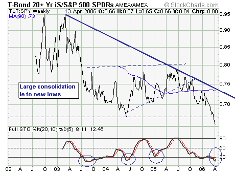
Last week the 10-year note and 30-year bond rose decidedly above the psychologically important 5.0% level. This is first time since June-2002 that the 10-year has traded above this level. If we have learned anything in our 24 years of trading ? it is that interest rates matter at the margin. Moreover, the technical prospects are very good for the 10-year to rise to 5.3% and the 30-year to 5.5%. Soon, we should begin to see a slowing of the economy and a equity market correction of at least -10%.
Thus, we like to look at the Lehman 20+ year bond fund/S&P 500 ?Spyders? Ratio (TLT: SPY) to glean important information. At the present time, the ratio is oversold and due for a technical bounce in the least; however, in 3 of the past 4 bounces?stocks have corrected rather sharply, but not by -10% of more. But the higher rates go?the greater the risk ? especially given the underlying internal deterioration seen during last week?s decline.
Therefore, we are selling stocks short ? and moving to a slightly overweight short position in the Paid-to-Play ?Long/Short? Portfolio.