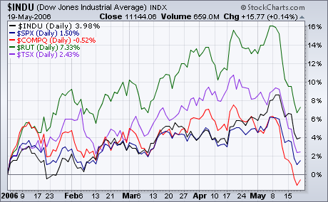
The markets moved lower last week with some disturbingly large downward movements. As you can see in the chart below, last week's losses put the Nasdaq Composite into negative territory for the year - the first of the major averages to get there.
(Did you notice the cool Performance chart that SharpCharts2 can now create? StockCharts member's can click the chart to see exactly how it was constructed.)
At this point, the small caps are still leading the other averages as they have all year, but recent strength in the Dow Industrials could change that soon.
BETTER, STRONGER, FASTER SHARPCHARTS2 CHARTS
We're continuing to listen to everyone's feedback on SharpCharts2. Thanks again to everyone that has sent in a suggestion for improvement. Rest assured that we are always working on ways to make our site even better. The other day we got a complaint from a user about his charts being hard to read and slow to download. The solution to this particular complaint may surprise you.
"Reader X" (not his real name ;-)) sent in a message saying that some of his saved charts were taking a long time to download and looked pretty bad once they arrived. Here's one of the charts he was referring to:
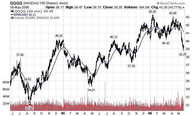
Wow. What a mess. But it turns out there's a good, valid reason for the way this chart looks. Without realizing it, the user was asking to fit 2 years worth of 60 minute candlesticks into a chart that was only 620 pixels wide. Let's think about the math involved in that request:
- There are seven 60-minute candlesticks in a normal trading day.
- There are ~250 trading days per year.
- In order to create a complete candlestick, we need a space at least 3 pixels wide (one for the left edge, one for the middle area, and one for the right edge).
So the minimum width (in pixels) that we need to create this chart is:
7 times 250 = 1750 (candlesticks per year)
1750 times 2 = 3500 (candlesticks for 2 years)
3500 times 3 = 10,500 (pixels per chart)
So, we'd need an area at least 10,500(!) pixels wide to display all of that information in a clean accurate way. (I don't know about you, but my computer screen is only 1280 pixels wide - not quite big enough!) However remember that "Reader X" told us to fit all of those candlesticks into a space only 620 pixels wide. In other words, we have to fit 3500 candles into a space that can only hold at most (620/3=) 216. Yikes!
So, how do we do that? In this case, we use a combination of two approaches: shrinking the candles and selectively omitting some candles from the chart. First off, we shrink the candles down to 1 pixel wide lines. That causes them to lose their "filled/unfilled" information, but we really don't have a choice. Even then, with 1 pixel wide candlesticks, we still need to fit 3500 candles into a 620 pixel wide chart. At that point, we get more drastic - we only plot every 6th candle (roughly). 2800 data points are thrown out in order to fit things into the 620 pixel space the user specified. With all that missing and scrunched data, it's no wonder things look so messy.
So that explains the poor visual quality of the chart, but what about the slowness?
The more data points that go into creating a chart, the longer it will take for our servers to generate that chart. So how many data points does this chart need? 3500, right? Wrong! This chart actually needs 4300 data points from our database. Can you spot the reason why?
The culprit is that 200-period EMA. In order to plot the EMA correctly on the left side of the chart, we need to pull additional data from our database that doesn't even appear on the chart. The amount of additional data depends on the type of indicators on the chart and their durations.
Now, if this chart contained just a 200-period Simple Moving Average, we'd only need to pull 200 additional data points. Unfortunately, Exponential Moving Averages are calculated in a very different way (which I've written about in previous newsletters). EMAs require much more data than SMAs do - it turns out that to accurately calculate a 200-period EMA, you need at least 800-periods of data. Thus we pull over 4300 data points from our database when creating this chart.
In addition, the "crunched" look of the candlesticks reduce the efficiency of the compression routine that we use to shrink down the chart - thus making the chart's file size larger and, as you probably know, the larger the file size, the longer the download.
SOLUTIONS
There are several things that "Reader X" could do to this chart to improve it.
- He could change the range from "2 Years" to "Fill the Chart". "Fill the Chart" will ensure that all of his candlesticks aren't scrunched. It is perfect for people that are mostly interested in the most recent information on the right side of the chart.
- He could change the duration of the chart from "2 Years" to something shorter. Anything more than about 30 trading days will result in some "scrunched" candles, but anything less than 2 years will be an improvement.
- He could increase the width of his chart. The more space we have, the less "scrunching" we have to do. Keep in mind however that wider charts mean larger file sizes and thus slower download times.
- He could change the period from 60-minute bars to daily bars. Then we'd only need to plot 500 candles in the 620 pixels available. There'd still be some scrunching, but not nearly as much. The only "gotcha" with this approach is that he'd also have to reduce the period of his EMA by a factor of seven (since there are seven 60-minute bars in one day). Thus, he'd need to change it from a 200-period EMA to a 28-period EMA.
- He could change from a "Candlestick" chart to a "Line (thin)" chart. A line chart only needs one pixel per data point and thus can fit more data into the same amount of space without scrunching. In this case there would still be lots of omitted data points, however this suggestion can be combined with some of the above suggestions to improve the final result.
- Finally, if "Reader X" is using a slow internet connection, he may want to disable the "Line Smoothing" option on the chart to further decrease it's size.
When contacted about this chart and its settings, "Reader X" replied "Wow, I didn't even think about that. I never really paid much attention to the settings and things look much better now that I've adjusted things based on your suggestions."
Here's a example of a chart that incorporates many of the above suggestions:
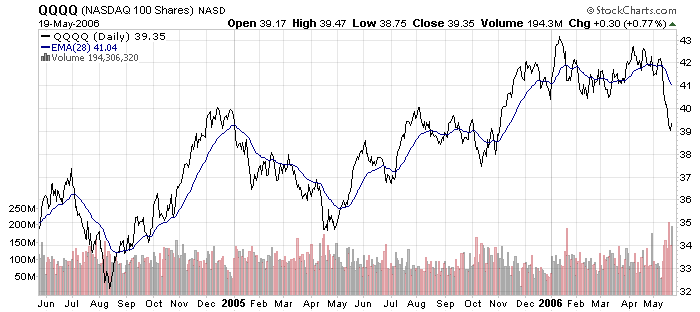
Reader X's original chart was 99K in size. This new chart is only 19K in size. That's more than 80% smaller than the original and actually MORE readable. In addition, the new chart only needed 1300 data points from our database, over 70% fewer data points than before. Now that's what I call a "win-win" situation!
So remember, use discretion when creating your charts. Think about the amount of data involved and the screen real estate required. Hopefully, "Reader X's" lessons will help you improve your charting experience also.
- Chip Anderson
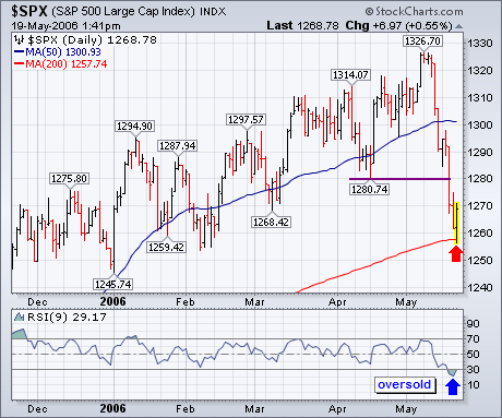
Although the longer-range chart picture has weakened (with most weekly
indicators on sell signals), the S&P 500 has lost about 5% this week and
looks to be in a short-term oversold condition. Its daily chart shows the 9-day
RSI line below 30 for the first time this year. In addition, the S&P has
reached its 200-day moving average and potential chart support along its first
quarter lows. That may be enough to cause a market rebound next week. If one
does materialize, the first level of resistance would be at 1280 which would
also be a one-third retracement of the recent selloff. That's also the mid-April
low that was broken this week. Broken support levels often become new resistance
levels. While short-term indicators are oversold, weekly indicators aren't.
Since weekly indicators take precedence over daily ones, I would continue to
view any short-term rally as another selling opportunity.
QQQQ established support at 40 with three bounces over the last six months and broke this key support level with a sharp decline over the last two weeks. The break below 40 signals a major victory for the bears and the first downside target is to around 37-38. The August 2004 trendline and October low mark support in this area.
The decline was enough to push the McClellan Summation Index into oversold territory. This version of the McClellan Summation Index is based on the stocks in the Nasdaq 100 and is directly related to QQQQ. This is the fourth dip below ?500 in the last two years. However, the indicator has yet to firm and rebound. As long as it remains below ?500 and below its 20-day EMA, breadth is deteriorating and this oversold indicator could become even more oversold. As long as its remains oversold, I would look for further weakness towards support around 37-38 for QQQQ.
A lot of damage has been done over the last two weeks and it will take some time for the bulls to regroup. Before calling for a sustainable rebound, I would like to see the McClellan Summation Index move back above ?500 and its 20-day EMA.

During the last two weeks the market has experienced a much needed (and long
anticipated) decline, and now it is due a bounce out of a short-term oversold
condition; however, the decline could continue for a few more months.
On our first chart below we can see that the CVI (Climactic Volume Indicator)
and the STVO (Short-Term Volume Oscillator) have reached deeply oversold levels
and have turned up. This is a pretty good indication that a short rally could be
starting.
Also, note the rising trend line I have drawn on the chart. For several
months it has acted as support as the market worked its way higher.
Unfortunately, that line has been decisively penetrated, and it will now
function as overhead resistance. My guess is that any rally will not exceed 1300
on the S&P 500.
The next chart shows three of our primary medium-term indicators -- one each
for price, breadth, and volume. The ITBM (IT Breadth Momentum) and ITVM (IT
Volume Momentum) Oscillators have become modestly oversold, but the PMO (Price
Momentum Oscillator) has only just passed through the zero line and is nowhere
near the level where other declines have ended. Also, the violation of the
short-term rising trend line suggests that the decline will continue at least to
the bottom of the medium-term rising trend channel.
The best-case scenario is that the decline will end once the PMO, ITBM, and
ITVM turn up from oversold levels, which might only take a few more weeks;
however I want to call your attention to the March-August 2004 correction. Note
that indicators (and the market) made three oversold bounces before the
correction was finally over.
Bottom Line: An oversold bounce can be expected, but there is plenty of room
(and need) for a continued decline longer-term. Our primary timing model for the
S&P 500 switched from buy to neutral on Friday, so I am inclined to believe
we are in for some rough sailing over the next several months.


