"Summer-time... and the trading's easy!" Sorry for the singing folks, but we are in a happy mood here at StockCharts right now. Summer time always cheers people in the Pacific Northwest up (I wonder why? ;-). We're so happy that we decided to roll out our Summer Special this week! That's right, sign-up (or renew) now for any our of long-term subscription packages and get extra time for free: 1 free month for a 6-month subscription, 2 free months for a 12-month subscription. This is our best deal ever so don't let it pass you by! Click here to get started.
Also this week we're giving you a double-dose of John Murphy. First, we've got an high-level piece that John wrote about the Bullish Percent Index and what it says about the rest of the year. After that, we have a link to John's most recent presentation to the New York Board of Trade (NYBOT). In my opinion, both of these items show John at his best. If you agree, I encourage you to consider subscribing to John Murphy's Market Message service and get John's insights throughout the year. (And remember, now that we are running our Summer Special, you can subscribe to John's commentary at the best price we've ever offered!)
BULLISH PERCENT INDEX SUGGESTS A BEAR - John Murphy
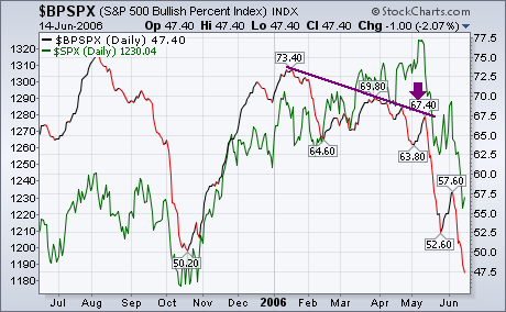
The most difficult thing to determine in market analysis is the difference between a market correction and the start of a bear market. They look pretty much the same. Prices fall to an area of chart support (usually around the 200-day moving average), get oversold, and start to bounce. In most cases, that's the end of the correction and another upleg starts. In rarer situations, the initial decline is just the first phase of a bear market. After the oversold bounce has run its course, the market starts down again. We now appear to be at the point where the market has suffered a sharp setback and is starting a rally attempt. Short-term indicators only tell us about the short-term trend which is oversold at the moment. That's why I've been relying on longer-term indicators to determine the seriousness of the recent market slide. One of those is the Bullish Percent Index. The purple line on the chart below is an updated version of the BPI for the S&P 500 while the green line is the S&P 500 itself. [The BPI is the number of stocks in an index that are in point & figure uptrends]. My concern in early May was that the BPI was falling while the S&P 500 was hitting a new high (see arrow). That type of negative divergence is usually a bearish sign for the market and give a correct warning of the market's May downturn. A closer analysis of the BPI line suggests that the recent decline may be more that just a downside correction.
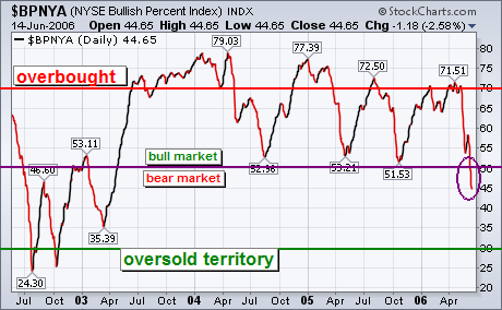
BPI FOR NYSE FALLS BELOW 50... That chart shows the BPI for the S&P 500 falling below 50 and undercutting the low formed last October. That's a bad sign for the market on both counts. To show why that is, however, I'm going to use the Bullish Percent Index for the NYSE Composite Index because that's the measure generally used for market analysis. Since the NYSE includes all stocks traded on the NYSE, it's also a broader measure of market trends. The next chart shows a chart of the BPNYA for the last four years. The general guidelines are these: readings over 70 (red line) warn of an overbought market condition. Major market tops usually begin from over the 70 level. Major market bottoms usually begin from below 30 which marks a major oversold condition (green line). The last time the BPNYA fell below 30 was in the fourth quarter of 2002 when the market hit bottom. Every downside correction that's occurred since the start of 2004 has started with readings over 70 (including the last one). The question before us is whether this is just another downside correction or something more serious. Which brings us to the middle line at 50. As I explained on May 6, the 50 level is the dividing line between bull and bear markets. As long as more than half of NYSE stocks are in uptrends, a bull market exists. When less than half are in uptrends, a bear market exists. The last time the BPI line crossed over 50 was in the spring of 2003 when the cyclical bull market began. The three market corrections since the start of 2004 bounced off the 50 line which acts as support during market pullbacks. This time, however, it is different. The BPI line has fallen below 50 for the first time in three years (see circle). That suggests to me that the recent market decline is more likely the start of a cyclical bear market than a normal downside correction.
- John Murphy
READING MY LIPS ... On Tuesday June 13, I gave a speech to traders on the New York Board of Trade. I used that opportunity to review the major intermarket principles relating to the dollar, commodities, bonds, and stocks. I talked about the impact of the dollar on foreign ETFs, and the close connection between commodity prices and emerging markets. I reviewed why I believe the new emergence of Japan is contributing to global inflation pressures and rising global bond yields -- and the potentially negative impact that could have on global stocks. I also review recent sector rotations out of basic materials and energy stocks and into consumer staples and utilities -- and why that could also carry a negative message for the stock market and the economy. All of the points have been covered at one time or another in my Market Messages. But it's one of the few chances I've had to try to put all of these intermarket factors together in one presentation. And I thought you'd like to see it through the courtesy of the NYBOT. You can see and hear it by clicking on the following link:
Click Here to View Presentation
(Note: Requires Microsoft Windows Media Player to view)
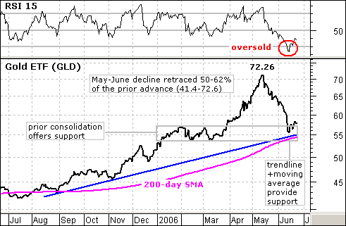
After a harrowing decline the last 5-6 weeks, the StreetTracks Gold ETF (GLD) finally reached a support zone and RSI became oversold. This paves the way for a bounce and possibly a continuation of the long-term uptrend.
A number of technical items have come together to mark support around 55. First, the rising 200-day moving average currently sits at 54.16. The fact that GLD is above this moving average and that the moving average is rising is long-term bullish. Second, the January to March consolidation provides a nice support zone between 53.5 and 57. Third, the blue trendline extending up from the August low extends to around 55 and acts as support. And finally, the current decline has retraced 50-62% of the prior advance (May-05 to May-06). Even though a classic correction pattern did not form, the distance of the retracement (50-62%) is normal for a correction.
In addition to evidence for support, 14-day RSI moved below 30 for the first time since 7-Jan-05. I should point out that GLD took another month to bottom in early 2005 and there was another support test at the end of May, over four months later. There was a short-term signal in February 2005 when RSI formed a positive divergence from early January to early February 2005 and moved above 50. The same could happen here and gold may need some time to base. Buying now is for bottom pickers and aggressive traders. The other option would be to wait for RSI to form a positive divergence and move above 50.
(Editor's Note: This article was written on June 16th - over a week ago. Given the market's sideways motion since then, the article's basic premise remains valid. It is also instructive to compare commentary from the past with current conditions to see how the commentary "played-out".)
Despite a massive rally on Thursday, the Rydex Cash Flow Ratio reflects that
very few bears have given up. The Rydex Cash Flow Ratio, an exclusive
DecisionPoint.com indicator, gives an improved view of sentiment extremes by
using cumulative cash flow (CCFL) into Rydex mutual funds rather than using the
totals of assets in those funds (which we use for the Rydex Asset Ratio). It is
calculated by dividing Money Market plus Bear Funds CCFL by Bull Funds plus
Sector Funds CCFL. While the Ratio is not necessarily representative of the
entire stock market (it only involves money in Rydex mutual funds), it has
proven to be a reliable sentiment indicator.
Our first chart shows that the Ratio is at the low end of its range, meaning
that bearish sentiment is at an extreme level. Note that Thursday's rally only
effected a small up tick on the Ratio, so very few bears have been shaken loose.
This is bullish for the stock market because short-covering bears are like
rocket fuel for rallies.
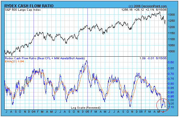
Our second chart shows how the recent rally was in fact a bounce off the bottom of a rising trend channel. That means the support, so far, has held, and that is also bullish. Additionally, most of our medium-term indicators are oversold, providing a good foundation for an extended rally.
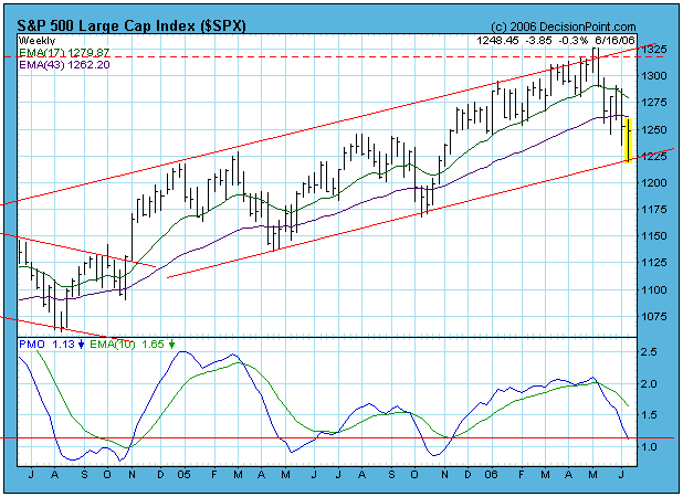
Bottom Line: Our primary mechanical timing model remains neutral, and it will take continued constructive market action to turn it back to bullish. An excess of bearish sentiment and generally oversold market conditions provide a good setup for a rally; however, I must emphasize that oversold conditions are very dangerous if the bull market is transitioning to a bear market. For planning purposes, I will assume that the rally will continue, but my market posture will remain neutral pending a buy signal on our timing model.
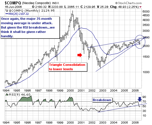
The NASDAQ Composite is now in danger embarking on an extended move lower. Quite simply, we use
the 25-month month moving average to demarcate the difference between bull and bear trends; and given the Composite is trading only 22 points above this level within the context of an RSI breakdown...increases the odds that this level will indeed be violated. We don't know how to be more simple than this.
To take advantage of this decline; we are in the process of putting on short positions via semiconductor equipment-makers such as Cymer (CYMI) and Lam Research (LRCX), and also looking to put on a short position in SanDisk (SNDK) in the very near future. These issues should lead the decline; and are quite far off their
representative October-2005 lows.
