Hello Fellow ChartWatchers!
This week we are pleased to announce a brand new feature for StockCharts.com users - Automatically Updating Charts! Starting Monday when the market opens, members of our "Extra" service will have a new way to watch the market. On the SharpCharts Workbench page, Extra members will find a new setting called "Auto-Refresh" (located just below the Ticker Symbol box). By changing that setting to 15 seconds (for example), members can now have their chart updated automatically throughout the trading day. Of course, this feature works best with short duration intraday chart periods such as "1 minute" or "5 minutes". It is also especially useful to our non-delayed "ExtraRT" members. Just make sure the market is open before trying to use this new feature.
In addition to the "Auto-Refresh" box for Extra members, we've added another new feature that ALL of our users can take advantage of - "Y-Axis Labels". When this new checkbox is checked, you'll see the final values for all of the lines and price plots on your chart clearly presented as little "flags" on the right edge of the chart. Here's an example:
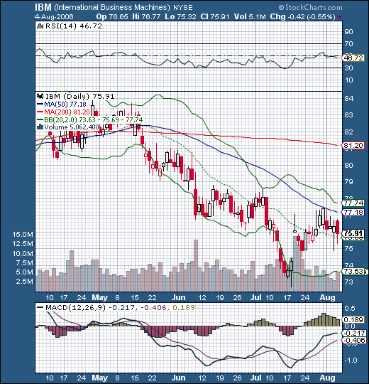
You'll find the new checkbox in the "Chart Attributes" section just under the chart.
Note: While the "Y-Axis Labels" setting can be saved into a member's account as a "Favorite Chart" or as a "ChartStyle", the "Refresh Rate" setting cannot be saved - it must be turned on manually each time you pull up a new chart. For more information, please see the "Instructions" link located just below any SharpChart.
Hopefully, these two new feature will help everyone continue to make better investing decisions with StockCharts.com's charts. And, as always, these new features come at now additional charge. Enjoy!
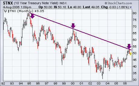
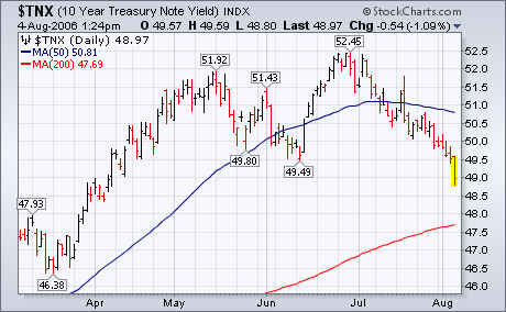
The U.S. economy added fewer jobs than expected during July and the unemployment report rose for the first time in five months to 4.8% from 4.6%. The weak job report is the latest in a string of signs that the economy is weakening. That's usually good news for bond prices which do better in a slowing economy. Technically, this is a logical spot for bond prices to start doing better and bond yields (which move in the opposite direction) to start dropping. Chart 1 is a monthly bar chart of the 10-year Treasury Note yield. The chart shows the 10-year yield testing a a major down trendline connecting the highs of 1994, 2000, and 2006. The last time I showed this chart I pointed out that this would be a logical spot for bond yields to start to weaken. And that's what they've been doing. The daily bars in Chart 2 show the reaction to today's weak news. The 10-year yield has fallen below its June low to the lowest level in four months. Besides pushing bond prices higher, falling bond yields have also given a boost to market sectors sensitive to interest rates ? like banks, utilities, and REITs and to defensive stocks in general ? and to safer large cap stocks (especially dividend-paying ones) at the expense of riskier smaller stocks. Falling rates are hurting the dollar which is giving a boost to gold.
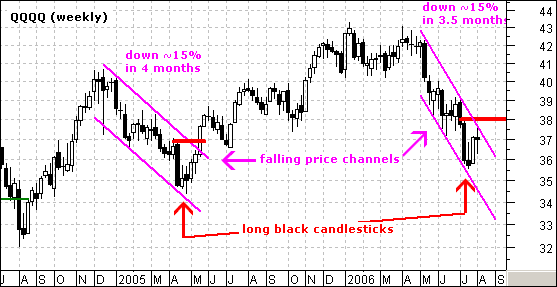
On the weekly QQQQ chart, it is clear that the stock remains in a falling price channel and has yet to break key resistance at 38. There are two falling price channels on the chart (magenta trendlines) and lessons from the first can be applied to now to identify a trend reversal.
Both price channels are similar in duration (3-4 months) and depth (~15%). The first price channel ended after a long black candlestick and the current one formed a long black candlestick four weeks ago (red arrows). The trend reversed with a break above the upper trendline and high of the long black candlestick (May-05).
To reverse the current downtrend, QQQQ needs to break the upper trendline and move above 38. Until this happens, there is no evidence of a trend change and we should expect the trend to continue (lower prices). The most glaring difference: the current price channel is much steeper than the first. This shows that selling pressure was much more intense over the last few months.
The decline from the May top, and the subsequent sideways chopping have been hard on investors' nerves as they try to decide how things will eventually resolve; however, even though the rising trend line has been challenged twice in the last few months, the technical picture has been steadily improving. Also, sentiment indicators have been persistently and strongly pessimistic ? some even worse than at the 2002 bear market lows ? and this is bullish for the market.
The first chart shows the components of our Thrust/Trend Model, our primary timing tool. (A full discussion of this model can be found in the Glossary section of the DecisionPoint.com website.) The first thing we can see is the bullish double bottom that was formed as the price index was challenging the bottom of the rising trend channel. What remains to be seen is a decisive break above the middle peak of the "W", but the price pattern is positive nevertheless.
Until recently the model has been in neutral because the Percent Buy Index (PBI) has been below its 32-EMA, but, as you can see, the PBI has also formed a double bottom and has recently broken above its 32-EMA, switching the model to a buy signal. Also, the PBI, like most of our other medium-term indicators, is rising out of oversold conditions. The chart looks very positive.
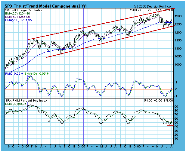
The model shown is for the S&P 500 Index, which gives us our positioning for the broad market, but we also apply the model to other market and sector indexes. As you can see in the table below, buy signals are being generated across a wide range of indexes and sectors.
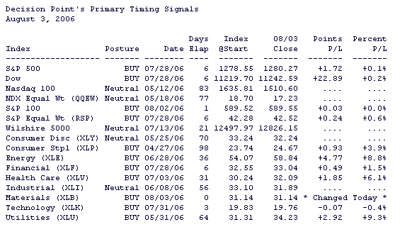
This table is updated daily in the Decision Point Alert Daily Report.
No matter how positive things may look, there is always something to worry about. For me it is that we are overdue for a bear market, and we are also due for a price trough associated with the 4-Year Cycle. As you can see by the chart below, the 4-Year Cycle is pretty reliable in attracting price lows, and based on the history shown on the chart, there is about an 80% chance that prices will be lower later this year (and about a 20% chance that they won't).
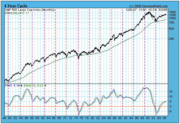
Also, it is not easy to see on the chart, but the monthly PMO has topped and has been falling for three months.
Bottom Line: Actions taken by the Fed next week could torpedo my conclusions, but the most objective evidence we have shows that the market is configured for another advance, and this is backed up by the more subjective pessimism reflected in most sentiment indicators. On the other hand, if the models have been tricked by the market, they will normally turn neutral with only minor loses; however, stops should be used to guard against negative price action that is too rapid for the models' reaction time.