Trend analysis is one of the most important technical analysis skills anyone can have. Knowing if a stock is trending or oscillating can have a big impact on what kind of approach you take to trading it. Stocks that are in a strong uptrend should be bought and held until one or more momentum oscillators show signs of weakness (a moving average cross-over for example). Stocks that are oscillating sideways within a trading range should be studied using oscillating indicators like Stochastics for entry and exit points.
So, how do you tell if a stock is trending or oscillating? And how do you tell if the trend is strong or weak? One way is to use the old Mark 1 Eyeball- but unfortunately that isn't always as accurate and impartial as one might like. A more objective technique is to use the ADX indicator.
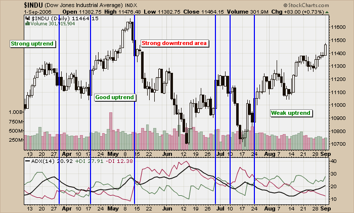
The ADX indicator was invented by Welles Wilder, the same guy who created the RSI. It is part of an indicator "system" whoses official name is "Wilder's DMI". Wilder's DMI consists of three lines - the green +DI line, the red -DI line and the thick black ADX line. Check out this example that uses the Dow Industrials:
(Click the chart to see a live version.)
I've added vertical blue lines whereever the green +DI line crossed the red -DI line in a significant way (I ignored some whipsaw-like crossovers for clarity). When +DI is above -DI, the chart is in an uptrend. When -DI is on top, the chart is in a downtrend. The "strength" of the trend (up or down), is indicated by the ADX line.
Working through the chart from left to right, at first the Dow was in an "uptrend" (+DI is above -DI) and it was a "strong uptrend" because the ADX line rose to a relatively high level. Next, in early April, came a short period of oscillation that saw the ADX fall. After that, in late April, another uptrend developed but a couple of down days near the beginning of May prevented the ADX from indicating that the uptrend was particularly "strong".
After setting a high in the middle of May, the Dow entered a strong downtrend for a couple of weeks. Notice that the ADX line continued moving higher during this downtrend - don't let that confuse you! The level of the ADX indicates the strength of the trend, not the direction. In this case, this downtrend is the strongest trend on the chart and therefore has the highest ADX levels.
The right side of the chart shows that we are currently in another uptrend however the "strength" of that uptrend is very questionable. Notice how the ADX line was at a very low level in mid-August and has only begun to move higher recently. The ADX is telling alert ChartWatchers to pay close attention for signs the Dow's current uptrend is running out of momentum and react accordingly.
The calculation of the ADX is complex and beyond the scope of this article however, we have recently gotten a very detailed new book about the ADX into our bookstore that can tell you everything (and I mean everything) you ever wanted to know about this important indicator. Although it is pricey, serious ChartWatchers will find that "ADXcellence" by Dr. Charles Schaap is well worth the cost.
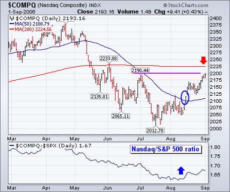
It's very hard for the stock market to stage a major advance without help from the Nasdaq market. Fortunately, it's been getting some Nasdaq help since mid-July. The chart below shows the Nasdaq Composite gaining nearly 200 points (10%) since mid-July. The actual signal of the upturn came with an upside break of its 50-day moving average (blue circle) in early August. Its rising relative strength ratio (bottom line) turned up at the same time and has been rising. That means that the Nasdaq has been leading the rest of the market higher over the last month. [The Nasdaq gained 6% during August versus 2.5% for the S&P 500 and 2.3% for the Dow]. The question is whether its recent rise can be continued. Chart 6 shows the Nasdaq moving into an overhead resistance zone ranging from its early July peak at 2190 to its 200-day moving average at 2225. Interestingly, the Nasdaq could be testing its 200-day line at the same time that the Dow and S&P 500 are testing their May highs. That will be a very important test for the market, especially as it enters the seasonally dangerous September/October time period.
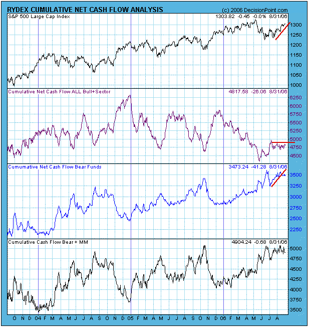
After the decline that lasted from the beginning of May to mid-June, a second bottom was made in July, from which the current rally emerged. Both the bottoming process and the rally have been rough and tedious, causing a lot of anxiety among market participants, and resulting in strong, persistent bearish sentiment. This is clearly visible on our first chart of Rydex Cash Flow analysis.
The first panel below the S&P 500 chart shows cumulative cash flow (CCFL) for bull plus sector funds. Note how the indicator has been running flat for the duration of the July/August rally, a reflection of caution. On the other hand, the next panel down shows that CCFL for bear funds has been increasing for most of that period and shows that the bears are nearly as committed now as they were at the June price low.
Our next chart is of the Rydex Cash Flow Ratio*, which summarizes the elements of the first chart into a single indicator. Again, we see that the Ratio has stayed near the bearish extremes of the three-year range, even as prices approach new highs. This brings to mind the psychological term "cognitive dissonance", which is the pain we experience when our belief is in conflict with reality. Surely the bears must be feeling some pain.
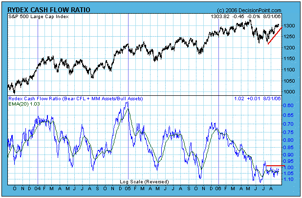
Bottom Line: If the rally had been stronger and smoother, it would probably been sufficient to shake out the bears and attract the bulls, shifting sentiment to the bullish side of the range. As it is, I think we must assume that prices will move higher until sentiment turns more bullish. Such an adjustment could occur within a few weeks.
Technical analysis is a windsock, not a crystal ball. Be prepared to adjust your tactics if conditions change.
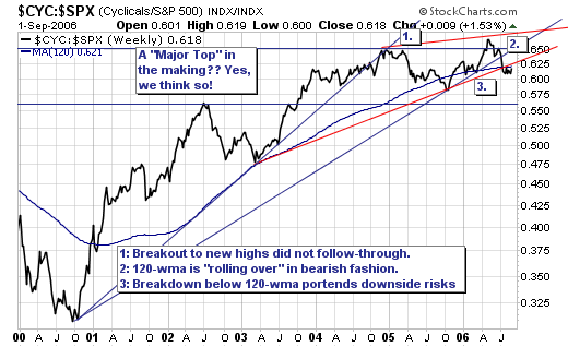
While many believe a "goldlilocks" soft-landing is forthcoming for the US economy; we think the probability of this occurring is rather small given the ongoing weakness in the housing market. That said, we are bearish on equities given our overbought indicators, and the fact this rally is becoming narrower with fewer and fewer stocks leading the major indices back towards the highs. Therefore, we would use rallies to layer into short positions. In terms of sectors, we believe the "cyclicals" are poised to decline on both an absolute as well as relative basis. Looking at the feature relative chart of the MS Cyclical Index vs. the S&P 500, we find a material "topping pattern" has formed, and indeed it is breaking down. Obviously, this suggests further weakness going foward; some of the major components of the MS Cyclical Index (CYC) are Phelps Dodge (PD), US Steel (X) and Caterpillar (CAT).
