Hello Fellow ChartWatchers!
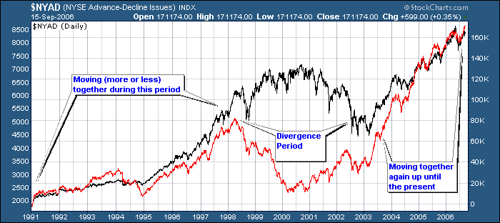
OK, do I really need to write an article explaining this picture?  Seriously, there are more than the proverbial thousand words in the chart above. The NY Advance-Decline Line (the red one) is defined as the cumulative total of the daily NYSE advancers minus the daily NYSE decliners. It is one of THE most important market breadth indicators. When it diverges from the NYSE Composite index, it signals market weakness. In late 1998, it signalled problem ahead for the internet bubble. In early 2000, the A-D Line started moving higher again, but the market didn't follow suit until mid-2002. Now the indices are moving in lock-step again. Will it last? Serious ChartWatchers check the NY Advance-Decline line at least once a week for new market signals.
To create a SharpCharts with the NY Advance-Decline line on it, plot the symbol $NYAD with the "Type" set to "Cumulative". Click the chart above to see an example. You can also use $NAAD to study the Nasdaq Advance-Decline line.
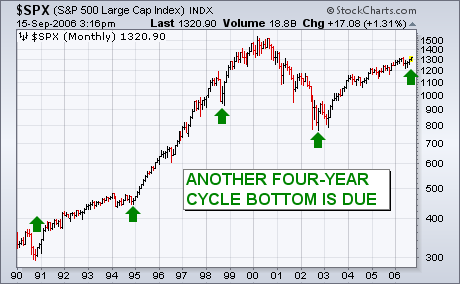
I've received a number of questions on the status of the four-year cycle. The stock market has shown a very consistent pattern of forming important bottoms every four years ? usually during the fourth quarter. The last bottom took place in October 2002, which makes another one due this year. The only problem is that most of those four-year bottoms occurred after a weak year (like 1990 or 1998) or a year in which prices moved sideways (like 1994). That makes this year's action somewhat unusual. My original market outlook had been for a weaker market into October followed by a probable upturn. So far, the market has held up much better than I had anticipated over the summer months. Although the market still needs to weather the seasonally dangerous September/October months, the four-year cycle should act as a bullish prop under the market on any selloffs. The green arrows in Chart 7 show the last four cycle bottoms in 1990, 1994, 1998, and 2002. If the cycle repeats itself, another four-year bottom is due this year.
The Dow Transportation iShares (IYT) recovered nicely this week, but the ETF is meeting resistance from broken support and a little more work is required for an upside breakout. On the daily chart, IYT formed a double top and confirmed this bearish reversal pattern with a break below the June low.
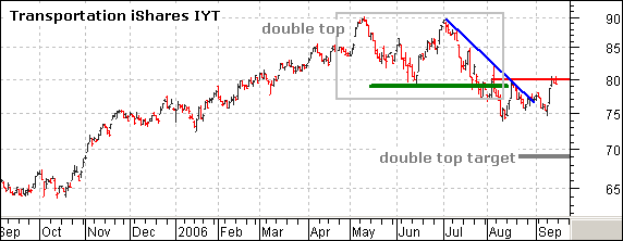
Support is not going quietly though. IYT moved below 75 in mid August, but suddenly firmed and bounced back to broken support. There was another dip to 75 and the stock again bounced back to broken support this week. A key tenet of technical analysis is that broken support turns into resistance and this is exactly what is happening with IYT. There was a support zone around 79 and this turned into a resistance zone around 80.
The bears still have the edge. I view the Aug-Sep price action as a consolidation and the double top support break still dominates the chart. A move below 74 would signal a continuation of the Jul-Aug decline and this would project further weakness towards the double top target around 69.

A move above the current resistance area would call for a reassessment of the double top. On the 30 minute chart, IYT formed a flag over the last few days and I will be watching 81 for a breakout. The ETF surged on Monday-Tuesday and then consolidated the rest of the week. This is a critical area and a breakout would have both short-term and medium-term implications.
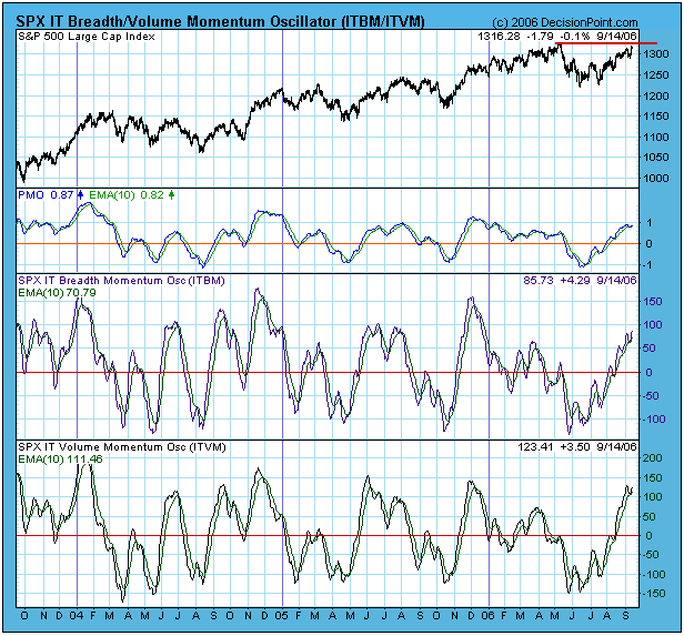
The S&P 500 Index is approaching new 52-week highs, but there is short-term overhead resistance immediately ahead, and our primary medium-term indicators are becoming modestly overbought. Does this spell trouble for the bulls? Probably not. Overbought conditions are not necessarily a problem in a bull market, and there are still way too many bears for an important top.
Our first chart shows the S&P 500 Index with our three primary medium-term indicators (oscillators) ? one each for price, breadth, and volume. As you can see they are approaching the overbought side of their range, but they are far short of being at their extreme limits, and they still allow for higher prices before they make a final top. Another thing to remember is that oscillators oscillate within a fixed horizontal range, prices normally do not. This means that, even though the oscillators top and begin to trend down, prices don't necessarily have to follow. In fact, you can see a few instances on the chart where prices continued higher even after the oscillators topped.
Our next chart is of the Rydex Cash Flow Ratio*, which I featured in an article two weeks ago. Note that the Ratio remains oversold (reflecting strong bearish sentiment), in spite of the fact that prices have continued higher. The condition of the Ratio is caused by a combination of aggressive buying of bear funds and timid acquisition of bull funds. This situation is extremely unusual, and I believe it must be relieved before we can expect a significant price decline. Relief will come when the bears give up and the bulls become more aggressive, ultimately causing the Ratio to move back up toward the top its trading range.
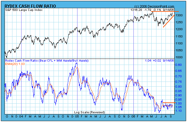
Bottom Line: The significant aspect of the market being overbought is that it is probably not a good time to be adding new long positions. Also, more caution is appropriate while the overbought condition is being worked off. Otherwise, I think the Rydex Cash Flow Ratio strongly suggests that prices will move higher, even after internals begin to correct downward. In other words, I think that people need to become more bullish before the rally will end.
Technical analysis is a windsock, not a crystal ball. Be prepared to adjust your tactics if conditions change.
Last week's commodity market decline was the most severe since 1980; which of course begs the question "is the correction over"? We don't believe that to be the case, as follow on selling will materialize taking prices far lower than one can believe.
In that vein, we think it wise to take a technical look at gold prices - ostensibly the leader of the bull market in commodities. From a longer-term perspective, we use the monthly chart, and we don't want to get to fancy with it. Right now, the 20-month moving average is rising sharply and crosses at $521; we think this level in combination with a normal 50%-62% "box retracement" of the entire bull since 1999 moves puts our comfortable buying zone between $520 to $550. Hence, another -10% to the downside will "clean the baffles" as late-long positions have been pushed harshly; thereby granting the gold market a healthy dose of skepticism as to whether the bull market is over. In our opinion at this point in time...it is not. Keep your eye on $520-to-$550 and prepare to buy.