| |
|
|
|
|
| |

|
ChartWatchers
the StockCharts.com Newsletter
|
|
|
|
|
|
|
|
INTERESTING STATISTICSby Chip Anderson | ChartWatchers
The Dow Industrials continued to set new highs last week and several interesting sectors led the way - but I'm not going to talk about that. (Our expert columnists have it covered below anyways.) I'm going to share some interested statistics with you about how StockCharts.com is used these days. Recently, we upgraded our statistics reporting tools and we are now getting new insights into how people are using StockCharts.com to make better investing decisions. Here are some of those results:
Did you know?
We generate, on average, over 3.2 million charts every day? At the peak parts of the day (10am and 4pm), we generate more than 8,000 charts each minute.
On average, it takes us a little less than 1/4 of a second to generate each of those charts?
Most of the charts we send out are between 10KB and 40KB in size? However, there is a significant number of charts that are over 100KB in size that get sent out also.
After "Default", the "Sunset" color scheme is the most popular? The next most popular are "Night" and "Vanilla".
Over 60% of our users use Microsoft Internet Explorer 6? Only 14% use Mozilla Firefox, which - on a personal note - I strongly recommend everyone use. During last week, two people made 3 times more chart requests than anybody else? (We are now helping them decrease their requests while still getting the information they need.)
One message board on InvestorsHub.com is responsible for 3 times more chart requests than any other external website? (We are also working on ways to help that board reduce it's usage.)
We now have over 16,700 website subscribers? ExtraRT subscriptions continue to grow at a very fast rate.
This newsletter goes out to over 50,000 active readers?
At peak times (7am and 4pm), we send out over 75 megabits of data every second? That the equivant of a 9.8 megabyte file or about 2.5 complete MP3s every second.
We now have over 3000 pages of educational content on our website?
We get almost 100 chart request each day from cell phones? (Hmmm... We need to make that easier...)
Los Angeles and Toronto are tied with the most number of StockCharts.com visitors?
Outside of North America, people from Japan, the United Kingdom, Taiwan, and Germany are the most frequent visitors to our site?
So far this month 481,000 unique people have visited StockCharts.com? We get about 80,000 visitors every day.
Almost exactly half of our users have a screen size that is 1024x768 pixels? Only 4% use a screen resolution of 1600x1200 or higher. (Hasn't everyone noticed how relatively inexpensive larger monitors are these days?) Word-of-mouth remains the #1 way that people learn about our website? We want to thank everyone out there for that.
There are tons more site statistics but those are the most interesting to me. Thanks again to everyone that uses our site to make better investment decisions - a truly win-win situation if there ever was one.
A WEAKENED HOUSING MARKETby John Murphy | The Market Message
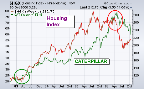
CATERPILLAR HURT BY WEAK HOUSING ... A plunge in Caterpillar on Friday, Oct 20th, unsettled the market. And for good reason. The bad news from the stock was blamed on a weak housing sector. Why that's worth noting is because Wall Street seems to be dismissing the housing meltdown as not very important. I beg to differ. There are subtle signs beneath the surface that weak housing is having a negative impact on parts of the market tied to the economy. Chart 1 attempts to show a positive correlation between Caterpillar (green line) and the PHLX Housing Index (brown line) since the bull market started four years ago. Both turned up together at the start of 2003 (green circle) and rallied together until the end of 2005. Notice that the plunge in housing stocks at the start of this year was followed shortly by a downturn in Caterpillar (red circle). That weak action isn't limited to CAT. It's generally true of most stocks tied to the economy.
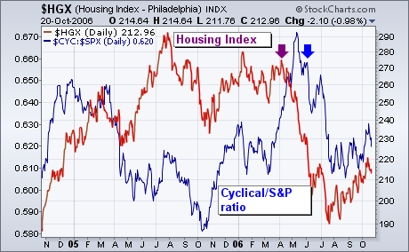
WEAK HOUSING IS HURTING CYCLICAL STOCKS... The brown line in Chart 2 is the Housing Index (HGX). The blue line is a ratio of the Morgan Stanley Cyclical Index (CYC) divided by the S&P 500. The chart shows that economically-sensitive stocks have done much worse than the S&P 500 since May and shortly after the peak in housing. Cyclical stocks are very closely tied to the economy. The fact that they're doing so badly suggests that the market is already preparing itself for an economic slowdown resulting from the weak housing sector. It's no concidence either that some of the market's strongest groups have been in the defensive sector. I wrote yesterday about strength in healthcare and utilities. Another group that usually benefits when cyclicals (and the economy) weaken is consumer staples.
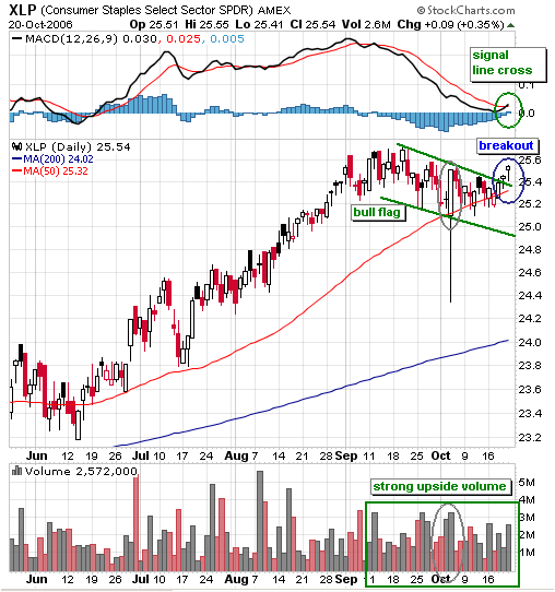
The Consumer Staples SPDR (XLP) was a top performer from April to September, but went through a period of underperformance over the last 4-5 weeks. The Dow Industrials and S&P 500 kept right on trucking in September and October. The Dow recorded a new all time high above 12000 and the S&P 500 is trading at levels not seen since February 2001. In contrast, XLP is trading below its September high and has not kept pace with the Dow or S&P 500 in recent weeks.
Despite this underperformance, the decline over the last few weeks looks like a bull flag (green trendlines). I elected to draw through the spike low on 4-Oct. Bullish flags slope down and act as minor corrections. XLP recorded a 52-week high in early September and the long-term trend is clearly up. Relatively small declines should be viewed as corrections when the long-term trend is up.
XLP declined to around 25.1, firmed just above 25 and broke flag resistance this past week. The breakout reinforces support at 25 and projects further strength above the September high. In addition, momentum is rebounding as MACD moved above its signal line and upside volume has been strong the last few weeks. Strong upside volume, a MACD crossover and a flag breakout all point to higher prices ahead for XLP.
WINDSOCK VERSUS CRYSTAL BALLby Carl Swenlin | DecisionPoint.com
For several months these articles have included a reminder that "Technical analysis is a windsock, not a crystal ball." To clarify, a windsock is used to ascertain the current wind direction and intensity. A crystal ball is used to predict the future. As a practical matter, if we make decisions in response to known market conditions, we are operating in a mode that will allow us to adjust our stance as conditions change. Conversely, if we position ourselves based upon a prediction about the future, we are stuck with defending that prediction until it comes true or sticking with it until we lose enough that we are forced to capitulate.
Market action during the period from May 2006 to the present serves as a prime example of how the crystal ball can get cracked. During the decline from the May top it was broadly accepted that the bull market top was finally in place and that a major decline was beginning. The rally out of the summer lows was viewed as a short-term technical bounce in the context of a longer-term decline. The bears held fast. As prices approached the level of the May top, hope was born that a bearish double top was forming. The bears held fast . . . until the last three weeks of rally left the bears with little on which to hang their hats.

That is not to say that the bears did not have convincing arguments ? I certainly agreed with most of them ? but I have become more of a "windsock" kind of guy, and find there is less stress when I rely on our mechanical Thrust/Trend Model to help me align with current market conditions. The Model turned neutral during the decline from the May top, but it turned bullish again as the market rallied off the July lows. The table below shows how it has performed with the 16 indexes to which it is applied:
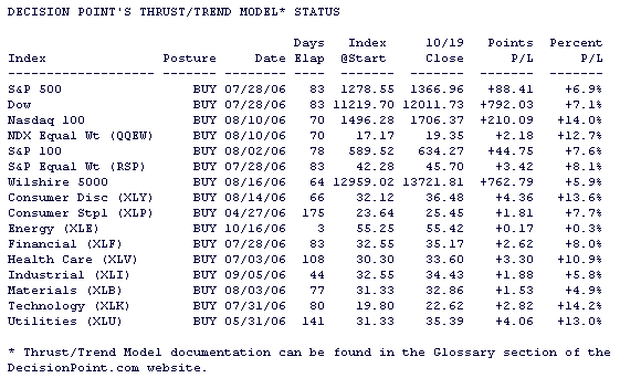
These are decent results, and we should be able to capture some of the profits if the market turns down at this point, but I don't want to leave the impression that there is any sure thing here. The Model has been marginally profitable for the last few years as market chopped higher in a fairly narrow range. And if the bears had been right more recently, the Model would have been whipsawed for some small losses. But that would not have been as distressing as hoping for a bearish outcome all the way from the July lows to the recent highs.
Checking current market conditions, the next chart shows the percentage of stocks in the S&P 500 Index that are above their 20-, 50-, and 200-EMAs, and it shows that the market is currently overbought in all three time frames. That doesn't mean that there will be a decline ? the market was similarly overbought about a year ago, yet prices continued to rise for several months. Nevertheless, the market is vulnerable under these conditions and is it not a good time to add to positions.
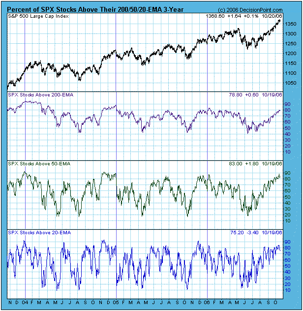
Bottom Line: Whether the current up trend continues or ends, we are fortunate that the Model got us in early. When the market finally turns, we can be reasonably confident that the Model will take us out and preserve some of the gains in the process. Keep in mind that Model signals do not predict what is going to happen, they merely point us in the direction the market seems to be going at the time.
FLIGHT TO SAFETYby Tom Bowley | InvestEd Central
Recall in my last article the "axis of normal returns" showing the potential move of the NASDAQ over the next 2-3 years to return to its "normal line". This time I'd like to approach the NASDAQ's potential move from another angle - studying the relationship that has existed between the Dow Jones Industrial Average and the NASDAQ over the past 26 years. We all hear the phrase "flight to safety", but look at the chart below to get a visual picture of what happens when the more "aggressive" NASDAQ leads the market versus what happens when there is a "flight to safety" to the Dow. Point A on the chart in 1983 shows that the Dow Jones/NASDAQ ratio (hereinafter referred to as the Flight To Safety Ratio, or FTS Ratio) dropped to a low of 3.7, below the "normal zone" where the FTS Ratio has generally been situated during the majority of the time frame reviewed. Once the bear market of 1984 hit, the 7 year flight to safety culminated in 1991 with the FTS Ratio peaking at 7.5 (Point B), meaning that the Dow Jones traded at 7.5 times greater than the NASDAQ in terms of index points. After the 1991 peak, the NASDAQ enjoyed a 9 year period of outperformance over the Dow that ended in March 2000, with the FTS Ratio dropping to an all-time low of less than 2.0 (Point C). When the bubble burst, there was a rush out of equities, but the bleeding was far deeper on the NASDAQ as the FTS Ratio cleared the upper end of the "normal zone" once again, peaking at 7.0 (Point D) in 2002.
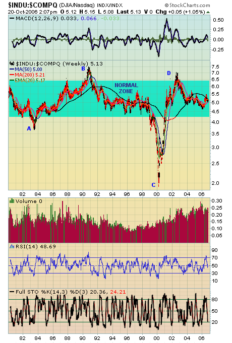
So where does the FTS Ratio go from here? Well, if it follows recent history, we'll see the next break out of the "normal zone" to the downside over the next couple years, perhaps to 3.50-4.00. That could coincide with a NASDAQ 4000-4500, right on the "axis of normal returns". Yes, I'm very bullish the NASDAQ.
OIL SERVICES TAKING A BEATINGby Richard Rhodes | The Rhodes Report
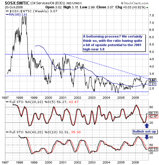
First, much continues to be made of the decline in crude oil prices, and the positive impact of lower energy prices upon the world consumer et al. This much is known; but oil service stocks have been "taken to the proverbial woodshed" and beaten to death, which creates a very interesting and perhaps very profitable opportunity to buy these stocks as crude oil continues to move lower.
Our interest stems from the technical perspective of the Oil Service Index vs. Crude Oil Ratio ($OSX:$WTIC). We think it is rather clear on a historical basis, the ratio is trading now too far off its lows of the past several years, which gives rise to the emerging "rounding bottom". Thi is confirmed with the now rising 100-week moving average. Too, we find trendline resistance above it coming into play; a clear breakout above this level would serve to push prices sharply higher towards 5.0.
So, in the end, no matter how crude oil trades...oil service is likely to trade better and outperform. Our favorite individual plays in the sector for the months and years ahead are: Nabors Industries (NBR), Transocean Offshore (RIG) and Weatherford International (WFT).
|
|
|
|
|
|
|
|
|
|
|
|
|
|
|