There is a lot more power inside our SharpCharts2 charting engine than we currently make available to our users. The problem is making that power available in an easy-to-use way. A great example of that is the ability to calculate indicators based on something other than the closing value in the underlying dataset. Imagine seeing a MACD display based on a stock's High values rather than it's close. Or image seeing a Bollinger Band plot based on the Lows of the day.
This week we took a step towards providing that level of flexibility by modifying the way that Simple Moving Averages and Exponential Moving Averages work. Now, you can add an optional letter to the end of any moving averages parameter box that will change the data value that we use to calculate the average. If you don't specify a letter, we will use the closing value like we always have.
For example, to plot the 10-period Simple Moving Average of the daily Highs for the Dow, use the string "10,H" in the "Parameters" box beside the Overlay dropdown. To plot the 10-period Simple Moving Average of the Lows, use "10,L". Here is an example of what that chart would look like:
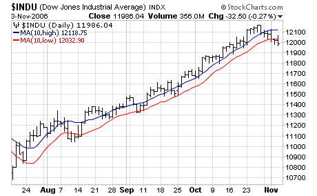 (Click on the chart to see the new settings in action.)
You can use the letter "O" for the Open, "H" for the Highs, "L" for the Lows, and "C" for the Close. If you don't specify a letter, the closing values will be used. Again, this new feature only works for Simple and Exponential Moving Averages right now.
You can combine this new ability with the existing ability to offset a moving average to create some very interesting charts. Here's a chart off the 1-period MA of the Highs and the 1-period MA of the Lows - only the 1-period MA of the Lows is offset by one day. In addition the price bars have been hidden so that they don't clutter things up.
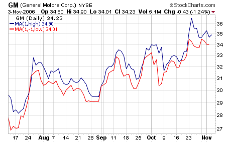 (Again, Click on the chart to see the exact settings.)
Please experiment with these new options and let us know what you think.
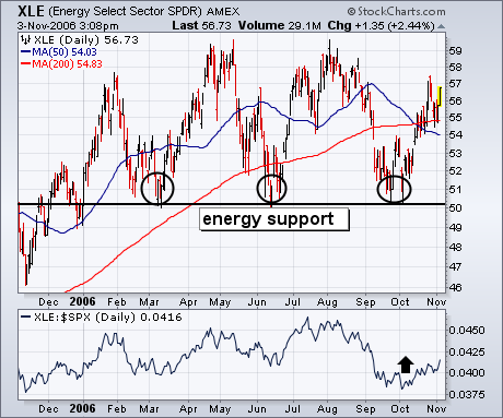
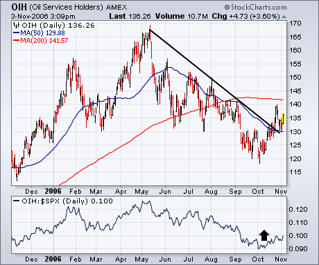
The last time I showed the Energy Sector SPDR (XLE) it was starting to bounce off chart support along its 2006 lows (see circles). Chart 1 shows that the XLE has climbed back over its moving average lines and may be heading toward the top of its 2006 trading range. Its relative strength ratio is starting to bounce as well. Oil Service stocks have been the weakest part of the energy patch. Chart 2 shows the Oil Service Holders (OIH) having broken their June/October downtrend line. I've suggested before that buying in energy stocks usually leads to buying in the commodities themselves. Rising bond yields on Friday gave a boost to the dollar. In an impressive show of strength, gold continued its recent climb.
The Semiconductor group is important to the performance of the Nasdaq and the Nasdaq is important to the performance of the overall market. Recent bearish developments in the Semiconductor HOLDRS (SMH) bode ill for the group and this is likely to weigh on both the Nasdaq and the S&P 500.
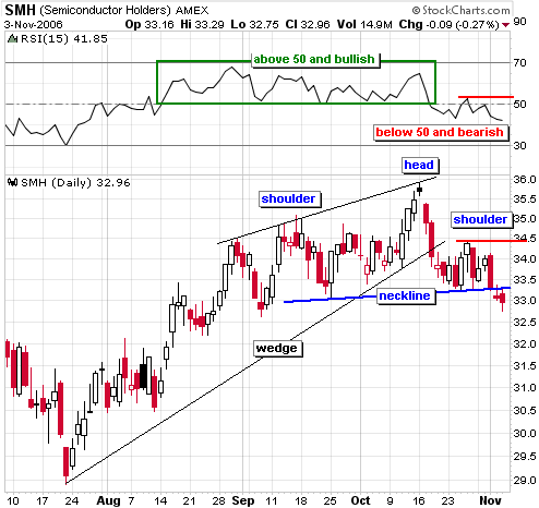
There are two bearish patterns at work and momentum recently turned negative. First, the advance from 29 to 36 formed a rising wedge and the mid October decline broke the lower trendline. Second, the ETF formed a head-and-shoulders pattern that extends back to early September and broke neckline support with a gap down on Thursday. For momentum, I am using RSI and this key indicator moved below 50 over the last few weeks. Notice how the stock held strong as long as RSI was above 50 (green box). The recent move below 50 shows a clear negative shift in momentum.
Until there is evidence to the contrary, I expect lower prices in SMH and this will weigh on the Nasdaq. What would it take to prove the bearish case otherwise? The right shoulder amounts to a consolidation with support at 33.3 and resistance at 34.5. SMH would have to recover the support break AND move above resistance from the right shoulder. Momentum would also have to improve and I would make RSI move above the late October high (53). These developments would be bullish and project further strength to 39. Let's see it happen first though.
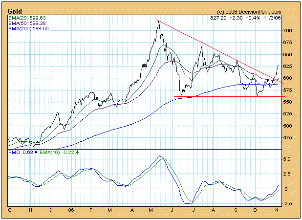
Since gold peaked around $725 in May of this year, it has been going through the process of digesting the huge advance that took place a year prior to that peak. At first it was not clear whether or not the gold bull market was over, but, as you can see on the chart below, the initially violent correction transformed into a sideways consolidation in the shape of a triangle. This week, over five months from the May top, gold decisively broke up through the top of the triangle, giving a pretty clear signal that the correction is over.
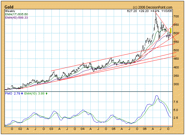
On the weekly chart below the breakout appears even more dramatic, and there is the added bonus that the weekly PMO (Price Momentum Oscillator) has bottomed. The picture is turning very positive.
With interest in gold likely to increase dramatically as prices advance, now is probably a good time to introduce a new vehicle for owning gold ? Central Gold Trust (AMEX: GTU). GTU is a closed-end fund that owns gold bullion (only gold bullion), which is stored in a Canadian bank vault. The fund is run by the same folks that run Central Fund of Canada (CEF), which differs from GTU in that it owns both gold and silver.
GTU began trading on the Toronto Exchange last year, but the chart below shows that it was thinly traded until it debuted on the AMEX in September where volume increased significantly. I think this will probably become one of the best vehicles available for owning and trading gold. It is my understanding that GTU qualifies for capital gains tax, which, for tax purposes, makes it superior to the gold ETFs and bullion. Do not take my word for it ? check with your tax professional.

Bottom Line: Our trend model for gold turned bullish on 11/3/2006, and the chart picture looks very good. In my opinion, the correction in gold is over, and the next leg up is beginning.
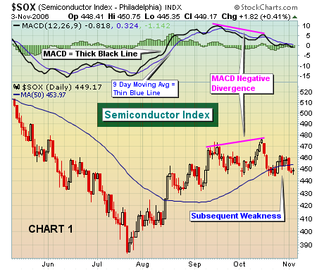
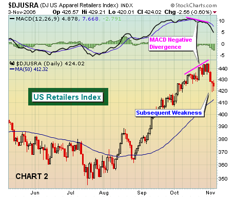
On the technical side, we believe the combination of price and volume is paramount to successfully trading the stock market. A strong second place finish goes to the Moving Average Convergence Divergence, or the "MACD". The standard settings on the MACD are 12, 26, 9. On daily charts, the MACD is the difference between the 12 day exponential moving average (12 day EMA) and the 26 day exponential moving average (26 day EMA) and this difference is plotted on StockCharts as the "thick black line". The 9 refers to the 9 day moving average of the MACD and is the "thin blue line". So what does the MACD do? Well, it is a momentum indicator. When a stock or index is rising, the 12 day EMA will be higher than the 26 day EMA and the MACD will be positive and above the zero line, or centerline. When a stock or index is falling, the 12 day EMA will be lower than the 26 day EMA and the MACD will be negative and below the zero line, or centerline. The beauty of the MACD is that as prices put in higher highs, the MACD will sometimes put in a lower reading. The significance here is that on the surface momentum appears to be strong if looking only at price action. Underneath the surface, however, the MACD begins to signal a very different message. The difference between the 12 day and 26 day EMA's is actually beginning to shrink, suggesting slowing momentum. These "negative divergences" can be a precursor to lower prices, and in some instances even predict a long-term top. Let's take a look at two examples. First in Chart 1, you'll see the Semiconductor Index which in mid-October experienced a rally that carried it beyond September highs. But take a look at the MACD reading on that higher October high. The MACD reading was actually lower, indicating that the momentum was waning. Astute technicians would have taken notice and lightened up on the sector or simply looked for opportunities elsewhere. We have seen a similar pattern unfold with retailers over the past week or two. Notice in Chart 2 below that the Dow Jones US Apparel Retailers Index continued to trade higher throughout October, but the MACD mysteriously lost its momentum. We're just beginning to feel the effects of that negative divergence now.
 The primary purpose of technical analysis is to gauge supply and demand. Use the MACD and its signals to better manage your portfolio and trading success
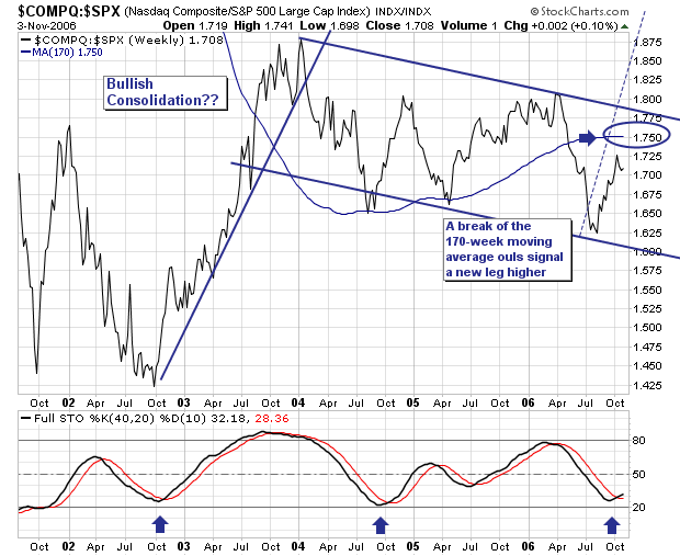
The broader market rally off the June/July lows has pushed all the major indices higher; and in particular the Nasdaq Composite has outperformed rather noticeably if one looks at the Composite/S&P 500 Ratio. It has moved from 1.625 to 1.725; not a very large move, but a relatively profitable one to those wise enough to have been overweight technology shares. In that technical vein, we cannot help but note the very long and drawn out bullish consolidation forming; one that is nearly 3-years old right now, and that will become older until a clear breakout above trendline resistance is obtained, or until it breaks down. Time will only tell. But remember, the longer consolidations take to form, the more powerful the move after the breakout. Then, and quite obviously, the first signs a breakout move was under way would be a move above the 170-week moving avearge, with confirmation coming on a break above trendline resistance. This would target a ratio level somewhere upwards of 2.07 if we use the October-2002 rally into January-2004 as a guide. Further, the time frame in which it is likely to do so is within a 12-18 months. Therefore, we are intently focused upon the 170-week moving avearge; once this occurs, then we are willing buyers of the ratio, which generally coincides with a broader Composite rally.
