The Dow Jones Industrial Average had a significant technical development in the middle of last week when it failed to surpass it's previous "peak" for the first time in months. After hitting 12,361 on November 22nd, the index sank to 12,072 a week later. The crucial rebound started on November 29th but stalled at 12,360 on December 5th.
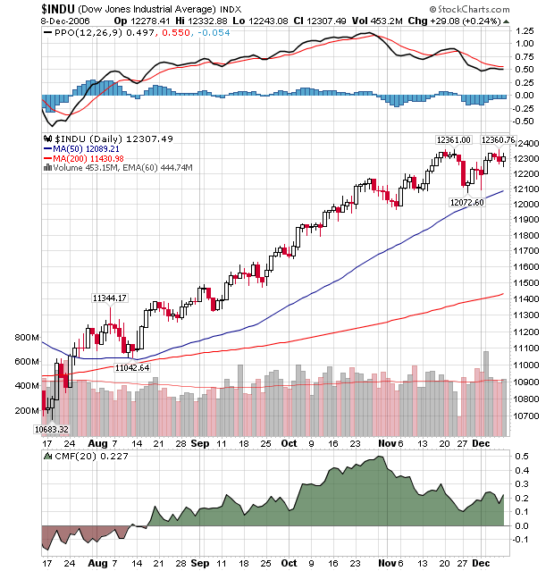
The failure to punch through the 12,360 level is technically significant. It signals the end of the very strong uptrend that the market has been in and the possible start of a reversal or, in the best case, a consolidation period. The key levels to watch for in the coming days are 12,360 on the upside and 12,100 on the downside. A close above 12,360 means this was (hopefully) a temporary glitch and the rally is back on. A close below 12,100 means that the index has reversed and we should expect lower prices.
Finally, Happy Holidays everyone! Our next newsletter will be after the new year.
% NYSE STOCKS ABOVE 200-DAY AVERAGES ... I've received requests to look at some long-term market sentiment indicators. I've chosen a couple that you can plot by yourself on Stockcharts. One of those is the % of NYSE stocks above their 200-day moving average ($NYA200R). That's the reddish line in Chart 1 (the blue line is the NYSE Composite Index). As with all sentiment indicators, there are two main considerations. One is the level. At the end of a major bear market (like at the start of 2003), readings below 30 often mark major bottoms. During bull market corrections, however, readings around 50 usually market intermediate bottoms. That was the case in mid-2004, late 2005, and mid-2006. Readings over 80 usually mean an overbought market. That often leads to downside corrections (and, in some cases, major tops). At the moment, the % of NYSE stocks above their 200-day average has reached 79. That's the highest level in two years and puts it very close to overbought territory. But that's not enough to signal the start of a market downturn.

THE TREND IS STILL UP ... As with most things in market analysis, the trend is the most important factor. Chart 2 is a point & figure chart of the same indicator shown in Chart 1. There are two points that jump out at me. One is that the value of this indicator has exceeded its early 2006 which is a sign of market strength. The second is that the trend is still up. The first buy signal was given at 56 during July, and there have been six buy signals since then. [A buy signal exists when an x column exceeds a previous x column. Obviously, the first two or three signals are always the best]. Although the indicator is moving into overbought territory over 80, the trend is still up. The indicator would have to drop to 72 to give an actual sell signal. It would have to fall to 76 to suffer a downside three-box reversal. Although the sentiment indicator is entering overbought territory, it doesn't show any sign of weakening

The Energy SPDR (XLE) surged over the last two months and is challenging resistance, but the U.S. Oil Fund ETF (USO) remains relatively weak and continues testing support. These two are out of sync and something has to give. As I see it, either XLE will fail at resistance and pull back to trading range support or USO will break resistance and confirm the surge in XLE.
The Energy SPDR (XLE) broke above trading range resistance at 60 in late November and this is bullish. The breakout occurred with a long white candlestick and the ETF stalled this past week with a doji. The last two candlesticks form a harami cross and this is a potentially bearish candlestick reversal pattern. A move below the low of the long white candlestick (57) would confirm this pattern and target a decline back to trading range support. As long as the breakout at 60 holds, the trend is up and XLE remains in bull mode.

The U.S. Oil Fund ETF (USO) declined to support at 50 and firmed over the last two months. The ETF surged at the end of November with a long white candlestick and is challenging resistance from the mid October high. USO then pulled back this past week and formed a small black candlestick. The ETF remains short of a breakout and needs to clear last week's high (55.21) to trigger a bullish signal. This would target a move to broken support around 60. A breakout would confirm strength in XLE and failure to breakout will likely weigh on XLE.

I have heard that a number of people have been predicting a crash. I don't know what evidence they are citing, but my analysis of the price structure and internal indicators leads me to the conclusion that there is not a crash anywhere in sight. This does not preclude a crash triggered by an external event of which we can have no advance knowledge, but the visible deterioration that typically precedes a crash does not currently exist.
To illustrate, we can look at charts (below) of the two most famous crashes of the last 80 years ? the Crash of 1929 and the Crash of 1987. There are two chart configurations that preceded these two major crashes. First, was the price action ? a major price top, followed by a lower top, followed by a break below the price low between the two tops. This kind of event doesn't always lead to a major crash, but it is always a sign of danger, and can be part of a market correction.
The second element is internal deterioration visible in a breadth indicator. In the case of the two charts below we can see that, when the second price top formed, the ITBM Oscillator also topped, and it topped below the zero line as a result of an extended period of deterioration. Below zero indicator tops are another danger sign that should not be ignored.


The next chart shows the current market status. The market is clearly overbought, but prices are making new highs, and the ITBM does not reflect any serious deterioration. The market is definitely due for a correction, but, other than the overbought condition, there is scant evidence that a correction, let alone a crash, is definitely about to occur.

Bottom Line: History shows us that structural crashes do not materialize out of thin air. That is to say, if the market is making new highs, it will take several weeks or months after the final top to allow for sufficient deterioration before the bottom falls out.
We've seen commodity prices skyrocket over the past several years and equities that have exposure to commodities have gone along for the ride. Should we be concerned now that those commodities have experienced weakness over the past couple months? Or should we instead be focused on the ensuing rally over the past few weeks? That is a very good question. Commodity prices, in our opinion, are in the process of topping. In May 2006, while the CRB Index was moving to yet another high at 365, a long-term negative divergence on the MACD formed (Chart 1). That led to the subsequent selloff and loss of support at 330. We are now looking at short-term resistance near that 330 level and we're fast approaching.

That's a glimpse at the last eighteen months of activity. A longer term ten year view (Chart 2) paints a more probable topping picture. There was a clear break of five year trendline support during the summer months and a subsequent low that appears to be the right side of the neckline of a long-term head and shoulders top. We are potentially forming the right shoulder whose top could be our current level, or possibly coincide with the aforementioned short-term resistance at 330.

Either way given the chart pattern, it would seem prudent to at least recognize the red flag that is present and protect your portfolio accordingly.
The recent "slowdown" in the major averages has produced "rotational undercurrents" between these averages; the most poignant we observe is the bullish breakout in the ratio of the S&P 500 Spyders (SPY) and the NASDAQ 100 (QQQQ). The reason we focus upon this is that it has implications in terms of traders taking on risk; in a normal bull run, traders tend to put on high-beta technology shares to increase returns above the market. Hence, when we begin to see strength in the ratio - it implies traders are shunning risk, which suggests a potential trend change is in the very near future. Perhaps it is merely a correction; perhaps it is something larger and deeper. History will be the final arbiter.
Technically speaking; the ratio chart has now broken out above it's shorter-term 35-day moving average, which given the 40-day stochastic is exhibiting positive divergences with the ratio...further suggests the ratio is headed higher. The real question is whether the more intermediate-term 130-day halts the rise and turns the ratio lower to new lows. In any case; it is our opinion that tactical short positions can now be considered with a greater probability of success than in recent months.


