Mary W. writes "I'd like to see how much above or below the 200-day moving average a stock currently is. Does your charting system show that?"
While we don't have a specific indicator for "Percentage above/below the Moving Average", clever chartists that understand how the "Price Oscillator (PPO)" works can create such an indicator easily. The PPO is very similar to the well-known MACD Indicator. Both are based on the difference between two exponential moving averages. The PPO differs from the MACD in that it's values are converted into a "percentage difference" rather than the "absolute difference" used by the MACD.
Essentially, PPO(#1, #2) = Percentage Difference of EMA #1 from EMA #2.
Remember, what Mary asked to chart is "Percentage Difference of the Closing value from the 200-day Moving Average."
See the similarity in those two statements? If Mary is willing to use the difference between the close and a 200-day Exponential Moving Average, then we can accommodate her. The final piece of the puzzle is to recognize that "Closing value" is equal to "EMA(1)." Given that, then
PPO(1, 200) = Percentage Difference of EMA(1) (i.e., Close) to EMA(200).
Thus all we need to do is plot PPO(1, 200) to see the line that Mary is asking for.
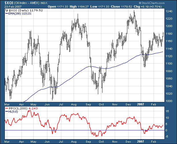
Viola! With a couple of setting changes, we can overlay that indicator on our price plot:
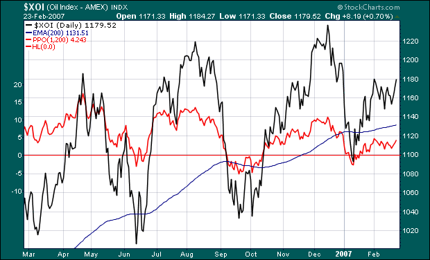
Click either chart to see how they were constructed. Last we heard, Mary was happily charting percentage differences left and right. Hopefully, this trick can help your chart analysis also!
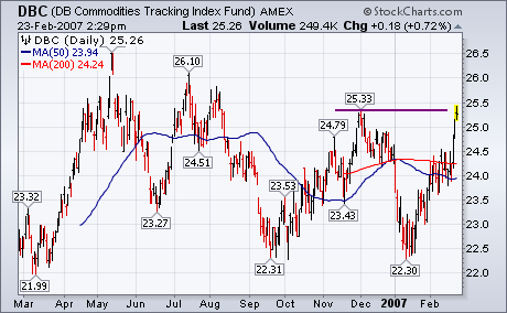
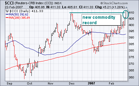
Just when it seemed like inflation was on the wane, another rally in commodity markets suggests just the opposite. [This week's unexpected jump in the core CPI also caught the market's attention]. Chart 1 shows the DB Commodities Tracking Fund (DBC) challenging its late November peak at 25.33. A close above that chart barrier would signal even higher commodity prices. Most commodity indexes benefitted from crude oil closing back over $60 and strong gains in precious metals, copper, and agricultural markets. [Corn hit a new 10-year high]. Since most commodity indexes have a heavy energy weight, they've been held down by energy prices since the start of the year. Chart 2 gives a better idea of how commodity markets are doing outside of energy. The CRB Continuous Index (CCI) has a smaller energy weighting than most other commodity indexes (including the CRB Reuters/Jefferies Index) and a heavier agricultural weighting. Chart 2 shows the CCI breaking out to a new record high on Thursday. The commodity bull market is alive and well. The Fed recently cited the drop in commodity prices as evidence that inflation was slowing. This week's upturn may cause some rethinking of that view.
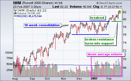
The Russell 2000 iShares (IWM) broke consolidation resistance this month and two key volume-based indicators point to strong buying pressure.
The first chart shows the Russell 2000 iShares (IWM) and volume. The ETF surged from mid August to mid November and then consolidated for 10 weeks. This consolidation represents a rest in the uptrend and the breakout signals a continuation of the uptrend. Notice that broken resistance is turning into support and the ETF is holding above broken resistance. This shows strength and a move back below the resistance breakout would be the first sign of trouble.
The next chart shows two classic volume-based indicators: On Balance Volume and the Accumulation Distribution Line. OBV is a cumulative indicator based on the close from one day to the next. Volume is added on up days and subtracted on down days. The Accumulation Distribution Line is based on the level of the close relative to the high-low range. Accumulation takes place when the close is above the midpoint of the high-low range and distribution takes place when the close is below the midpoint of the high-low range.
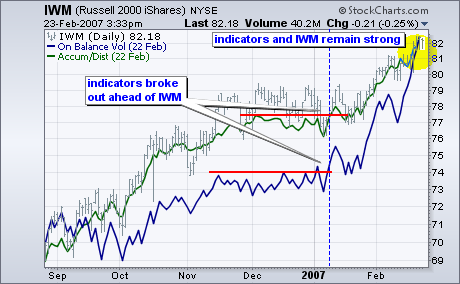
On Balance Volume (blue) and the Accumulation Distribution Line (green) show strong buying pressure and this bodes well for further strength in IWM. First, notice that both broke out ahead of IWM. The blue dotted line shows the indicator breakouts in early January. This is a few weeks earlier than IWM. Second, notice that both indicators are trading near their highs and continue strong. Buying pressure is not letting up and this points to higher prices in IWM.
In my 2/16/2007 article, Cash Flow Shows Wall of Worry, I asserted that the dearth of bullish Rydex cash flow was a sign that the rally would probably continue because the bulls were still not committing in a big way. For the sake of variety I try not to repeat a topic too soon, but I received an unusual amount of mail about this, much of it asserting that ETFs and other products are siphoning bullish funds from Rydex and other mutual fund groups. The following letter makes the point very well.
Hi Carl,
While I don't disagree with your overall opinion about the market
'climbing a wall of worry', I do think you're missing the boat regarding
what the Rydex data is telling us. If you look closely at the Rydex
Asset Analysis Total Bull+Bear+Sector+MM chart you will notice that total
assets have been diminishing since the beginning of '06. How could this
be? Well I'll tell you. I've been trading Rydex funds for over 10yrs.
It's a bears den. It does not make for a valid picture of overall market
sentiment during bull markets.
The reason total assets have been declining is because the
funds/investors/etc. that use Rydex for bearish positioning are now
bullish and allocating their assets outside of Rydex. A long time ago I
realized that there is no better vehicle than Rydex to establish short
positions. Where else (except other Rydex clones) can you establish a
short position with a limited downside risk outside of the options
markets? Thats why Rydex is the (smart) bears choice. There are however
far more efficient vehicles to establish bull positions. During an
extended bull market like we have right now, assets leave the Rydex
funds in general. This is normal as Rydex is an expensive place to ride
a long position. When (if) the market starts heading down for any
extended period you will see money flow back into Rydex. The bears will be
back.
The total asset data doesn't tell us where these previous assets have
gone, but I assure you its generally long. That means the data is still
useful because its telling us there are very few bears in this market
right now . . . a dangerous (if you're long) situation for sure. Bull
markets can and do continue far longer and higher than most of us can
guess or even stomach. Thats their nature to flummox the disbelievers
into submission, and then they're done for awhile.
I really appreciate your efforts to organize the Rydex data. I use it
all the time. I do however respectfully disagree with the way you divine
overall market sentiment from it. You are taking one slice of market
participation (a bears den) and applying far too much importance to it,
especially in an extended bull market.
Respectfully,
Tim Herbert
DecisionPoint.com Subscriber
I want to thank Tim Herbert for giving me much food for thought. I don't agree with all his points, but, after much thought and chart gazing, I believe he is correct that the migration of bull money from Rydex into ETFs and other instruments is now a significant factor, but it is a relatively recent one. In any case, it does make me have second thoughts about my conclusions in last week's article.
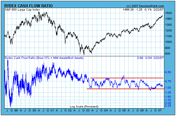
Under this new concept, we are going to have to develop new techniques to analyze the Rydex data. This will not be the first time. As you can see by the chart below, the Ratio has had three distinctive phases and ranges. In the early days the range was very wide because there were fewer assets involved in calculating the ratio. During the bear market the range narrowed, and, when the bull market began, the range shifted lower and was more regular and stable than ever before.
During the period between the beginning of 2003 to mid-2006 the Ratio was a superb measure of extremes in bullish and bearish sentiment. That it was not such a good top picker, is not a weakness that is limited to the Ratio. During bull markets, there are virtually no indicators/oscillators that can reliably identify price tops.
In the next chart we look at bull, bear, and total cash flow. On the Bull plus Sector panel you can see three cash flow peaks followed by cash flow declines that I have emphasized with sloping trend lines. What we are observing here is money going into bull funds, then being withdrawn during the topping process that takes up to several months. Is the withdrawal evidence of money moving into ETFs? That is not a reasonable assumption. Why would a person who is using Rydex bull/sector funds suddenly close profitable positions to open bullish ETF positions?
The first real evidence we have of Rydex bull funds being abandoned for ETFs is the period following the June/July 2006 lows. Note the absence of an upward surge in bullish cash flow associated with the rally. Last week I concluded that this was evidence of a "wall of worry", and that the bulls had not yet accepted the rally. I now believe that conclusion was wrong, and that investors are shunning Rydex bull funds in favor of ETFs. I think this conclusion is borne out by the bottom panel on the chart which shows total cash flow beginning to trend downward.
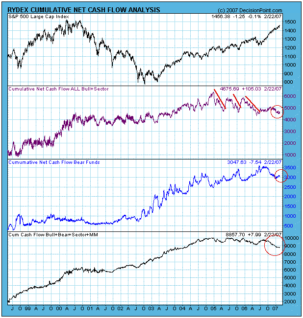
Finally, notice how in the last few months bull cash flow is declining and bear cash flow is rising. This is a similar pattern to the three prior bull cash flow peaks, albeit much smaller. As in the previous cases, I think this shift is a precursor to a correction or consolidation.
Bottom Line: The Rydex Cash Flow Ratio is probably being influenced by a significant lack of interest by investors in Rydex bull funds ? ETFs now being the vehicle of choice. This shift in emphasis will necessitate our being more cautious in our interpretation of the Ratio until we can see what kind of new pattern, if any, emerges.
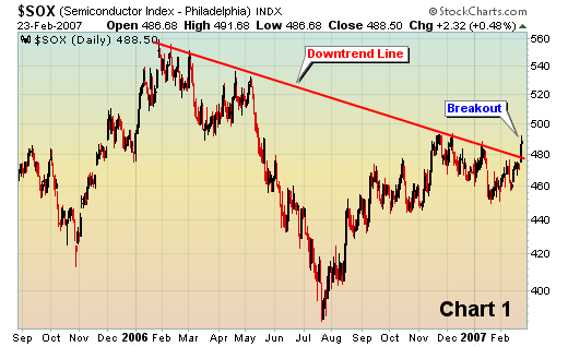
We have been very bullish the equity market for months and we continue to be. But one wild card has been the semiconductors. In order to truly sustain a nice market rally, we felt the semiconductors would need to participate. Well, we've been waiting...and waiting...and waiting. Finally, a critical technical move was made this week. Semiconductors got the fundamental lift from Analog Devices (ADI) which said that January business conditions were improving. That was music to technology investors' ears. We've seen the fundamental news before, however. We wanted to see price action follow. On Thursday, price action followed in a big way. We had two technical issues to resolve on semiconductors. First, we needed to break a recent downtrend line spanning the last thirteen months. That issue was resolved on Thursday, as can be seen below (Chart 1):
There still remains a longer-term technical picture that must be resolved. Yes, the intermediate-term break of resistance was bullish this past week. But we will need a catalyst to break the symmetrical triangle that has developed over the last six years (Chart 2):
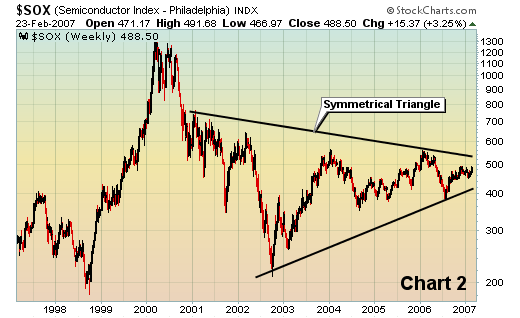
KLA Tencor (KLAC) added a little bullish semiconductor fuel Thursday after hours as they said they were "accelerating" their $750 million repurchase program and authorized another 10 million shares to be repurchased. That's a serious vote of confidence from the Board of Directors and shouldn't be ignored. However, we haven't seen the long-term symmetrical triangle break. Money speaks louder than words. While the break of the recent downtrend line was quite bullish, semiconductors still have much work to do.
We favor the group at this time and expect their contributions to be felt for weeks and months as the bull market continues to gain momentum.
The technology rally from July-to-present has occurred without the participation of the Semiconductor Index ($SOX). We find this rather "odd" to be sure, for one of the basic tenets of any broader market rally were that they were led in general by the technology sector, and more specifically the "high-beta" semiconductor industry. That hasn't been the case recently however, for the semis have lagged rather badly , and the question before us is whether they are "dead money" or not. A reasonable question we think.
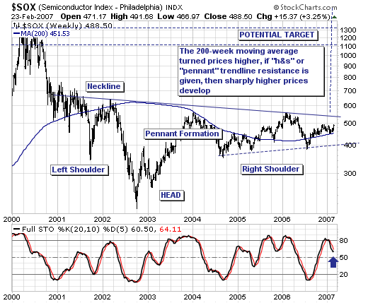
Our opinion: the semis are poised to trade sharply higher...if...if they can get some "gitty up and go" behind them to breakout of either the ugly "head & shoulders" pattern or the more "neat" pennant formation. It matters not to us which pattern; we are only concerned with the results once trendline resistance is given...whether sharply higher prices materialize as anticipated. We give this more than a 50/50 chance given major support at the 200-week moving average held and turned prices higher; with the 20-week stochastic poised to reverse higher from "postive numbers". This would imply "strength", which would target nearly a 100% rally over the course of the next several years. And of further support to our thesis, the Semi/S&P 500 and Semi/NASDAQ 100 relative ratio charts are turning higher as well.
Therefore, we are carefully watching semiconductor price action, for we feel they are poised for a major breakout...with our favorite individual stock being Lam Research (LRCX).