| |
|
|
|
|
| |

|
ChartWatchers
the StockCharts.com Newsletter
|
|
|
|
|
|
|
|
P&F CHARTS PROVIDE PERSPECTIVEby Chip Anderson | ChartWatchers
Hello Fellow Chartwatchers!
This week's market gyrations have caused many people to stop and question the market's current position - sometimes quite emotionally. In times like this I like to go back to basics and look at some of the most impartial charts out there - Point and Figure charts. Check out this chart of the S&P 500 index:
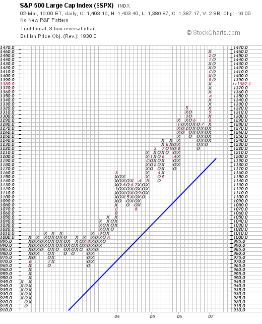
Again, P&F charts compress long uptrends and downtrends into vertical columns of rising X's and falling O's. (The red numbers & letters in the boxes indicate which box was filled first during the corresponding month.) By compressing uptrends and downtrends, more time can be represented on the chart and therefore a longer-term perspective can be gained. In this case, this chart goes back to the middle of 2003. Most of the chart shows a clear, healthy uptrend from 2004 through mid 2005 with the 45-degree rule for P&F trendlines clearly visible.
Things get interesting in the last column of X's on the right side of the chart. That column represents an uptrend that started back in July of last year. Things continued to rise without a significant pause through August ("8"), September ("9"), October ("A"), November ("B"), December ("C"), and then into January ("1") and February ("2") of this year. The chart really shows how atypical such a steep, continuous rise in prices was. Something had to give...
Looking at this chart, things may have to fall a little further to get back into the "normal" channel of the long-term uptrend. That's not my emotion talking. That's the verdict from the impartial P&F perspective.
(For more on P&F charts, see our ChartSchool article on the topic.)
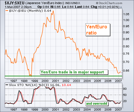
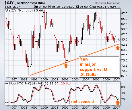
Our main concern here is the relationship between the world's strongest currencies and the Japanese yen. Since 2000, the world's strongest currency has been the Euro (followed by the Swiss Franc, Canadian and Aussie Dollars, and the British Pound. The yen has been the weakest global currency). Chart 1 measures the yen against the Euro (XJY:XEU ratio). The yen has been falling against the Euro (and all other currencies) since 2000. The Yen:Euro ratio, however, has reached a major support level at its 1998 lows and is in oversold territory as measured by the monthly stochastic lines. Purely on technical grounds, this would be a logical time to start reversing the "yen carry trade" that's existed for seven years. In other words, it may be time for the yen to start rising against the world's major currencies (including the Dollar). Chart 2 shows that the yen is bouncing off a nine-year support line (versus the U.S. Dollar). The monthly stochastic lines are turning up from oversold territory. The yen may be done with "carrying" the rest of the world's markets. That's why everyone is very nervous about the bouncing yen.
CORRECTION AHEAD FOR S&P 500?by Arthur Hill | Art's Charts
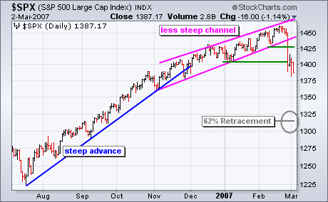
The current breakdown in the S&P 500 looks quite similar to the May-June 2006 breakdown. Let's look at the May-June 2006 break down first. The S&P 500 surged from mid October to mid December (2005) and then began a slower zigzag higher until early May (2006). Despite slowing momentum, the trend was in good shape as long as the index kept forging higher highs and higher lows. The break down started with a sharp decline and break below the April low in mid May. There was a brief reaction rally back above 1280 and then another move lower to forge the mid June low. The total decline retraced 62% of the Oct-May advance.
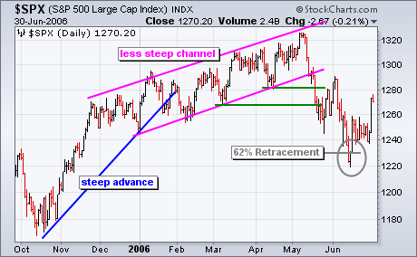
On the current S&P 500 chart, the index advanced sharply from mid July to late November and then began a slower zigzag higher from December to February. Despite slowing upside momentum, this advance was in good shape as long as the index kept forging higher highs and higher lows. With a gap down and sharp decline this week, the index broke below the February and January lows. This breaks the string of higher lows and argues for a trend reversal. At the very least, we should expect a correction. Should the index follow the May-June script, a 62% retracement of the Jul-Feb advance would target a correction to around 1314.
UPDATED CRASH ANALYSISby Carl Swenlin | DecisionPoint.com
In light of this week's sharp decline (mini-crash?), the most obvious subject for discussion in this week's article is to question whether or not we are on the verge of another major crash. In my 12/8/2006 article, Crash Talk Is Premature, I stated:
". . . my analysis of the price structure and internal indicators leads me to the conclusion that there is not a crash anywhere in sight. This does not preclude a crash triggered by an external event of which we can have no advance knowledge, but the visible deterioration that typically precedes a crash does not currently exist."
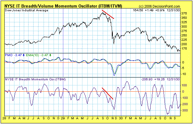
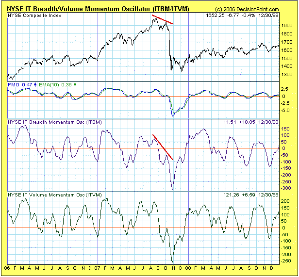
"To illustrate, we can look at charts (below) of the two most famous crashes of the last 80 years ? the Crash of 1929 and the Crash of 1987. There are two chart configurations that preceded these two major crashes. First, was the price action ? a major price top, followed by a lower top, followed by a break below the price low between the two tops. This kind of event doesn't always lead to a major crash, but it is always a sign of danger, and can be part of a market correction."
"The second element is internal deterioration visible in a breadth indicator. In the case of the two charts below we can see that, when the second price top formed, the ITBM Oscillator also topped, and it topped below the zero line as a result of an extended period of deterioration. Below zero indicator tops are another danger sign that should not be ignored."
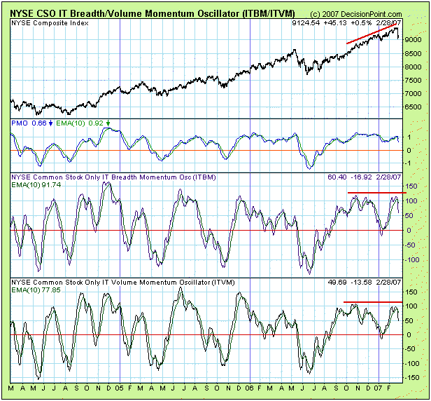
Now let's take a look at a current chart of the ITBM/ITVM Oscillators. We can see that prior to the mini-crash, the indicators were overbought and showing a negative divergence; however, we can also see numerous instances where negative divergences and overbought conditions did not lead immediate, serious declines. In other words, there was nothing on this chart that would hint at a crash. The most logical actions prior to the decline would have been to hold current longs and wait for better (oversold) conditions before opening new longs.
The important point to be made here is that we currently do not have the kind of setup that preceded the 1929 and 1987 Crashes; and, while the recent decline was rather precipitous, the market has only declined about 4% from its recent highs. Having said that, it is unlikely that the correction is over, and continued negative action could indeed lead to a technical setup similar to the ones that formed prior to the Big Crashes.
One big positive that the market has going for it is the major support that can be seen on the next chart. The recent rally pushed the S&P 500 above the top of its long-term rising trend channel. Where the top of the channel used to be resistance, it is now support, and the remainder of the correction could be played out above the support line.

Bottom Line: We have gone seven months without a medium-term correction, and, while I am surprised at the violence with which it was initiated, I am not surprised that a correction has begun. I personally do not believe that we are setting up for a big crash or a bear market, but I will be guided by future market action. Regardless of my personal opinion, we rely on mechanical trend models to determine our market posture. Below is a recent snapshot of our primary trend-following timing model status for the major indexes and sectors we track.
ENERGY - A BULLISH VIEWby Tom Bowley | InvestEd Central
We have been in the bearish camp on energy and over the past several months and for now remain on the bearish side. But anytime you take a position on the bullish or bearish side, you need to realize patterns that could change your view. The price of oil broke a five year uptrend in 2006 that has us very cautious on the energy sector in 2007. There are circumstances and patterns that could develop to change our bearish view. Oil prices have been bouncing, from lows just under $50 per barrel to our recent highs back over $62 per barrel. Will the sudden uptrend continue or will the rally fade? No one knows the answer for sure, although there is a formidable bullish pattern that is potentially forming - the bullish inverse head and shoulder continuation pattern. Take a look at the following chart:
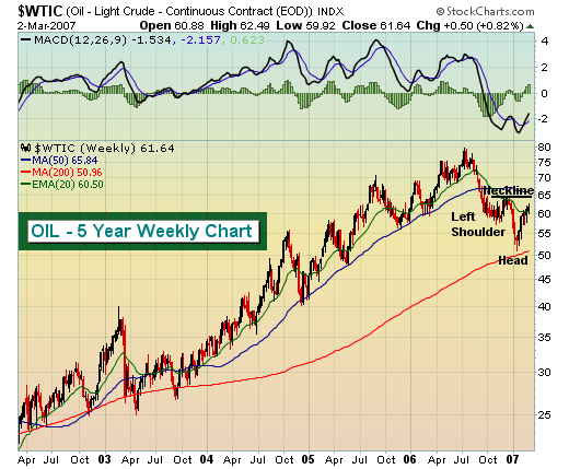
Off of a significant uptrend, we saw oil pull back in the fourth quarter of 2006 touching $57-$58 per barrel (inverse left shoulder). After a quick reaction bounce to $64 (first point of neckline) approaching the 50 day SMA, oil found a new low near $50 per barrel (inverse head). Now we're watching oil climb again, perhaps to test that $64 area (second point of neckline). Could we then witness one more pullback under $60 to form a potential inverse right shoulder before ultimately breaking out above $64? If that pattern develops, the breakout would measure to $78 or so, testing the highs from last summer. We realize we're getting a bit ahead of ourselves and we do not anticipate oil completing this bullish pattern. However, as a trader, you need to be able to recognize the possible bullish and bearish patterns that develop not only to maximize gains from opportunities, but more importantly, to minimize losses from mistakes. Let's watch the action unfold in the coming days and weeks and be prepared to react accordingly.
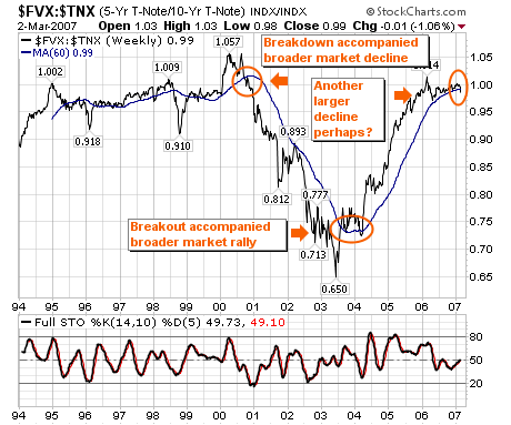
Last week's market decline was quite interesting from a number of perspectives. First, the decline clearly mirrors the movement in Japanese Yen as the "carry-trade" is unwound; if one watches these closely, one will see that stock traders are cleary focused on the yen. We will have more to say on this in the future; but suffice to say, a major reversal higher in the yen has taken place. Secondly, and perhaps more importantly from an economic perspective in the US - is that our simple interest rate model of the ratio between the 5-year note and 10-year note ($FVX:$TNX) has broken important support at its "fulcrum point" of its 60-week moving average. Over the past 10-years, this model has generally kept one long during corrections if it is above its 60-week moving average; but for the first time since September-2001...it has broken below its 60-week moving average after attaining the 1.0 level. What we think the market fears is not "inflation", but slowing growth. And this is exactly what happened during the 2001-2002 broader market decline; and we all know just how "deep" and "gut wrenching" that bear market was. Thus, the odds of this decline being more than just a normal correction have increased given the interest rate model. Those who have followed it have done well. Our strategy at this point is to "short rallies" going forward until "the facts change".
|
|
|
|
|
|
|
|
|
|
|
|
|
|
|