Hello Fellow Chartwatchers!
Last week's recovery rally was crushed by Tuesday's big decline and while the Dow quickly rose back above 12,000, the technical damage was done. The chart below shows the important technical developments for the Dow in recent days. See if you can spot the key signals.
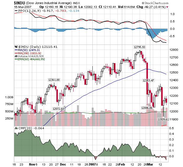
For me, the key signals include:
The PPO is at its lowest level in months.
The CMF remains in negative territory and appears headed lower.
The 200-day Moving Average has reappeared on the chart (the thin red line on the lower right corner of the price plot area).
Volume has been significantly higher since the big drop at the end of February.
Support at 12,000 remains strong (so far) - but that's about the only bullish technical signal right now.
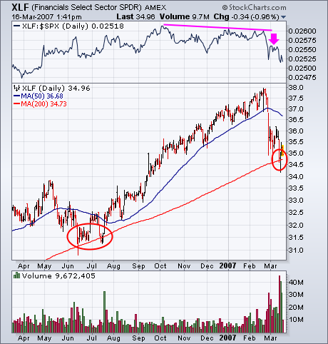
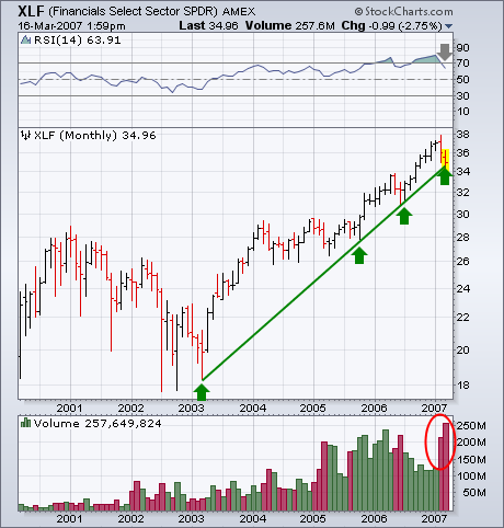
It's no secret that one of the main problems pulling the market down over the last month has been the fallout from subprime mortages. It's also no surprise to read that financial stocks (mainly banks and brokers) have been the weakest part of the market over the last couple of weeks. That's a concern because financial stocks are historically viewed as market leaders. They had been leading the market higher over the last two years. Not anymore. The line on top of Chart 1 is a ratio of the Financials Select SPDR (XLF) divided by the S&P 500. That ratio peaked in October of last year, and failed to confirm this year's move to new high ground (red arrow). Even worse, the ratio has fallen to the lowest level since last May. The group itself is now in the process of testing some long-term support lines. One is the 200-day moving average. That support line line hasn't been decisively broken for eighteen months (red circles). Chart 2 shows the XLF also testing a four-year uptrend line (drawn on a log scale). Chart 10 holds some other warnings. One is the unusually heavy downside volume over the last month. Another is the fact that the 14-month RSI is turning down from major overbought territory over 70 (down arrow). The financial sector is undergoing a major test of its long-term uptrend. That's a big test for the rest of the market as well.
The sector rotations since 26-Feb reflect a defensive and nervous market. Things started changing on Wall Street with the sharp decline on 27-Feb and the PerfChart below shows sector performance since this decline. The Utility SPDR (XLU), the Industrials SPDR (XLI) and the Consumer Staples SPDR (XLP) are the strongest sectors. Strength in XLP and XLU shows a preference for defensive sectors. The Consumer Discretionary SPDR (XLY) and Finance SPDR (XLF) are the weakest sectors and this is not a good sign.
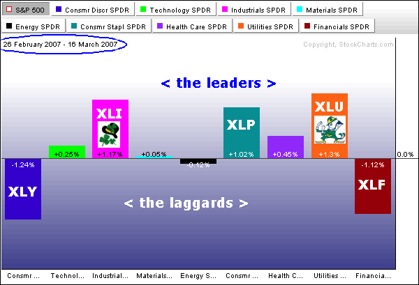
As its name implies the Consumer Discretionary sector represents companies that are sensitive to economic fluctuation. This includes retail, media, leisure, homebuilding and restaurant stocks. These are the first to get hit when there are signs of weakness in the economy. Relative weakness in this sector points to upcoming weakness in the economy.
Finance is the single biggest sector in the S&P 500 and XLF represents the banks and brokers. We are already aware of the sub-prime lending problems and this continues to hang over the Finance sector. The sub-prime problems are probably not enough to bring down the big banks, but continued uncertainty is keeping buyers on the sidelines. The S&P 500 is going to have a hard time rising as long as these two KEY sectors show relative weakness.
One of my colleagues has been harassing me (in a friendly way) for not yet having declared myself a bear. The truth is that top picking is a treacherous business, and I have given it up in favor of letting trend models make my declarations for me. For example, I changed from bullish to neutral (medium-term) on stocks on March 6, and some readers have wondered why I didn't go all the way to bearish instead of just neutral. The reason is that my long-term trend model must be bearish at the time the medium-term mechanical model issues a sell signal in order for me to become medium-term bearish. My long-term trend model also defines, for me, whether the market is in a bull or bear mode over all.
The long-term trend model is driven by the relationship of the 50- and 200-EMAs (exponential moving averages) of the price index. If the 50-EMA is above the 200-EMA, we are in a bull market, and we are in a bear market if the 50-EMA moves below the 200-EMA. In the chart below you can see that this model has performed brilliantly from late-2000 to the present. The downside crossover in October 2000 cleanly declared that a bear market was in progress, and the upside crossover in May 2003 confirmed that a bull market had begun. After that, there were four bull market corrections that caused the 50-EMA to approach the 200-EMA, but a downside crossover never happened, and the bull market, by this measure, remained in force.
Now another correction is in progress, and it has caused the 50-EMA to turn down, but, as you can see, we are a long way from a downside crossover, assuming that no major crash occurs. Until proven otherwise, I think it is safest to assume that the recent decline is a bull market correction. This doesn't mean that we have our guard totally down. Our medium-term model has us out of the market, but the long-term model prevents us from becoming aggressive on the short side.
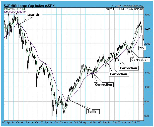
While the long-term trend model has done well in the last six years, I should emphasize that it is not always this perfect, and it too slow to side step major crashes, like 1929 and 1987. For that we need more sensitive tools, focused in the medium-term. The long-term trend model is best used as a tool to objectively define bull and bear markets, so, for example, if someone asks me, "Is it a bear?", I can look at the chart, see that the 50-EMA is above the 200-EMA, and reply, "Not yet!"
Bottom Line: It is useful to have an objective method to define bull and bear markets, and we use simple crossover signals generated by longer-term moving averages. I do not claim that this is the best method, but it is very effective for our purposes.
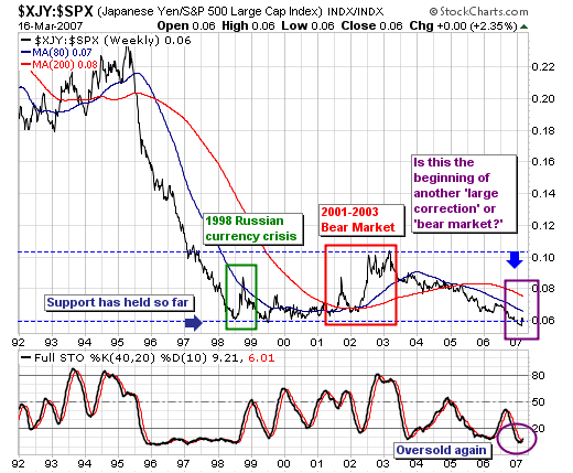
The recent focus of the equity markets is upon the "sub-prime" mortgage problem; and upon the "yen-carry trade". We think both are valid concerns; however, the question of the "yen-carry trade" is more important in our mind than the "sub-prime implosion." Perhaps the sub-prime problem is the "catalyst" to start the correction ball rolling, while the "yen-carry" is the horse that does the heavy-pulling, and the heavy-pulling in this regard is a correction that takes stocks back to more traditional oversold levels.
That said, looking at the Yen-S&P 500 ratio, we find two clear periods in the past decade - one short and one long - where the yen rose against the S&P. And in both cases, when the yen was rising against the S&P 500, the S&P 500 was in an absolute correction. The first period was short, and coincided with the 1998 Russian currency crisis, which took the S&P lower by -22%; whereas the second period was more prolonged and coincided with the technology "bubble". The result was quite a larger bear market with the S&P dropping 50%. Thus there is precedent for a larger decline coincident with a rising ratio.
Hence we must be concerned given the ratio is starting to show nascent signs of wanting to rally once again. The initial "spike higher", coupled with the oversold 40-week stochastic certainly concerns us. Moreover, the yen is right upon its 80-week trading moving average, of which a break above it would be the first time it has closed above it since 2005. Obviously, this would usher in higher yen prices. So, we think the ratio rally continues, and we clearly believe stocks will falter.
And in ending, this begs the question as to just how "deep" a correction are we looking at. If we simply look at the weekly and monthly S&P charts, we find major weekly support crosses at 1330...or its 80-week moving average. Monthly support however, is at the 40-month moving average, which crosses at 1230. Therefore, we think it would be rather reasonable for a test of this zone to occur; of which the total decline off the high would be roughly -9% and -16% respectively. Normal corrections on the order of -10% are common; hence we are willing to split the zone difference leaving our target at roughly S&P 1280. Obviously, this means are are selling rallies.
