The Dow Jones Industrials continues to rise week after week setting new records as it goes. I thought it would be good to take a quick look back and see if history can teach us anything about what the Dow does to signal the end of these long up-trends. Here's a weekly chart of the Dow Industrials going back to 1990.
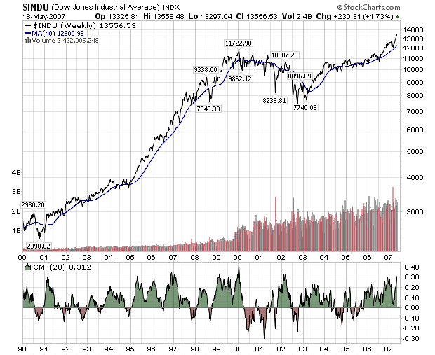
This is a semi-log scale chart (the vertical axis is logarithmically scaled, the horizontal axis is not) and includes my favorite one-size-fits-all indicator, the 20-period Chaiken Money Flow.
The log scaling helps us see that the recent rise, while impressive, is no match for the HUGE rise in the Dow during the mid-nineties. We also see that during the nineties, the Dow's 20-week CMF stayed in the green for several multi-year periods. Both of those observations bode well for the current long-term trend. The Dow has done this kind of thing in the past and might be repeating itself now.
On the downside (there's always a downside, sigh...), the CMF has been in the green for just over 18 months now and that is about as long as it has ever been in the green without some kind of drop. Even during the go-go nineties, the CMF dipped into the red in mid-1996 to break up the longest above-zero stretch on the chart. With history as their guide, alert ChartWatchers will be watching the 20-week CMF for signs of weakness in coming months.
BTW, be sure to read our previous newsletter for details on our Spring Special which is almost over!
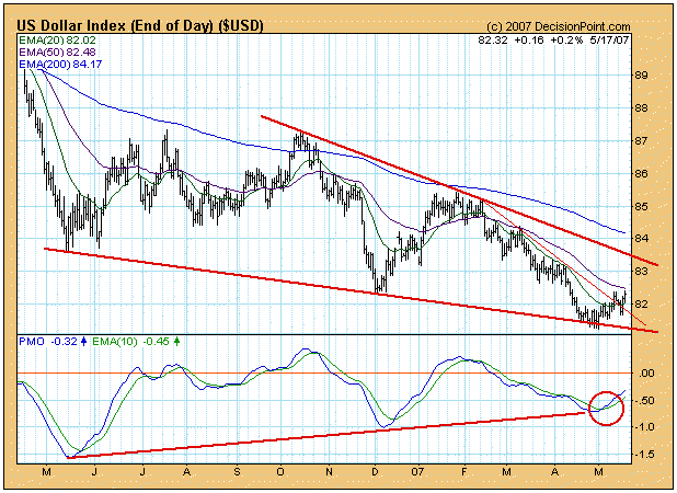
The U.S. Dollar is trying to turn up for the fourth time since it topped in 2004, but this bottom looks more promising than the prior three. While the long-term trend is down, this bottom is the third confirmation of the descending wedge formation, a technical configuration which normally resolves to the up side. This wedge is also a long-term formation, so the direction of a breakout has long-term implications.
In the short-term we have a PMO (Price Momentum Oscillator) buy signal, generated when the PMO crosses up through its 10-EMA. Also, the price index has broken above the short-term declining trend line. Medium-term we have a positive divergence as the PMO has been making higher highs corresponding to lower price lows.
On the long-term chart below we can see other positive signs. Most important is the long-term support zone between 78 and 80. There is no guarantee that the support will hold, but we have to view it as being in the plus column. Assuming that the support does hold, the bottom that will result will form a double bottom that spans over two years. Like the wedge formation, this will have very positive long-term implications.
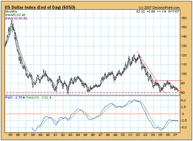
Bottom Line: Let there be no doubt, the trend is down in both the medium- and long-term (our trend model is still bearish on the dollar), and it is too early to assume that a change in trend is taking place; however, there are plenty of reasons to begin nursing some positive expectations.
Folks, we're merely in the second or third inning of a nine inning game. Let there be no doubt, the bulls are in charge. And they will remain in charge. This current bull rally goes beyond interest rates, earnings, inflation, blah, blah, blah. It's not that those fundamentals aren't important, they are. But we are talking about supply and demand, Economics 101. We are seeing deal after deal after deal. We have been talking for months at Invested Central about the long-term effect of all of these buyouts and private equity deals. First of all, the fact that these deals are occurring at all should give you a clue about valuations - prices are CHEAP. Did you notice the premium Microsoft was willing to pay for aQuantive? How about 77%? We hear very little about initial public offerings (IPOs) and secondary public offerings. Instead, it's about buyouts, private equity deals, and corporate stock repurchase plans . That equals supply reduction. As supply dwindles, prices rise assuming demand is constant. The best news is that demand hasn't even begun to pick up yet. During the bull market run from 1995-1999, the NASDAQ rose more than 5% in a calendar month 22 different times. There were 22 different calendar months that produced gains of more than 5%. So, on average, the NASDAQ had 4 or 5 of these months each year. Interestingly enough that during the NASDAQ's advance since July 2006 there has not been one calendar month of 5% appreciation. Yet I heard last week talk of another "bubble". Let's get real! The psychology of investors is so tainted since the 2000-2003 NASDAQ crash that they cannot see the forest for the trees. I want to reprint a chart that was posted in a previous newsletter to give you the Big Picture view of what's transpiring in the stock market. I call it the "Axis of Normal Returns" (see chart below). Over short and intermediate terms, the market's pricing efficiency struggles, but over the long term generally gets it right. The Axis of Normal Returns provides a look at the Big Picture.
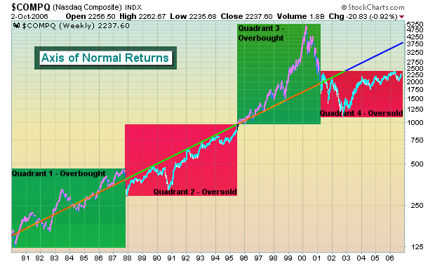
We anticipate a strengthening economy in the second half of 2007, an accommodating Fed - which we haven't had in several years - and, as a result, expanding multiples. The put call ratio, a contrarian indicator, continues to reflect bearishness or at best guarded optimism. Historically, that has not been a sign of a topping equity market. Rather, it provides the fuel for a further advance. As long as skeptics abound, the market has plenty of upside remaining.
We recently featured the S&P 500 Large Cap vs. Russell 2000 Small Cap ratio surrogate using the ETFs SPY:IWM; with the implication that the tectonic plates were shifting beneath the markets, with large caps slowly, but surely coming back to favor at the expense. This was simply the thesis based on "looking through" out indicators; however, last week provided clear confirmation that indeed - a major breakout had taken place on the daily as well as the weekly and monthly charts. Obviously, this has major implications for our trading strategy; we are increasingly likely to trade the Pfizer's (PFE) or Cisco's (CSCO) or General Electric's (GE) of the world rather than small stocks.
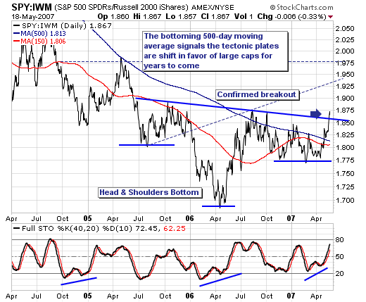
Analyzing the SPY:IWM daily chart once again and keeping it rather simple; we find prices bottomed in April-2006, with the "right shoulder" of a larger "head & shoulders" bottoming formation breaking out above the major 500-day moving average resistance level, and then above neckline resistance. Moreover, the stochastic pattern is supportive of further gains. This breakout could not be cleaner... nor clearer; hence our confidence level is quite high that rotation in favor of large caps will come from the small cap area. Keeping it simple again; one must trade accordingly.