Things got a little bumpy last week as the Dow had a big "down" day on Thursday. Friday's recovery was reassuring, but was any lasting damage done? One of the best ways to examine the overall "health" of the Dow is to look at the total number of Dow stocks that are above or below their 50-day moving average.
StockCharts.com tracks that information closely via the $DOWA50 and $DOWA50R market indexes. $DOWA50 contains the actual number of stocks that are above their 50-day moving average. It is updated once a day after each market close. Because there are 30 Dow stocks, the value of $DOWA50 ranges from zero to 30. $DOWA50R is a percentage-based version of the same information - i.e., its value ranges from 0% to 100%. Use the "R" version when you want to compare this information to similar indexes for other markets (e.g., $SPXA50R).
Below is a great chart for you to use to examine the "internal health" of the Dow.
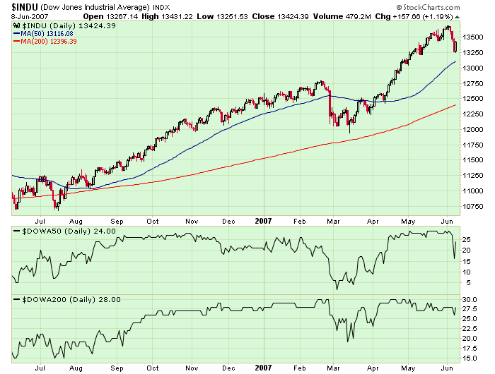
The most interesting thing this chart shows is the difference in behavior of the A50 line back in late February versus its behavior during the past week. Back in February, the Dow suffered a similar big decline in value, but in that case, the A50 line dropped significantly and continued to move lower. This past week, the Dow fell and then immediately recovered - so did the A50 line.
Maybe even more telling in this case is the behavior of the A200 line. February's decline resulted in a very visible dip in the A200 line. Last week's decline barely even registered.
Remember that indexes like the Dow can move significantly for a number of different reasons - the A50 and A200 lines can help you determine the importance of those movements.
NASDAQ RECOVERSby Arthur Hill | Art's Charts
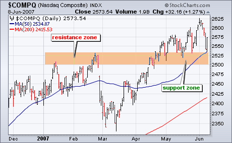
The Nasdaq held support and led the market higher on Friday. Even though Thursday's decline was quite drastic, the Nasdaq never broke support from its May lows and the medium-term uptrend remains. Nasdaq support is just above 2500 and extends back to the January highs. The index established a resistance zone around 2510 and this resistance zone turned into support during May. This is a classis tenet of technical analysis: broken resistance turns into support. While this week's three day plunge was the sharpest decline since late February, the index is still holding support and I would not put on my bear hat until a break below 2500.
CORRECTION AT LAST!by Carl Swenlin | DecisionPoint.com
We have been watching prices trend higher for several weeks, even as internal strength trended lower and warned that price weakness could be ahead. Finally, this week prices broke down in a big way, signaling the start of a correction that could last at least a few weeks.
Our first chart is of the Participation Index (PI). The PI measures short-term price trends and tracks the percentage of stocks pushing the upper or lower edge of a short-term price trend envelope. Specifically we track the participation of each stock in a given index. A trend needs a strong plurality of participation to be maintained. We can see how UP participation, the number of stocks actually driving the up move expands as the market moves higher, then the PT contracts prior to short-term market tops. A similar thing, but in reverse, is beginning to happen now with DOWN participation now as the market begins its correction. Note the strong down spike accompanying Thursday's sell off.
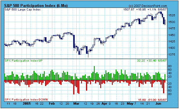
While it is always possible that the correction is complete, it is more likely that it will play out somewhat like the February-March correction which is visible on the chart. In other words, it could take a couple of weeks and several tests of support before the rising trend resumes.
The next chart puts the correction in a long-term context. We can see that prices are dropping down from the top of a rising trend channel, and support will be encountered at around 1430. As long as that support holds, no serious technical damage will have occurred. It is reasonable for us to expect that the current selling is temporary and that the up trend will resume.
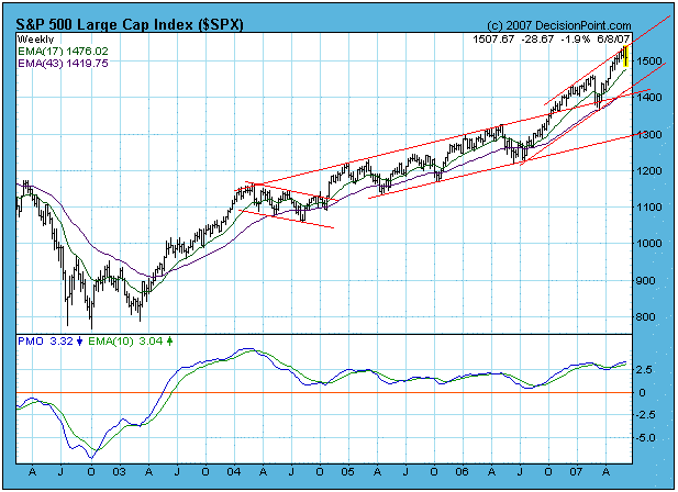
Bottom Line: While we are experiencing a short-term correction, I have no reason to believe that the longer-term rising trend is in jeopardy. While corrections are uncomfortable to ride out, they are healthy and necessary, and we should hope this one builds a strong base for the next rally.
A GOLDEN OPPORTUNITYby Tom Bowley | InvestEd Central
The market periodically finds reasons to selloff, even in bull markets. This past week it was all about interest rates. You could see it coming. Interest rates had been rising for the last month. The yield on the 10 year treasury bond increased from 4.61% on May 8th to a high of 5.18% on Friday, June 8th, before settling back at the close to 5.12%. Equity markets get skittish as interest rates rise, and generally for good reason. When rates rise, access to capital begins to dry up, capital expenditures drop and corporate America sees shrinking profits. Think about what's driven the market for the last year or more - private equity deals, merger mania, and corporate share buybacks. As access to capital becomes more difficult, we see less of what's been driving the market higher.
But is this rise in interest rates temporary or permanent? And what's causing it? The answers to those two questions will directly impact equity prices over the next many months and quite possibly 1-3 years. First, you have to realize that bonds trade the same as stocks and their prices move up and down, rarely do they move in just one direction. Keep in mind also that as bond prices rise, yields drop. Conversely, as bond prices drop, yields rise. That's what we've seen over the past thirty days, a deep selloff in bonds and yields on the rise.
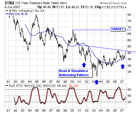
Look at the long-term chart of the yield on the 10 year treasury bond. Because bonds trade like stocks, technical traders follow the same basic principles. Long-term trendlines matter. As you can see from Chart 1 below, the yield on the 10 year treasury bounced off of long-term trendline resistance on Friday.
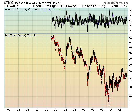
The second chart that we'd like for you to look at is a short term candlestick chart of the yield over the past few months. After a lengthy downtrend in bonds and a corresponding uptrend in yields, we saw the "dreaded" black candle appear at the top of the uptrend - see Chart 2.

If you're looking at the price of the bond, you'll see a red hollow candle appear after a lengthy downtrend. Both are reversal signs. We believe there is a very strong chance yields topped on Friday and began moving lower.
Black candles appearing the way this one did suggests that the heavy selloff in bonds and exhaustive gap down on Friday (and corresponding spike in the yield) is signaling the bottom of ten year bond prices and the top of the yield. The fact that the yield reversal occurred right at long-term resistance gives us more confidence the top has been hit.
We continue to believe that inflation is not a problem in the U.S. When the Fed meets at the end of June, we expect to hear that inflation remains a concern, but that they expect it to moderate throughout the balance of 2007. That news will keep interest rates in check and propel equity prices higher. Of all the scenarios that include higher interest rates, the only one that is terribly troubling is the scenario that shows inflation rising. If interest rates do continue their climb to offset a strengthening economy, we remain steadfastly bullish equity markets. Inflation is the wild card and we are convinced it is a non-event in 2007 and 2008.
Use the recent weakness in the stock market to buy for the longer term. We tend to recognize opportunities after they're over. Take a look now before it's too late.
MARKET FOCUSING ON 10-YEAR NOTE YIELDby Richard Rhodes | The Rhodes Report
Last week saw stocks sell off rather sharply for several days, of which the catalyst was the sharp rise in bond yields as inflation and too strong growth concerns too center stage. Since bond yields are now the tail wagging the stock market dog ? we think it imperative to understand perhaps where bond yields are headed given stocks are now showing a highly inverse correlation with bond yields. If bond yields are headed higher; then ostensibly stock prices are headed lower.
The market's focus is upon the 10-year note yield; it is clear bond yields are in a bull market given the bottom forged in 2003, with a subsequent series of higher lows and higher highs. Also, we must point out that the 120-week moving average tends to illustrate the trend rather well, and further provides support to declines. Our concern, and it should also be our clients concern ? is that a technical "head & shoulders bottoming pattern" is forming, of which a breakout above 5.25% would break neckline support and lead to still higher yields... perhaps sharply higher yields towards those extant in early-2000 at 6.75%.
Market participants aren't mentally prepared for this circumstance. Can you think what the world would look like if 10-year notes were at 6.75%? What the stock market would look like? What would have to happen for this to occur? Most ? including us have been conditioned on a low interest rate environment after the technology bubble burst, as well as the sub-prime implosion. We and others looked for lower interest rates; not higher interest rates. We were wrong headed; now we must contend with a world with greater risks and lower levels of liquidity... and perhaps sharply lower stock prices after a 5-year bonanza.
