| |
|
|
|
|
| |

|
ChartWatchers
the StockCharts.com Newsletter
|
|
|
|
|
|
|
|
One thousand words:
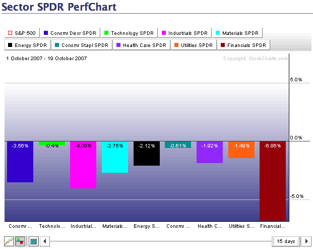
All the sectors are moving lower this month led by the Financials. Click on the chart to explore more.
TWO DOW CYCLICALS TUMBLEby John Murphy | The Market Message
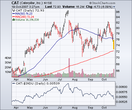
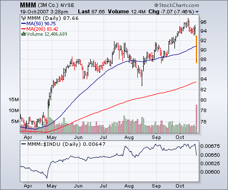
The Dow Industrials were hit especially hard on Friday. A lot of that was due to big tumbles in two of its cyclical stocks â Caterpillar and 3M. Chart 3 shows Caterpillar falling 6% (on higher volume) to undercut its 50-day average. CAT appears headed for a retest of its 200-day line. Chart 4 shows 3M tumbling 7% on huge volume. Both relative strength lines are in downtrends. The fact that both stocks are considered be cyclical in nature (or economically-sensitive) suggests that the market is getting more worried about the U.S. economy. That view is supported by the fact that Dow stocks holding up the best were in the defensive consumer staple and healthcare categories.
ANOTHER LEG LOWERby Arthur Hill | Art's Charts
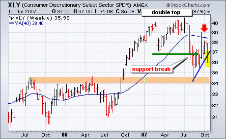
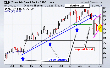
The Consumer Discretionary SPDR (XLY) and Finance SPDR (XLF) broke down this week to signal a continuation of downtrends that began in July. In other words, the Aug-Oct rally was just a countertrend advance within a larger downtrend. XLF and XLF moved into bear mode when double tops were confirmed with support breaks in July. Both broke their March lows and forged lower lows. The advance over the last nine weeks retraced around 62% of the Jul-Aug decline and both ETFs met resistance near their 40-week moving averages (red arrows). This week's sharp decline ended this countertrend rally and started another leg down. In addition, a lower high formed and this is what downtrend are all about: lower lows and lower highs. The next support levels are around 30.5 for XLF and 34 for XLY. The Finance sector represents the banks, brokers and REITs. The Consumer Discretionary sector is the most economically sensitive. Needless to say, breakdowns in both bode ill for the market overall.
CORRECTION UNDERWAYby Carl Swenlin | DecisionPoint.com
Two weeks ago I wrote an article that stated that it was a good time for a pullback. As it turns out the pullback started four trading days later, and it appears now that a full blown correction is in progress. It will probably take at least two or three weeks to complete the correction, and there will probably be something of a bounce before the correction low is found.
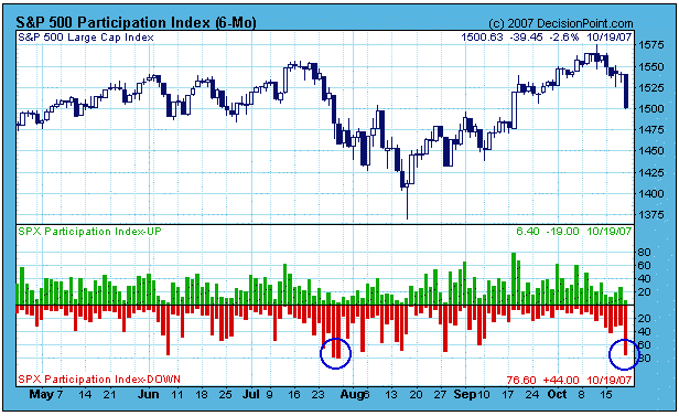
Friday's down move was quite violent, but it also provided evidence that the market is getting short-term oversold. The following chart shows the Participation Index (PI), which measures short-term price trends and tracks the percentage of stocks pushing the upper or lower edge of a short-term price trend envelope. As you can see, on Friday the Down PI reached an oversold level similar to the down spike last summer. While this kind of selling climax indicates that a short-term bottom is near, it is most likely an initiation climax, meaning that any bounce will most likely be followed by more selling. (See last summer's correction.)
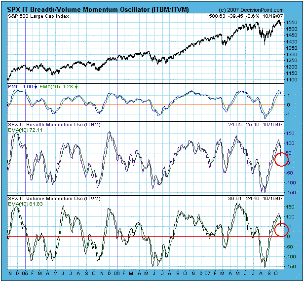
Other indicators show that the market is just coming off overbought levels, and that more corrective action is needed to work off the excesses of the last rally. The next chart shows price, breadth, and volume oscillators. Note that they are moving down, but at least a few weeks will be needed to get them to oversold levels.
Bottom Line: There may be a few more days of selling, but the market is short-term oversold, and we should expect a bounce in a few days. Since it is October, there is a lot of talk about a market crash. With the usual caveat that "anything can happen," my opinion is that conditions are not typical of what we have seen before major crashes. (See my 12/8/2006 article, Crash Talk is Premature.) That does not mean that selling won't continue for longer than I anticipate based upon the above chart. The 9-Month Cycle projection is for a price top in this time frame, with a cycle low projected for mid-December, so, as usual, I'd caution against trying to pick a bottom.
The panic selloff and subsequent recovery in August was nearly a mirror image of what we've seen in October. First, let's start with August. If you recall, we discussed how long-term market bottoms are marked by extreme bearish sentiment. The sentiment we saw in August doesn't get any more bearish. We had put call ratios routinely printing 1.30 to 1.40 and higher. The "equity only" put call ratio printed over 1.0 on 3 consecutive days, the first time that had happened since CBOE has been providing data to the public. For those of you unfamiliar with the put call ratio, it represents the number of put contracts divided by the number of call contracts. A number above 1.0 indicates that more puts are being bought than calls. Since 1995, the average or norm has been .75. The put call ratio serves as a contrarian indicator. The more bearish the put call ratio becomes (ie, the higher the number), the more bullish the implic ations for the stock market. It made perfect sense to us that a significant market bottom was put in place on August 16th after watching the put call ratio soar. The timing of the late afternoon reversal on August 16th and the ensuing gap up on August 17th couldn't have been better for market makers as options expired on August 17th. The reversal saved marker makers a bundle.
Now let's fast forward to October. As we approached options expiration Friday, the market had been straight up for weeks with tons of in-the-money calls. A further look at sentiment early last week revealed a 5 day moving average of the put call ratio that equaled its lowest level since April 2006. The pessimism from August had faded and sentiment was suggesting that the market was ripe for a selloff. Solid earnings reports came in from the likes of INTC, YHOO and GOOG, yet the market couldn't sustain attempted rallies. That was a big red flag and with so much money on the line for market makers due to options expiration, it should not have shocked anyone to see the indices sell off the way they did on Friday. This time a fortune was saved by market makers benefitting by a move in the opposite direction.
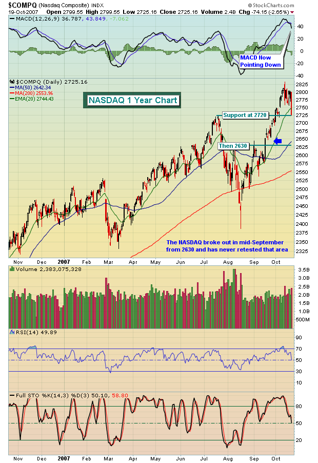
Where does this leave us now? Well, for starters, you must realize that next week is historically the worst performing week of the year, bar none. We are believers of historical tendencies and since 1950, the S&P 500 struggles more during the next 7 calendar days than it does during any other period throughout the year. In addition, the market had become way too complacent as we rose week after week after week. Below is a chart of the NASDAQ and key support levels to watch.
While we remain very bullish on the long-term prospects of the market, it could be financial suicide to ignore the short-term signals here. Take it easy, play it safe and look at any upcoming weakness as yet another opportunity to make money on the long side if panic selling kicks in.
TECHNOLOGY REIGN COMING TO AN END?by Richard Rhodes | The Rhodes Report
Over the past 18-months, the technology sector has outperformed the S&P 500 by a rather handy amount; however, we believe this trend towards technology out-performance is very close to ending. This has major implications in terms of "rotation" to be undertaken by mutual and hedge funds as they are currently very very overweight technology; hence a period of "de-leveraging" themselves may create an opportunity to be short the sector as the "doorway narrows" as everyone attempts to get out at the very same time.
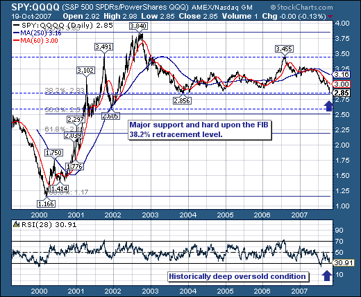
Technically speaking, we use the ratio between the S&P 500 "Spyders" and the NASDAQ 100 "Q's" (SPY:QQQQ). As the chart illustrates, a larger trading range has formed over the past 5-years, with prices now hard upon support at the 2.85 level - which also happens to be right at Fibonacci 38.2% retracement level. This important and critical support level in our opinion shall "hold" and provide for a rally back towards both the short-term 60-day moving average as well as longer-term 250-day moving average... if not higher. Quite simply, prices are oversold when one looks at the 28-day RSI level of 30.91, which is attempting to form a positive divergence with prices.
The most recent experience with an oversold RSI positive divergence occurred in early-2000 - which of course was "the top" of the technology bubble, and right before the onset of a recession. While we don't necessarily believe an exact "redux" is likely - the risk-reward dynamic does indicate that the risk is towards higher ratio prices rather than a continuation towards lower prices. Hence, we 'smell' an opportunity to be short a number of technology names in the days and weeks ahead.
|
|
|
|
|
|
|
|
|
|
|
|
|
|
|